


Understanding UX and UI Design
Before exploring the various tools used in the design process, it is important to understand the difference between User Experience (UX) and User Interface (UI) design. Although the two terms are often used together and are closely connected, they represent distinct disciplines within product design. Both contribute to the success of a digital product, but they focus on different aspects of the user’s interaction with that product.
A well-designed application or website requires both strong UX and effective UI. A product may look visually stunning, but if users find it difficult to navigate or accomplish tasks, the experience will be frustrating. Similarly, a product may function perfectly, but if the interface appears outdated or confusing, users may lose trust in it. Understanding the relationship between UX and UI helps designers create products that are both useful and enjoyable to use.
What Is UX Design?
User Experience (UX) Design focuses on the overall experience users have when interacting with a product, service, or system. The primary goal of UX design is to ensure that users can achieve their objectives efficiently, effectively, and with minimal frustration.
UX design is deeply rooted in understanding human behavior, user needs, and problem-solving. Rather than concentrating solely on how a product looks, UX designers focus on how it works and how people feel while using it. They strive to create experiences that are intuitive, accessible, and satisfying.
A UX designer seeks answers to important questions such as:
- Is the product easy to use?
- Can users complete tasks quickly and efficiently?
- Does the navigation make sense?
- Are users able to find information easily?
- What challenges or frustrations do users encounter?
- Does the product solve a genuine user problem?
- How can the overall experience be improved?
To answer these questions, UX designers conduct extensive research and testing throughout the design process.
Key Activities in UX Design
User Research
User research is one of the most critical stages of UX design. Designers gather information about target users to understand their goals, behaviors, preferences, and pain points. This research provides valuable insights that guide design decisions and ensure that products are built around real user needs rather than assumptions.
User Interviews
Interviews allow designers to communicate directly with users and gain deeper insights into their experiences, challenges, and expectations. These conversations often reveal issues that may not be apparent through quantitative data alone.
Surveys and Questionnaires
Surveys help collect feedback from larger groups of users. They can be used to identify trends, measure satisfaction, and understand user preferences on a broader scale.
Information Architecture
Information Architecture (IA) focuses on organizing and structuring content so users can easily find what they need. A clear and logical information structure improves navigation and reduces confusion.
User Personas
UX designers often create user personas, which are fictional representations of typical users based on research findings. Personas help teams maintain a user-centered approach throughout the design process.
User Flows
User flows map the steps users take to complete specific tasks within a product. By visualizing these journeys, designers can identify obstacles and optimize interactions.
Wireframing
Wireframes are basic layouts that represent the structure of a page or screen. They focus on functionality and content placement rather than visual design, allowing teams to test ideas early in the design process.
Prototyping
Prototypes simulate how a product will function before development begins. They help designers validate ideas and gather feedback without the cost of building a fully functional product.
Usability Testing
Usability testing involves observing users as they interact with a product or prototype. Designers analyze user behavior to identify areas of confusion, inefficiency, or frustration and make improvements accordingly.
Importance of UX Design
Good UX design can significantly impact a product’s success. When users can accomplish their goals easily, they are more likely to remain engaged, return to the product, and recommend it to others.
Effective UX design offers several benefits:
- Increased user satisfaction
- Higher customer retention
- Reduced support costs
- Improved accessibility
- Greater user engagement
- Higher conversion rates
- Stronger brand loyalty
Companies such as Amazon, Google, Airbnb, and Spotify invest heavily in UX because they understand that a positive user experience directly influences customer satisfaction and business performance.
What Is UI Design?
User Interface (UI) Design focuses on the visual and interactive elements that users encounter when using a digital product. While UX design determines how a product functions, UI design determines how it appears and how users interact with its visual components.
UI designers are responsible for creating interfaces that are attractive, consistent, and easy to understand. Their goal is to ensure that users can interact with products comfortably while enjoying a visually engaging experience.
UI design combines principles of graphic design, branding, psychology, and interaction design to create cohesive digital experiences.
Key Elements of UI Design
Layout
Layout refers to how content and interface elements are arranged on a screen. A well-structured layout guides users naturally through the interface and helps them focus on important information.
Typography
Typography involves selecting and organizing fonts to improve readability and visual hierarchy. Effective typography ensures that content is easy to consume while reinforcing the product’s brand identity.
Color
Color plays a vital role in visual communication. UI designers use color to create contrast, establish hierarchy, convey emotions, and strengthen brand recognition.
Buttons and Controls
Buttons, forms, dropdown menus, and other controls enable user interaction. These elements must be clearly visible, intuitive, and responsive to user actions.
Icons
Icons provide visual cues that help users understand functionality quickly. Well-designed icons can improve navigation and reduce reliance on text.
Images and Graphics
Visual assets contribute to a product’s overall aesthetic and help communicate information more effectively.
Animations and Transitions
Animations add life to interfaces and provide feedback during interactions. Smooth transitions can help users understand changes within the interface and create a more engaging experience.
Interactive States
UI designers define how elements behave in different situations, such as:
- Hover states
- Focus states
- Active states
- Disabled states
- Loading states
- Error states
These states help users understand what actions are available and what is happening within the system.
Principles of Effective UI Design
Successful UI design follows several important principles:
Consistency
Consistency is one of the most fundamental principles of effective UI design. It involves maintaining uniform design patterns, visual elements, terminology, and interaction behaviors throughout a digital product. When buttons, navigation structures, colors, and layouts behave predictably across different screens, users can quickly learn how the interface works and perform tasks with greater confidence. Consistent design reduces cognitive load, minimizes confusion, and creates a more intuitive user experience by allowing users to apply previously learned behaviors to new situations within the product.
Simplicity
Simplicity focuses on presenting only the information and functionality necessary for users to accomplish their goals. A simple interface eliminates unnecessary visual clutter, excessive features, and distracting elements that may overwhelm users. By emphasizing clarity and ease of use, designers can create experiences that are efficient and intuitive. Simplicity does not mean reducing functionality; rather, it involves organizing information and features in a way that makes interactions straightforward and accessible, enabling users to complete tasks with minimal effort.
Accessibility
Accessibility ensures that digital products can be used effectively by people with diverse abilities, including those with visual, auditory, motor, or cognitive impairments. Accessible design incorporates features such as sufficient color contrast, keyboard navigation, screen reader compatibility, clear typography, and alternative text for images. Beyond meeting legal and ethical requirements, accessibility broadens a product’s reach and improves usability for all users. Designing with accessibility in mind creates more inclusive experiences and demonstrates a commitment to serving a diverse user population.
Feedback
Feedback refers to the system’s ability to communicate the results of user actions. Whenever users interact with an interface, they should receive immediate and clear responses indicating that their actions have been recognized. Examples include button animations, loading indicators, success messages, error notifications, and progress bars. Effective feedback reduces uncertainty, helps users understand system status, and prevents frustration by keeping them informed about what is happening within the application. It plays a critical role in building trust and confidence in the user experience.
Visual Hierarchy
Visual hierarchy is the arrangement of interface elements in a way that guides users’ attention toward the most important information first. Designers achieve visual hierarchy through strategic use of size, color, contrast, spacing, typography, and positioning. A well-structured hierarchy helps users quickly scan content, understand relationships between elements, and navigate interfaces efficiently. By emphasizing key actions, messages, and content, visual hierarchy improves readability and ensures that users can interact with digital products in a logical and intuitive manner.
Importance of UI Design
The visual quality of an interface often forms a user’s first impression of a product. Attractive and well-organized interfaces can increase trust, improve usability, and encourage engagement.
Good UI design helps:
- Improve user satisfaction
- Strengthen brand identity
- Increase engagement
- Enhance usability
- Build user confidence
- Support accessibility
A visually appealing interface alone cannot guarantee success, but it can significantly enhance the overall experience when combined with strong UX design.
The Relationship Between UX and UI Design
Although UX and UI design are distinct disciplines, they work together to create successful digital products.
UX design focuses on the structure, functionality, and user journey, while UI design focuses on the visual presentation and interaction elements. One cannot effectively exist without the other.
Consider a house as an analogy:
- UX design is the architectural blueprint that determines how rooms are arranged and how people move through the space.
- UI design is the interior design that determines the colors, furniture, lighting, and overall appearance.
A house with beautiful interiors but a poor floor plan will be frustrating to live in. Likewise, a house with an excellent layout but unattractive interiors may fail to create a positive impression. The same principle applies to digital products.
The most successful products combine exceptional UX and UI design to create experiences that are functional, intuitive, visually appealing, and enjoyable to use.
The Evolution of UX/UI Design Tools
The history of digital design tools reflects the evolution of the technology industry itself. In the early days, designers primarily used graphic design software such as Adobe Photoshop and Illustrator. While these tools were powerful for visual design, they were not specifically created for interface design. Designers often faced challenges such as:
- Limited prototyping capabilities
- Difficult collaboration
- Version control issues
- Lack of responsive design support
As digital products became more sophisticated, specialized UX/UI tools emerged.
The evolution can be divided into several phases:
Phase 1: Graphic Design Adaptation
The first phase of UX/UI design tool evolution was dominated by traditional graphic design software such as Adobe Photoshop and Adobe Illustrator. Although these applications were originally developed for print and visual design, they became the primary tools for creating website and software interface mockups. Designers relied on layered files and static screen layouts to communicate their ideas to developers.
Phase 2: Specialized UI Design
The second phase emerged with the introduction of dedicated interface design tools such as Sketch, which were specifically built for digital product creation. Unlike traditional graphic design applications, these tools offered features such as artboards, reusable components, design systems, and interactive prototyping.
Phase 3: Collaborative Cloud Platforms
The third phase was defined by cloud-based collaborative platforms, most notably Figma. By enabling real-time collaboration within a shared browser-based environment, these platforms transformed how design teams worked together. Multiple stakeholders, including designers, developers, and product managers, could simultaneously contribute to projects, reducing communication barriers and version-control issues.
Phase 4: AI-Assisted Design
The current phase of UX/UI design tool evolution focuses on the integration of artificial intelligence into design workflows. Modern platforms increasingly use AI to automate repetitive tasks, generate interface layouts, create design variations, and provide data-driven recommendations. These capabilities enable designers to work more efficiently, explore ideas more rapidly, and make informed decisions based on user behavior and analytics.
Popular Tools
Figma: The Industry Standard
Few tools have transformed the UX/UI design industry as significantly as Figma. Since its launch in 2016, Figma has rapidly evolved from a promising design application into the dominant platform for interface design and collaboration. Today, it is widely used by startups, agencies, educational institutions, and large enterprises to create websites, mobile applications, and digital products.
One of the primary reasons behind Figma’s success is its cloud-based architecture. Before Figma, design teams often struggled with version control issues caused by sharing files through email attachments, cloud storage folders, or local drives. Designers frequently encountered problems such as duplicate files, outdated versions, and inefficient communication between team members. These challenges became even more pronounced as remote work and distributed teams became more common.

Adobe XD
Adobe XD was developed by Adobe as a dedicated solution for user experience and interface design. As part of the Adobe Creative Cloud ecosystem, XD was designed to provide designers with a streamlined environment for wireframing, interface design, prototyping, and collaboration.
One of Adobe XD’s greatest strengths is its seamless integration with other Adobe applications. Designers who regularly use Photoshop, Illustrator, After Effects, and Creative Cloud Libraries can move assets between tools with minimal effort. This interconnected workflow is particularly valuable for teams working on visually rich digital experiences that require custom graphics, illustrations, and animations.

Sketch
Sketch occupies an important place in the history of modern UX/UI design. For many years, it was considered the industry standard for interface design and was instrumental in moving designers away from general-purpose graphic design software toward tools specifically built for digital products.
Unlike traditional applications such as Photoshop, Sketch was designed with user interfaces in mind. Its lightweight architecture, focused feature set, and intuitive workflow allowed designers to work more efficiently when creating websites, mobile applications, and software interfaces.

InVision
InVision played a pivotal role in the evolution of digital product design by making interactive prototyping more accessible and practical. Before tools such as Figma and Adobe XD integrated prototyping capabilities directly into their platforms, designers often struggled to communicate how interfaces would behave once developed.
Traditional static mockups were effective for presenting visual designs but failed to demonstrate interactions, transitions, and user flows. InVision addressed this problem by enabling designers to transform static screens into clickable prototypes that simulated real-world experiences.

Axure RP
While many UX/UI tools focus primarily on visual design and basic prototyping, Axure RP specializes in creating highly detailed and functional prototypes. It is particularly popular among enterprise organizations and teams working on complex digital systems.
Enterprise applications often involve sophisticated workflows, conditional logic, user permissions, dynamic content, and extensive business rules. Communicating these interactions through simple wireframes or static prototypes can be challenging. Axure RP addresses this challenge by providing advanced prototyping capabilities that closely simulate real application behavior.

Balsamiq and Low-Fidelity Wireframing
Not every design project begins with polished visuals and detailed interfaces. In the early stages of product development, teams often benefit from exploring ideas quickly without becoming distracted by visual details. Balsamiq was created specifically to support this phase of the design process through low-fidelity wireframing.
The tool intentionally uses a sketch-like visual style that resembles hand-drawn concepts. This aesthetic encourages stakeholders to focus on structure, functionality, and user flows rather than colors, typography, or branding decisions.

Why Design Systems Are Important
As organizations scale, inconsistencies can become a major obstacle to efficiency and quality. Different teams may interpret design requirements differently, resulting in fragmented user experiences.
Consistency
One of the most significant advantages of a design system is consistency.
Users expect familiar patterns and behaviors throughout a product. When interface elements behave differently across screens or platforms, users may become confused or frustrated.
A design system ensures that:
- Buttons look and behave consistently.
- Navigation structures remain familiar.
- Visual styles align with brand standards.
- User interactions follow predictable patterns.
Consistency improves usability and helps users build confidence when interacting with a product.
Efficiency
Without a design system, teams often spend time recreating elements that already exist.
Reusable components allow designers and developers to:
- Work faster.
- Reduce repetitive tasks.
- Focus on solving new problems.
- Accelerate product development.
Instead of designing a button from scratch every time, teams can simply use an existing component from the design system.
Scalability
As organizations expand, maintaining consistency across multiple products becomes increasingly difficult.
Design systems support scalability by enabling teams to:
- Manage large product portfolios.
- Support multiple platforms.
- Coordinate work across departments.
- Maintain quality standards at scale.
This is particularly important for enterprise organizations with hundreds of designers and developers working simultaneously.
Better Collaboration
Design systems create a shared vocabulary between designers and developers.
When both teams reference the same components and documentation:
- Communication improves.
- Development errors decrease.
- Handoffs become smoother.
- Product quality increases.
This alignment reduces misunderstandings and helps teams work more efficiently.
Improved Accessibility
Many modern design systems incorporate accessibility standards directly into components.
This helps organizations:
- Meet accessibility requirements.
- Create inclusive experiences.
- Ensure consistency in accessibility implementation.
- Reduce compliance risks.
By embedding accessibility into the system itself, teams can create more inclusive products without additional effort.

Explore the Design process behind the Quint.
AI Powered Design Tools
Artificial intelligence is rapidly transforming the field of UX/UI design. As AI technologies continue to advance, they are changing how designers research, create, test, and refine digital experiences. Rather than replacing human designers, AI is serving as a powerful assistant that helps automate repetitive tasks, accelerate workflows, and support data-driven decision-making.
Galileo AI
Galileo AI is one of the most innovative tools in the emerging AI design landscape. It allows designers to generate interface concepts using simple text prompts. By describing the desired application, screen, or feature, users can quickly receive AI-generated UI designs that serve as a starting point for further refinement.
Uizard
Uizard is designed to help individuals and teams transform ideas into prototypes with minimal effort. The platform uses artificial intelligence to convert sketches, wireframes, and text descriptions into digital interface designs.
Framer AI
Framer combines design, prototyping, and website creation within a single platform. Its AI-powered features enable users to generate websites, layouts, and content from simple prompts.

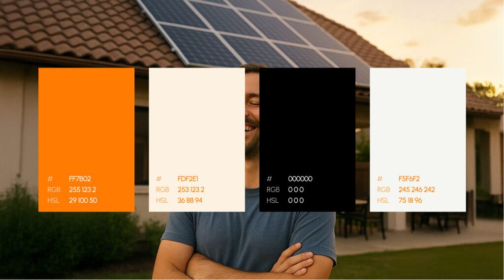
Explore the UX design process behind the Kind Energy.
The Future of AI in UX/UI Design
As AI technologies continue to mature, their role in UX/UI design is expected to expand significantly. Future tools will likely provide deeper integration between research, design, prototyping, testing, and development workflows. Designers will increasingly rely on AI to automate routine tasks, generate insights, and accelerate experimentation.
However, human creativity, empathy, critical thinking, and problem-solving will remain essential. AI can generate layouts and suggestions, but it cannot fully understand human emotions, cultural contexts, business goals, or complex user needs. Therefore, the most successful design teams will be those that effectively combine human expertise with AI-powered capabilities.
Ultimately, AI is not replacing UX/UI designers, it is enhancing their abilities. By reducing manual effort and increasing efficiency, AI enables designers to focus on what matters most: creating meaningful, accessible, and user-centered digital experiences.
How to Choose the Right UX/UI Tool
With a wide range of UX/UI design tools available today, selecting the most appropriate solution can be challenging. Each tool offers unique strengths, features, and workflows, making it important for organizations to evaluate their specific requirements before making a decision. The ideal tool should align with team objectives, project complexity, budget constraints, and long-term product development goals.
Team Size
The size of the design and development team plays a significant role in tool selection. Small teams and individual designers may prioritize simplicity, affordability, and ease of use. In contrast, larger organizations often require advanced collaboration features, shared libraries, design systems, permission controls, and real-time communication capabilities.
Tools such as Figma are particularly popular among larger teams because they support simultaneous collaboration and centralized project management. These features help maintain consistency and improve coordination across departments.
Budget
Cost is another important consideration. UX/UI tools vary significantly in terms of pricing models, subscription fees, and enterprise licensing costs. While some tools offer free plans with limited functionality, others require substantial investment to access advanced features.
Organizations should evaluate whether the benefits provided by a tool justify its cost. Factors such as productivity improvements, collaboration capabilities, and scalability should be considered alongside licensing expenses when making a decision.
Workflow Complexity
The complexity of a project’s requirements can influence which tool is most appropriate. Simple websites and mobile applications may only require basic wireframing, design, and prototyping capabilities. However, enterprise-level applications often involve complex workflows, dynamic content, and advanced user interactions.
For example, tools such as Axure RP are particularly valuable for projects that require sophisticated prototyping and business logic simulation, while Figma and Adobe XD may be sufficient for more straightforward interface design projects.
Technical Requirements
Organizations should also consider how well a tool integrates with their existing technology stack and development processes. Seamless integration with project management platforms, developer tools, design systems, and collaboration software can significantly improve efficiency.
Compatibility with existing workflows helps reduce friction between teams and ensures smoother communication throughout the product development lifecycle.
Learning Curve
The ease with which team members can learn and adopt a tool is another critical factor. Some platforms are designed to be intuitive and accessible, while others require extensive training and experience to use effectively.
Organizations should evaluate the time and resources required for onboarding, training, and ongoing support. A powerful tool may offer advanced functionality, but if it is difficult to learn, it could slow productivity and create adoption challenges.
Scalability and Future Growth
When choosing a UX/UI tool, organizations should think beyond their current needs and consider future growth. A tool that works well for a small team today should also be capable of supporting larger projects, additional team members, and evolving workflows in the future.

Explore the UX design process behind the Maverick AI.
Common Mistakes When Selecting Design Tools
Selecting a UX/UI design tool is an important decision that can significantly influence a team’s productivity, collaboration, and overall project success. Understanding common mistakes can help organizations make more informed decisions and avoid costly adjustments later.
Choosing Based on Popularity Alone
One of the most common mistakes is selecting a tool simply because it is popular or widely used within the industry. While popular tools often provide strong functionality and community support, they may not necessarily align with a team’s specific needs or workflows.
Ignoring Future Growth
Many organizations choose tools based solely on their current needs without considering future expansion. While a tool may work well for a small team today, it may struggle to support larger teams, multiple products, or more complex workflows as the organization grows.
Overlooking Collaboration Features
Modern product design is highly collaborative and involves contributions from designers, developers, product managers, researchers, marketers, and stakeholders. Choosing a tool without strong collaboration capabilities can create communication barriers and slow project progress.
Neglecting User Research
Another common mistake is focusing exclusively on design tools while overlooking the importance of user research. Even the most advanced design software cannot replace a thorough understanding of user needs, behaviors, and expectations.
Focusing Solely on Visual Design
Many teams prioritize visual design capabilities when evaluating tools, assuming that attractive interfaces automatically lead to better user experiences. While visual design is important, effective UX/UI design involves much more than aesthetics.
A comprehensive design process includes:
- User research
- Information architecture
- Interaction design
- Accessibility considerations
- Prototyping
- Usability testing
- Design systems
- Developer collaboration
Organizations that focus only on visual design may overlook features that support these equally important aspects of product development.
Underestimating Training Requirements
Even the most powerful design tool provides limited value if team members do not know how to use it effectively. Some platforms offer extensive functionality but require significant time and training to master.

Explore the design system behind the EVOS.
Questions for Discussion
As UX/UI technology evolves, several important questions emerge:
- Which UX/UI tool has improved your productivity the most?
- How much of the design process can AI automate?
- Will cloud-based tools completely replace desktop software?
- Should every designer learn front-end development?
- How can teams maintain creativity within structured design systems?
- What role will accessibility play in future workflows?
- Which platform is most likely to dominate the industry over the next decade?
These questions continue to shape conversations across the design community.
Conclusion
UX/UI design tools are essential for creating modern digital products by helping teams design, prototype, test, and collaborate efficiently. Popular tools such as Figma, Adobe XD, Sketch, Axure RP, Miro, and UserTesting support different stages of the design process, while emerging AI-powered tools improve productivity through automation. Despite continuous technological advancements, the main goal of UX/UI design remains the same: understanding user needs and creating seamless, engaging, and user-friendly experiences that enhance customer satisfaction and support business success.

Thanseem
Junior UI/UX Designer