Brand and digital experience for Kind Energy, focused on turning a complex transition into a clear, actionable journey.
Year
2025
Industry
Solar Energy
Location
Surat, India
Services
UX Research,
Content Strategy,
Information Architecture,
UI/UX Design,
Website Development
Project Overview
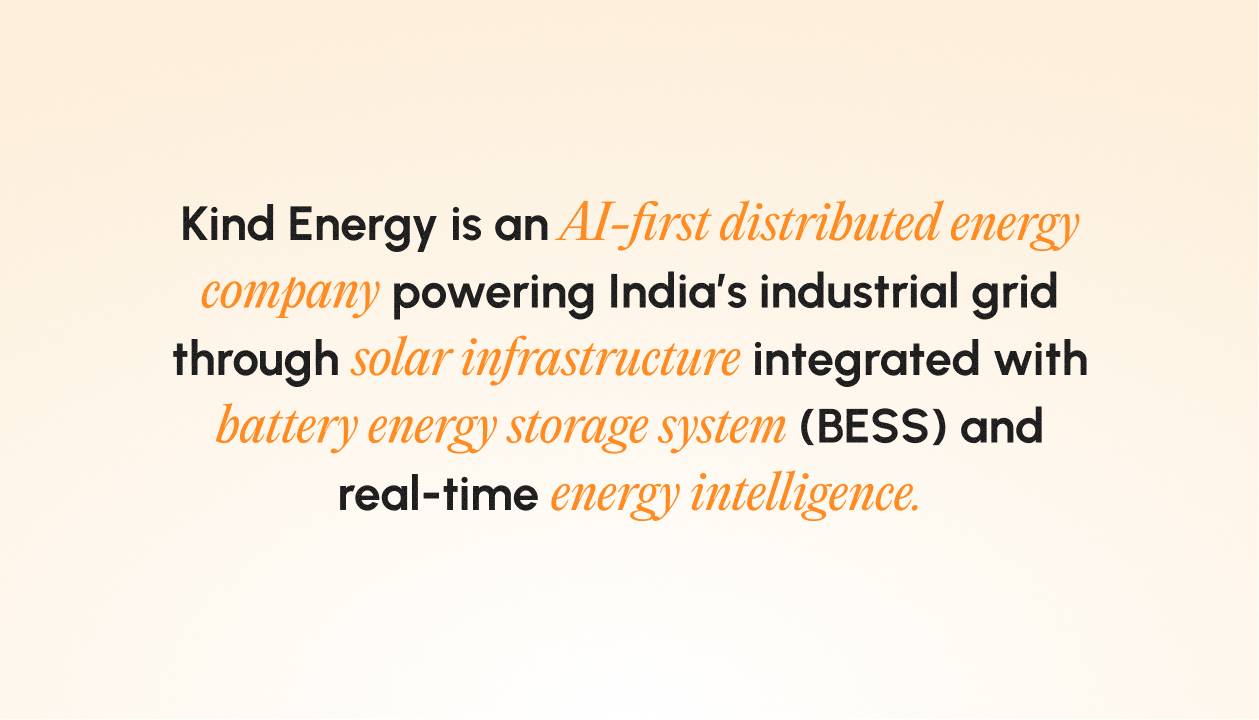
India’s transition towards renewable and sustainable energy is accelerating, but for many industrial and commercial businesses, the path to get there is still unclear. The opportunity is evident; the process, far less so. Kind Energy operates at this intersection – building solar and energy-storage solutions backed by intelligent optimisation, while helping businesses understand how to make the shift in practical terms.
As a brand in a fast-growing and relatively new segment, Kind Energy’s challenge wasn’t just about visibility. It was about explanation, trust, and adoption – making a complex offering feel accessible, credible, and actionable.
Challenge
While the demand for clean energy is rising, the category is crowded with technical language, fragmented information, and over-promised narratives. For many businesses, the gap isn’t intent—it’s understanding. How does the transition work? What does it mean operationally? Where do they begin?
Kind Energy needed a brand and digital presence that could simplify the story without diluting it – guiding users from their pain points to a clear, confident solution.
Approach
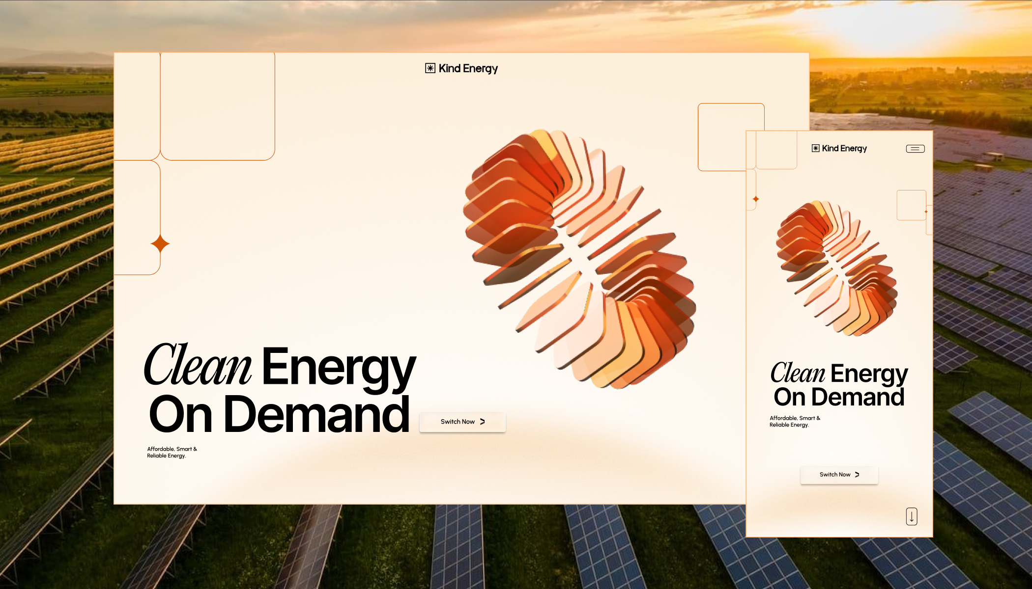
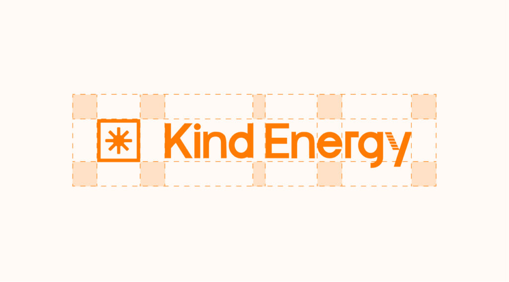
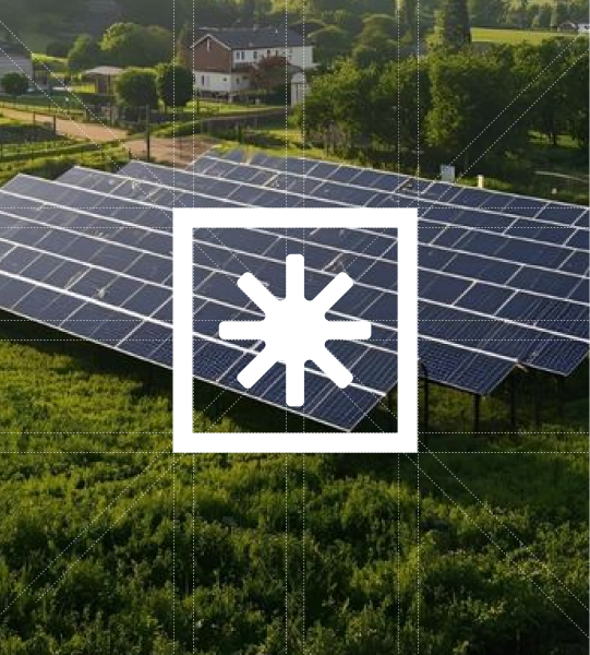
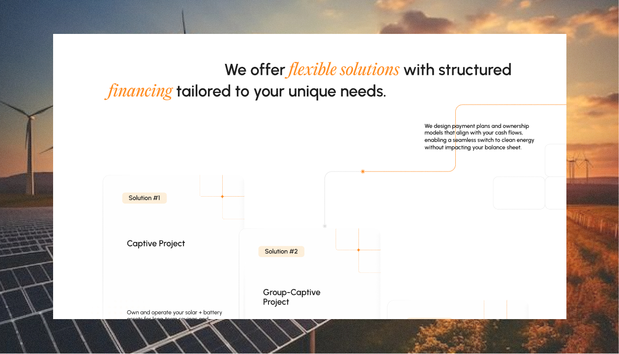
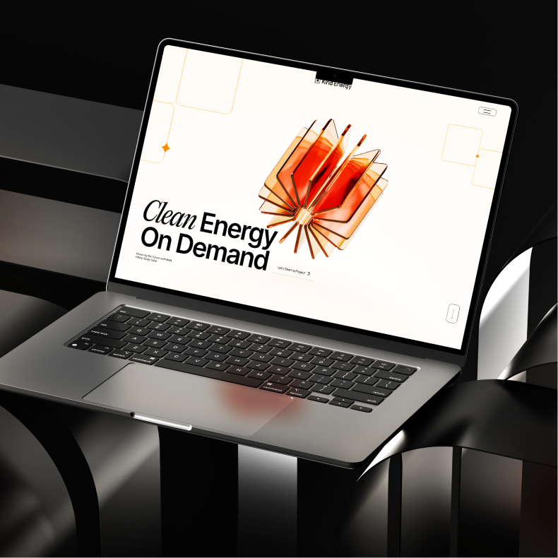
Wings led the creation of the logo and website, focusing on communication first and aesthetics second. The goal was to build a system that feels clear, precise, and easy to navigate – one that structures information in a way that naturally leads users from problem to solution.
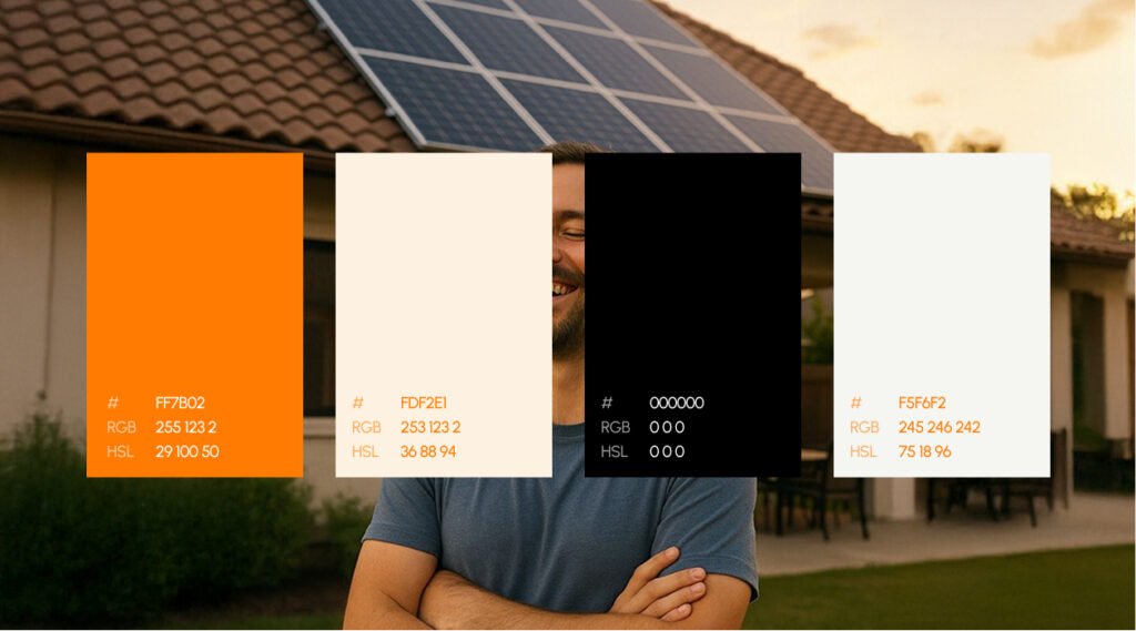
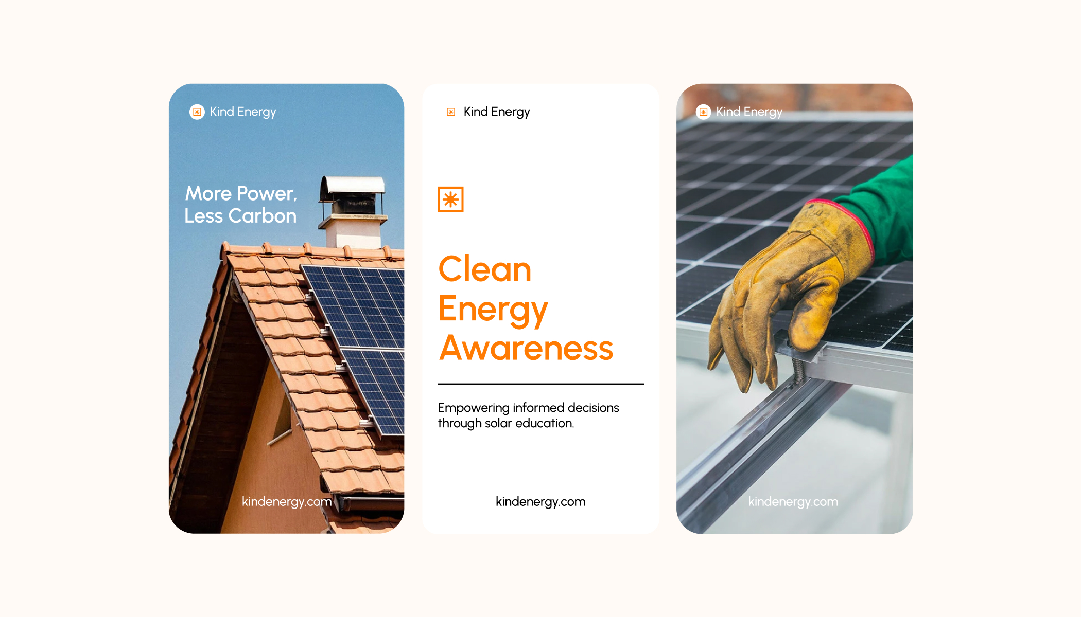
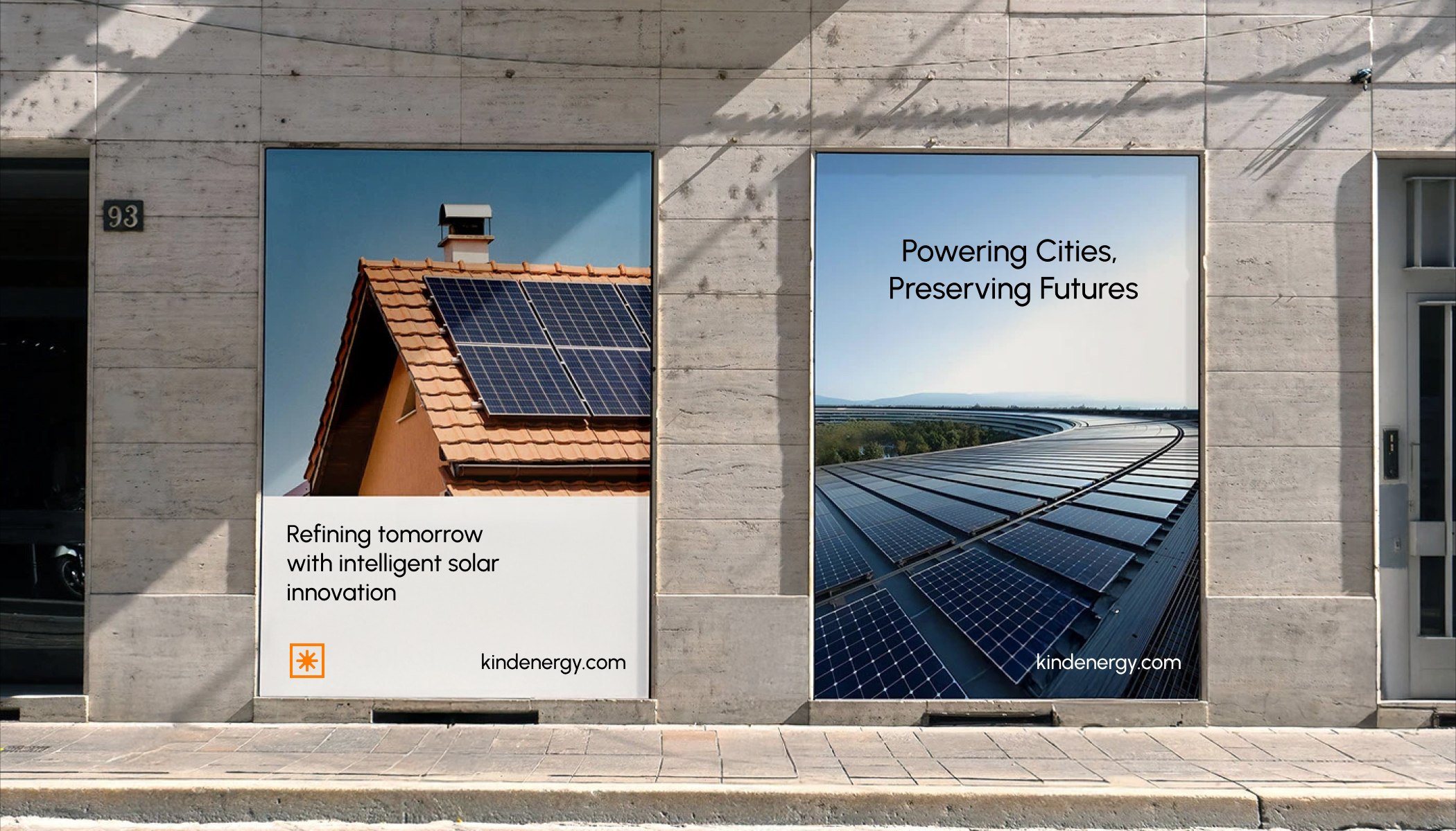
The visual language was intentionally restrained. A strong black and orange palette was chosen to evoke solar energy, strength, and reliability, while keeping the interface minimal and focused. Interaction was used sparingly, in service of clarity rather than spectacle, ensuring the experience stays accessible to a wide business audience.
The navigation of the website was designed to do the heavy lifting – introducing the problem, framing the opportunity, and then clearly positioning Kind Energy’s offering as a practical, scalable path forward.
Execution
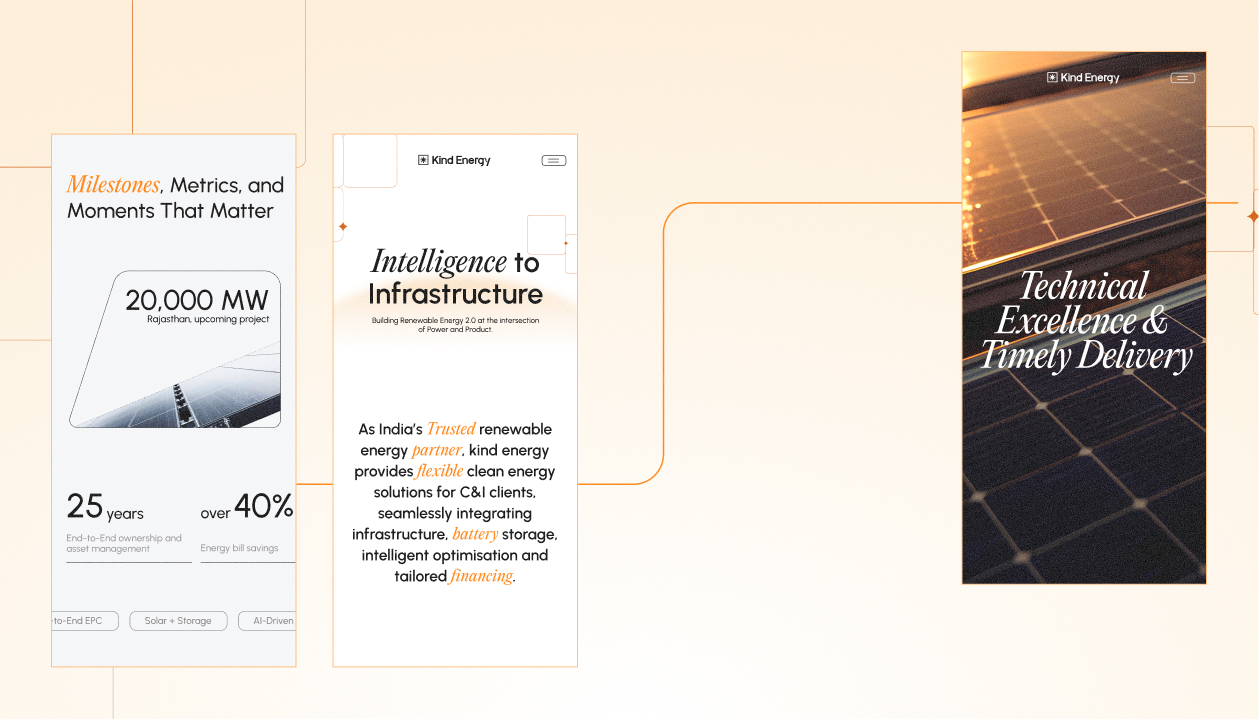
Instead of treating the website as a container for information, the experience was designed as a guided path—one that anticipates questions and leads users from uncertainty to clarity. In a category defined by technical complexity and high-stakes decisions, the real risk is cognitive overload. To avoid that, the interface was deliberately pared back and every section was structured with intention.
The layout and hierarchy are built to prioritise understanding before persuasion. Content is sequenced to move from the problem of energy transition to the logic of the solution, allowing users to follow the narrative in clear, measured steps rather than being confronted with feature-heavy explanations.
Motion is used only where it adds continuity. Subtle transitions connect sections and support the flow of the story, without competing for attention. This restraint keeps the experience calm and confident, even as it explains a multi-layered offering.
Outcome
The result is a brand and digital presence that helps Kind Energy speak with clarity in a rapidly evolving market. The website that does two things at once: it simplifies a complex subject and builds credibility through clarity—guiding users from pain point to solution through a connected, well-paced digital experience.
It gives the company a credible, structured way to explain what they do, why it matters, and how businesses can engage with them. More than a visual refresh, the project created a communication platform – one that supports both immediate business needs and long-term positioning in India’s clean-energy transition.
“Wings didn’t just redesign our website; they reshaped how global buyers perceive us. Their team deeply understood our business and delivered a platform that’s both elegant and effective. We’ve seen stronger engagement, better feedback from partners, and now have a digital presence that truly reflects who we are.”
“Redesigning Shivam Jewels’ digital presence was a deep learning curve. We explored how to distill decades of trust and craftsmanship into a seamless, modern experience.
It taught us to strike the right balance between legacy and innovation; sharpening our B2B storytelling and design thinking in the process.”


WINGS Team
India – Dubai – Singapore – USA – Australia
India – Dubai – Singapore – USA – Australia