


Is Your Website Turning Away Your Best Customers?
You’ve invested time and money into building your website. You’re publishing content, running ads, sharing posts on social media, and even seeing a steady flow of visitors. Yet, the inquiries are inconsistent, leads are scarce, and sales aren’t where they should be.
If this sounds familiar, the problem may not be the amount of traffic you’re attracting, it could be your website itself.
Many businesses assume that more visitors automatically mean more customers. In reality, traffic is only the beginning of the customer journey. What truly matters is what happens after someone lands on your website. Do they instantly understand what you offer? Do they trust your business? Can they easily find the information they need? Most importantly, are they encouraged to take the next step?
Your website acts as a digital storefront, salesperson, and customer service representative all at once. When it’s designed strategically, it attracts the right audience, builds confidence, and guides visitors toward becoming customers. But when it’s poorly optimized, it silently filters out the very people you want to reach.
This is what we call website self-sabotage, when your own website unintentionally creates barriers that discourage qualified prospects from engaging with your business.

Explore the Web development process behind the Kind Energy
Why Traffic Alone Doesn’t Guarantee Sales
Many business owners celebrate rising website traffic, believing it’s a sign of success. While attracting visitors is important, high traffic doesn’t automatically translate into high conversions.
Imagine inviting hundreds of people into a physical store with unclear signage, cluttered aisles, unhelpful staff, and no visible checkout counter. Visitors might browse briefly before walking out without making a purchase. Your website works the same way.
If your messaging is vague, navigation is confusing, pages load slowly, or visitors can’t immediately see why they should trust your business, even highly qualified prospects are likely to leave without taking action.
Successful websites don’t simply attract visitors, they convert the right visitors into leads and customers.
The Hidden Cost of Website Self-Sabotage
The effects of an underperforming website are often invisible. Instead of receiving complaints, businesses simply experience lower engagement, fewer inquiries, and missed revenue opportunities.
Some of the most common hidden costs include:
- Losing qualified prospects before they contact you.
- Wasting marketing budgets by sending paid traffic to poorly optimized pages.
- Lower search engine performance due to poor user experience.
- Reduced trust and credibility compared to competitors.
- Missed opportunities for repeat business and referrals.
Because these problems happen quietly, many businesses blame their marketing campaigns instead of recognizing that their website is the real bottleneck.
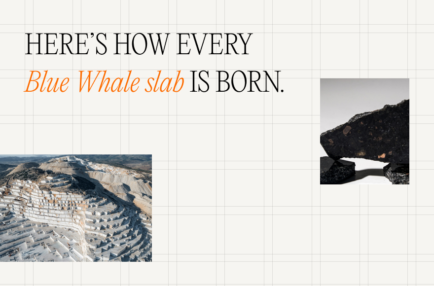
Explore the Web development process behind the Bluewhale.
The Silent Filter: How Websites Repel Ideal Customers
Every visitor forms an opinion about your website within seconds. Before reading your content in detail, they subconsciously evaluate whether your business appears trustworthy, relevant, and professional.
Small issues can have a surprisingly large impact on their decision to stay or leave. These include:
- A confusing homepage that doesn’t clearly explain what you do.
- Outdated visuals that make your business seem inactive.
- Slow-loading pages that frustrate impatient users.
- Poor mobile experiences that make browsing difficult.
- Missing testimonials, reviews, or trust indicators that create uncertainty.
These seemingly minor obstacles create friction throughout the customer journey. Individually, they may not seem significant, but together they can convince ideal customers that another business is a safer or easier choice.
First Impressions Matter More Than Ever
Online visitors have endless alternatives just a click away. If your website fails to make a strong first impression, most users won’t spend time trying to understand your business, they’ll simply leave and visit a competitor.
A strong first impression comes from a combination of clear messaging, professional design, intuitive navigation, fast performance, and visible trust signals. When these elements work together, visitors feel confident enough to explore further.
The good news is that website self-sabotage is entirely fixable. By identifying the barriers that prevent visitors from converting, you can transform your website from a silent filter into a powerful customer acquisition tool.
Diagnosis – 10 Signs Your Website Is Filtering Out the Wrong People
Now that you understand how a website can unintentionally drive away potential customers, it’s time to identify the warning signs. Many of these issues seem minor in isolation, but together they create friction that discourages visitors from taking the next step. If you recognize several of these signs on your own website, they could be the reason you’re attracting traffic without seeing the conversions you expect.
01. Your Message Isn’t Speaking to the Right Audience
The first thing visitors look for is an answer to a simple question: “Is this website for me?”
If your homepage is filled with generic statements like “We provide innovative solutions” or “We’re committed to excellence,” you’re not giving visitors a compelling reason to stay. These phrases sound impressive but fail to explain who you help, what problem you solve, and why someone should choose your business.
Instead, your messaging should focus on your ideal customer. Clearly identify their pain points, explain how your product or service solves them, and communicate the benefits they can expect. When your value proposition aligns with the visitor’s intent, they immediately recognize that they’ve come to the right place.
02. Confusing Navigation Creates Friction
Even the best content won’t convert if visitors can’t find it.
Complex menus, too many navigation options, unclear page labels, or buried contact information make it difficult for users to accomplish their goals. Every extra click increases the likelihood that someone will leave your website.
Keep navigation simple and intuitive. Group related pages logically, use familiar menu names, and make key pages, such as Services, Pricing, About, and Contact, easy to access. The less effort visitors need to expend, the more likely they are to continue exploring your website.
03. Slow Loading Speeds Kill Conversions
Speed is no longer a luxury, it’s an expectation.
When a page takes several seconds to load, visitors often abandon it before seeing your content. Slow websites create frustration, reduce trust, and negatively affect both search engine rankings and conversion rates.
Common causes of poor performance include oversized images, unnecessary plugins, excessive scripts, and unoptimized hosting. Regular performance testing and technical optimization can significantly improve the user experience, especially for mobile visitors.
04. Weak Design Undermines Credibility
Visitors often judge your business before reading a single paragraph.
An outdated layout, inconsistent branding, poor typography, or cluttered pages can make even a reputable company appear unprofessional. On the other hand, a clean, modern, and visually consistent website immediately builds confidence.
Good design isn’t about adding flashy animations or trendy graphics. It’s about creating a professional experience that’s easy to navigate, visually appealing, and aligned with your brand identity. Simple improvements, such as better spacing, consistent colors, and readable fonts, can have a significant impact on credibility.
05. Your Calls-to-Action Aren’t Clear
Imagine a visitor has read your content and is interested in your offering, but they have no idea what to do next.
This happens when calls-to-action (CTAs) are vague, hidden, or inconsistent. Buttons labeled “Learn More” or “Click Here” don’t clearly communicate the next step or its value.
Instead, use action-oriented language that tells visitors exactly what they’ll gain, such as “Book a Free Consultation,” “Get Your Custom Quote,” or “Download the Guide.” Place CTAs strategically throughout your website so users always have a clear path forward without feeling overwhelmed.
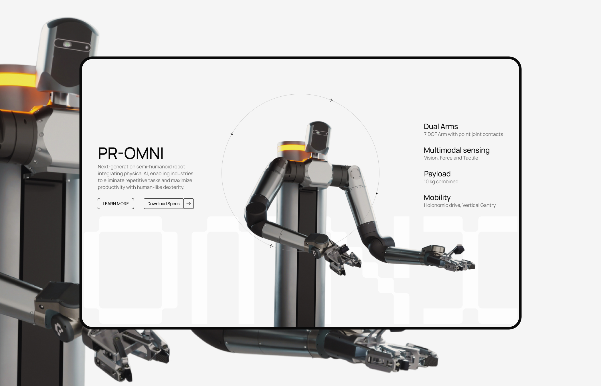
Explore the Web development process behind the perceptyne.
06. Missing Trust Signals Are Costing You Sales
People rarely buy from businesses they don’t trust.
If your website lacks testimonials, customer reviews, case studies, certifications, guarantees, or recognizable client logos, visitors may hesitate to engage with your business, even if your products or services are excellent.
Trust signals reduce perceived risk. They reassure potential customers that others have had positive experiences and that your business delivers on its promises. Display them prominently across your website, especially near key conversion points such as contact forms or pricing pages.
07. Your Website Isn’t Mobile-First
More than half of all website traffic now comes from mobile devices, yet many websites are still designed primarily for desktop users.
If visitors need to pinch and zoom, struggle to tap buttons, or wait for slow-loading pages, they’re unlikely to stay. A poor mobile experience can quickly send potential customers to competitors with more user-friendly websites.
A mobile-first approach ensures that your website is responsive, easy to navigate, and optimized for smaller screens. This includes readable text, touch-friendly buttons, fast loading times, and simplified forms that are easy to complete on a smartphone.
08. Forms That Ask for Too Much
Your contact form should make it easy for people to reach you, not feel like they’re completing an application.
Long forms with unnecessary fields often discourage users from submitting inquiries. Asking for information that’s not essential at the initial stage increases friction and reduces lead generation.
Only request the details you genuinely need, such as a name, email address, and brief message. Once a conversation begins, you can gather additional information through follow-up communication.
09. You’re Attracting the Wrong Traffic
Not all website traffic has the potential to become customers.
If your SEO strategy targets broad or irrelevant keywords, you may attract visitors who have no intention of purchasing your products or services. High traffic numbers may look impressive in analytics, but they offer little value if those visitors aren’t aligned with your business goals.
Focus on search intent rather than search volume. Create content that answers the questions your ideal customers are asking and optimize for keywords that reflect genuine buying or decision-making intent. Quality traffic consistently outperforms quantity.
10. You’re Ignoring Website Analytics
Your website generates valuable data every day, but many businesses rarely look beyond total visitor numbers.
Analytics reveal where users enter your site, how long they stay, which pages perform well, where visitors drop off, and which traffic sources produce the highest conversions. Without this information, improving your website becomes a matter of guesswork.
Monitor metrics such as bounce rate, conversion rate, average engagement time, page performance, and form completion rates. These insights help you identify bottlenecks, prioritize improvements, and make informed decisions that lead to better results.

Explore the Web development process behind the franck muller.
Bringing It All Together
Most websites don’t fail because of one major flaw, they struggle because of several smaller issues that combine to create a frustrating user experience. Unclear messaging, confusing navigation, slow performance, weak trust signals, and poor mobile usability all contribute to the same outcome: qualified visitors leave before becoming customers.
The encouraging news is that these problems are entirely fixable. By identifying which of these signs apply to your website, you’ve already taken the first step toward improving your conversion rate.
Solutions – How to Stop Your Website from Filtering Out Ideal Customers
Recognizing the problems is only half the battle. The real value comes from taking deliberate steps to improve your website’s user experience and conversion potential. The good news is that you don’t always need a complete redesign to see meaningful results. Small, strategic improvements can make your website more welcoming, trustworthy, and effective at converting the right visitors.
The following self-audit checklist will help you evaluate your website from the perspective of your ideal customer and identify opportunities for improvement.
Website Self-Audit Checklist
01. Review Your Messaging
Ask yourself whether your homepage clearly answers three essential questions within the first few seconds:
- Who do you help?
- What problem do you solve?
- Why should visitors choose you?
Replace generic marketing language with customer-focused messaging that highlights specific benefits and outcomes. Your value proposition should immediately reassure visitors that they’ve found the right solution.
02. Evaluate Your Website Design
Your design should reinforce professionalism rather than distract from your message.
Look for signs that your website may need updating, such as inconsistent branding, outdated visuals, crowded layouts, or difficult-to-read text. Ensure that colors, typography, and imagery remain consistent across every page to create a polished and trustworthy experience.
03. Test Your Website Speed
Every second counts when it comes to user experience.
Compress large images, remove unnecessary plugins, enable browser caching, and minimize scripts that slow down your pages. Regularly test loading performance on both desktop and mobile devices to identify opportunities for optimization.
04. Check the Mobile Experience
Browse your website using different smartphones and tablets rather than relying solely on desktop previews.
Verify that text is readable without zooming, buttons are easy to tap, menus function properly, and forms can be completed comfortably on smaller screens. A mobile-friendly website isn’t optional, it’s essential for meeting user expectations.
05. Improve Your Calls-to-Action
Every important page should guide visitors toward a logical next step.
Review your calls-to-action and ask:
- Are they easy to find?
- Do they clearly explain what happens next?
- Are they written in action-oriented language?
Instead of generic buttons like “Submit” or “Learn More,” use clear, benefit-driven CTAs such as “Request Your Free Quote,” “Schedule a Consultation,” or “Start Your Free Trial.”
06. Strengthen Trust Signals
Trust is built through evidence, not claims.
Display customer testimonials, case studies, reviews, certifications, awards, guarantees, and recognizable client logos where appropriate. Adding real customer success stories helps reduce uncertainty and demonstrates that others have achieved positive results with your business.
07. Simplify Your Forms
Every additional form field creates another opportunity for visitors to abandon the process.
Only ask for information that’s necessary during the initial interaction. A simple contact form requesting a name, email address, and message is often enough to start a conversation. If additional details are needed, gather them during follow-up communication rather than creating unnecessary friction upfront.
08. Align Your SEO Strategy
Review whether your content attracts the audience you actually want.
Focus on keywords that reflect customer intent rather than simply chasing high search volumes. Create pages that answer common questions, solve real problems, and guide visitors toward making informed purchasing decisions.
09. Use Analytics to Drive Improvements
Your analytics platform provides valuable insights into user behavior.
Regularly monitor metrics such as:
- Conversion rate
- Bounce rate
- Average engagement time
- Landing page performance
- Form completion rate
- Exit pages
Use this data to identify bottlenecks, test improvements, and measure the impact of every change you make.
Explore the Web development process behind the DCC.
Quick Wins You Can Implement Today
Not every improvement requires weeks of planning or a large development budget. Start with these high-impact actions:
Five-minute improvements
- Rewrite your homepage headline to clearly communicate your value.
- Update your primary CTA with more action-oriented language.
- Add customer testimonials to your homepage or service pages.
- Make your contact information easier to find.
One-day optimization tasks
- Compress oversized images to improve loading speed.
- Simplify your navigation menu by removing unnecessary items.
- Review your forms and eliminate non-essential fields.
- Test your website on multiple mobile devices and fix usability issues.
Long-term improvements
- Refresh outdated website design and branding.
- Develop detailed case studies that showcase customer success.
- Build a content strategy based on search intent and customer needs.
- Continuously monitor analytics and conduct A/B testing to refine your website over time.
Continuous Improvement Drives Better Results
Website optimization isn’t a one-time project, it’s an ongoing process. Customer expectations, technology, and search engine algorithms continue to evolve, which means your website should evolve as well.
By regularly reviewing your messaging, design, speed, mobile usability, trust signals, forms, SEO, and analytics, you create a website that not only attracts visitors but also earns their trust and encourages them to take action.
Action – Turn Your Website into a Customer Magnet
Your website should do more than simply exist online, it should actively support your business goals by attracting the right audience, building trust, and converting visitors into customers. If it’s failing to do that, the problem isn’t always your marketing strategy. Often, it’s the small usability and messaging issues that quietly push qualified prospects away before they ever reach out.
The encouraging news is that website self-sabotage is rarely caused by a single major flaw. Instead, it’s usually the result of several small issues working together. The advantage of this is that even small improvements can create noticeable gains in engagement, lead generation, and conversions.
Recap: The Biggest Website Self-Sabotage Mistakes
Throughout this guide, we’ve explored ten common issues that prevent websites from converting ideal customers:
- Unclear messaging that doesn’t resonate with your target audience.
- Confusing navigation that makes information difficult to find.
- Slow page loading times that increase visitor abandonment.
- Outdated or inconsistent design that weakens credibility.
- Weak calls-to-action that fail to guide visitors.
- Missing trust signals such as testimonials, reviews, and case studies.
- Poor mobile experiences that frustrate smartphone users.
- Long, complicated forms that discourage inquiries.
- SEO strategies that attract irrelevant traffic instead of qualified buyers.
- Ignoring analytics and missing opportunities for continuous improvement.
While every website is different, addressing these areas will significantly improve the overall user experience and increase the likelihood of converting visitors into loyal customers.

Explore the Web development process behind the Obession.
Prioritize Improvements Based on Impact
You don’t need to redesign your website overnight. Begin with the changes that offer the greatest return for the least effort.
Start by clarifying your homepage message, simplifying navigation, improving page speed, and making your primary call-to-action more visible. Next, strengthen trust with testimonials, optimize your website for mobile users, and streamline your contact forms. Finally, use website analytics to monitor performance, identify weak points, and continuously refine your site based on real user behavior.
By tackling improvements in stages, you’ll make steady progress without disrupting your existing website or marketing efforts.
Build a Website That Works for You
Think of your website as your hardest-working employee. It’s available 24 hours a day, seven days a week, often making the first impression your business leaves on potential customers. Every page should educate, reassure, and guide visitors toward taking the next step.
When your website clearly communicates your value, loads quickly, offers intuitive navigation, showcases social proof, and provides clear calls-to-action, it stops filtering out your best customers and starts attracting more of them.
The goal isn’t to create the most visually impressive website, it’s to create one that delivers a seamless experience, answers your audience’s questions, and makes it easy for qualified prospects to become paying customers.
Final Thoughts
A high-performing website isn’t built by chance. It’s built through continuous evaluation, thoughtful improvements, and a deep understanding of your audience’s needs.
Take a few minutes to review your website using the checklist from this guide. Identify one or two areas that need attention and start there. As each improvement removes friction from the customer journey, you’ll create a website that not only attracts more visitors but also converts more of the right visitors into long-term customers.
Remember, the best websites don’t just generate traffic, they build trust, solve problems, and inspire action. Stop letting your website filter out your ideal customers, and start turning it into the growth engine your business deserves.

Prasanna M
WordPress Developer