

If a corporate logo’s only job were to look premium, a machine learning algorithm could solve your branding challenges in three seconds. In the enterprise landscape, however, a brand mark is not an art project; it is a specialized piece of communication engineering that anchors your market equity, justifies your pricing power, and sets the visual tone for your entire digital product funnel. When scaling past a certain threshold, choosing a design partner isn’t about finding someone who can draw an attractive icon, it’s about finding a team that understands how visual architecture directly impacts revenue, conversion physics, and category dominance.
The market is saturated with options, ranging from massive crowdsourcing platforms to elite global design agencies. To help you navigate this choice, we analyze five of the top logo design and branding companies globally and regionally: Wings, Pentagram, Designhill, Branzone, and Raga Designers. We break down their distinct methodologies, capabilities, and target audiences so you can choose the partner that aligns with your strategic business outcomes.
The Strategic Importance of Corporate Identity
Before evaluating specific partners, it is vital to understand what an enterprise-grade visual identity system requires. A corporate mark does not exist in a vacuum; it must perform seamlessly across an increasingly fragmented array of touchpoints:
- Scalability: The mark must scale from a 16-by-16 pixel favicon on a mobile web browser to a massive physical billboard overlooking a highway, maintaining structural integrity and readability at every size.
- Medium Adaptability: It must translate across diverse media, from high-resolution digital screens and dark-mode mobile interfaces to physical embroidery, blind debossing on luxury packaging, and print collateral.
- Cognitive Retention: In an economy with fragmented consumer attention spans, a brand mark must offer instant category recognition, building trust and familiarity within milliseconds of exposure.
- Commercial Alignment: The visual system must actively reinforce the brand’s pricing power, market tiering, and strategic messaging. A luxury label, a high-volume consumer product, and a deep-tech business require fundamentally different visual physics.
When selecting an agency, you are not paying for the final vector file; you are investing in the research, risk mitigation, and strategic positioning that guarantee the mark can anchor your corporate growth for a decade or more.
1. Wings Design Studio: The Strategy-Led Growth Engine
Wings Design Studio is a premium, strategy-led digital and branding studio that treats visual identity as a core business asset. While traditional agencies approach logo design through a purely aesthetic or artistic lens, Wings flips the script: they build cohesive systems where branding, user psychology, premium UI/UX design, and custom engineering work together to drive measurable business results.
The Philosophy: Design and Commercial Purpose
A logo shouldn’t just represent a brand; it must create value. It shapes first impressions, establishes instant credibility, and anchors the user journeys that follow.
Wings operates on the principle that design alone is no longer enough. As customer expectations evolve and competition intensifies, every digital experience and brand asset needs to serve a clear purpose and deliver measurable results. Instead of starting a project with mood boards or isolated sketches, Wings begins with a deep dive into your business objectives, target audience behavior, market positioning, and conversion opportunities. This strategic foundation informs every decision, creating digital experiences designed to engage users and actively support commercial outcomes.
Key Capabilities & Global Scale
Wings brings comprehensive digital capabilities under one roof, enabling businesses to maintain strict consistency across all physical and digital customer touchpoints.
- Branding & Visual Identity: Crafting scalable, premium design systems that position brands for authority and long-term equity.
- Custom UI/UX & Web Development: Translating brand systems into high-performance, responsive platforms using Webflow and Shopify.
- Motion & Interactive Design: Utilizing immersive storytelling elements, premium visual design systems, and transitions to reduce purchasing friction.
- Conversion-Focused Architecture: Designing layouts, landing pages, and user flows optimized around customer acquisition, lead quality, and brand perception.
Their strength lies in integrating strategy, design, and engineering into cohesive systems that grow alongside a business. This methodology is globally proven yet locally precise. Wings has delivered over 350 projects across time zones for 160+ global clients, ranging from fast-growing startups to Fortune 500 enterprises. Their track record includes working with more than 270 founders and industry leaders across sectors like luxury, e-commerce, fintech, automotive, technology, and clean energy.
Case Studies in Action
Every successful brand transformation begins with understanding the business behind it. These case studies showcase how Wings combines strategy, creativity, and execution to solve unique branding challenges across industries. From legacy businesses and consumer brands to technology-driven enterprises, each project demonstrates our approach to creating identities and experiences that deliver measurable business value. Together, they reflect our commitment to building brands that are distinctive, relevant, and built for long-term growth.

Krishna Group: Evolving a Legacy Brand
With a legacy spanning over four decades in Chennai’s highly competitive real estate market, Krishna Group had earned the trust of generations through quality developments and consistent delivery. However, as the company expanded its vision to attract younger homebuyers and modern investors, its existing brand identity no longer reflected its progressive outlook. The challenge was to preserve the credibility and emotional equity built over decades while creating a contemporary brand language that resonated with today’s audience.
Wings approached the transformation as a strategic brand evolution rather than a complete reinvention. Extensive research into the company’s history, market positioning, and customer perception informed the redesign process. We developed a refined visual identity system featuring a modern logo, typography, color palette, and graphic language that conveyed stability, sophistication, and innovation in equal measure. Alongside the identity, we created a comprehensive suite of corporate collateral, including stationery, brochures, presentation templates, project branding, and digital communication assets, ensuring consistency across every customer touchpoint.
The result was a brand that remained instantly recognizable to existing stakeholders while projecting renewed confidence and relevance. Krishna Group emerged with a cohesive identity that strengthened its market presence, enhanced customer trust, and positioned the business for sustained growth in an increasingly design-conscious real estate landscape.

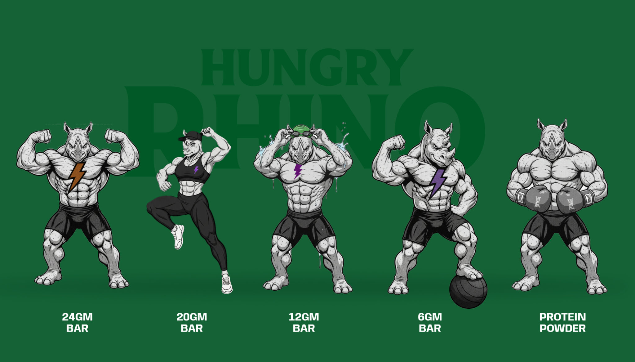
Hungry Rhino: Bold Consumer Expression
In the crowded consumer food market, visibility is everything. Hungry Rhino needed a brand identity that would immediately capture attention while communicating energy, flavor, and personality. Rather than following conventional packaging trends dominated by safe layouts and muted branding, the objective was to create a visual language that consumers would remember within seconds of seeing it on a shelf.
Wings built the brand from the ground up, developing a distinctive visual identity anchored in expressive storytelling and bold design choices. Vibrant colors, oversized typography, dynamic illustrations, and playful compositions came together to create a packaging system that reflected the brand’s confident voice. Every design element was carefully considered, from hierarchy and readability to shelf impact and product differentiation, ensuring each SKU maintained consistency while retaining its own unique character.
Beyond packaging, the identity extended seamlessly into digital assets, social media creatives, promotional materials, and marketing campaigns, creating a unified brand experience across physical and digital platforms. The outcome was a memorable consumer brand that commands attention, builds instant recognition, and creates a strong emotional connection with its audience, allowing Hungry Rhino to stand apart in an intensely competitive retail environment.
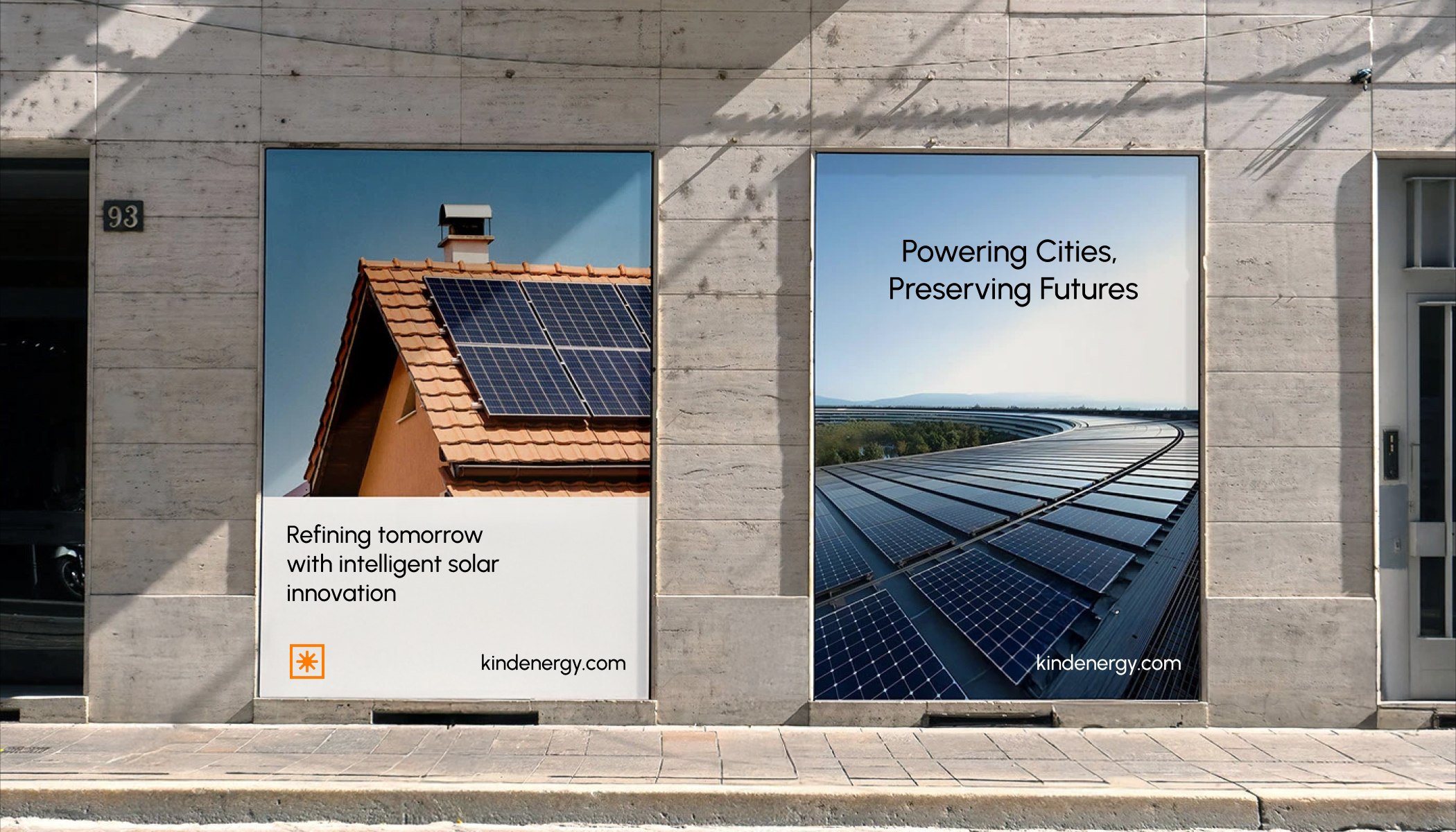
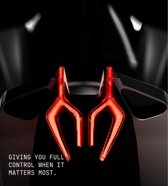
Kind Energy: Designing Clarity for Clean Tech
As India’s clean-energy sector continues to expand, businesses increasingly seek reliable partners to help them transition toward sustainable energy solutions. Kind Energy, based in Surat, specializes in serving commercial and industrial clients, but its technically sophisticated offerings required a digital experience that simplified complex concepts without compromising credibility.
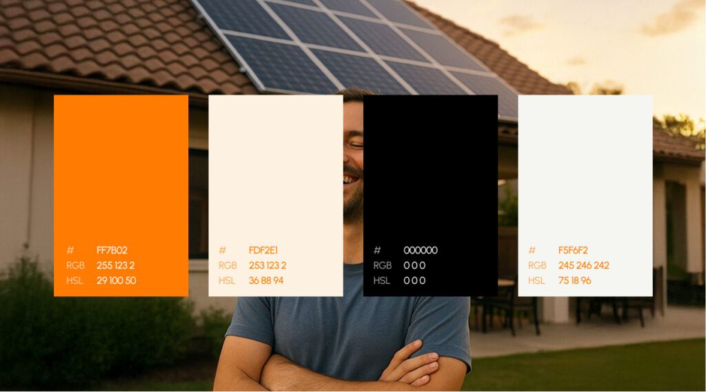
Wings designed and developed a comprehensive digital platform focused on clarity, usability, and conversion. Beginning with information architecture and user journey mapping, we restructured the website to present technical information in an intuitive, business-friendly format. The interface employed a restrained visual language built around a high-contrast black-and-orange palette, clean typography, generous spacing, and minimal design elements that reinforced professionalism while keeping the experience distraction-free.
Every page was crafted to answer customer questions logically, from identifying energy challenges and explaining solar and clean-energy solutions to demonstrating financial benefits and encouraging direct engagement. Strategic content organization, intuitive navigation, and clearly positioned calls-to-action helped transform a complex technical offering into a simple decision-making process for business owners.
The finished website serves not merely as an online presence but as a strategic sales and communication tool. By combining thoughtful UX design with purposeful content strategy, Wings enabled Kind Energy to communicate expertise with clarity, strengthen its market credibility, and guide prospective clients confidently toward adopting sustainable energy solutions.
Comprehensive Operational Expansion: The Wings Engineering Ecosystem
What truly sets Wings apart from the global agency landscape is their deep focus on post-design execution. When most creative boutiques conclude an engagement by passing over a folder of static asset files, the strategic workflow at Wings is often just getting started. A brand system cannot achieve traction in the market if it is constrained by clunky, template-driven web templates or slow-loading standard code structures. For a design system to perform optimally, it must be paired with precision engineering.
Wings addresses this challenge by specializing in custom, high-performance web engineering built natively inside Webflow and Shopify ecosystems. By bridging the gap between design theory and technical deployment, they ensure that the complex visual systems created during the branding phase are translated into responsive, lightning-fast web architectures. This eliminates the asset breakdown and miscommunications that typically occur when a separate design boutique hands layouts off to a disconnected engineering vendor.
Every custom digital platform developed by Wings is built around conversion rate optimization. By integrating detailed user behavior analysis, advanced tracking frameworks, and custom interaction design directly into the UI layer, they convert organic and paid traffic into high-intent pipeline revenue. Their development pipeline treats speed, semantic SEO structural safety, and device responsiveness as non-negotiable standards, ensuring that your corporate digital home reinforces the market premium established by your brand identity.
2. Pentagram: The Elite Global Partnership
Pentagram is widely considered the world’s largest independently owned design studio. Organized as a unique partnership of world-class designers, Pentagram has shaped the visual landscapes of massive corporations, cultural institutions, publishers, and global tech giants for over half a century.
The Philosophy: Design as High Art and Culture
Pentagram’s model is completely distinct from traditional agency hierarchies. It is built around individual partner autonomy, meaning clients work directly with the creators. When you hire Pentagram, you are hiring a specific master designer who manages the project with a small team of specialists. Their approach is deeply rooted in design history, typography, architectural structure, and cultural context. They treat logo design as an enduring piece of clear communication that defines a brand’s structural place in the world.
Capabilities & Track Record
- Comprehensive Brand Architecture: Designing complex visual identities and restructuring naming systems for massive global conglomerates.
- Editorial & Environmental Design: Extending brand marks seamlessly into physical signage, book layouts, corporate office interiors, and spatial design.
- Cross-Medium Consistency: Ensuring an identity functions as flawlessly on a museum wall or printed monograph as it does on an app icon or interactive installation.
3. Designhill: The Democratized Creative Marketplace
Designhill sits on the opposite end of the operational spectrum from boutique design studios. It is a massive global creative marketplace that leverages crowdsourcing, community talent, and automated tools to democratize graphic design, making it accessible to businesses of all sizes.
The Philosophy: Variety and Accessibility
Designhill operates on the principle of volume, speed, and affordability. Recognizing that not every business has the budget or timeline required for a deep, months-long strategic consultation, Designhill provides a centralized infrastructure to source concepts from a global pool of freelance creative talent rapidly.
Capabilities & Features
- Design Contests: Launch a detailed creative brief and receive dozens of distinct logo concepts from different designers worldwide within days, giving the business a broad selection of visual directions.
- AI Logo Maker: An entry-level, algorithmically driven automated tool for immediate, low-cost asset generation, ideal for initial mockups or temporary branding.
- Freelancer Bookings: A direct 1-on-1 hiring model allowing businesses to select a specific designer from the marketplace for secondary assets, packaging modifications, or social media graphics.
4. Branzone: Focused Digital Execution
Branzone is a dedicated creative and digital marketing agency based in Chennai, India. They focus on delivering cost-effective logo design, brand asset creation, and regional digital marketing services tailored to growing companies.
The Philosophy: Accessible Marketing Alignment
Branzone views logo design as an essential functional step in launching a business online. Their focus is on giving regional enterprises a clean, professional corporate look that can be quickly deployed into ongoing digital marketing campaigns, SEO structures, and social media channels without unnecessary friction.
Capabilities & Regional Services
- Corporate Logo Design: Creating clean, vector-ready visual marks for local businesses and service providers.
- Print & Collateral Layouts: Translating logos to business cards, brochures, and corporate stationery.
- Digital Marketing Integration: Aligning new visual identities with local search engine optimization, lead generation funnels, and advertising assets.
5. Raga Designers: High-Volume Corporate Delivery
Raga Designers is an established web development and graphic design agency based in Chennai, India. They specialize in providing high-volume, accessible corporate design services to a broad array of local and national businesses.
The Philosophy: Turnkey Digital Utilities
For Raga Designers, a logo is a vital component of a broader, functional web development checklist. They focus on quick execution, providing businesses with the foundational digital graphics required to launch domain spaces, set up basic corporate websites, and begin operations efficiently.
Capabilities & Technical Deliverables
- Multi-Concept Logo Design: Offering clients multiple fast iterations to choose from based on initial templates and business guidelines.
- Full-Stack Web Utilities: Providing domain registration, web hosting, and software development alongside graphic assets, serving as an all-in-one technical vendor.
- Corporate Identity Packages: Bundling logo design with basic digital marketing setups, stationery printing, and email configurations.

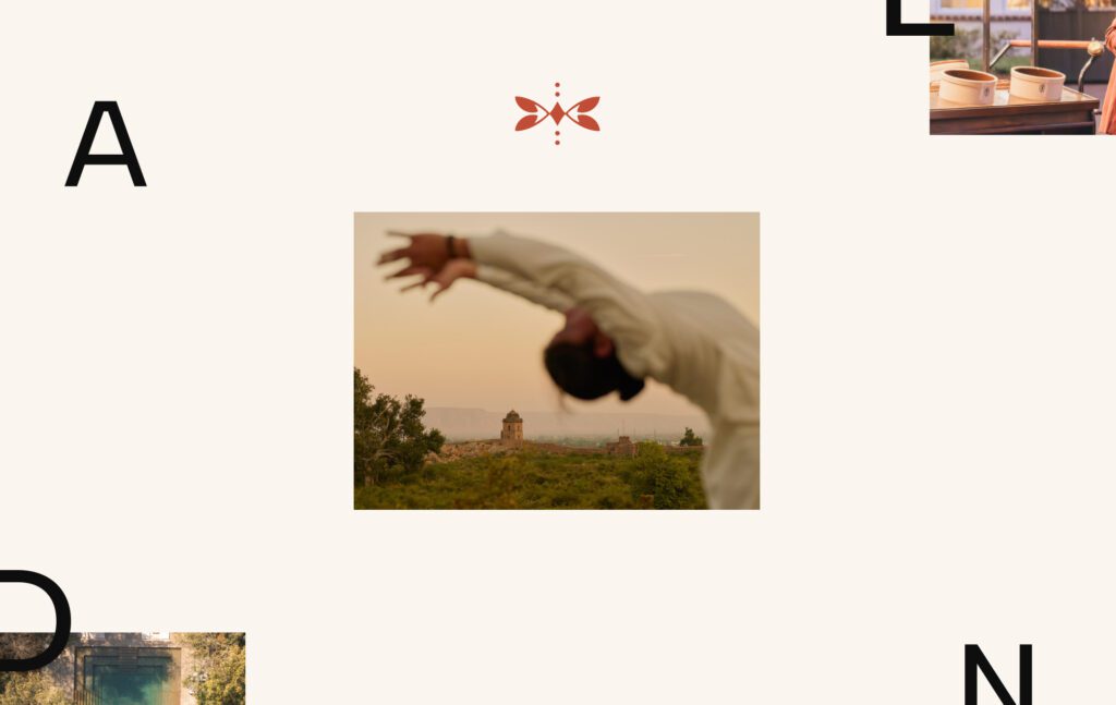
Explore the Branding behind the Diamensions.
The Corporate Rebranding Playbook: Managing the Visual Transition
When an enterprise moves beyond selecting a logo design company and officially enters a rebranding phase, the challenge quickly transitions from a creative puzzle to an operational launch plan. A beautiful new logo holds little value if its deployment across global channels is fragmented, slow, or inconsistent. To ensure your investment yields immediate capital returns and elevates market trust, your organization must treat the visual transition as a cross-functional corporate rollout.
Phase 1: Auditing the Existing Footprint
Before a single pixel of the new logo is deployed, your marketing and operations teams must build an exhaustive inventory of every touchpoint where the legacy brand mark currently lives. Fragmented branding, where a customer sees the new logo on your website but encounters the old emblem on an invoice or a customer support portal, erodes trust and dilutes brand authority.
Your transition audit must cover three primary layers:
01. Owned Digital Channels: Corporate web domains, staging sites, customer-facing web applications, native iOS/Android mobile apps, third-party software integrations (such as Salesforce, HubSpot, or Zendesk portals), and email signature templates for your entire employee base.
02. Paid and Earned Channels: Social media profiles (LinkedIn, X, YouTube, Instagram), active paid search and display ad creatives, directories, employer brand portals (Glassdoor, Indeed), and digital PR distribution templates.
03. Physical and Offline Assets: Corporate office signage, interior wall graphics, employee ID badges, business cards, printed sales decks, product packaging, shipping boxes, apparel, and legal or financial document headers.
Phase 2: Technical Migration & SEO Safeguards
A common pitfall during a corporate visual overhaul is the unintended disruption of organic search rankings and web traffic. If your visual rebranding is paired with changes to your website structure, URL names, or content management systems (such as migrating a platform to an optimized Webflow build), maintaining strict technical SEO guardrails is critical.
- URL Mapping and 301 Redirects: If your brand change requires a domain modification or structural changes to your blog and landing page directories, map every single old link to its exact corresponding new page. A failure to execute precise 301 redirects will cause an immediate drop in historical search equity.
- Media Asset Optimization: Modern visual systems require high performance. When updating logos and imagery across your digital footprint, ensure all vector graphics (.SVG) are minified, and raster images use next-generation web formats like .WebP. This keeps page speeds high and prevents slow loading times from hurting your conversion rates.
- Structured Data and Schema: Update your website’s backend structural code, specifically Organization Schema, to reflect the updated brand name, logo URL, and corporate descriptions. This signals search engine crawlers that the transition is an intentional, authoritative evolution rather than a structural error.
Phase 3: The Internal and External Rollout
Introducing a new identity requires careful internal alignment before it goes public. Your team members are the frontline stewards of the new brand; if they do not understand the strategy behind the shift, they cannot communicate it effectively to your market.
- Internal Alignment First: Launch the brand identity internally two to four weeks before the public announcement. Host an all-hands meeting to break down the business drivers behind the change, demonstrate how the design system functions, and distribute updated corporate templates. Provide your sales, account management, and customer success teams with clear talking points so they can address client questions with confidence.
- The Public Launch Narrative: Frame your rebranding around a story of growth and future direction, not just a cosmetic update. Whether the shift represents an expansion into mid-market enterprise tiers, the integration of new technology solutions, or a renewed focus on user experience, the external launch messaging must explain exactly how this evolution creates more value for your customers.

Explore the Branding behind the Shivam.
The Anatomy of a Technical Brand Style Guide
Once a logo is designed and the rollout begins, the final critical component of long-term brand equity is preservation. Without strict operational boundaries, an enterprise identity can experience visual drift within six months, as external vendors, internal marketing teams, and regional offices begin altering spaces, margins, and core colors. A professional design company does not just deliver graphics; they provide an architectural blueprint known as the Brand Style Guide.
1. Logo Exclusion Zones and Proportions
A brand mark requires clear visual space to command authority and retain its readability. A technical style guide establishes absolute mathematical boundaries, known as exclusion zones, around the core mark. This area is typically defined relative to an element within the logo itself (such as the height of the primary monogram or logotype letter “X”). No secondary text, graphic elements, or page borders are permitted to cross into this zone. Furthermore, the guide sets exact guidelines for minimum physical dimensions, defining the specific pixel or millimeter limits below which the logo cannot be scaled without dropping complex secondary marks or transition strokes.
2. Typographic Hierarchy and Licensing
A visual identity is heavily driven by its supporting typography. The technical guide outlines clear font systems across all physical and digital channels:
- Primary Display Typography: The specific, highly character-driven font used for major headers, billboard assets, and editorial titles.
- Secondary UI/UX Typography: High-readability fonts optimized for digital screens, responsive layouts, web application interfaces, and paragraphs.
- System-Fallback Typography: Universally accessible typefaces (such as Arial or Helvetica) configured directly in your digital stylesheets. This ensures that if a user’s local browser or browser security system blocks custom web fonts, your layout gracefully reverts to an approved fallback that preserves your structural layout.
3. Color Value Consistency and Profiles
Color shifts across different devices and print systems represent a major visual consistency challenge for growing brands. A professional style guide maps out exact values across all color profiles:
- HEX & RGB Values: The precise numerical codes reserved for digital screen environments, web applications, and interactive user interfaces.
- CMYK Frameworks: Standard four-color printing values used for mass print production, corporate stationery, and advertising inserts.
- Pantone Matching System (PMS): The gold standard for physical color matching, critical for consistent paint finishes on office signage, custom packaging papers, and corporate merchandise.
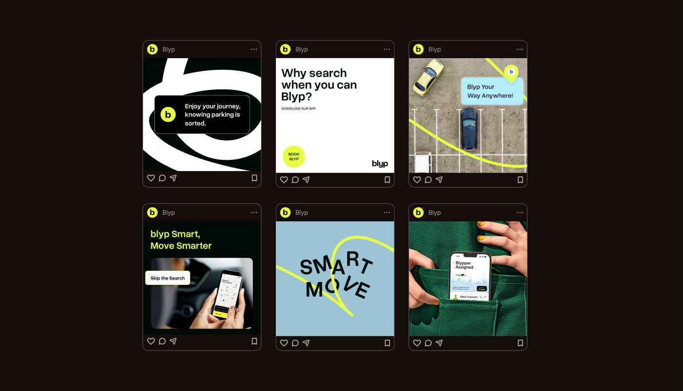
Explore the Branding behind the Blyp.
Conclusion: Aligning Visual Equity with Corporate Ambition
Securing long-term visual equity requires making an intentional, high-stakes investment in a design partner whose structural focus and technical execution align perfectly with your near-term growth benchmarks and long-term corporate ambitions. If your brand is operating at a massive global scale or managing complex institutional structures, aligning with an industry icon like Pentagram ensures your corporate mark will be woven cleanly into broader cultural and design history. On the other hand, if your priority is immediate proof-of-concept testing, rapid asset experimentation, or deploying localized service channels efficiently, high-volume options like Designhill, Branzone, or Raga Designers offer functional, cost-effective frameworks to launch your business footprint without long procurement cycles.
However, for enterprise brands, high-growth consumer engines, and funded startups that treat digital experiences as their primary commercial engine, the path forward demands a deeply integrated strategic framework. Wings Design Studio bridges the traditional gap between creative expression and analytical performance by building comprehensive ecosystems where brand strategy, user psychology, premium UI/UX interfaces, and high-performance engineering operate as a single unified force. By selecting a partner that builds beautiful assets engineered to capture attention and convert market intent into revenue, you transform your visual identity into a scalable, wealth-generating asset that accelerates your competitive advantage.

Akshita Shivani Sundar
Senior Graphic Designer