

Why UI Design Trends Matter
User interface (UI) design has continuously evolved with changing technology, user expectations, and digital experiences. From simple flat designs to realistic interfaces and immersive visual systems, designers are always searching for better ways to make digital products more engaging and user-friendly.
In recent years, two UI design styles have gained significant popularity among designers and developers: Neumorphism and Glassmorphism.
Both styles focus on creating depth and visual interest, but they follow completely different design philosophies.
Neumorphism creates an interface that feels soft, physical, and almost touchable. It uses subtle shadows and highlights to make elements appear as if they are emerging from the background. Glassmorphism creates a transparent, layered, and futuristic appearance. It uses blurred backgrounds, transparency, and floating components to simulate the look of frosted glass.
These design trends are not just about making interfaces beautiful. They influence how users interact with digital products, how brands communicate visually, and how designers create memorable experiences. In this first part of our detailed guide, we will explore the fundamentals of Neumorphism and Glassmorphism, their history, design principles, advantages, disadvantages, and practical applications.
What Is Neumorphism?
Neumorphism is a modern UI design style that combines the concepts of minimalism and skeuomorphism.
The word “Neumorphism” comes from the combination of:
- Neo → meaning new
- Skeuomorphism → a design approach that imitates real-world objects
The main idea behind Neumorphism is to create interface elements that appear to be part of the same surface as the background.
Instead of using strong borders, bright colors, or obvious separation between elements, Neumorphic designs use soft shadows and highlights to create depth. For example, a Neumorphic button may look like it is slightly raised from the screen. When clicked, it may appear pressed into the surface. This creates a physical connection between the user and the digital interface.
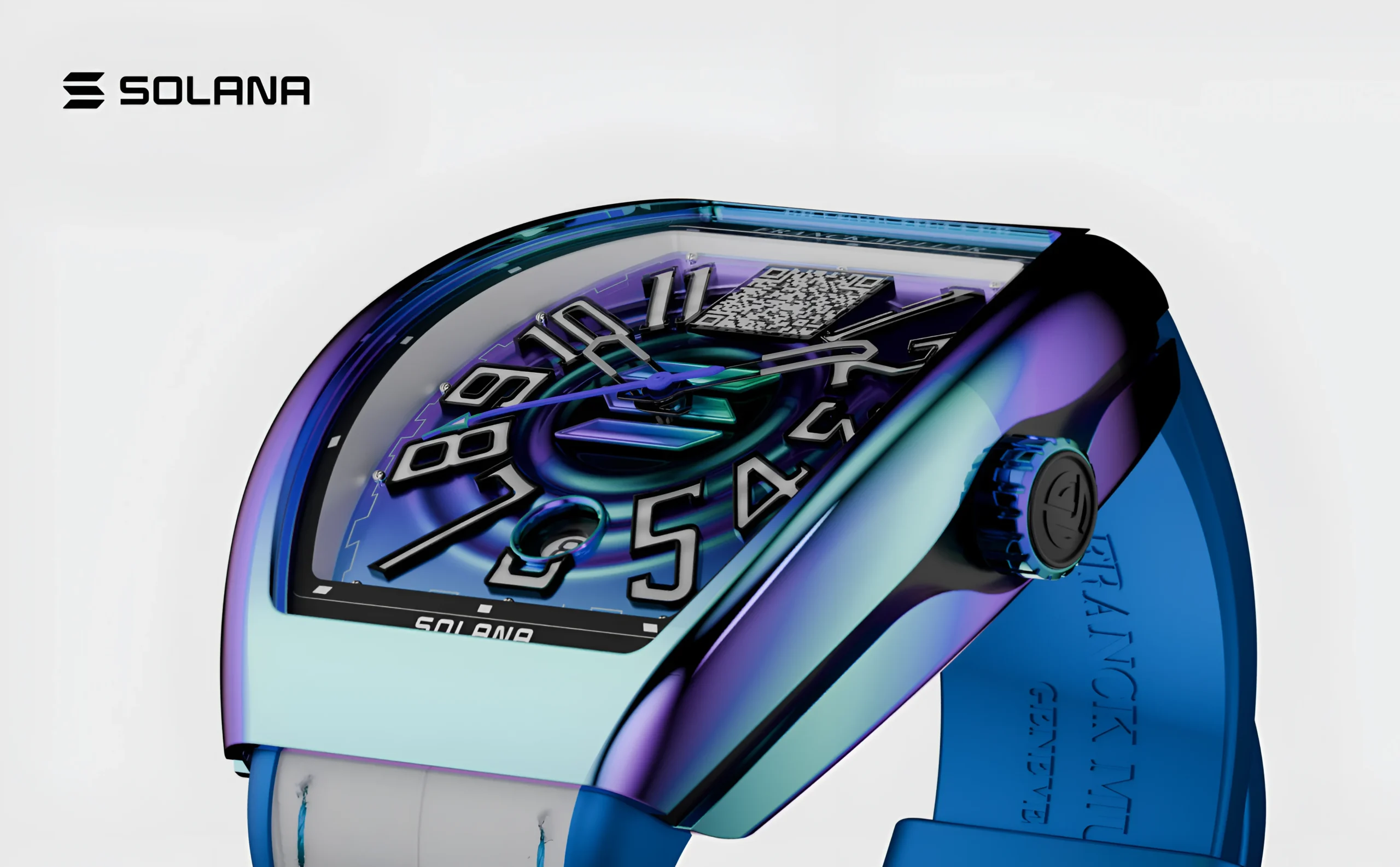
Explore the UX design process behind the Franckmuller.
History and Evolution of Neumorphism
Before Neumorphism became popular, UI design went through several major stages.
01. Skeuomorphic Design Era
Skeuomorphic design imitated real-world objects to make digital interfaces feel familiar and easy to use. It featured realistic textures, shadows, and physical-looking buttons. This approach helped users adapt to new technology.
02. Flat Design Era
Flat design introduced a clean and minimal interface by removing realistic effects and decorative elements. It focused on simple colors, clear layouts, and better performance. However, it often lacked visual depth and interaction.
03. Rise of Neumorphism
Neumorphism combined the simplicity of flat design with subtle depth and soft shadows. It created interfaces that looked modern, elegant, and interactive. This style became popular for its fresh and visually appealing design.
Core Principles of Neumorphic Design
Neumorphism depends on several important design principles.
01. Soft Depth
Soft depth is the defining feature of Neumorphism. It uses light shadows, dark shadows, and highlights to create the illusion that interface elements are raised or pressed. This adds a subtle three-dimensional appearance while maintaining a clean design.
02. Minimal Color Palette
Neumorphism relies on a simple color palette consisting of white, gray, soft pastel shades, and neutral backgrounds. Using fewer colors keeps the interface clean and allows users to focus on shapes, depth, and interaction. This creates a calm and modern visual experience.
03. Consistent Background and Elements
In Neumorphic design, UI elements such as buttons, cards, and input fields usually share a similar color with the background. Their visibility comes from carefully placed shadows and highlights rather than contrasting colors. This creates a smooth and unified interface.
04. Rounded Shapes
Rounded corners are an essential characteristic of Neumorphism. They give interface elements a softer, friendlier, and more visually balanced appearance. Sharp edges are generally avoided to preserve the smooth and elegant design style.

Explore the UI/UX design system behind the EVOS.
Key Design Elements of Neumorphism
01. Shadows
Shadows are the foundation of Neumorphic design. A combination of light and dark shadows creates the illusion of depth, making elements appear three-dimensional. This subtle effect gives the interface a soft and realistic look.
02. Raised and Pressed Effects
Neumorphic elements have two common states: raised and pressed. Raised elements, such as buttons, cards, and navigation icons, appear to lift above the surface, while pressed elements, like active buttons and toggle switches, appear embedded into it. These effects enhance user interaction and feedback.
Advantages of Neumorphism
01. Elegant and Premium Appearance
Neumorphism creates a sophisticated and modern visual style.
Its smooth appearance can make applications feel luxurious and polished.
02. Simple User Interface
Because Neumorphism avoids excessive colors and decorations, interfaces often appear clean and organized.
03. Strong Visual Consistency
Using similar colors and repeated design patterns helps create a unified experience.
04. Improved Emotional Connection
The soft appearance can make digital products feel more friendly and approachable.
Challenges and Limitations of Neumorphism
Although Neumorphism looks attractive, it has several usability challenges.
01. Accessibility Issues
The biggest problem is contrast.
Because elements often blend with the background, some users may struggle to identify:
- Buttons
- Input fields
- Interactive controls
Designers must carefully balance beauty with accessibility.
02. Limited Visual Flexibility
Neumorphism works best with simple layouts.
It can become difficult to use when designing:
- Complex dashboards
- Large websites
- Information-heavy applications
03. Interaction Confusion
Some users may not immediately understand which elements are clickable. A button should not only look attractive; it should clearly communicate its purpose.

Explore the UI/UX design process behind the Maverick AI.
What Is Glassmorphism?
Glassmorphism is a UI design trend inspired by the appearance of frosted glass. Unlike Neumorphism, which focuses on physical depth, Glassmorphism focuses on transparency and layering.
The interface creates the impression that users are looking through a glass surface where background elements remain visible but slightly blurred. Popular Glassmorphic interfaces usually include:
- Transparent cards
- Blurred backgrounds
- Bright gradients
- Soft borders
- Floating elements
History and Rise of Glassmorphism
Glassmorphism became popular as digital interfaces started moving toward more immersive and visually rich experiences. Modern operating systems and applications began using transparency and blur effects to create depth without traditional shadows. The style became especially popular because it works well with:
- Large screens
- High-resolution displays
- Colorful backgrounds
- Modern branding
Glassmorphism represents a shift from static interfaces toward more dynamic and layered experiences.
Core Principles of Glassmorphic Design
01. Transparency
Transparency is the defining feature of Glassmorphism. Elements appear partially see-through, allowing background visuals to remain visible.
02. Blur Effects
Blur creates the frosted glass appearance. It separates foreground content from background elements while maintaining visual connection.
03. Layering
Glassmorphism uses multiple layers to create depth. For example: Background image → blurred layer → transparent card → text and buttons
04. Vibrant Colors
Unlike Neumorphism, Glassmorphism often uses:
- Bright gradients
- Colorful backgrounds
- Dynamic visuals
These colors enhance the glass effect.

Explore the UI/UX design process behind the Kind Energy.
Key Elements of Glassmorphism
01. Frosted Glass Effect
The frosted glass effect is the defining feature of Glassmorphism. It combines transparency with background blur to create a smooth, glass-like appearance. This effect gives interfaces a modern and elegant look.
02. Thin Borders
Glassmorphic elements use thin, light-colored borders to improve visibility and define their edges. These borders help separate transparent components from the background. They also enhance the realistic glass effect.
03. Floating Components
Cards, panels, and other interface elements appear to float above the background using shadows and transparency. This creates a clear visual hierarchy and adds a sense of depth. As a result, the interface feels more organized and interactive.
Advantages of Glassmorphism
01. Modern and Futuristic Look
Glassmorphism gives user interfaces a sleek, modern, and futuristic appearance. Its transparent layers and blurred backgrounds create a premium digital experience. This style is widely used in contemporary applications and websites.
02. Strong Visual Impact
The combination of transparency, vibrant colors, and layered elements makes Glassmorphism visually appealing. It creates attractive interfaces that capture users’ attention. This helps improve the overall user experience.
03. Flexible Branding Options
Glassmorphism supports a wide variety of colors, gradients, and background images. This flexibility allows designers to create unique interfaces that match different brand identities. It offers greater creative freedom compared to Neumorphism.
04. Better Content Organization
Layered glass panels help separate different sections of content without making the interface feel cluttered. This improves visual hierarchy and makes information easier to understand. As a result, users can navigate the interface more efficiently.
Challenges and Limitations of Glassmorphism
01. Readability Problems
Glassmorphism can reduce text readability when transparent elements are placed over complex or colorful backgrounds. Insufficient contrast may make content difficult to read. Designers must carefully balance transparency and text visibility.
02. Performance Issues
Blur and transparency effects require additional graphical processing. On older or low-performance devices, these effects may reduce performance and responsiveness. Optimizing visual effects is important for a smooth user experience.
03. Risk of Overdesign
Excessive use of Glassmorphism can make an interface look overly decorative and confusing. Too many transparent layers may distract users from important content. Using the style in moderation helps maintain clarity and usability.
Which one is better — Neumorphism or Glassmorphism?
There is no single design style that is better in every situation. The choice between Neumorphism and Glassmorphism depends on factors such as usability, accessibility, performance, brand identity, and the type of application being designed. Each style has its own strengths and limitations.
In this section, we will compare Neumorphism and Glassmorphism in detail to understand their differences, advantages, and the situations where each design style is most effective.
Neumorphism vs Glassmorphism: Direct Comparison
1. Design Philosophy
Neumorphism
Neumorphism is based on the idea of creating a physical relationship between the user and the interface. It makes digital elements appear like objects placed on a soft surface.
The design goal is:
- Simplicity
- Soft interaction
- Realistic depth
- Minimal appearance
A Neumorphic button should feel like a physical button that users can press.
Glassmorphism
Glassmorphism focuses on creating a digital environment that feels transparent, layered, and futuristic.
The goal is:
- Visual depth
- Modern appearance
- Floating elements
- Dynamic layouts
A Glassmorphic card feels like a transparent glass panel floating above a background.
2. Visual Appearance Comparison
| Feature | Neumorphism | Glassmorphism |
| Overall Look | Soft and minimal | Modern and futuristic |
| Depth Creation | Shadows | Transparency and blur |
| Background | Usually plain | Often colorful |
| Elements | Blended with surface | Floating above layers |
| Style Feeling | Calm and elegant | Dynamic and premium |
3. Color Usage
Neumorphism Colors
Neumorphism usually depends on subtle colors.
Common examples:
- White
- Gray
- Beige
- Soft pastel shades
The focus is not on color but on lighting and shadows.
Advantages:
- Clean appearance
- Professional feeling
- Less visual distraction
Limitations:
- Less creative freedom
- Difficult for colorful brands
Glassmorphism Colors
Glassmorphism uses colors as a major design element.
Common choices:
- Gradients
- Bright backgrounds
- Vibrant combinations
Advantages:
- More branding flexibility
- More visual excitement
- Better for creative products
Limitations:
- Poor color choices can reduce readability
4. User Experience Comparison
Neumorphism User Experience
Neumorphism creates a feeling of touch and interaction.
Users may feel that:
- Buttons are physical objects
- Controls are easy to understand
- Interfaces feel comfortable
However, if elements are too subtle, users may not know what is clickable.
Glassmorphism User Experience
Glassmorphism creates a sense of exploration.
Users experience:
- Depth
- Movement
- Layer separation
It works especially well for products where visual storytelling matters.
However, too many transparent elements can create confusion.
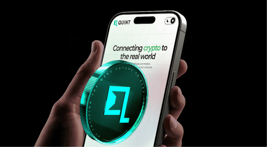
Explore the UI/UX Design process behind the Quint.
5. Accessibility Comparison
Accessibility is one of the most important considerations in UI design.
Neumorphism Accessibility
Problems:
- Low contrast
- Hidden buttons
- Difficult navigation for visually impaired users
Example:
A white button on a white background with only a small shadow may not be visible to everyone.
Solution:
Designers should use:
- Stronger contrast
- Clear labels
- Visible interaction states
Glassmorphism Accessibility
Problems:
- Text may blend with backgrounds
- Transparency may reduce readability
Example:
White text placed over a colorful image may become difficult to read.
Solution:
Designers should use:
- Dark overlays
- Solid text backgrounds
- Proper contrast ratios
6. Performance Comparison
Neumorphism Performance
Neumorphism usually performs better because it mainly depends on:
- Shadows
- Colors
- Simple shapes
It requires fewer visual effects.
Suitable for:
- Mobile apps
- Low-powered devices
- Simple interfaces
Glassmorphism Performance
Glassmorphism can require more processing because of:
- Blur effects
- Transparency
- Layer rendering
On older devices, excessive blur can affect:
- Loading speed
- Animation smoothness
- Battery usage
Designers should optimize effects carefully.
7. Mobile App Design Comparison
Neumorphism for Mobile Apps
Works well for:
- Calculator apps
- Music players
- Smart controls
- Personal dashboards
Why?
Because mobile screens benefit from simple and focused interactions.
Glassmorphism for Mobile Apps
Works well for:
- Social media apps
- Entertainment apps
- Creative applications
- Modern productivity tools
Why?
Because mobile users enjoy visually rich experiences.
8. Website Design Comparison
Neumorphism Websites
Neumorphism can work well for:
- Minimal portfolios
- Personal websites
- Product pages
However, large websites may face challenges because complex content requires stronger visual separation.
Glassmorphism Websites
Glassmorphism is highly effective for:
- Technology websites
- Startup websites
- SaaS landing pages
- Creative portfolios
It provides more flexibility for storytelling and branding.
9. Branding and Business Impact
Neumorphism Branding
Suitable for brands that want to communicate:
- Trust
- Simplicity
- Calmness
- Professionalism
Examples:
- Financial tools
- Healthcare applications
- Productivity products
Glassmorphism Branding
Suitable for brands that want to communicate:
- Innovation
- Creativity
- Technology
- Premium experiences
Examples:
- AI products
- Software companies
- Digital platforms
10. Combining Neumorphism and Glassmorphism
Modern designers do not always need to choose only one style.
A hybrid approach can combine:
- Neumorphic shadows
- Glass transparency
- Modern typography
- Clean layouts
For example:
A dashboard may use glass cards with soft Neumorphic buttons.
This creates a unique interface that balances beauty and usability.
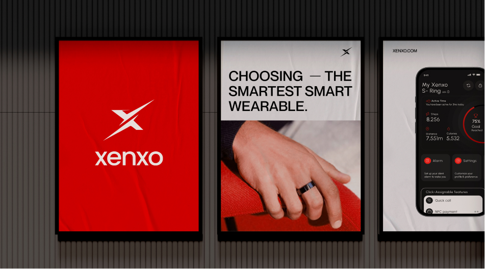
Explore the UI/UX design process behind the Xenxo.
Common Design Mistakes to Avoid
01. Choosing Appearance Over Usability
A visually attractive interface is ineffective if users cannot understand or navigate it easily. Designers should always prioritize usability by focusing on clear navigation, accessibility, and user goals. Good design balances aesthetics with functionality.
02. Excessive Effects
Using too many shadows, blur effects, or animations can make an interface look cluttered and distracting. Excessive visual effects may also reduce performance. Maintaining a balanced design improves both appearance and usability.
03. Ignoring Accessibility
Accessibility should be considered throughout the design process. Designers should test interfaces on different devices and ensure good text readability, clear button visibility, and sufficient color contrast. This helps create an inclusive experience for all users.
04. Following Trends Without Purpose
Design trends should support the product’s objectives rather than be used only because they are popular. Neumorphism and Glassmorphism should be applied only when they improve the user experience and align with the brand’s identity. Purpose-driven design leads to more effective interfaces.
Best Practices for Using Neumorphism
01. Use Clear Interactive Elements
Interactive components such as buttons and input fields should clearly appear clickable. Visual cues like subtle shadows and highlights help users identify actions easily. This improves usability and interaction.
02. Maintain Contrast
Ensure there is enough contrast between interface elements and the background. Important components should remain clearly visible and easy to distinguish. Good contrast also improves accessibility.
03. Keep Layouts Simple
Neumorphism works best with clean and uncluttered layouts. Using fewer elements and sufficient spacing creates a balanced and elegant interface. Simplicity enhances the overall user experience.
04. Use Shadows Carefully
Shadows are essential in Neumorphic design but should be applied subtly. Excessive shadows can make the interface look heavy and reduce its elegance. Balanced shadow effects create a soft and realistic appearance.
Best Practices for Using Glassmorphism
01. Use Transparency Strategically
Apply transparency only to important interface elements such as cards, dialogs, or panels. Using the glass effect everywhere can reduce clarity and visual impact. Strategic use creates a cleaner and more effective design.
02. Control Background Complexity
Choose simple or lightly detailed backgrounds behind glass elements. Busy or highly textured backgrounds can reduce visibility and distract users. A clean background improves the overall glass effect.
03. Prioritize Text Readability
Ensure text has sufficient contrast against transparent backgrounds. Proper spacing, font size, and color choices improve readability. Clear text enhances both usability and accessibility.
04. Optimize Performance
Blur effects should be used carefully to avoid slowing down the interface, especially on older devices. Limiting unnecessary visual effects improves performance. A balanced design provides a smooth and responsive user experience.
Future of UI Design Beyond Neumorphism and Glassmorphism
UI design is continuously evolving to provide more intelligent, interactive, and personalized user experiences. Future interfaces are expected to combine advanced technologies with user-centered design principles. These innovations will improve usability, accessibility, and overall engagement.
1. Artificial Intelligence
Artificial Intelligence (AI) will enable interfaces to adapt automatically based on user behavior, preferences, and usage patterns. This will create smarter and more personalized user experiences.
2. 3D Experiences
Future user interfaces will increasingly use realistic depth, three-dimensional elements, and immersive visuals. These features will make digital interactions more engaging and intuitive.
3. Motion Design
Animations and smooth transitions will play a greater role in providing visual feedback and guiding user interactions. Well-designed motion will improve usability without distracting users.
4. Personalized Interfaces
Future applications will offer customized interfaces that adapt to individual user preferences, habits, and accessibility needs. This will make digital products more efficient and user-friendly.
5. Voice and Gesture Interaction
Voice commands and gesture-based controls are expected to become more common, allowing users to interact with technology beyond traditional touchscreens. These interaction methods will support faster and more natural user experiences.
Final Verdict: Which One Should You Choose?
There is no single winner between Neumorphism and Glassmorphism.
The right choice depends on your goals.
Choose Neumorphism If You Need:
✔ Simple design
✔ Soft visual experience
✔ Minimal interface
✔ Calm and professional appearance
Best for:
- Productivity tools
- Finance apps
- Control interfaces
Choose Glassmorphism If You Need:
✔ Modern appearance
✔ Strong branding
✔ Visual storytelling
✔ Premium experience
Best for:
- Websites
- SaaS platforms
- Creative applications
- Technology products
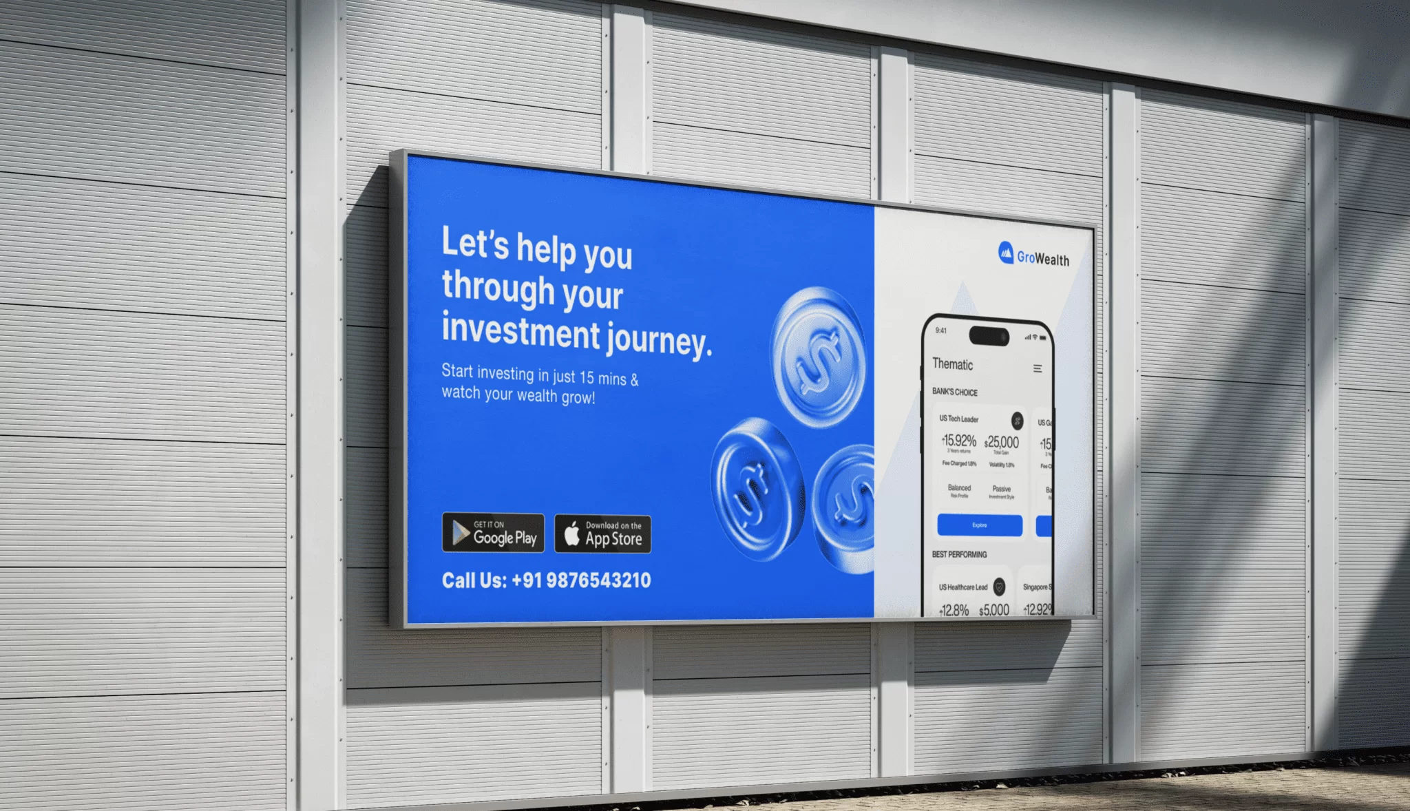
Explore the UX design process behind the GroWealth.
Final Conclusion
Neumorphism and Glassmorphism represent two important movements in modern UI design. Neumorphism brings softness, simplicity, and physical interaction to digital experiences.
Glassmorphism introduces transparency, depth, and futuristic visual language. The best designers understand that UI design is not about following trends. It is about creating experiences that are:
- Easy to use
- Accessible
- Beautiful
- Functional
The future of UI design will not belong to one specific style. Instead, it will combine the strongest elements of different approaches to create smarter, more human-centered digital experiences.

Thanseem
Junior UI/UX Designer