

For decades, UI/UX design has rested on one assumption: a human being is looking at the screen. Every button, color, animation, and microcopy line exists to guide human eyes, thumbs, and attention.
That assumption is starting to crack. AI agents now book flights, compare insurance plans, reorder groceries, file support tickets, and fill out forms on our behalf. Sometimes they call an API. Often they do something more awkward: they open your website, read the page, and try to click things like a person would.
So a new question lands on the design table: what does good design look like when the “user” is an AI acting for someone else?
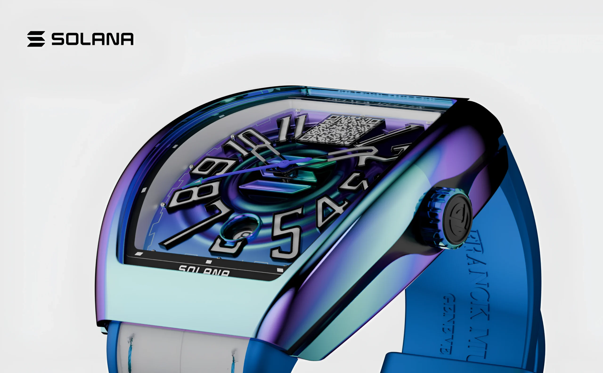
Explore the UX design process behind the Franckmuller.
The Two-User Problem
Designing for agents doesn’t mean abandoning humans. It means a single product now serves two audiences at once:
- The principal: the real person who delegated the task and cares about the outcome.
- The agent: the software that navigates your product to get that outcome done.
Most products were built for only one of these. That creates friction in both directions. An agent can get stuck on a hover-only menu, a CAPTCHA, or a modal that appears at random. A human who delegated a task may have no idea what the agent did, why it chose one option over another, or whether it spent their money wisely.
Good agent-era design serves both. The agent needs clarity and predictability. The human needs visibility and control.
How Agents “See” Your Interface
Humans scan a page visually. Agents usually don’t. Depending on the system, they may read the page’s underlying structure (the DOM and accessibility tree), analyze screenshots, or use structured APIs. In every case, they depend on your interface being legible, not just pretty.
Here is where that matters:
Ambiguous labels. A button that says “Continue” tells a human a lot when it sits beneath a checkout summary. To an agent parsing structure, it’s just “Continue.” Is that the payment step, or a step that adds insurance? Clear, specific labels like “Continue to payment” help both audiences.
Icon-only controls. A magnifying glass or a heart icon without a text label or accessible name is invisible or ambiguous to a machine reader.
Hidden state. If selecting a size changes the price but nothing in the markup announces it, an agent may miss the change entirely. So might a screen reader user.
Custom components that break conventions. A beautifully animated dropdown built from unlabeled divs looks great, but it may not be operable by anything except a mouse.

Explore the UX design process behind the Kind Energy.
The Uncomfortable Truth: Accessibility Is the Foundation
Here is the most useful insight for designers: much of what makes an interface agent-friendly is what makes it accessible.
Semantic HTML, proper heading hierarchy, labeled form fields, meaningful button text, logical focus order, and ARIA attributes used correctly all help screen readers. They also help agents understand what’s on the page and what each element does.
If your team has treated accessibility as a compliance checkbox, agents raise the stakes. Products with strong accessibility foundations will be easier for agents to use, which means more completed tasks, more conversions, and more happy customers who never touched the interface themselves.
Accessibility work now pays off twice.
Design Principles for the Agent Era
1. Make intent explicit
Agents perform best when the purpose of every element is unambiguous. Use descriptive labels, consistent naming, and clear structure. Avoid clever copy where clarity would serve better. “Let’s do this!” is charming for humans but meaningless as a signal for what a button does.
2. Keep flows predictable
Randomly appearing pop-ups, shifting layouts, and interstitials that interrupt a task confuse agents and frustrate humans alike. Consistent step order, stable element placement, and clear progress indicators make automated navigation reliable.
3. Offer structured pathways, not just visual ones
If your product has a common task, such as booking, ordering, or canceling, consider whether it can be exposed through an API, a structured data format, or a well-documented action. Agents that can use a purpose-built path are faster and less error-prone than ones scraping a UI built for eyes.
This doesn’t replace your interface. It complements it, the way a mobile app complements a website.
4. Design for verification, not just action
An agent that completes a purchase should produce a confirmation a human can review. That means clear order summaries, machine-readable and human-readable receipts, and states that clearly say what happened: submitted, pending, failed, needs your input.
Ambiguous success states are dangerous when nobody is watching in real time.
5. Treat consent as a design problem
This is the biggest shift. When an agent acts on someone’s behalf, the question isn’t just “can it click this button?” It’s “was it authorized to?”
Consider the difference between:
- Browsing and comparing prices (low risk)
- Adding items to a cart (moderate)
- Placing an order and charging a card (high)
- Canceling a subscription or deleting data (potentially irreversible)
Well-designed systems create clear tiers of permission. The human sets boundaries up front: spending limits, approved merchants, actions that always require confirmation. The interface should support checkpoints where the agent pauses and asks the person, “You said under $200, but the best option is $240. Approve?”

Explore the UX design process behind the Maverick AI.
The Human Side: Designing the Oversight Experience
Much of the interesting design work here isn’t about the agent at all. It’s about the human’s experience of delegating.
Trust needs transparency. People will hand over tasks only if they can see what’s happening. That means activity logs, step-by-step summaries, and the ability to ask, “Why did you choose this?” A black box that says “Done!” earns skepticism, not trust.
Progress, not just results. For longer tasks, good design shows what the agent is doing right now, what it has completed, and what’s left. This is the same principle as a good loading state, applied to complex, multi-step work.
Interruption design matters. When should an agent interrupt its principal? Too often and it defeats the purpose of delegation. Too rarely and it makes risky decisions unsupervised. Designing the threshold, and letting users adjust it, is a real UX challenge.
Easy undo. Delegation feels safe when mistakes are reversible. Cancel windows, confirmation emails, return policies, and rollback options are part of the agent experience.
Dark Patterns Meet Their Match (and Their Risk)
Dark patterns depend on exploiting human psychology: countdown timers, guilt-trip decline buttons (“No, I don’t like saving money”), pre-checked add-ons, and confusing cancellation flows.
Agents don’t feel urgency or guilt, so some manipulative tactics simply won’t work on them. But this doesn’t make dark patterns harmless. Agents can still be tricked. Hidden text, deceptive layouts, and misleading labels can lead an agent to make choices that harm the person it represents. This is a real security concern, since a malicious page could embed instructions aimed at hijacking an agent’s behavior.
For designers and product teams, the ethical stance is simple: design honestly. If an agent can’t tell what your interface is really doing, and neither can the human it represents, that’s a design failure, and probably a liability.
New Questions Designers Should Be Asking
Agents raise questions our field is only beginning to answer:
- Who is our customer? If an agent makes the purchase decision, do we design to persuade the agent or the human behind it?
- What happens to brand experience? If people never see our interface, how does our brand show up? Perhaps through reliability, clarity of information, and the quality of the outcome rather than visual polish.
- What happens to the funnel? Conversion tactics built for browsing humans, like upsells, banners, and recommendation carousels, may never be seen by an agent. Value has to come from the product itself.
- How do we test? Usability testing with agents is a new discipline. Can an agent complete your core flow? Where does it fail? Running agent-based tests alongside human ones is starting to look like good practice.
A Practical Starting Checklist
You don’t need to overhaul your product tomorrow. Start here:
- Audit your accessibility. Fix unlabeled buttons, missing form labels, and broken keyboard navigation.
- Clarify your copy. Replace vague CTAs with specific, action-oriented labels.
- Simplify critical flows. Reduce unnecessary steps, pop-ups, and surprises in checkout, signup, and support.
- Add clear status states. Make success, failure, and pending states explicit and unambiguous.
- Design confirmation points. Decide which actions should require explicit human approval.
- Test with an agent. Try letting an AI agent complete your primary flow and note where it stumbles.
- Consider structured access. Explore whether key actions could be offered through an API or another machine-friendly interface.

Explore the Design process behind the Quint.
The Bigger Picture
It’s tempting to see agents as a threat to design: if nobody’s looking at the screen, what’s left for designers to do? I’d argue the opposite. The work becomes more important, and more interesting.
Designers already specialize in understanding intent, reducing ambiguity, building trust, and shaping how people feel about handing control to a system. Those are exactly the skills the agent era demands. The interface is no longer only a surface for human eyes. It’s a contract between people, software, and the businesses they interact with.
The best products in this era will work well for both audiences: clear enough for an agent to act on, and transparent enough for a human to trust.
So the next time you review a flow, ask a second question alongside “Will a person understand this?” Ask, “Could someone’s assistant complete this correctly on their behalf, and could that person tell what happened?”