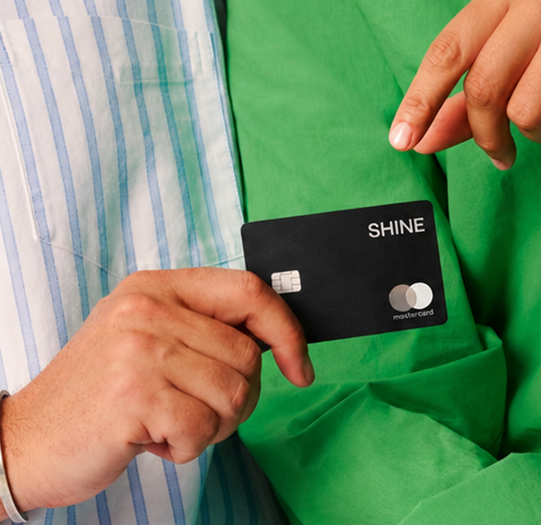



The best color combinations for websites do more than make a page look attractive. They establish mood, create hierarchy, influence perception, and help a brand become recognisable. Compare the soft, restrained palette of Pureforma with the black-and-orange system of Kind Energy or the ultraviolet and neon direction of Franck Muller, and it becomes clear that there is no universal formula for website colors. Each palette works because it reflects a different brand, audience, and digital experience.
That is why choosing website colors should start with the brand rather than a list of trending palettes. A home lifestyle brand like Obsessions needs warmth and simplicity to make products feel inviting, while a robotics company like Perceptyne benefits from a more restrained, structured visual system that supports technical precision. The right combination is ultimately the one that helps users understand what the brand stands for and where they should look next.
1. Soft White and Subtle Tones: Clean, Calm and Premium
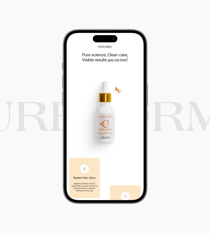
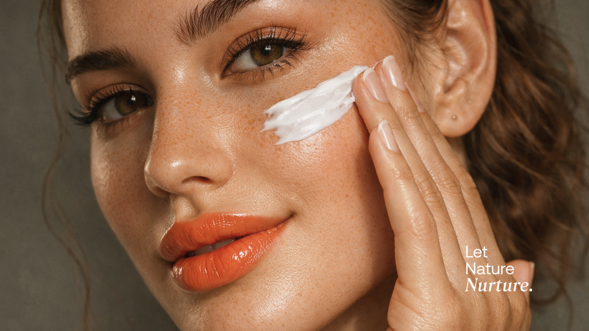
Soft white combined with subtle colour tones is one of the strongest website color combinations for brands that want to communicate simplicity and refinement. Pureforma is a strong example. The skincare website deliberately uses clean white surfaces, generous whitespace, calm typography, and subtle colour tones so that the product remains at the centre of the experience. Rather than using colour to create attention everywhere, the design allows motion, imagery, and content to do the storytelling.
This approach works particularly well when the product itself needs to be the visual hero. Beauty, skincare, wellness, fashion, and premium ecommerce brands can use a restrained palette to create an experience that feels confident without becoming visually loud. Pureforma demonstrates how fewer colours can actually create a stronger impression when every visual element has room to breathe.
Best for: Skincare, beauty, wellness, luxury ecommerce, fashion and lifestyle.
Explore Wings Design’s energy company work in Mumbai, India
2. Black and Orange: Bold, Confident and Energetic
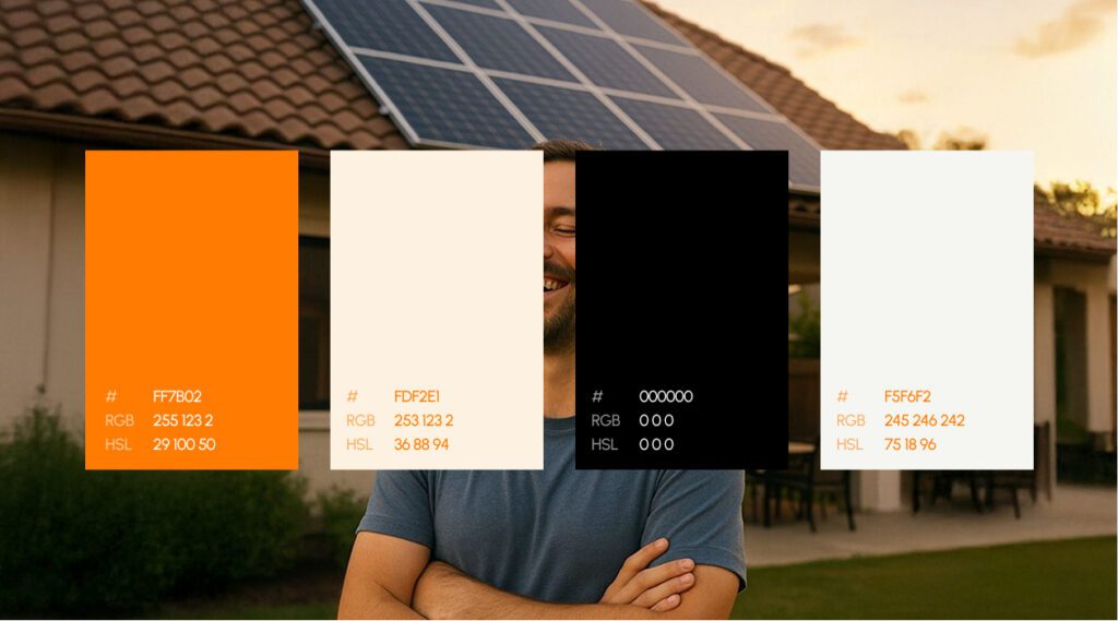
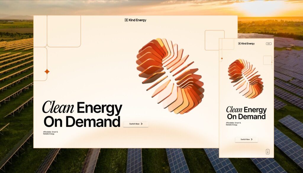
Black and orange is one of the most striking color combinations for websites when the goal is to create energy and visual confidence. Kind Energy uses this combination deliberately. Wings describes the palette as a way to evoke solar energy, strength, and reliability, while keeping the overall interface minimal and focused. The orange provides energy and emphasis against the black foundation without overwhelming the content.
The important lesson from Kind Energy is that bold colour does not mean using more colour. Orange becomes effective because it has a defined role within the visual system. When an accent colour is reserved for important moments, it can guide attention towards CTAs, key information, graphics, and other high-value elements while the darker base keeps the experience controlled.
Best for: Energy, technology, automotive, sports, construction and bold B2B brands.
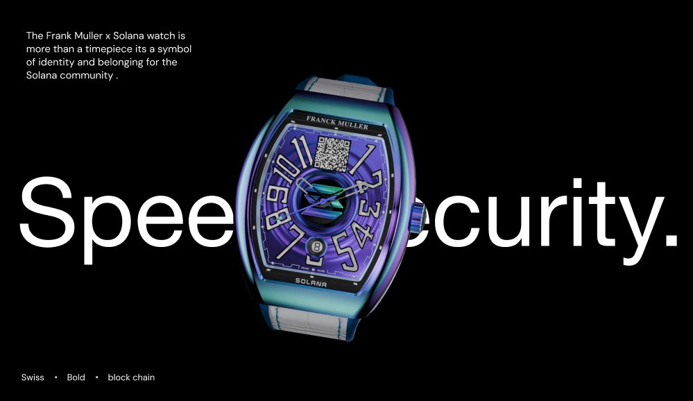
Explore Wings Design’s luxury watch website work for Franck Muller in Switzerland
3. Deep Purple, Ultraviolet and Neon: Futuristic and Experimental
Some brands need a website color palette that feels unmistakably digital. Deep purple, ultraviolet gradients, and neon highlights can create that effect, particularly when combined with motion and immersive interaction. Franck Muller Encrypto demonstrates this approach through a visual language inspired by its Solana collaboration. The project uses deep purples, ultraviolet gradients, and neon highlights while retaining the minimal elegance expected from an ultra-luxury watchmaker.
What makes this combination interesting is the contrast between heritage and technology. Franck Muller needed to communicate luxury craftsmanship while introducing blockchain culture into the brand experience. The palette therefore could not simply look futuristic; it had to sit within a carefully controlled luxury system. This is a good example of why website color combinations need to respond to the brand story rather than follow a generic “tech” aesthetic.
Best for: AI, Web3, blockchain, gaming, creative technology and futuristic product launches.
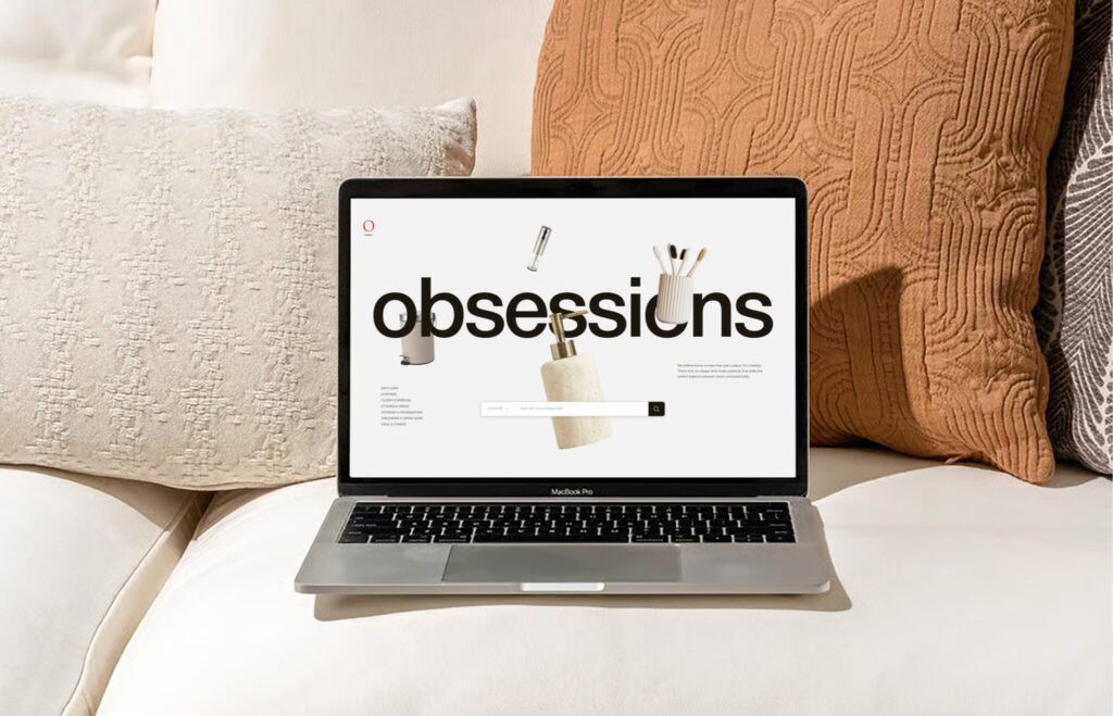
Explore Wings Design’s ecommerce work for Obsessions in Delhi, India
4. Warm Neutrals and Soft Tones: Inviting and Human
For ecommerce and lifestyle websites, warm and understated colours can make the digital experience feel more personal. Obsessions is designed around warmth, simplicity, and clarity because its products are connected to homes, interiors, seasons, and everyday rituals. Rather than making the website feel like a conventional product catalogue, the visual direction helps create an inviting environment for discovery.
This is particularly useful for brands selling products where emotion influences the purchase decision. Home decor, furniture, interiors, fashion, food, and lifestyle businesses often benefit from palettes that feel approachable rather than overly technical. In Obsessions, colour is part of a larger system involving product imagery, layout, navigation, and visual pacing, showing how a palette can support the feeling of a category rather than simply decorate it.
Best for: Home decor, furniture, interiors, lifestyle, fashion and D2C ecommerce.
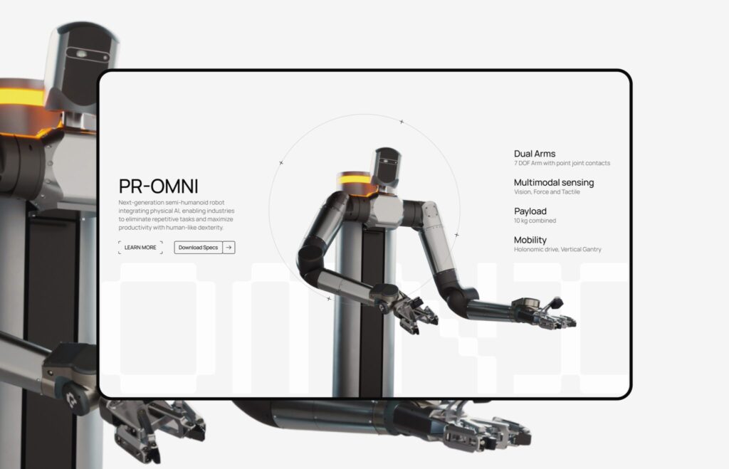
Explore Wings Design’s Robotics website work for Perceptyne in Hyderabad, India
5. Restrained Dark Tones and High Contrast: Technical and Precise
Technology websites do not always need bright blues or futuristic gradients. Sometimes restraint communicates sophistication more effectively. Perceptyne uses a restrained colour palette alongside structured layouts and strong imagery to communicate technical precision while keeping the experience accessible. For a robotics company introducing complex AI-driven technology to a global audience, this restraint helps the product and narrative remain clear.
The same principle applies to enterprise and B2B websites. When the subject matter is already complex, excessive colour can increase cognitive load. A controlled palette with strong contrast can create hierarchy without competing with technical information, product visuals, diagrams, or photography. Perceptyne shows how a technology brand can feel futuristic through composition and imagery without relying on an overloaded colour system.
Best for: Robotics, AI, SaaS, engineering, manufacturing and B2B technology.
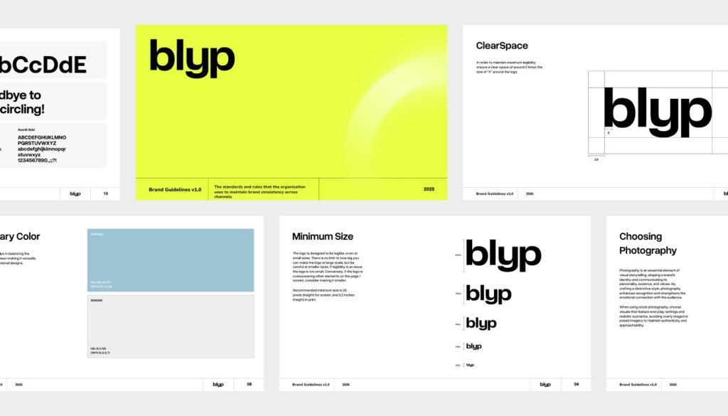
Explore Wings Design’s mobility branding work for Blyp in Delhi, India
6. Vibrant Neon Green: Energetic, Visible and Distinctive
Neon green can be extremely effective when a brand needs to stand apart from an established category. Blyp is a clear example. Instead of following the muted, utilitarian visual language common in mobility services, Wings chose vibrant neon green as the brand’s core colour. The goal was visibility, energy, recognition, and a stronger emotional association with movement and momentum.
The colour was not selected only for the website. It was designed to work across valet uniforms, signage, communication, digital interfaces, and other brand touchpoints. That is an important distinction: the strongest website color combinations often originate from a broader brand identity system. When the colour works consistently beyond the screen, it becomes an asset rather than simply a UI choice.
Best for: Mobility, sports, startups, youth-focused brands, consumer technology and disruptive services.
Explore Wings Design’s real estate website work for EVOS in Chennai, India
7. Minimal Neutrals and Editorial Contrast: Quietly Premium
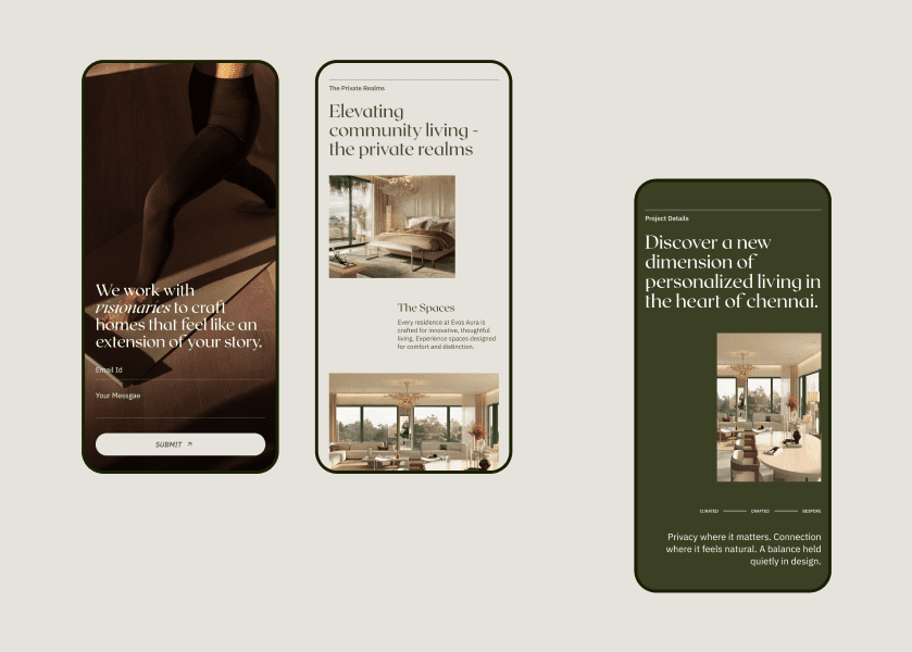
A premium website does not necessarily need gold, black, or dramatic gradients. EVOS takes a much quieter approach. The real estate website was intentionally designed to feel precise, minimal, editorial, and quietly confident, reflecting a brand that wanted to speak to a more considered audience rather than compete through the usual visual language of real estate.
This type of palette works because colour is allowed to support proportion, imagery, typography, and whitespace rather than dominate them. For premium real estate, architecture, interiors, hospitality, and luxury brands, a restrained website color scheme can communicate confidence precisely because it does not try too hard to attract attention.
Best for: Luxury real estate, architecture, interiors, hospitality and premium services.

Explore Wings Design’s website development work for DCC in Mumbai, India
8. White, Dark Neutrals and Vibrant Accents: Clear but Dynamic
A website does not have to choose between minimalism and colour. DCC demonstrates how a restrained foundation can be combined with vibrant accents to create energy. Its website uses crisp imagery, high contrast, and vibrant colour accents inspired by the company’s “Print Brilliance” and “Brighter Solutions” concepts. This gives the experience visual energy while maintaining clarity across a very large B2B information ecosystem.
This combination is particularly useful for businesses with large amounts of information. DCC’s platform spans nearly 1,150 pages, so colour has to work alongside information architecture rather than distract from it. The result shows how vibrant accents can help bring energy to a complex website without turning every section into a visual competition.
Best for: Manufacturing, industrial technology, B2B, media, printing and large enterprise websites.
9. Dark Neutrals and Metallic Visuals: Luxury and Craftsmanship
Luxury brands often benefit from a darker, controlled visual environment because it gives products more presence. Shivam Jewels takes this idea further through an immersive, 3D-led website built around the journey of a diamond. Instead of relying on a conventional B2B website filled with specifications, the experience uses cinematic storytelling, motion, and detail to communicate craft and precision.
Here, colour works alongside the product itself. Diamonds, materials, reflections, 3D forms, and motion become part of the visual language. This is an important consideration for jewellery and luxury brands: the best website color palette is often the one that creates the right stage for the product rather than competing with it.
Best for: Jewellery, luxury goods, manufacturing, premium B2B and craftsmanship-led brands.
How to Choose the Best Color Combination for Your Website
The examples above show why copying a colour palette from another website rarely works. Pureforma needs restraint because the brand is built around clean skincare and a focused hero product. Kind Energy needs stronger contrast because its visual identity has to communicate energy and reliability. Blyp needs high visibility because its brand has to operate in public spaces as well as digital ones. Franck Muller needs a more sophisticated balance between luxury and futuristic technology.
Before selecting colours, define what you want the website to communicate. Should it feel premium or accessible? Technical or human? Calm or energetic? Established or experimental? EVOS, for example, deliberately chose restraint because its positioning was about selectivity and design rather than mass-market real estate. The palette therefore becomes part of the positioning, not simply a visual preference.
Your industry matters, but it should not dictate your palette completely. Perceptyne operates in robotics but avoids relying on an overly futuristic colour system, while Kind Energy moves away from the predictable green associated with sustainability and instead uses black and orange. Both demonstrate that differentiation can come from challenging category conventions while still communicating the right message.
Your imagery matters just as much. A product-heavy ecommerce website such as Obsessions needs a palette that allows products and interiors to remain visually important. A technology website such as DCC can use colour accents more aggressively because colour is part of the story around printing, vibrancy, and visual output. The palette should always be evaluated alongside photography, typography, graphics, motion, and content.
A Simple Website Color Palette Formula
A practical website color palette does not need dozens of colours. Start with a primary colour, a supporting colour, an accent colour, a background, and a text colour. The exact balance will depend on the brand. Pureforma keeps these relationships subtle, while Kind Energy gives its orange accent a much stronger role. DCC demonstrates how vibrant accents can be introduced against a more controlled foundation.
The most important part is assigning each colour a job. Your primary colour can establish brand recognition, the supporting colour can create variation, and the accent can direct attention toward important actions. Background and text colours should prioritise readability. When every colour is competing for attention, the interface loses hierarchy.
Website Color Combinations Should Serve the Experience
Looking across Obsessions, Pureforma, Franck Muller, EVOS, Perceptyne, Kind Energy, Shivam Jewels, Blyp, and DCC, the biggest lesson is that there is no single “best” colour combination for websites. There are only combinations that are appropriate for particular brands and experiences. Each project uses colour differently because each one has a different audience, category, product, and positioning.
Pureforma uses restraint to create clarity. Kind Energy uses black and orange to create strength. Franck Muller combines deep purple, ultraviolet, and neon to bridge luxury and blockchain culture. Blyp uses neon green to disrupt a muted mobility category. EVOS uses minimalism to create exclusivity. DCC uses vibrant accents to bring energy to a complex B2B ecosystem. Perceptyne keeps colour controlled to communicate technical precision, while Shivam lets product, craft, motion, and cinematic detail carry the experience.
That is the difference between choosing colours for a website and designing a visual system for a brand.
Need a Website That Gets the Colour Right?
At Wings, colour is considered within the larger digital experience: brand strategy, UX, UI, typography, imagery, interaction, motion, and development all need to work together. The result should not simply look good. It should make the brand easier to recognise, the interface easier to navigate, and the business easier to understand.
The Wings portfolio includes digital experiences across ecommerce, luxury, real estate, robotics, energy, mobility, manufacturing, jewellery, and more. Projects such as Pureforma, Franck Muller, EVOS, Perceptyne, Kind Energy, Shivam Jewels, Blyp, DCC, and Obsessions demonstrate how different visual systems can be built around very different business objectives.
If your current website looks disconnected from your brand, the solution may not be another trendy colour palette. It may be a stronger visual system built around how your business actually wants to be perceived.
Explore Wings’ work and see what a design-led digital experience can look like.

Mugesh Kanna
Junior Web developer