

What is User Experience (UX)?
User Experience (UX) refers to the overall experience a person has while interacting with a digital product, such as a website, mobile application, or software. It encompasses every aspect of the user’s journey, from the moment they first visit a platform to the completion of a task, such as making a purchase, signing up for a service, or finding information. A great user experience ensures that interactions are intuitive, efficient, enjoyable, and free from unnecessary frustration.
Some of the key principles of effective UX design include:
- Usability: Making products easy to learn and use.
- Accessibility: Ensuring everyone, including people with disabilities, can interact with the product.
- Consistency: Maintaining predictable layouts and interactions throughout the interface.
- Efficiency: Helping users complete tasks quickly and with minimal effort.
- User Satisfaction: Creating enjoyable and meaningful digital experiences.
As digital products continue to evolve, UX has become one of the most important factors determining whether users stay, return, or switch to a competitor. Every interaction, no matter how small, contributes to the overall perception of a product. This is where animation becomes an essential part of modern UX design.
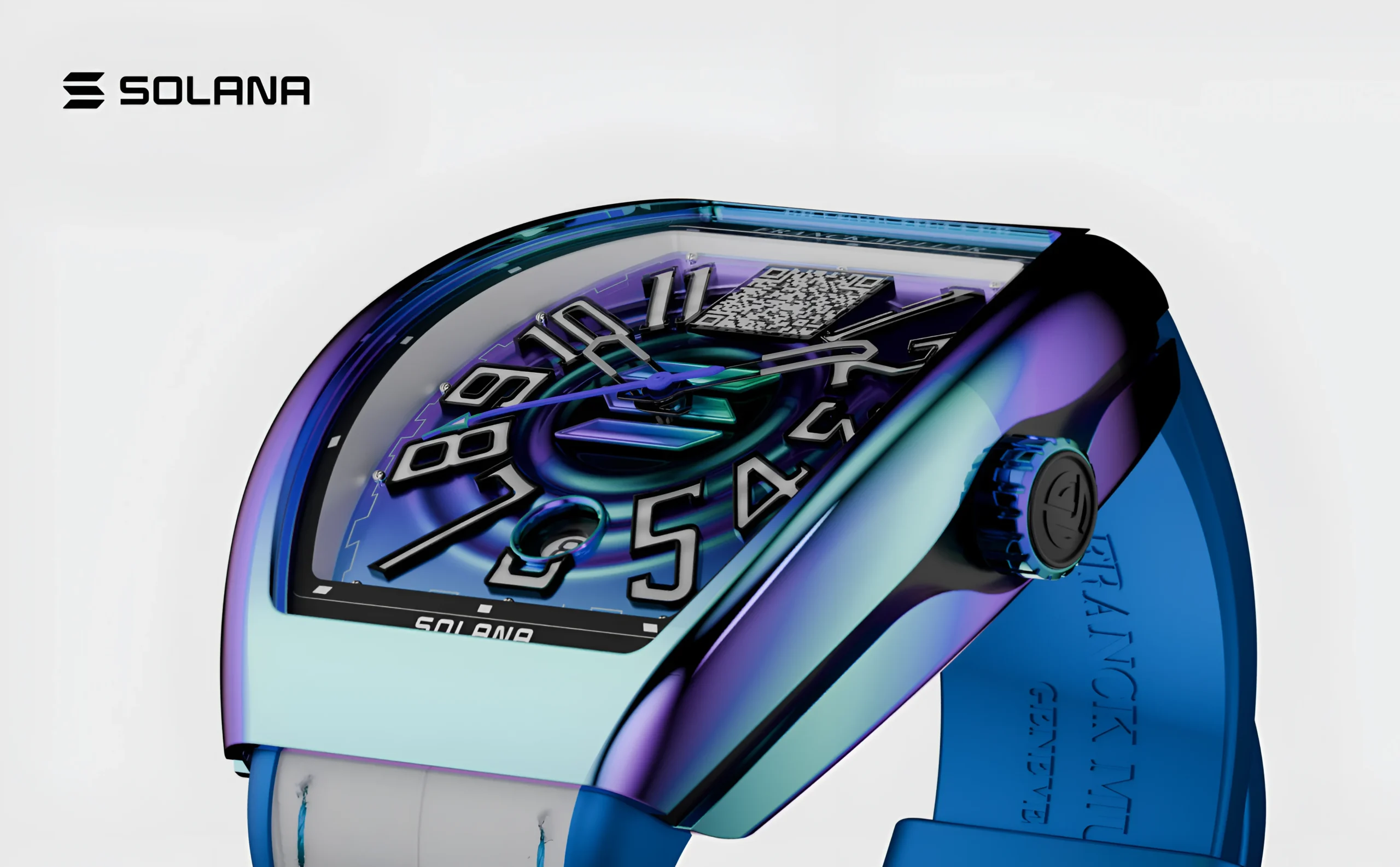
Explore the UX design process behind the Franckmuller.
What is UX Animation?
UX animation, also known as interface animation or motion design, refers to the purposeful use of movement within a digital interface to improve communication between the system and its users. Unlike decorative animations that exist purely for visual appeal, UX animations are designed to support usability, provide feedback, guide attention, and make interactions more intuitive.
UX animation can be found across various digital products, including:
- Mobile applications
- Websites
- SaaS platforms
- Banking applications
- E-commerce stores
- Healthcare portals
- Educational platforms
- Smart TV interfaces
- Wearable devices
The primary goal of UX animation is not to entertain users but to improve clarity, usability, and efficiency. When used thoughtfully, motion transforms static interfaces into dynamic experiences that feel natural and engaging.

Explore the UX design process behind the Kind Energy.
Why Animation Matters in UX Design
Imagine opening an application and tapping a button. Nothing changes immediately. There is no visual response, no indication that the system has received your input, and no confirmation that your action is being processed.
Most users would instinctively wonder:
- Did my tap register?
- Is the application frozen?
- Should I tap the button again?
- Is my internet connection working?
Now consider the same scenario with a subtle animation. As soon as the button is tapped, it slightly compresses, changes color, and a small loading indicator appears. Within a fraction of a second, users receive clear feedback that the application has acknowledged their action.
This is the true power of animation in UX, it communicates with users instantly.
Animation acts as a silent guide throughout the user journey. It reduces uncertainty, explains changes, and creates a sense of continuity between different interface states. Instead of relying solely on text or pop-up messages, motion communicates information naturally and efficiently.
Animation is Communication, Not Decoration
One of the biggest misconceptions about interface animation is that it exists only to make products look modern or visually impressive. While attractive motion can certainly enhance aesthetics, its primary purpose should always be communication.
Every animation should answer a question that users naturally have during their interaction.
For example:
- What happened after I clicked this button?
- Where did this menu come from?
- Why did this message disappear?
- Which element should I focus on next?
- Is my file uploading successfully?
Purposeful animations provide these answers without interrupting the user’s workflow.
Think of animation as body language during a conversation. Just as facial expressions and gestures help people understand emotions and intentions, interface animations help users understand digital interactions.
For example:
- A success checkmark confirms a completed action.
- A shaking password field indicates incorrect input.
- A progress bar communicates loading status.
- An expanding card reveals additional information.
- A fading notification indicates completion.
Each movement delivers meaningful information.
Decorative animations, on the other hand, often consume attention without improving usability. Excessive bouncing elements, unnecessary transitions, or overly complex visual effects can distract users and slow down task completion.
Great UX animation always serves a purpose. If an animation does not improve understanding, reduce confusion, or enhance usability, it may not belong in the interface.
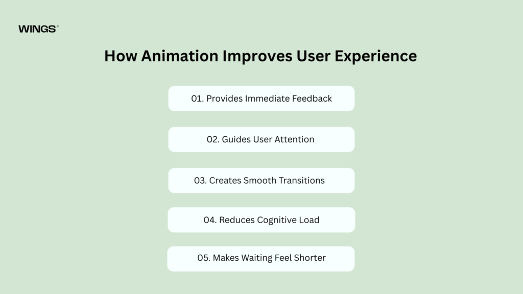
How Animation Improves User Experience
Animation is one of the most effective tools for making digital interfaces feel responsive, intuitive, and user-friendly. It enhances communication between the user and the system by providing visual cues that explain what is happening at every stage of an interaction. Rather than relying on text-based instructions, animation allows users to understand actions almost instantly through movement.
Let’s explore the key ways animation improves the overall user experience.
01. Provides Immediate Feedback
Feedback is one of the fundamental principles of good UX design. Every action performed by a user should receive an immediate response from the interface.
Imagine pressing a “Submit” button on an online form. If nothing changes for several seconds, users may assume the button didn’t work and click it multiple times. This can lead to duplicate submissions, frustration, and confusion.
Animations eliminate this uncertainty by confirming that the system has received the user’s input. A button might briefly change color, shrink slightly, or display a loading indicator, reassuring users that their action is being processed.
Examples of feedback animations include:
- Buttons changing state after being clicked.
- Success checkmarks appearing after completing a payment.
- Progress indicators during file uploads.
- Animated error messages highlighting invalid form fields.
- Icons transform when an item is added to favorites.
These small visual responses build trust by showing users that the system is actively responding to their actions.
02. Guides User Attention
Modern digital interfaces often contain a large amount of information, making it difficult for users to know where to focus. Animation helps solve this problem by naturally directing attention toward the most important elements on the screen.
Human eyes are instinctively drawn to movement. Designers use this principle to highlight key actions, notifications, or updates without overwhelming the user.
For example, a subtle animation can draw attention to a newly available feature, a confirmation message, or the next step in a checkout process. Instead of relying on bright colors or intrusive pop-ups, motion gently guides users through the interface.
This improves usability by reducing cognitive effort and helping users complete tasks more efficiently.
03. Creates Smooth Transitions Between Screens
Abrupt changes between pages or interface states can be disorienting. Users may struggle to understand where they are or what changed.
Animation bridges these transitions by creating visual continuity.
For example, when opening a product from a shopping list, the product card can smoothly expand into the product details page. This movement helps users understand that they are viewing more information about the same item rather than navigating to an unrelated page.
Smooth transitions preserve context, making navigation feel more natural and reducing mental effort.
04. Reduces Cognitive Load
Every digital interaction requires users to process information. The more effort required to understand an interface, the higher the cognitive load.
Animation simplifies complex interactions by visually explaining changes instead of relying on lengthy instructions.
For example, when filters are applied to a product list, the updated products can smoothly rearrange themselves instead of instantly appearing. This allows users to follow the changes naturally, making the interface easier to understand.
Reducing cognitive load leads to faster learning, improved efficiency, and higher user satisfaction.
05. Makes Waiting Feel Shorter
Waiting is an unavoidable part of using digital products. Whether loading a webpage, uploading files, or processing payments, delays can negatively affect user perception if not handled properly.
Animation makes waiting feel shorter by providing visible progress and reassurance. Loading indicators, skeleton screens, and progress bars let users know that the system is working rather than frozen.
Research in UX consistently shows that users are more patient when they receive continuous visual feedback during waiting periods.
Instead of staring at a blank screen, users remain informed and engaged, resulting in a more positive experience.

Explore the UX design process behind the Maverick AI.
Types of UX Animation
Animation in UX design comes in many forms, each serving a different purpose. Some animations help users complete tasks, while others provide feedback, improve navigation, or make the interface feel more natural. Choosing the right type of animation depends on the context and the user’s needs.
Below are the most common types of UX animation used in modern digital products.
01. Microinteractions
Microinteractions are small, functional animations that occur when users interact with an interface. They may last only a fraction of a second, but they play a significant role in improving usability and creating a delightful experience.
Every digital product contains hundreds of microinteractions, often without users consciously noticing them. These subtle animations provide immediate feedback and reassure users that the system has responded to their actions.
Common Examples of Microinteractions
- A button changes color when clicked.
- A heart icon fills when liking a social media post.
- A toggle switch smoothly slides between ON and OFF states.
- A notification badge briefly expands when a new message arrives.
- A checkbox displays an animated checkmark after selection.
Although these interactions seem simple, they improve confidence and reduce uncertainty. Instead of wondering whether an action was successful, users receive instant visual confirmation.
Why Microinteractions Matter
Microinteractions help make interfaces feel responsive rather than static. They improve usability by acknowledging user actions, preventing repeated clicks, and making routine tasks more enjoyable. Products like Instagram, Facebook, LinkedIn, and Spotify rely heavily on microinteractions because they create satisfying experiences without interrupting the user’s workflow.
02. Navigation Animations
Navigation is one of the most important aspects of UX design. Users should always know where they are, where they came from, and where they are going. Navigation animations create visual continuity between different pages or interface sections. Instead of abruptly switching screens, smooth transitions help users understand the relationship between different parts of an application.
Examples of Navigation Animations
- Sliding between mobile app screens.
- Expanding cards into detailed pages.
- Sidebar menus smoothly opening and closing.
- Bottom navigation indicators moving between tabs.
- Animated breadcrumbs showing navigation paths.
These transitions reduce confusion and help users build a mental model of the application’s structure.
Benefits of Navigation Animation
- Creates smoother user journeys.
- Maintains visual context.
- Prevents users from feeling lost.
- Improves overall usability.
- Makes interfaces feel polished and professional.
03. Loading Animations
No matter how fast an application is, users occasionally need to wait while data loads or processes complete. Without visual feedback, users may assume the application has frozen or stopped working. Loading animations reassure users that the system is actively processing their request.
Common Loading Animations
- Circular loading spinners.
- Skeleton screens.
- Progress bars.
- Pulsing placeholders.
- Animated dots.
Modern UX increasingly favors skeleton screens over traditional loading spinners because they preview the page layout while content loads. Instead of waiting in uncertainty, users begin understanding how the page will appear.
Why Loading Animations Improve UX
Loading animations reduce perceived waiting time. Even when actual loading speed remains unchanged, users feel that the application is faster because they continuously receive visual feedback.
04. State Change Animations
Every interface contains different states. Buttons become disabled. Products move into shopping carts. Notifications disappear. Messages become read. Instead of changing instantly, animation visually explains these transitions.
Examples
- “Add to Cart” button changing into “Added.”
- Favorite icons filling with color.
- Upload buttons transforming into success icons.
- Completed tasks fading from active lists.
- Payment confirmation checkmarks.
State change animations reduce confusion by clearly communicating what has changed.
05. Gesture-Based Animations
Touchscreen devices rely heavily on gestures. Animations help users understand the results of these gestures.
Common Gesture Animations
- Swipe to delete.
- Pull to refresh.
- Pinch to zoom.
- Drag and drop.
- Long press interactions.
For example, when deleting an email by swiping left, the message follows the user’s finger before disappearing. This movement creates a direct connection between the user’s action and the system response.
06. Scroll Animations
Scrolling is one of the most common interactions on websites and mobile applications. Scroll animations make long pages feel engaging without distracting users.
Examples include:
- Elements fading into view.
- Statistics counting upward.
- Images gradually appearing.
- Sticky headers shrinking while scrolling.
- Sections smoothly revealing themselves.
However, scroll animations should always remain subtle. Excessive movement can overwhelm users and negatively affect accessibility.
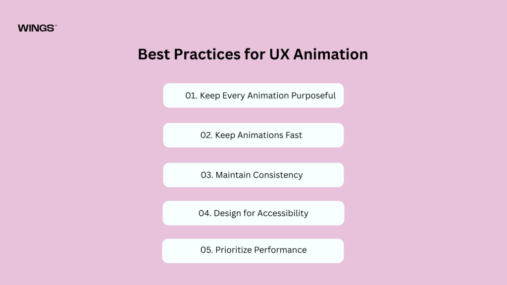
Best Practices for UX Animation
Creating effective UX animations requires more than creativity. Every animation should have a purpose and improve the user experience rather than simply making an interface look attractive. Well-designed animations make products feel intuitive, responsive, and enjoyable to use.
01. Keep Every Animation Purposeful
Before adding an animation, ask:
“Why does this animation exist?”
Every animation should solve a usability problem or help users understand the interface.
A purposeful animation can:
- Confirm user actions.
- Explain interface changes.
- Guide user attention.
- Improve navigation.
- Reduce confusion.
Animations that exist only for decoration may distract users and increase cognitive load. Purpose should always come before visual appeal.
02. Keep Animations Fast
Users expect interfaces to respond instantly. Slow animations can make an application feel sluggish and delay task completion.
For most interactions, animations work best between 150 and 300 milliseconds. This duration feels smooth without slowing the user down.
Longer animations should only be used for complex transitions, such as moving between major screens or presenting detailed content.
Fast, responsive animations create a smoother and more satisfying user experience.
03. Maintain Consistency
Animations should follow a consistent design language throughout the application.
For example:
- Buttons should use the same hover and click animations.
- Menus should open and close with identical motion.
- Dialog boxes should appear using similar transitions.
- Notifications should follow a consistent entrance and exit animation.
Consistency helps users predict how the interface will behave, reducing the learning curve and increasing confidence while using the product.
04. Design for Accessibility
Not all users experience motion in the same way. Some people have motion sensitivity or vestibular disorders, making excessive animations uncomfortable or even disorienting.
To create accessible animations:
- Respect the device’s Reduce Motion setting.
- Avoid excessive zooming, spinning, or parallax effects.
- Provide simpler alternative transitions when possible.
- Never rely on animation alone to communicate important information.
Accessible animations ensure that everyone can comfortably use the interface.
05. Prioritize Performance
Even the most beautiful animation loses its value if it stutters or lags. Poor performance makes applications feel unreliable and negatively affects the user experience.
To improve animation performance:
- Optimize images and graphical assets.
- Avoid unnecessary or excessive animations.
- Use hardware-accelerated properties such as transform and opacity.
- Minimize animations that trigger expensive layout recalculations.
Smooth, responsive performance is just as important as attractive visual design.
Explore the Design process behind the Quint.
Real-World Examples of UX Animation
Studying successful digital products helps designers understand how animation improves usability and creates engaging experiences.
01. Google Material Design
Google’s Material Design is one of the best examples of purposeful animation. Every movement follows clear motion principles that help users understand how interface elements relate to one another.
Examples include:
- Floating Action Buttons expanding into new screens.
- Cards smoothly transforming into detailed views.
- Menus sliding naturally into place.
- Ripple effects confirming button taps.
Rather than adding decoration, Google’s animations explain relationships and provide clear visual feedback.
02. Apple iOS
Apple is well known for its smooth and elegant interface animations. These animations make complex interactions feel simple and natural.
Examples include:
- Apps smoothly zooming from their icons when opened.
- Face ID authentication animations.
- Dynamic Island expanding and collapsing.
- Control Center transitions.
- Notification animations.
Apple carefully balances speed and fluidity, creating an interface that feels polished and intuitive.
03. Airbnb
Airbnb uses animation throughout the booking journey to guide users and reduce friction during the reservation process.
Examples include:
- Animated property cards.
- Smooth map updates while searching.
- Calendar date-selection transitions.
- Skeleton loading screens while content loads.
- Interactive booking flow animations.
These subtle animations help users understand changes, maintain context, and complete bookings with confidence.
04. Instagram
Instagram relies heavily on microinteractions to create an engaging and enjoyable experience.
Popular examples include:
- Double-tap heart animation when liking a post.
- Story progress indicators.
- Animated like button effects.
- Smooth pull-to-refresh interactions.
- Seamless navigation transitions.
These small animations provide instant feedback, making the app feel responsive and interactive without overwhelming users.
05. Duolingo
Duolingo uses animation to motivate users and make learning more enjoyable. Positive visual feedback encourages learners to continue practicing.
Examples include:
- Celebratory success animations after correct answers.
- Animated character reactions.
- Progress indicators showing lesson completion.
- Achievement reward animations.
- Lesson completion celebrations.
These animations create a sense of accomplishment, increase motivation, and make the learning experience more engaging.
Explore the UX design process behind the Xenxo.
Common Mistakes to Avoid
Even well-designed animations can negatively impact the user experience if they are used incorrectly. Instead of improving usability, poor animation choices can distract users, slow down interactions, and create confusion. To ensure animations enhance rather than hinder the user experience, avoid these common mistakes.
01. Overusing Animation
Adding animations to every interface element can overwhelm users and make the design feel cluttered. Too much movement competes for attention, making it difficult for users to focus on important tasks. Use animations selectively and only where they provide value.
02. Making Animations Too Slow
Animations that take too long to complete can frustrate users and interrupt their workflow. Most UI animations should be quick and responsive, allowing users to complete tasks efficiently without unnecessary delays.
03. Using Animation Without a Purpose
Animations should always serve a functional purpose, such as providing feedback, guiding attention, or explaining interface changes. Decorative animations that don’t improve usability can increase cognitive load and distract users from their goals.
04. Ignoring Accessibility
Not all users are comfortable with motion-heavy interfaces. Excessive animations can cause discomfort for people with motion sensitivity or vestibular disorders. Always support reduced-motion settings and ensure important information isn’t conveyed through animation alone.
05. Inconsistent Motion Design
Using different animation styles, speeds, or directions throughout an application creates an inconsistent experience. Establish a unified motion system with consistent duration, easing, direction, and behavior so users can easily understand and predict interactions.
06. Poor Performance and Laggy Animations
Animations that stutter, freeze, or drop frames make an application feel slow and unreliable. Optimize animations for performance to ensure they run smoothly across different devices and browsers.
07. Blocking User Interactions
Animations should never prevent users from interacting with the interface. Long intro animations or transitions that delay clicks and navigation can frustrate users. Allow users to continue their tasks without unnecessary interruptions.
08. Animating the Wrong Elements
Not every UI element needs animation. Moving unimportant elements can distract users from key actions or content. Prioritize animating elements that improve navigation, provide feedback, or highlight important changes.
09. Ignoring User Expectations
Animations should feel natural and follow familiar interaction patterns. Unexpected or confusing movements can make users question how the interface works. Keep animations predictable and aligned with standard UX principles.
10. Failing to Test Animations
An animation that looks great during design may not perform well in real-world use. Test animations across multiple devices, screen sizes, and user scenarios to ensure they improve usability, maintain performance, and provide a consistent experience.
Explore the UX design process behind the GroWealth.
Future Trends in UX Animation
01. AI-Powered Adaptive Animations
Artificial intelligence will enable animations to adapt based on user behavior, creating more personalized and intuitive experiences.
02. Personalized User Experiences
Interfaces will customize animations according to user preferences, habits, and interaction patterns, making digital products feel more user-centric.
03. AR and VR Motion Design
As augmented reality (AR) and virtual reality (VR) become more common, animations will help users understand movement, depth, and object interactions in immersive environments.
04. Spatial Computing Interfaces
Animation will play a key role in spatial computing by guiding users through three-dimensional digital spaces and enhancing navigation.
05. Minimal and Purposeful Motion
Designers will focus on subtle, meaningful animations that improve usability without overwhelming or distracting users.
06. Improved Accessibility
Future UX animations will prioritize accessibility by supporting reduced-motion settings and ensuring comfortable experiences for users with motion sensitivities.
07. Performance-Optimized Animations
Lightweight and smooth animations will become the standard, ensuring faster loading times and better performance across websites and mobile applications.
08. Voice and Gesture-Based Interactions
As voice assistants and gesture controls grow in popularity, animations will provide visual feedback that complements hands-free and touchless interactions.
09. Wearable and Smart Device Experiences
UX animation will expand to smartwatches, fitness trackers, IoT devices, and other wearables, helping users interact with compact interfaces more effectively.
10. Human-Centered Motion Design
The future of UX animation will focus on creating natural, responsive, and emotionally engaging interactions that improve usability while making digital experiences smarter and more intuitive.
Explore the UX design process behind the Sirf Taxi.
Conclusion
Animation has become an essential part of modern User Experience (UX) design, transforming digital interfaces from static screens into interactive and intuitive experiences. Rather than serving as a decorative element, purposeful animation helps users understand actions, provides instant feedback, guides attention, and creates smooth transitions between different interface states. When used thoughtfully, it reduces confusion, enhances usability, and makes digital products feel more responsive and engaging. By prioritizing clarity, consistency, accessibility, and performance, designers can use animation to create seamless user journeys that improve satisfaction, build trust, and ultimately help users achieve their goals more efficiently.

Nandin
Design Lead