

Digital ecosystems are no longer evaluated solely on the utility of their features. Instead, they are judged on how effortless, rapid, and intuitive it is to interact with those features. In an era where attention spans sit at a hyper-volatile 8.25 seconds, user experience (UX) and customer experience (CX) have fused into a single, unbreakable commercial driver.
While UI (User Interface) addresses the surface aesthetics, the specific choices of typography, color blocks, and layout structures, UX dictates the micro-actions, cognitive processing, and emotional responses triggered by that surface. If your interface is beautiful but structurally confusing, your customer experience suffers. This com¯prehensive guide breaks down how implementing core UX design principles transforms digital touchpoints into high-converting, friction-free customer experiences.

Explore the UX design process behind the Kind Energy.
The Direct Financial Connection Between UX and CX
Investing in structural UX design is a calculated revenue strategy. It directly moves key metrics across your profit and loss statements by decreasing interaction friction, minimizing decision fatigue, and building immediate brand trust.
The ROI of Usability: Broad industry research from Forrester indicates that every single $1 invested in user experience design yields an average return of up to $100, a compounding 9,900% ROI.
When user experiences are unoptimized, users don’t struggle through them; they exit. According to global data, 88% of online consumers state they are highly unlikely to return to a digital platform after encountering a single poor user experience. Furthermore, 32% of customers will completely abandon a brand they previously loved following just one frustrating digital encounter.

We To see where this value registers across business models, examine how specific performance metrics shift following targeted UX interventions:
| Business Impact Category | Primary Metric Influenced | Validated Performance Delta | Industry Source Reference |
| Conversion Uplift | Checkout Completion Rate | +200% to +400% conversion lift via optimized interface structures | Forrester / NNGroup |
| Customer Retention | Multi-Year Revenue Retention | +10.8% compounding retention over a 3-year timeline | Forrester TEI Study |
| Cost Reductions | Inbound Support Ticket Volume | -27% to -37% drop in customer care tickets through contextual design | ParallelHQ / Statista |
| Engineering Efficiency | Developer Rework Allocation | 50% reduction in avoidable development code rewrites | IEEE Software Engineering |
| Mobile Monetization | Smartphone Checkouts | +28% conversion lift and +15% user return rates | Google Think with Google |
Core UX Principles That Transform Customer Journeys
To build a product architecture that systemically enhances customer experience, digital platforms must rely on core psychological and interactive principles. These design frameworks are structured to align software responses directly with native human behaviors.
Jacob’s Law: Capitalizing on Familiarity
Formulated by Jakob Nielsen, this principle states that users spend most of their time on other websites and applications. Consequently, they explicitly prefer your platform to function exactly like the ones they already know.
When you intentionally deviate from established design systems (such as altering standard shopping cart layouts, changing universal icon meanings, or hiding search bars), you introduce severe friction. Capitalizing on familiarity lets users bypass the learning curve and immediately focus on completing their core task.
Hick’s Law: Minimizing Choice Paralyzation
Named after British psychologist William Edmund Hick, this law proves that the time required to make a decision increases logarithmically with the number and complexity of choices presented.
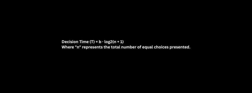
In customer experience terms, forcing a user to evaluate too many options simultaneously causes decision paralysis, spikes bounce rates, and lowers completions. UX design solves this by implementing progressive disclosure, revealing secondary information or complex input fields only when the user explicitly requests or requires them.
Fitts’s Law: Designing Target Elements for Speed
This law dictates that the time required to move to a targeted element is a direct function of the target’s physical size and its spatial distance from the user’s current cursor or thumb position.
For modern customer experiences, this means interactive call-to-action (CTA) buttons must be large enough to hit effortlessly without accidental miss-clicks (minimum 48×48 pixels according to global accessibility standards) and positioned within accessible reach zones on mobile layouts.
The Peak-End Rule: Shaping Long-Term Brand Memory
Human beings do not judge an entire digital experience as a uniform mathematical average. Instead, their lasting impression is intensely constructed from two distinct moments:
- The absolute emotional peak (the most intense positive or negative point of the interaction).
- The exact end of the journey.
UX design leverages this psychological reality by heavily optimizing critical milestone interactions, such as making the exact moment of payment execution feel remarkably smooth, celebratory, or reassuring.

Explore the UX design process behind the Maverick AI.
Minimizing Cognitive Load and System Friction
Cognitive load refers to the total volume of mental effort required by a user’s working memory to interact with your platform. When digital interfaces force users to overthink, decipher cryptic icons, or search for hidden navigation paths, their mental capacity is drained away from the actual purchase decision.
Reducing this friction requires a methodical layout strategy that clarifies information instantly:
Eliminate Superfluous Input Fields: Strip forms down to absolute operational necessities. Every additional field added to an entry form drops conversion rates by an average of 10%.
Deploy Real-Time Inline Input Validation: Never make users fill out a dense form, click submit, and then wait for an error page to reload. Provide instant visual confirmation directly next to the fields as they type.
Incorporate Clear Visual Progress Elements: When multi-step sequences are required (such as advanced checkouts or account onboarding), use step indicators to provide complete visibility into the overall length of the task.
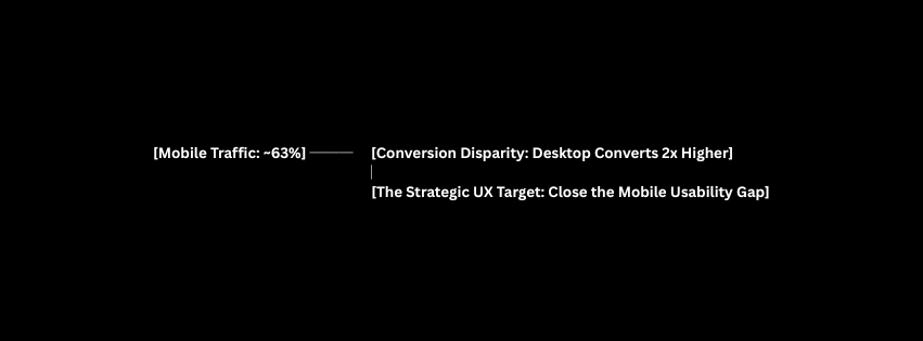
Building Mobile-First Experiences for Shifting Traffic
As of early 2026, global web metrics confirm that 62.5% to 63% of all global web traffic originates from mobile smart devices. Despite this dominant traffic share, historical desktop conversion rates traditionally double mobile performance. This performance gap is a direct consequence of poor mobile experience design.
To close this revenue gap and maximize engagement, systems must adopt strict mobile-first engineering choices:
Establish Safe, Reachable Interaction Zones
On modern large smartphone displays, the human thumb safely accesses only the lower two-thirds of the screen with comfort. Strategic mobile UX places critical navigation paths, checkout triggers, and form submits within this natural baseline target zone, moving non-essential informational links to the top.
Optimize Layout Performance to Match Attention Spans
Mobile users are frequently navigating on the go, making them highly sensitive to interface delays. Data from Google reveals that 53% of mobile users will entirely abandon a web property if a single mobile page load takes longer than 3 seconds.
Ensuring a high-converting customer experience means monitoring core Web Vitals strictly: keeping your Largest Contentful Paint (LCP) under 2.5 seconds and your Interaction to Next Paint (INP) below 200 milliseconds.
Universal Accessibility: Driving ROI Through Inclusion
Digital accessibility is no longer just a checkbox for corporate social responsibility, it is an absolute financial and legal imperative. Globally, over 1.3 billion individuals live with recognized forms of disability, commanding an estimated annual spending power exceeding $13 trillion.
When a digital interface fails basic accessibility requirements, it locks out up to 15% of its total potential market share while exposing the enterprise to escalating legal risks.
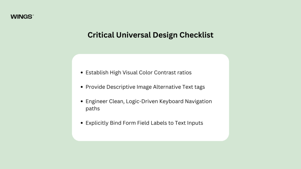
Critical Universal Design Checklist
01.Establish High Visual Color Contrast ratios:
Prerequisite for readability.
Ensure all body text meets a minimum contrast ratio of 4.5:1 against its background (3:1 for large text lines) to comply fully with Web Content Accessibility Guidelines (WCAG) AA standards. Low contrast causes direct visual fatigue for all users, particularly in outdoor or high-glare environments.
02.Provide Descriptive Image Alternative Text tags:
Essential for screen reader engines.
Expect very informative image asset must feature a clean, descriptive alt attribute. Avoid generic filenames like image_revised_v2.jpg or stuffing keywords. Instead, write clear contextual descriptions: alt=”Close-up of secure online checkout button with padlock graphic”.
03.Engineer Clean, Logic-Driven Keyboard Navigation paths:
Supports alternative input hardware.
Users must be able to navigate every single link, interactive button, drop-down menu, and form control using solely a keyboard interface (utilizing Tab, Shift+Tab, and Enter keys). Visible focus rings must highlight active elements immediately.
04.Explicitly Bind Form Field Labels to Text Inputs:
Eliminates input confusion.
Never replace formal form labels with temporary placeholder text inside the input box. Screen reader engines cannot parse unlinked input boxes reliably, and placeholders vanish once typing begins, causing immediate short-term memory drain.
Real-World Implementations of Strategic UX Transformations
To truly understand how user experience principles reshape customer loyalty and bottom-line outcomes, we can evaluate common digital touchpoints before and after applying expert UX adjustments.
The E-Commerce Checkout Optimization
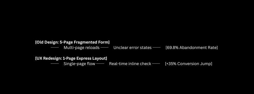
The Friction State: An international e-commerce site utilized an outdated five-page checkout sequence. Users had to repeatedly hit “Continue” to reload separate pages for account selection, shipping, billing details, and final payment overview. This structure offered no real-time inline input validation, forcing users to submit forms blindly. If an error occurred, the entire page reloaded with cleared data fields, driving a massive 69.8% cart abandonment rate.
The UX Intervention: The team re-engineered the process into an elegant, single-page express checkout layout driven by Hick’s Law. They grouped all form interactions into three clear, progressive steps and integrated auto-fill address capabilities using geolocation APIs. They added instant visual validation alongside a persistent visual summary cart module.
The Business Outcome: This structural transformation delivered a direct 35% net increase in checkout conversion rates using the exact same traffic volume, while cutting mobile cart drops in half.
The SaaS Platform Onboarding Overhaul
The Friction State: A business analytics SaaS platform immediately presented new trial sign-ups with an unconfigured, completely empty data dashboard. Users faced a steep learning curve with no initial data to view and no clear indication of their next step, leading to a major 40% user drop-off rate within the first 24 hours of account creation.
The UX Intervention: Designers replaced the blank dashboard with a tailored, progressive multi-step onboarding sequence. The system introduced sample data visuals to showcase immediate value while utilizing native micro-copy tips to guide users through linking their live accounts step-by-step.
The Business Outcome: Completing this interactive onboarding flow boosted 30-day user retention metrics by 58%, while simultaneously reducing inbound product setup support requests by 27%.
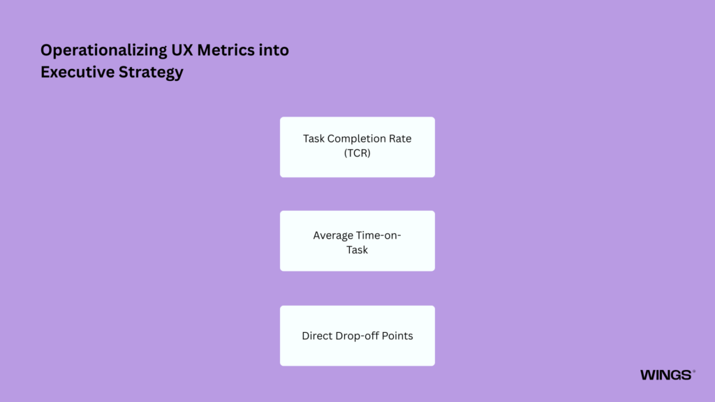
Operationalizing UX Metrics into Executive Strategy
To treat design as a core business driver, you must move away from subjective design opinions and anchor your strategy in real-world, measurable user metrics. Enterprise teams should regularly review these core product metrics to identify and fix layout friction:
Task Completion Rate (TCR)
This metric tracks the raw percentage of users who successfully complete a specific, intended interaction flow (e.g., finishing a registration flow or uploading a file). If your TCR drops below 80%, it indicates severe structural or informational roadblocks in the user journey.
Average Time-on-Task
This measures the exact duration of time a user requires to complete a core action. While longer times on educational or long-form media content show healthy engagement, an elevated time-on-task metric within tools, checkouts, or account setups points to immediate cognitive confusion.
Direct Drop-off Points
Utilize advanced visual click-tracking and funnel analytics to identify the exact interface fields where users consistently abandon your application. Isolating these high-friction pages highlights exactly where to run targeted user testing.

Explore the Design process behind the Quint.
Conclusion: Designing for Long-Term Value
User experience design is not a cosmetic layer applied at the end of a software development cycle; it is a foundational business methodology that influences how digital products are planned, developed, and improved. By designing platforms around established principles of human psychology, businesses can create experiences that feel natural, reduce confusion, and help users complete tasks efficiently. A well-designed UX considers user expectations, decision-making patterns, accessibility needs, and interaction habits to remove unnecessary complexity and create smooth digital journeys.
In a competitive digital environment, prioritizing clean UX has a direct impact on business success. Intuitive interfaces build customer confidence, improve engagement, increase conversions, and reduce frustration that can lead users to abandon a product. When brands respect users’ time and attention through thoughtful design, they create stronger relationships, encourage loyalty, and establish a foundation for long-term growth. UX is therefore not just about appearance, it is a strategic approach to creating meaningful, reliable, and valuable customer experiences.

Nandin
Design Lead