Why Design Is No Longer “Just Design”
If you’re an entrepreneur or business owner, you already know that attention is expensive, you invest heavily in ads, marketing, and funnels, yet often overlook the design layer that determines whether those efforts convert or leak. The reality is simple: design is not decoration, it’s a core part of your conversion infrastructure. Every color, font, and spacing choice either moves your customer closer to action or quietly pushes them away. High-performing brands don’t rely on guesswork; they use psychology, behavioral science, and data-driven design to shape perception and influence decisions. When done right, design builds trust, clarity, and authority within seconds. This is how color, typography, and layout turn your brand into a powerful, high-converting system built for growth and scale.
The Business Case for Design (Why You Should Care)
Before we dive into the elements, it is important to address the real question on your mind which is how this impacts revenue. Design is not just about how things look, it directly influences how users perceive and interact with your brand. A well structured design can improve trust, engagement, and overall user experience. This leads to higher conversion rates and better customer retention. Ultimately, better design decisions translate into stronger business performance and increased revenue.
First Impressions Drive Business Outcomes
Users form an opinion about your brand in milliseconds, often before they read a single word. This first impression is driven entirely by what they see and how it makes them feel. In that brief moment, your design sets the tone for trust, credibility, and relevance. A strong visual experience can instantly capture attention, while a poor one can push users away.
In that moment, they subconsciously evaluate:
- Is this trustworthy?
- Is this premium or cheap?
- Is this relevant to me?
- Should I stay or leave?
These judgments happen automatically and require no conscious effort from the user. They are not based on logic or detailed analysis, but on immediate perception. Your product features, no matter how strong, come later in the decision process. If the initial visual impression fails, users may never explore further. That is why design plays a critical role in shaping user behavior from the very first interaction.
Design Directly Impacts Conversion Metrics
Well executed design has a direct impact on how users interact with your brand and whether they choose to take action. It influences how easily users can navigate, understand, and engage with your content. A strong design experience keeps users interested, while a weak one can cause them to leave quickly. These effects are reflected in key performance metrics that determine business success.
Well executed design influences:
- Click through rates (CTR)
- Bounce rates
- Time on page
- Conversion rates
- Customer trust and retention
These outcomes are not random but are directly shaped by how your design communicates and guides users. Small improvements in design can lead to noticeable changes in user behavior and engagement. For example, enhancing visibility and clarity can encourage more clicks and deeper interaction. Even a simple change like improving button contrast can significantly increase conversions. Over time, these improvements compound to drive stronger and more consistent business results.
Design Builds Perceived Value
People do not buy products, they buy perceived value, and that perception is shaped long before they evaluate features or pricing. What users see and experience visually plays a major role in how they judge your brand. A strong and consistent design creates a sense of quality and professionalism, while a weak design can lower perceived value instantly. This is why visual presentation directly influences buying decisions.
And perception is heavily influenced by:
- Color consistency
- Typography sophistication
- Layout clarity
When these elements are executed well, they create a premium feel that builds confidence in your brand. Users begin to associate your visuals with quality and reliability without needing detailed proof.
If your brand looks premium, people assume:
- Your product is better
- Your service is reliable
- Your pricing is justified
These assumptions happen subconsciously and can significantly impact conversion decisions. A well designed brand reduces hesitation and builds trust faster. It positions your offering as valuable, even before users fully understand it.
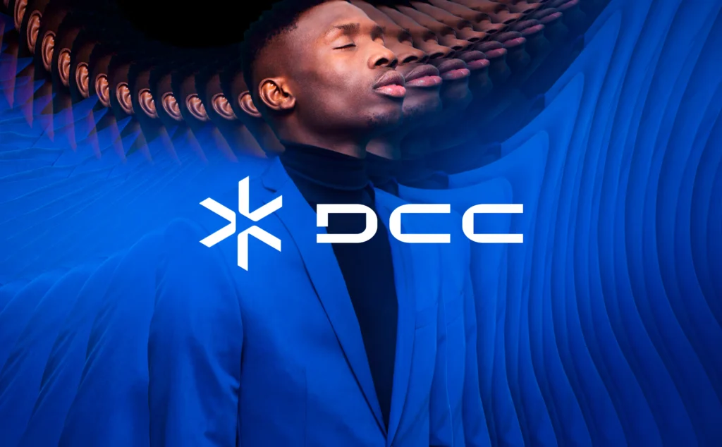
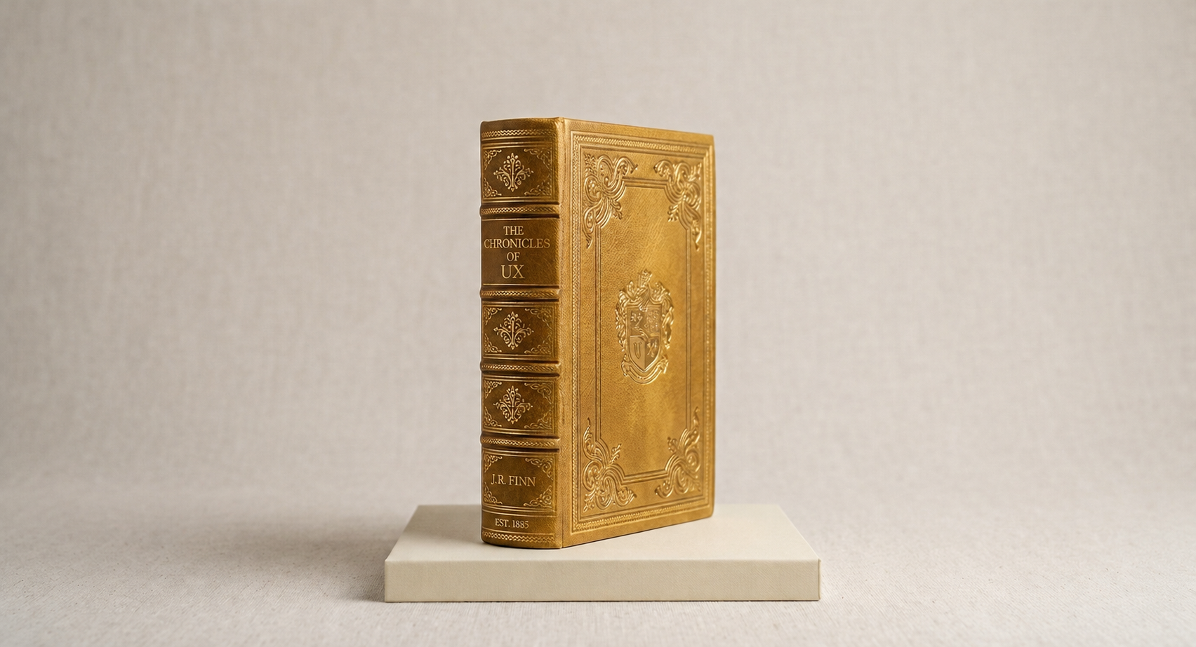
Explore the design system behind the DCC.
What is Color Psychology — Engineering Emotional Triggers
Color psychology is not about personal preference or what looks visually appealing, it is about influencing human behavior. Colors have the power to trigger emotions, shape perceptions, and guide decisions without users even realizing it. When used strategically, color becomes a tool that communicates your brand message instantly. It helps users feel something before they even read a single word. This is why high performing brands treat color as a business decision, not just a design choice.
How Color Impacts Decision Making
The human brain processes visuals much faster than text, which means color is often the first signal users respond to. It acts as a shortcut to emotion, helping users quickly decide how they feel about your brand. It also works as a signal for action, subtly guiding users toward what they should do next. Over time, color becomes a memory anchor, helping users recognize and remember your brand more easily. This is why consistent and intentional use of color can significantly influence user behavior.
Color acts as:
- A shortcut to emotion
- A signal for action
- A memory anchor
Because of this, the right color strategy can:
- Increase brand recall
- Improve engagement
- Drive faster decisions
When users instantly recognize your brand and feel confident about it, they are more likely to engage and convert.
Strategic Color Mapping for Business Goals
Different business goals require different emotional triggers, and color plays a key role in activating those emotions. Choosing the right color is not random, it should align with what you want your audience to feel and how you want them to act.
If you want to build trust, especially in industries like finance, SaaS, or consulting, using blues and cool tones can communicate stability and reliability. These colors create a sense of calm and professionalism, making users feel safe engaging with your brand.
If your goal is to create urgency, such as in e-commerce or sales campaigns, reds and oranges are highly effective. These colors grab attention quickly and encourage faster decision making, which is essential for driving immediate action.
For businesses focused on growth and wellness, such as health or sustainability brands, green is a natural choice. It signals balance, positivity, and renewal, helping users feel aligned with your message.
If you are aiming for premium positioning, especially in luxury or high ticket services, darker tones like black, gold, or deep neutrals create a sense of exclusivity. These colors elevate perceived value and make your brand feel more sophisticated and high end.
The Real Secret: Contrast Over Color
Most brands focus too much on choosing the “right” color and overlook what truly matters, which is contrast. It is not just about the color itself, but how it stands out in relation to other elements on the page. Without proper contrast, even the best color choices can fail to drive action.
A high converting design uses contrast to:
- Make CTAs stand out instantly
- Separate sections clearly
- Guide the eye effortlessly
For example, a bright “Get Started” button placed on a muted background will always perform better than a button that blends in. The goal is to make important elements impossible to miss. When users can instantly identify where to click, conversions naturally improve.
Actionable Strategy for Decision Makers
As a business leader, you do not need to choose colors yourself, but you must ensure they are used strategically. Start by asking whether your primary color truly reflects your brand positioning and the emotion you want to convey. Evaluate whether your call to action buttons visually dominate the page or get lost in the design. Check if there is enough contrast to ensure clarity and readability across all elements.
Ask yourself:
- Does our primary color reflect our brand positioning?
- Do our CTAs visually dominate the page?
- Is there enough contrast for clarity?
If the answer to any of these is no, you are likely losing conversions without even realizing it. Small adjustments in color and contrast can lead to significant improvements in performance, making this one of the most powerful yet overlooked areas in design.
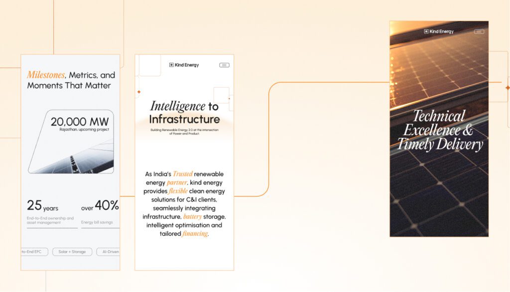
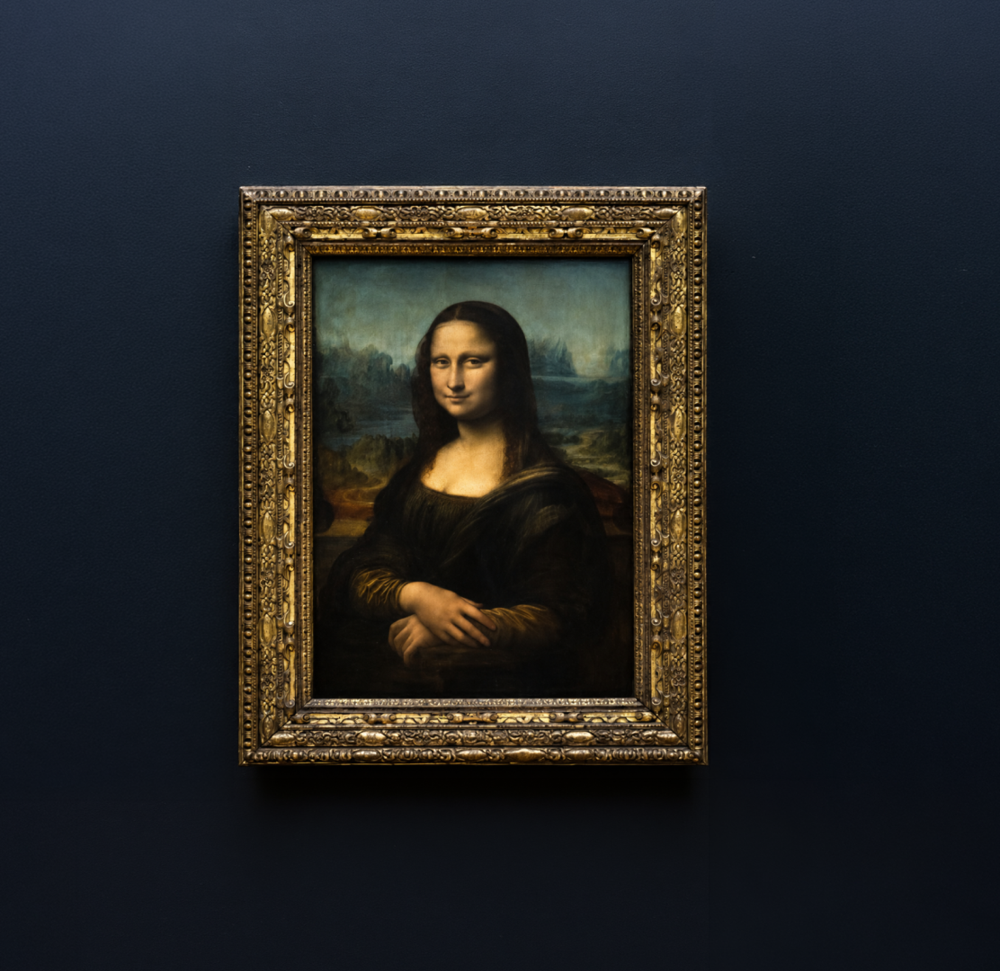
Explore the design system behind the Kind energy.
What is Typography — The Silent Salesperson
Typography is not just about making text readable, it is about shaping how your message is perceived and understood. It quietly influences user behavior by controlling clarity, tone, and emotional response. Good typography guides attention without being noticed, while poor typography creates friction and confusion. In many cases, typography decides whether a user stays engaged or leaves within seconds. This makes it one of the most powerful yet underestimated elements of design.
Fonts Create Instant Brand Perception
Before users read a single word, they already form an impression based on typography. Fonts carry personality and instantly communicate what kind of brand you are. Serif fonts often signal authority and tradition, making them suitable for established or formal brands. Sans serif fonts feel modern, clean, and minimal, which works well for digital and tech focused businesses. Decorative fonts are more expressive and creative, but they must be used carefully to avoid reducing clarity.
These subconscious associations shape how users judge your credibility within seconds of landing on your page.
Typography and Cognitive Load
If your content is difficult to read, users will not make the effort to understand it, they will simply leave. High performing typography reduces cognitive load by making information easy to process at a glance. It minimizes eye strain and lowers mental effort, allowing users to focus on the message instead of struggling with readability. When typography is clear and well structured, it naturally increases engagement and comprehension. It also removes friction, making users more likely to continue reading and take action.
At its core, good typography simplifies thinking for the user.
The Power of Hierarchy
Users do not read content in a linear way, they scan it visually. This means typography must act as a guide that directs their attention in the right order. A strong hierarchy starts with a clear headline that grabs attention immediately. It is followed by a subheading that provides context and encourages further reading. The body text delivers detailed information, while the CTA stands out as the final action point.
Without proper hierarchy, users feel overwhelmed and confused, which directly reduces conversions.
Font Pairing Strategy for Businesses
Effective typography is simple and intentional, not random or overly decorative. Most successful brands limit themselves to one font for headings and one font for body text to maintain clarity and consistency. In some cases, an additional accent font can be used, but only sparingly and with purpose. Overusing multiple fonts creates visual noise and weakens brand identity.
Consistency in typography builds trust, while inconsistency creates doubt and reduces perceived professionalism.
Advanced Insight: Typography and Pricing Power
Typography directly influences how valuable your brand appears to users. Premium brands often use larger font sizes, generous spacing, and minimal clutter to create a sense of openness and confidence. This visual breathing space communicates authority, clarity, and high value. Users naturally associate clean and well structured typography with higher quality and better service.
On the other hand, cramped or poorly designed typography can make even great products feel cheap. This leads to price resistance, where users hesitate to pay more because the brand does not visually justify its value. Strong typography removes this friction and strengthens perceived worth.
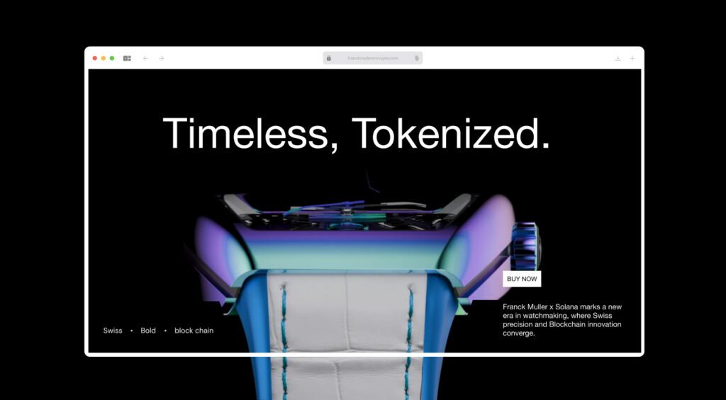
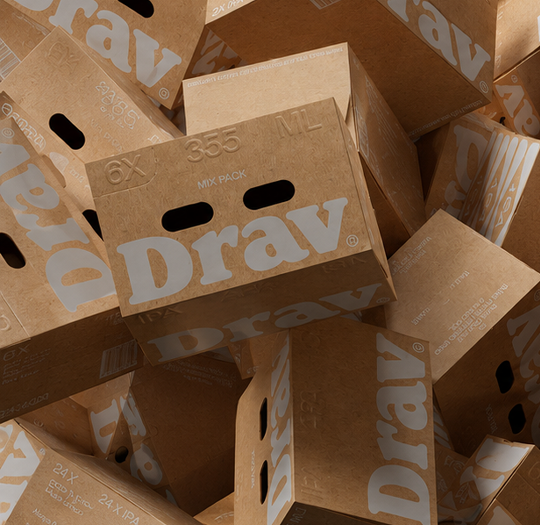
Explore the design system behind the Franckmuller .
What is Layout & Visual Hierarchy — Designing the User Journey
If color attracts attention and typography communicates the message, layout is what ultimately drives users to take action. It organizes all elements into a structured flow that guides user behavior step by step. A well planned layout ensures users instantly understand where to look and what to do next. It reduces confusion by presenting information in a logical sequence. This transforms attention and understanding into meaningful conversions.
Layout Is Behavioral Design
Layout is not just visual arrangement, it is behavioral design that influences how users think and act on a page. A strong layout anticipates user intent and removes unnecessary effort from decision making.
A good layout answers:
- Where should the user look first?
- What should they do next?
- How can we reduce friction?
When these questions are addressed correctly, the user journey becomes intuitive and seamless, leading to higher engagement and better conversion outcomes.
The Science of Scanning Patterns
Users do not read web pages word by word, they scan them in predictable visual patterns. Understanding these patterns allows designers to place content where it will naturally be seen.
The most common scanning patterns include the F pattern, typically seen on content heavy pages where users scan horizontally and then vertically. Another is the Z pattern, often used on landing pages where users move diagonally across key elements.
When your layout aligns with these natural behaviors instead of fighting them, users process information faster and take action more easily.
The Role of Whitespace
Whitespace is often misunderstood as empty or wasted space, but in reality, it is one of the most powerful design tools. It creates focus by separating important elements and reducing visual noise. It gives content room to breathe, making it easier to read and process.
Whitespace also enhances perceived value by making designs feel more premium and intentional. When used correctly, it directs attention to what matters most and improves overall clarity.
Visual Hierarchy Principles
Visual hierarchy determines the order in which users process information on a page. It ensures that the most important elements stand out while supporting details remain secondary.
To guide users effectively:
- Use size to indicate importance
- Use color for emphasis
- Use spacing to group elements
- Use alignment for structure
When these principles are applied consistently, users can naturally navigate the content without confusion or effort.
Conversion Focused Layout Techniques
A high performing layout is designed with conversion as the primary goal, not just aesthetics. It ensures that users understand the value proposition immediately and are guided toward action without hesitation.
For business growth, ensure:
- Clear above the fold messaging
- Visible CTA within seconds
- Logical content flow
- Minimal distractions
These elements work together to reduce friction and increase the likelihood of user action at every stage.
The Cost of Poor Layout
A weak layout can undermine even the strongest product or offer. When information is poorly structured, users feel confused and frustrated. This leads to drop offs, reduced engagement, and lost conversions.
Even if your product is excellent, poor layout can prevent users from ever understanding its value. This is why layout is not just design, it is a critical business driver that directly impacts performance and revenue.
The High-Converting Brand System (Putting It All Together)
The real power comes when color, typography, and layout work together as a unified system. When these elements are aligned, they create a seamless and consistent brand experience. This makes your design more effective in building trust and guiding user actions.
Alignment Creates Trust
When all elements are consistent, users feel more comfortable as they navigate your brand experience. This consistency creates a sense of familiarity and reduces confusion. As a result, decisions feel easier because users do not have to think too much about what to do next. A clear and predictable experience builds confidence in your brand. Over time, this comfort and clarity lead to increased trust and higher engagement.
Clarity Drives Action
Confused users do not convert because uncertainty creates hesitation and friction in the decision making process. Your design should remove friction by making interactions simple and intuitive. It should answer user questions visually so they can quickly understand what is being offered. Clear design helps users move forward without needing extra effort or clarification. When decisions are guided seamlessly, users are more likely to take action.
Emotional + Logical Balance
Great design works by combining emotion, clarity, and direction into one cohesive experience. It appeals emotionally through color, communicates clearly through typography, and directs user behavior through layout. Each element plays a specific role in influencing how users perceive and interact with your brand. When these elements work together, they create a smooth and engaging journey for the user. That combination is what ultimately drives higher conversions.
What Entrepreneurs & Decision-Makers Should Focus On
If you are leading a business, you do not need to micromanage every design decision, but you must guide it with clear strategy and intent. Your role is to ensure that design supports business goals rather than just looking visually appealing. This means focusing on clarity, user experience, and conversion impact. By setting the right direction, you empower your team to make better design choices. Strategic guidance ensures consistency, efficiency, and stronger results over time.
Ask Better Design Questions
Instead of asking “Does this look good?”, shift your focus to questions that measure effectiveness and impact.
Ask whether the design drives action and encourages users to take the next step. Consider if the message is clear within the first few seconds, as users make quick decisions about whether to stay or leave. Evaluate whether it is obvious what the user is supposed to do without confusion or hesitation. These questions help ensure your design is not just visually appealing, but purposeful and conversion focused.
Invest in Systems, Not One-Off Designs
Avoid relying on random freelancers who may not follow a consistent brand direction, as this can lead to a fragmented and unprofessional look. One time design fixes may solve short term problems but do not create lasting impact or scalability.
Instead, focus on building a strong design system that ensures consistency across all platforms and touchpoints. Establish clear brand guidelines so every design element aligns with your identity and messaging. Prioritizing scalable consistency helps your brand grow efficiently while maintaining trust and recognition.
Align Design With Business Goals
Your design should reflect your target audience, ensuring it speaks directly to their expectations and preferences. It should align with your price positioning, whether you are presenting a premium, mid range, or budget offering. Your visual style must also match your market category so users instantly understand where you fit. When these elements are aligned, your brand feels clear and trustworthy. Any mismatch between design and positioning can quickly create confusion and lead to lost trust.

Common Mistakes That Kill Conversions
Even strong businesses make these errors because design decisions are often overlooked or treated as secondary. As businesses grow, small inconsistencies and overlooked details start to impact user experience. What seems like a minor issue can create confusion and reduce clarity for users. Over time, these mistakes quietly affect engagement and conversion rates. Recognizing and fixing them is essential to maintain a strong and effective brand presence.
Too Many Colors
Using too many colors can overwhelm users and create a confusing visual experience. Instead of guiding attention, it scatters focus across the page. This weakens your brand identity and makes it harder for users to remember you. A cluttered color palette also reduces the impact of important elements like call to action buttons. Keeping your colors simple and consistent helps create clarity, recognition, and stronger engagement.
Poor Contrast
Poor contrast makes your content difficult to read and key elements easy to miss. When text blends into the background, users have to put in extra effort to understand your message. This increases frustration and leads to quicker drop offs. Low contrast also hides important actions like buttons or links, reducing conversions. Strong contrast improves readability, highlights priorities, and guides users toward action.
Overdesigned Layouts
An overdesigned layout often includes too many elements competing for attention at once. This creates visual clutter and makes it harder for users to focus on what truly matters. Instead of enhancing the experience, excessive design can confuse and overwhelm visitors. Users may struggle to find information or take the next step. A clean and simple layout improves clarity, usability, and overall conversion performance.
Inconsistent Typography
Inconsistent typography makes your brand appear unprofessional and untrustworthy. When fonts, sizes, and styles change randomly, it disrupts the reading experience. This lack of consistency creates confusion and reduces visual harmony. Users may find it harder to follow content or understand the hierarchy of information. Maintaining consistent typography builds trust, improves readability, and strengthens your brand image.
Hidden CTAs
Hidden call to action buttons make it difficult for users to know what to do next. If users have to search for the next step, they are more likely to leave without taking action. Poor placement or lack of visibility reduces engagement and conversions. A clear and prominent CTA guides users smoothly through the journey. Making actions obvious and easy to find significantly increases the chances of conversion.
The Competitive Advantage Most Businesses Ignore
Most businesses compete on price, constantly lowering margins to attract customers, often leading to a race to the bottom. They compete on features, adding more and more functionalities in an attempt to stand out, even when those features don’t truly matter to the customer. They also compete on marketing spend, pouring money into ads and campaigns just to capture attention in an increasingly crowded space. While these strategies can drive short term results, they are easy to replicate and difficult to sustain, making it harder to build a lasting competitive advantage.
Most businesses compete on:
- Price
- Features
- Marketing spend
Few businesses choose to compete on experience design, even though it has the power to create a lasting and meaningful impact. That is where your real opportunity lies. When your brand focuses on how it looks, how it feels, and how easily users can interact with it, you move beyond basic competition and start building a stronger connection with your audience.
When your brand:
- Looks better
- Feels clearer
- Converts faster
You win without necessarily spending more, because a well designed experience does more with what you already have. Instead of relying on bigger budgets, your brand becomes more effective at capturing attention, building trust, and converting users through clarity and simplicity.
Conclusion: Design Is a Growth Lever, Not a Cost
Your design either drives growth or holds you back. It shapes perception, trust, and action. Strong design builds momentum. Weak design silently limits you.
- Color shapes emotion.
- Typography delivers clarity.
- Layout drives behavior.
Together, these elements decide whether your audience trusts, engages with, and ultimately buys from you. As an entrepreneur or decision maker, your role isn’t to choose colors or fonts, but to ensure your brand is built on intentional, conversion driven design. In a world where attention is scarce, clarity and trust become your biggest advantages. The brands that truly win are not just seen, they are understood and remembered. And in the end, they are the ones people choose.

Nandin
Design Lead