In hyper-connected world, attention is fleeting. Consumers scroll, swipe, and skim through content at an unprecedented pace, making snap judgments in mere seconds. For brands, this means one thing: you don’t have the luxury of time. You have about three seconds to make an impression that sticks.
This is where the concept of the 3-second brand experience comes into play, an approach focused on delivering immediate value, emotional connection, and clarity across every customer touchpoint. It’s not just about grabbing attention; it’s about creating instant delight that compels users to stay, engage, and ultimately convert.

Explore the Branding behind the BLYP.
Why the First Three Seconds Matter More Than Ever
Defining Instant Delight
Instant delight is the immediate emotional response a user experiences the very first time they interact with your brand. It’s that subtle but powerful moment when something just clicks, when the experience feels intuitive, engaging, and worth continuing.
It doesn’t announce itself loudly. Instead, it shows up as a quiet sense of ease, a spark of curiosity, or a feeling of “this is exactly what I was looking for.” That emotional signal is what encourages users to stay, explore, and ultimately trust what you offer.
Crucially, instant delight is often misunderstood.
It’s not about overwhelming users with flashy animations, aggressive pop-ups, or overdesigned visuals. In fact, those tactics can do the opposite, creating friction, confusion, or even skepticism. Delight isn’t created through excess; it’s created through precision.
At its core, instant delight is about removing effort.
It’s the result of an experience that feels seamless, where users don’t have to think too hard, search too long, or second-guess what to do next. Everything works the way they expect or better.
Brands that consistently create this kind of experience tend to share three defining characteristics:
-
They are clear in their communication
There’s no ambiguity in what they offer or why it matters. Their messaging is sharp, focused, and immediately understandable. Users don’t have to interpret, they instantly “get it.”
-
They are fast in their delivery
Speed isn’t just a technical metric; it’s a perception. Fast-loading pages, responsive interactions, and quick access to information all contribute to a sense of competence and reliability. Slowness, on the other hand, breaks momentum and trust.
-
They are human in their tone
The experience feels personal, not mechanical. Whether through microcopy, visuals, or overall voice, there’s a sense that real people are behind the brand. This human touch builds connection and lowers resistance.
When these elements come together, the result is powerful but almost invisible. Users don’t stop to analyze why they like the experience, they just continue using it.
And that’s the point.
Instant delight doesn’t demand attention. It earns it quietly, in the very first moments that matter most.
Mapping the 3-Second Experience Across Touchpoints
Every interaction a user has with your brand contributes to their overall perception. From the moment they see an ad to the experience of unboxing a product, each touchpoint must be optimized for those critical first seconds.
Below is a breakdown of key touchpoints and how brands can create instant delight in each:
| Touchpoint | What Users Notice in 3 Seconds | Common Mistakes | How to Create Instant Delight |
| Website Homepage | Visual design, headline clarity, loading speed | Cluttered layout, vague messaging | Use clean UI, bold value proposition, fast loading |
| Mobile Experience | Navigation ease, responsiveness | Tiny text, slow performance | Design mobile-first, simplify navigation |
| Social Media Content | Visual appeal, relatability | Generic posts, lack of identity | Use striking visuals, authentic voice |
| Digital Ads | Relevance, clarity of offer | Clickbait, unclear messaging | Be direct, match audience intent |
| Product Packaging | Aesthetics, tactile feel | Overcomplicated design | Focus on minimalism and sensory experience |
| Email Marketing | Subject line, preview text | Spammy tone, lack of personalization | Write compelling, personalized hooks |
| Customer Support | Response speed, tone | Delayed replies, robotic responses | Provide fast, empathetic communication |
| Checkout Experience | Simplicity, trust signals | Too many steps, hidden costs | Streamline process, show transparency |
This table highlights a critical truth: instant delight must be consistent across all channels. A great website cannot compensate for poor customer service, and beautiful packaging cannot fix a confusing checkout process.
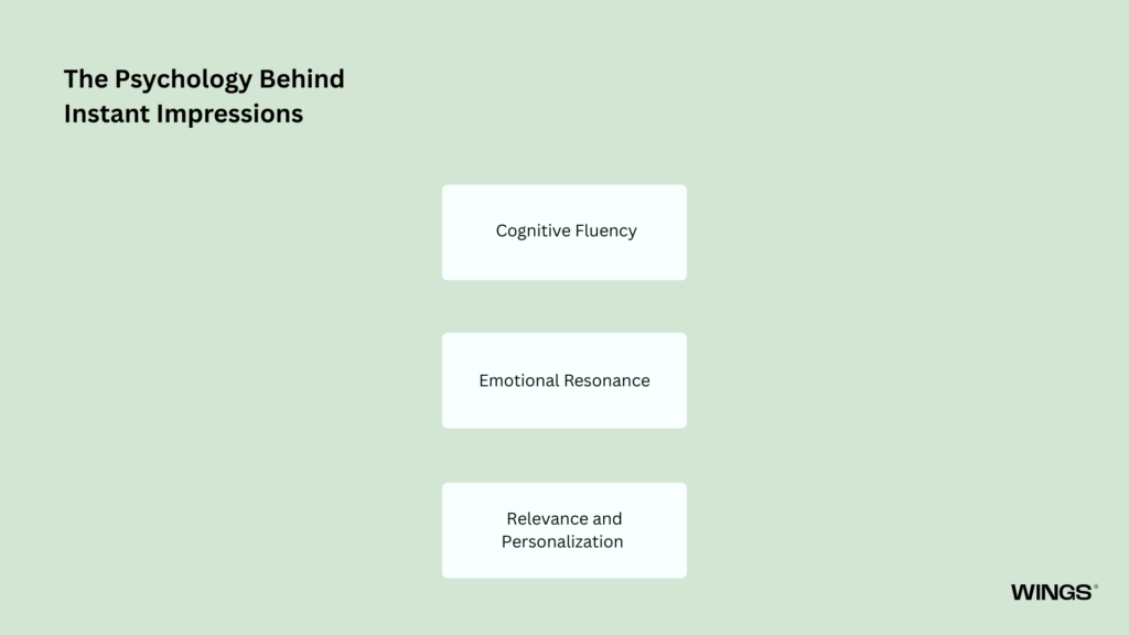
The Psychology Behind Instant Impressions
Designing effective 3-second experiences isn’t just about aesthetics or speed, it’s about aligning with how the human mind naturally works. Users don’t carefully analyze what they see in those first moments; they feel their way through it. And those feelings are shaped by a few powerful psychological principles.
Understanding these principles allows you to design experiences that feel right immediately, without requiring conscious effort from the user.
Cognitive Fluency
At its core, cognitive fluency is about ease.
People are naturally drawn to things that are simple to process. When a layout is clean, text is readable, and navigation feels intuitive, the brain doesn’t have to work hard to make sense of it. That ease creates a subtle but important signal: this is safe, this is good, this is trustworthy.
On the other hand, when users encounter clutter, confusing structure, or unclear messaging, their mental effort increases. That friction doesn’t just slow them down, it creates doubt. And in a fast-moving digital environment, even a moment of hesitation can lead to abandonment.
In short, when users don’t have to “figure you out,” they’re far more likely to trust you.
Emotional Resonance
While we often like to think of ourselves as rational decision-makers, the reality is that emotion leads and logic follows.
In those first few seconds, users aren’t weighing pros and cons. They’re reacting. A visually pleasing interface, a headline that feels relatable, or even a small, thoughtful microinteraction can trigger a positive emotional response almost instantly.
That response doesn’t need to be dramatic. It can be as simple as a sense of calm, curiosity, or quiet satisfaction. But it matters.
Because once a user feels something positive, they become more open to engaging further. Without that emotional connection, even the most well-reasoned message can fall flat.
Early impressions are emotional shortcuts and they often carry more weight than detailed information presented later.
Relevance and Personalization
Attention follows relevance.
Users are constantly scanning for signals that something is meant for them. This doesn’t require explicit personalization or complex algorithms, often, subtle cues are enough. The choice of words, the imagery used, the context you establish, all of these can communicate, “This fits your needs.”
When users recognize themselves in what they see, their mindset shifts from passive scanning to active interest. The question changes from “What is this?” to “How can this help me?”
Without that sense of relevance, even a well-designed experience can feel distant or generic. With it, engagement becomes almost automatic.
When these three principles, ease, emotion, and relevance, work together, they create experiences that feel instantly compelling.
Users don’t pause to analyze why they want to stay. They simply do.
And in a world where attention is fragile and fleeting, that instinctive decision makes all the difference.
Designing for the First Three Seconds
Creating an impactful 3-second experience requires intentional design and strategic thinking. Here are key principles to guide your approach:
Prioritize Clarity Over Creativity
While creativity plays an important role in capturing attention, it should never come at the cost of clarity. Users need to instantly understand what your brand offers and why it matters to them, without having to pause or interpret your message. When communication is straightforward and easy to grasp, it builds confidence and keeps users engaged. In contrast, a clever but ambiguous headline may intrigue momentarily but often creates confusion, causing users to lose interest. In most cases, a clear and direct headline will outperform one that prioritizes wit over understanding, because clarity makes the value immediately accessible.
Optimize for Speed
Performance plays a crucial role in shaping user experience, as slow-loading pages or laggy interfaces quickly lead to frustration and higher bounce rates. Users expect interactions to be smooth and responsive, and even small delays can break their flow and reduce engagement. Speed, therefore, is not just a technical benchmark but a reflection of your brand itself. Fast experiences signal efficiency, reliability, and professionalism, while slower ones can create doubt and diminish trust before users even engage with your content.
Use Visual Hierarchy
Guide users’ attention by structuring content in a way that naturally leads the eye to what matters most. Thoughtful use of contrast, size, and spacing helps prioritize key elements, making it clear where users should focus first without requiring conscious effort. When content is organized effectively, users can quickly scan and understand the message without feeling overwhelmed. A strong visual hierarchy reduces cognitive load and ensures that the most important information is absorbed instantly, allowing users to engage with confidence and clarity.
Leverage Microinteractions
Small details, such as button animations, hover effects, and loading indicators, can significantly elevate the overall experience. These subtle elements provide immediate feedback, showing users that their actions are recognized and processed. When thoughtfully designed, they make interfaces feel responsive, intuitive, and alive, adding a sense of polish that enhances both usability and engagement.
Maintain Consistency
Consistency across touchpoints plays a key role in building familiarity and trust, as users come to recognize and rely on a unified experience. When elements like colors, typography, tone of voice, and messaging align across platforms, the brand feels cohesive and dependable. This consistency reduces the need for users to reorient themselves, making interactions smoother and more intuitive. In contrast, a fragmented experience introduces confusion, disrupts flow, and ultimately weakens the overall brand identity.
Real-World Examples of Instant Delight
Some of the world’s most successful brands excel precisely because they understand how to win those first few seconds. Their experiences feel effortless, relevant, and immediately rewarding.
Take Netflix, for example. The moment users open the app, they’re presented with personalized recommendations tailored to their viewing habits. There’s no need to search or think, content that feels relevant is already waiting, creating an instant sense of connection and ease.
Similarly, platforms like Amazon focus heavily on speed and personalization. Pages load quickly, product suggestions feel tailored, and key information is easy to access. This reduces friction and helps users move from browsing to decision-making almost instantly.
On the physical side, brands like Apple demonstrate instant delight through product design and packaging. The unboxing experience is intentionally crafted to feel smooth, minimal, and satisfying, reinforcing a sense of quality and care before the product is even used.
In each of these cases, the principle is the same: remove friction, anticipate user needs, and deliver value immediately. The result is an experience that feels intuitive from the very first moment and one that users are naturally drawn to continue.
Measuring the 3-Second Experience
Creating a strong first impression isn’t just about design, it’s about understanding how that experience performs in real-world conditions. To improve effectively, you need to measure how users actually behave in those critical first moments.
Several key metrics can help you evaluate your first-impression performance. Bounce rate reveals how many users leave almost immediately, often signaling that the initial experience failed to capture interest or communicate value. Time to first interaction shows how quickly users take action, indicating whether your interface feels intuitive and engaging. Click-through rate (CTR) reflects how compelling your content and calls to action are, while conversion rate measures how effectively those first seconds translate into meaningful outcomes. User session duration provides additional context, showing whether users stay long enough to explore beyond their initial impression.
However, numbers alone don’t tell the full story.
User testing plays an equally important role in understanding the 3-second experience. Observing real users as they interact with your brand, especially without guidance, can uncover friction points, confusion, or missed expectations that analytics might overlook. You can see where they hesitate, what they ignore, and what captures their attention instantly.
Often, the most valuable insights come from these raw, unfiltered moments.
By combining quantitative data with real user behavior, you gain a clearer picture of what’s working, what’s not, and where the experience can be refined. Because when it comes to those first three seconds, even small improvements can lead to meaningful gains in engagement, trust, and conversion. 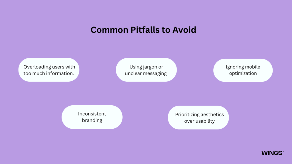
Common Pitfalls to Avoid
Even well-established brands can fail in the first three seconds if the experience isn’t intentionally designed around user needs. In those critical moments, even minor friction can lead to disengagement, making it essential to recognize and address the most common mistakes.
Overloading users with too much information.
When users are presented with excessive text, visuals, or options all at once, it becomes difficult to quickly identify what matters. Instead of guiding attention, the experience creates noise, forcing users to sort through content on their own, which most won’t do.
Using jargon or unclear messaging
Introduces another layer of friction. While industry-specific language or clever phrasing might seem appealing, it often slows down understanding. In the first few seconds, users aren’t looking to interpret, they’re looking to instantly grasp what you offer and why it’s relevant to them.
Ignoring mobile optimization
Critical mistake. With a significant portion of users accessing content on mobile devices, any experience that isn’t responsive, fast, and easy to navigate risks losing attention immediately. Small usability issues on mobile can feel magnified, breaking the experience before it even begins.
Inconsistent branding
Across channels can further weaken the first impression. When users encounter different tones, visuals, or messaging across platforms, it creates a sense of disconnect. This lack of cohesion can reduce trust and make the brand feel less reliable or professional.
Prioritizing aesthetics over usability
While visual appeal can attract attention, it should never come at the expense of clarity or functionality. An interface that looks impressive but is difficult to use quickly leads to frustration, undermining the overall experience.
Avoiding these pitfalls requires discipline and a strong user-first mindset. It means making intentional decisions that prioritize clarity, ease, and consistency over complexity or novelty. When brands focus on reducing friction rather than adding flair, they create experiences that resonate instantly and keep users engaged beyond those crucial first three seconds.
The Future of Brand Experience
As technology continues to evolve, so do user expectations. The demand for instant gratification is no longer a trend, it’s becoming the standard. With advancements in AI, deeper personalization, and more immersive digital experiences, users will expect interactions that are not only fast, but նաև highly relevant from the very first moment.
This shift means that brands can no longer rely on traditional engagement strategies that unfold over time. Instead, experiences must deliver value immediately, anticipating user needs before they are even explicitly expressed. Personalization will become more precise, interfaces more adaptive, and interactions more seamless, reducing the gap between intent and outcome.
In this environment, the first three seconds will carry even greater weight. Users won’t just expect clarity and speed, they will expect experiences that feel tailored, intuitive, and emotionally aligned with their goals. Anything less will feel outdated.
Brands that invest in optimizing these initial moments today are setting themselves up for long-term success. By focusing on clarity, responsiveness, and relevance now, they build a foundation that can scale with future technologies and rising expectations.
Ultimately, the focus will shift from simply capturing attention to earning it, instantly, effortlessly, and meaningfully. In a world where users have endless choices, the brands that succeed will be the ones that prove their value before the user even has to ask.

Explore the Branding behind the Crypto & Beans.
Conclusion
The 3-second brand experience is not just a passing trend, it reflects how people engage with the world today. In an environment driven by speed, choice, and constant distraction, the ability to create instant delight has become a true competitive advantage.
Brands that succeed are those that prioritize clarity, speed, emotional connection, and consistency across every touchpoint. These elements work together to transform brief interactions into meaningful impressions that stay with the user.
Because in the end, those first three seconds are more than just an introduction, they’re a defining moment. A moment to connect, to resonate, and to stand out in an increasingly crowded digital landscape.
When done right, those few seconds don’t just capture attention, they lay the foundation for trust, engagement, and a lasting relationship between the brand and its audience.

Akshita Shivani Sundar
Senior Graphic Designer