

Why Color Matters in Logo Design?
When people see a brand for the first time, they often form an impression within seconds. Before reading the company name or understanding what the business offers, they notice the visual elements of the brand. Among these elements, color plays a powerful role in logo design.
A well-designed logo is more than just a symbol or attractive graphic. It represents a company’s personality, values, and identity. The right colors can make a logo feel trustworthy, energetic, professional, creative, luxurious, or friendly. On the other hand, the wrong color choices can create confusion or communicate a message that does not match the brand.
Color also helps businesses stand out in competitive markets. Think about how easily you can recognize certain brands simply from their familiar colors. Consistent use of color across a logo, website, packaging, social media, and marketing materials can make a brand more recognizable and memorable.
This is why choosing colors should be an important part of the logo design process, rather than something added at the very end.

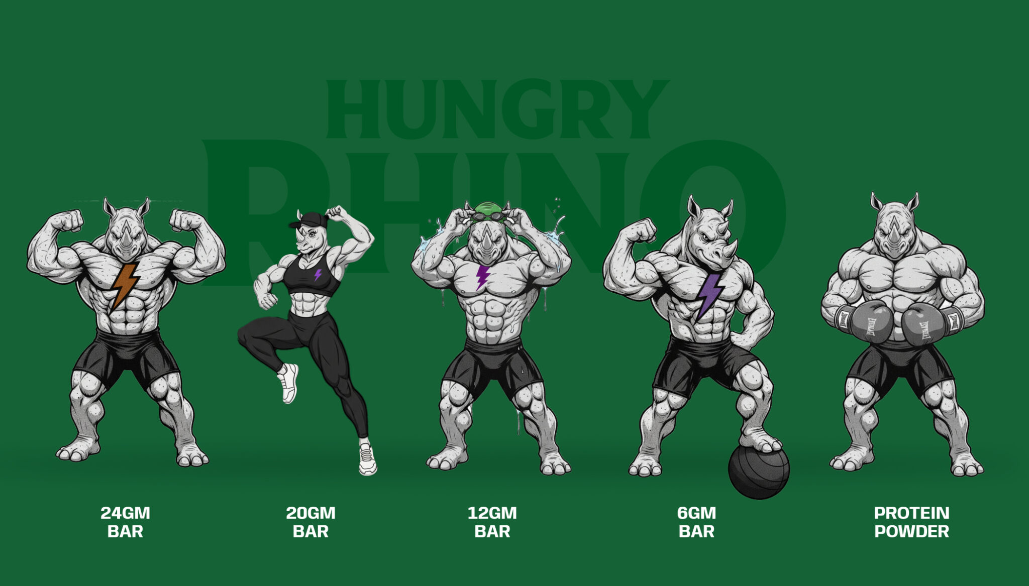
Explore the Logo Design behind the Krishna Group.
What Is Color Psychology in Logo Design?
Color psychology refers to the way different colors can influence people’s emotions, perceptions, and responses. In logo design, understanding color psychology helps designers select colors that support a brand’s message.
Different colors can create different emotional associations. For example, blue is commonly associated with trust and professionalism, while green can suggest nature, health, or growth. Red may communicate energy, passion, or excitement, whereas purple can be associated with creativity and luxury.
However, color meanings are not universal. Culture, industry, personal experiences, and context can all influence how a particular color is perceived. A color that works well for a technology company may not have the same effect for a children’s brand or a luxury business.
Therefore, professional logo design should consider more than simply choosing a favorite color. Designers need to understand the brand, its target audience, industry, competitors, and the emotions the business wants to create.
The goal is to create a visual connection between the brand and its audience.

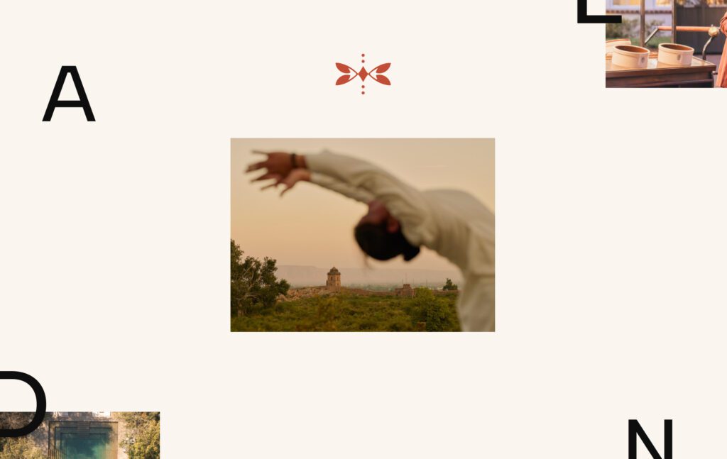
Explore the Branding behind the Crypto bean.
How Colors Influence Customer Emotions
Color can influence how customers feel about a brand before they interact with it. A strong color choice can make a logo appear more appealing and help communicate the brand’s personality instantly.
For example, a fitness brand may use energetic colors to communicate movement and motivation, while a financial company may choose colors that create feelings of trust and stability. A creative agency might use bold or unusual color combinations to demonstrate originality.
The key is consistency. When the colors in a logo design match the brand’s personality and are used consistently across different platforms, customers can begin to associate those colors with the business.
Ultimately, color does not work alone. Typography, shapes, spacing, imagery, and other visual elements also contribute to a logo’s overall impression. But when used strategically, color can make a logo design more meaningful, memorable, and effective.

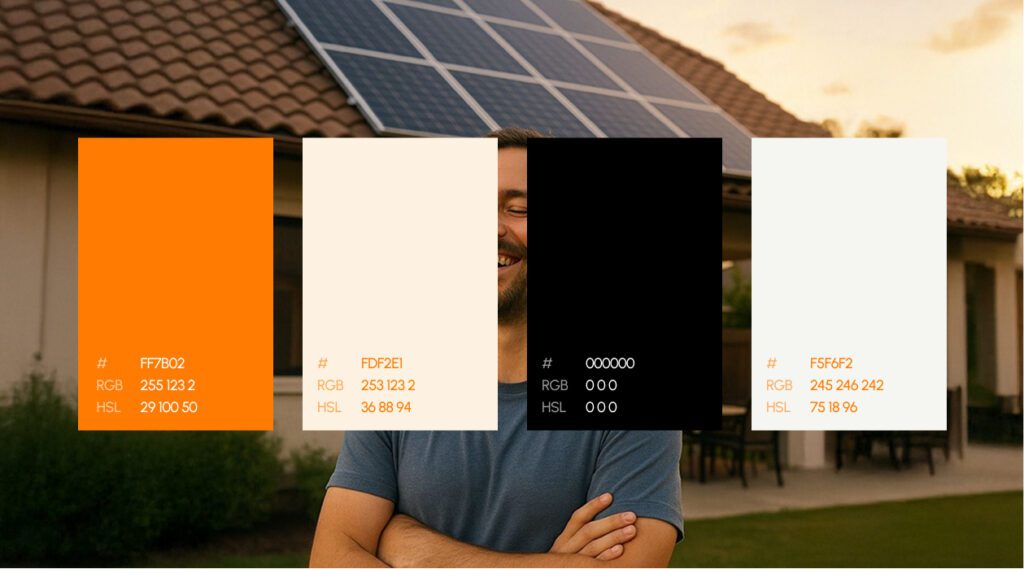
Explore the Branding behind the Shivam.
What Different Colors Mean in Logo Design
Choosing the right color is one of the most important decisions in logo design. Colors can communicate a brand’s personality and influence how customers perceive a business. While color meanings can vary depending on culture and context, certain associations are commonly used in branding.
Understanding these associations can help businesses choose colors that support their message rather than working against it.
Red: Energy and Passion
Red is a bold and attention-grabbing color. It is often associated with energy, passion, excitement, confidence, and urgency. Businesses that want their logo design to feel powerful and energetic may consider red.
It can work particularly well for entertainment, sports, food, and lifestyle brands. However, because red is visually strong, using too much of it can make a logo feel aggressive or overwhelming.
Blue: Trust and Professionalism
Blue is one of the most commonly used colors in branding because it can communicate trust, reliability, security, and professionalism. It is frequently seen in technology, finance, healthcare, and corporate logo design.
Different shades of blue can create different impressions. Dark blue can feel established and professional, while lighter blue can appear friendly, modern, and approachable.
Yellow: Optimism and Creativity
Yellow is bright, cheerful, and energetic. It is commonly associated with happiness, optimism, warmth, and creativity. A yellow logo design can help a brand appear approachable and positive.
Because yellow is highly visible, it can work well as an accent color. However, designers need to consider contrast carefully to ensure the logo remains readable across different backgrounds.
Green: Nature and Growth
Green is strongly connected with nature, health, freshness, sustainability, and growth. It is a popular choice for environmental organizations, organic products, wellness companies, and businesses associated with natural products.
A green logo design can communicate a sense of balance and freshness. Darker greens may suggest stability and tradition, while lighter greens can feel youthful and energetic.
Orange: Creativity and Friendliness
Orange combines the energy of red with some of the warmth of yellow. It can communicate enthusiasm, friendliness, creativity, and confidence.
Brands that want to appear approachable and energetic may use orange in their logo design. It can be particularly effective when a company wants to avoid appearing overly formal or corporate.
Purple: Creativity and Luxury
Purple has traditionally been associated with creativity, imagination, sophistication, and luxury. It can be a strong choice for beauty, creative, entertainment, and premium brands.
A carefully designed purple logo design can create a distinctive and elegant appearance. Darker purple can feel luxurious, while lighter shades can appear softer and more creative.
Black: Sophistication and Authority
Black is a versatile color that can communicate sophistication, power, elegance, and authority. It is widely used in modern and minimalist logo design.
One major advantage of black is its versatility. A black logo can work across many industries and can often be paired with other colors to create a strong visual identity.
White: Simplicity and Cleanliness
White is commonly associated with simplicity, cleanliness, openness, and minimalism. Although white is often used as a background rather than the main logo color, it can be an important part of a logo design.
White space also helps other colors and design elements stand out, creating a clean and uncluttered appearance.
Pink: Creativity and Warmth
Pink can communicate warmth, playfulness, creativity, compassion, and softness. Although it has traditionally been associated with feminine branding, modern logo design uses pink across many industries and audiences.
Different shades can create very different impressions. Bright pink can feel energetic and youthful, while muted or pastel pink can appear elegant and sophisticated.
How Color Combinations Affect a Logo
Using multiple colors can make a logo design more dynamic and distinctive, but the colors should work together rather than compete for attention.
A good color combination should provide sufficient contrast, support the brand personality, and remain recognizable across different applications. Designers should also consider how the colors look on websites, business cards, packaging, social media, and both light and dark backgrounds.
The goal is not to use as many colors as possible. The goal is to create a balanced color palette that makes the logo memorable while communicating the right message.
How to Choose the Right Color for Your Logo Design
Choosing the right color for your logo design requires more than selecting colors that look attractive. The colors should reflect what your business stands for and help communicate the right message to your target audience.
Start by identifying the main purpose of your brand. Ask yourself what emotions you want customers to feel when they see your logo. Do you want your business to appear trustworthy, creative, luxurious, energetic, friendly, or professional? Your answers can help guide your color choices.
It is also important to consider your industry. Certain industries commonly use specific colors because they support customer expectations. For example, blue is often associated with trust and is widely used by financial and technology businesses. Green is frequently used by brands connected to health, nature, and sustainability. However, you do not always need to follow industry conventions. A unique color choice can also help your logo design stand out from competitors when it still matches your brand identity.
Your target audience should also influence your decision. Consider their preferences, expectations, age group, location, and the type of relationship you want to build with them. The best color is one that connects your brand message with the people you want to reach.
Understanding Your Brand Personality Before Choosing Colors
Before finalizing a color palette, define your brand personality. Think of your brand as a person. How would you describe it?
A professional and reliable brand may choose a clean and calm color palette. A youthful and energetic brand may use brighter and bolder colors. A luxury brand might prefer darker, richer, or more refined shades.
Your logo design should visually reflect these characteristics. When the color choices match the personality of the brand, the logo feels more authentic and consistent.
You can begin by selecting three to five words that describe your brand. For example:
- Trustworthy
- Modern
- Creative
- Friendly
- Premium
Then choose colors that support those qualities. This approach makes the color selection process more strategic and prevents decisions based only on personal preference.

Explore the Branding behind the Diamensions.
How Color Helps Build Brand Recognition
Consistent color use can make a brand easier to recognize over time. When customers repeatedly see the same colors on a logo, website, packaging, advertisements, and social media, they begin to associate those colors with the business.
For this reason, the colors used in your logo design should become part of your wider brand identity. Create clear guidelines for primary and secondary colors, including where and how each color should be used.
Consistency is especially important as a business grows. A recognizable color system can help create a stronger and more professional brand presence across every customer touchpoint.
Single-Color vs. Multi-Color Logo Design
Both single-color and multi-color logos can be effective. The right choice depends on the brand and the message it wants to communicate.
A single-color logo design often looks simple, clean, and versatile. It can work particularly well for professional, minimalist, and luxury brands. Single-color logos are also easier to reproduce across different materials and backgrounds.
A multi-color logo can communicate creativity, energy, diversity, and playfulness. However, using too many colors can make a logo feel complicated or difficult to reproduce consistently.
The best approach is to focus on clarity. Whether you choose one color or several, every color in your logo design should have a purpose and contribute to the overall brand identity.
Common Color Mistakes in Logo Design
- Choosing colors based only on personal preference
- Colors should reflect the brand’s personality and appeal to the target audience.
- Using too many colors
- Too many competing colors can make a logo look confusing.
- A simple, balanced color palette usually looks cleaner and more professional.
- Poor color contrast
- Similar text and background colors can make the logo difficult to read.
- Good contrast is important for websites, mobile screens, signs, packaging, and printed materials.
- Following trends too closely
- Trendy colors may become outdated quickly.
- Logo colors should be chosen for long-term relevance and consistency.
- Ignoring cultural differences
- Colors can have different meanings across cultures.
- Businesses operating internationally should consider the cultural significance of colors in their target markets.
Tips for Creating a Timeless Logo Color Palette
A timeless color palette should be simple, purposeful, and connected to the brand’s identity. Instead of choosing colors based only on current trends, focus on what represents the business and what will remain relevant as the company grows.
Start with one primary color that represents the brand. Then select one or two supporting colors if necessary. This creates a consistent visual system without making the logo design unnecessarily complicated.
Neutral colors such as black, white, gray, or carefully selected shades can also provide flexibility. They can help balance stronger colors and make the logo easier to use across different applications.
Most importantly, make sure the chosen colors work in both digital and print formats. A strong color palette should look effective on a website, business card, product, social media profile, and large sign.
How to Test Your Logo Colors Before Launch
Testing is an important part of the logo design process. Before finalizing the logo, view it in different environments and sizes.
Check how the colors appear on both light and dark backgrounds. Test the logo on mobile screens, websites, printed documents, packaging, and promotional materials. It is also useful to create a black-and-white version to make sure the design remains recognizable without color.
You can also ask potential customers, team members, or other unbiased viewers what they feel when they see the logo. Their feedback may reveal associations you had not considered.
Testing helps identify problems before the logo becomes part of your complete brand identity.
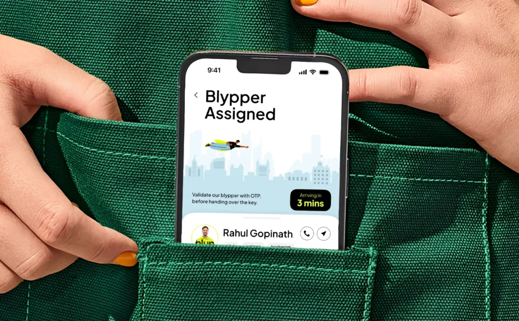
Explore the Branding behind the Blyp.
Final Thoughts: Choosing the Perfect Color for Your Logo Design
Color is much more than a decorative element in logo design. It can communicate emotions, express personality, improve recognition, and influence how customers perceive a brand.
The right color choice should be based on your brand identity, target audience, industry, and long-term goals. Instead of following every trend, focus on creating a color palette that feels authentic and remains effective over time.
A successful logo design combines color with typography, shapes, spacing, and other visual elements to create a clear and memorable identity. When every element works together, your logo can become a powerful representation of your business.

Akshita Shivani Sundar
Senior Graphic Designer