It’s the ultimate digital gut punch.
You check your analytics, and the traffic is there. People are clicking. Your ideal buyers, the exact demographic, industry, and company size you built your business to serve, are landing on your homepage.
But then, they vanish.
They didn’t fill out your contact form. They didn’t book a demo. They didn’t add anything to a cart. Instead, they hit the “Back” button, opened a new tab, and signed a contract with your closest competitor.
In a hyper-competitive market, a beautiful website is no longer enough. Writing massive checks for a platform that just “looks pretty” is a luxury of the past. If your digital presence isn’t actively doing the heavy lifting, capturing higher-quality leads, winning over skeptical buyers, and directly driving revenue, it’s not art. It’s an expensive liability.
Here is the comprehensive, deep-dive breakdown of the 8 critical structural, strategic, and psychological failures causing your ideal clients to leave your site, and exactly how to fix them.
1. You’re Treating Web Design Like an Isolated Art Project
Many businesses treat their website like a painting in a luxury gallery: something to be admired for its aesthetics, white space, and trendy typography, but entirely disconnected from the actual business machinery. When a website is designed in a creative silo, separate from your brand strategy, sales cycle, and customer psychology, it is fundamentally broken from day one.
Your ideal clients aren’t visiting your site to critique your color palette or marvel at your parallax scrolling; they are arriving under stress, looking for a solution to a specific, painful operational or financial problem. If your UX/UI design doesn’t immediately communicate that you understand their pain and possess the precise mechanism to fix it, they will bounce. Design must always be the wrapper for strategy, never the substitute.
2. You’re Speaking to Everyone (And Resonating with No One)
When an ideal prospect lands on your website, they should instantly experience a shock of recognition. Within the first three seconds of the page loading, their subconscious mind needs to answer one question: “Is this built specifically for me?”
If your headline and hero copy are generic, packed with corporate jargon, or watered down to avoid alienating auxiliary markets, you fail this test. Skeptical customers in highly competitive spaces look for specialized experts, not horizontal generalists. If your copy reads like a generic template that could apply to five different industries, your perfect-fit clients will assume you lack the deep nuance required to solve their unique problems, opting instead for a competitor whose positioning feels tailor-made for them.
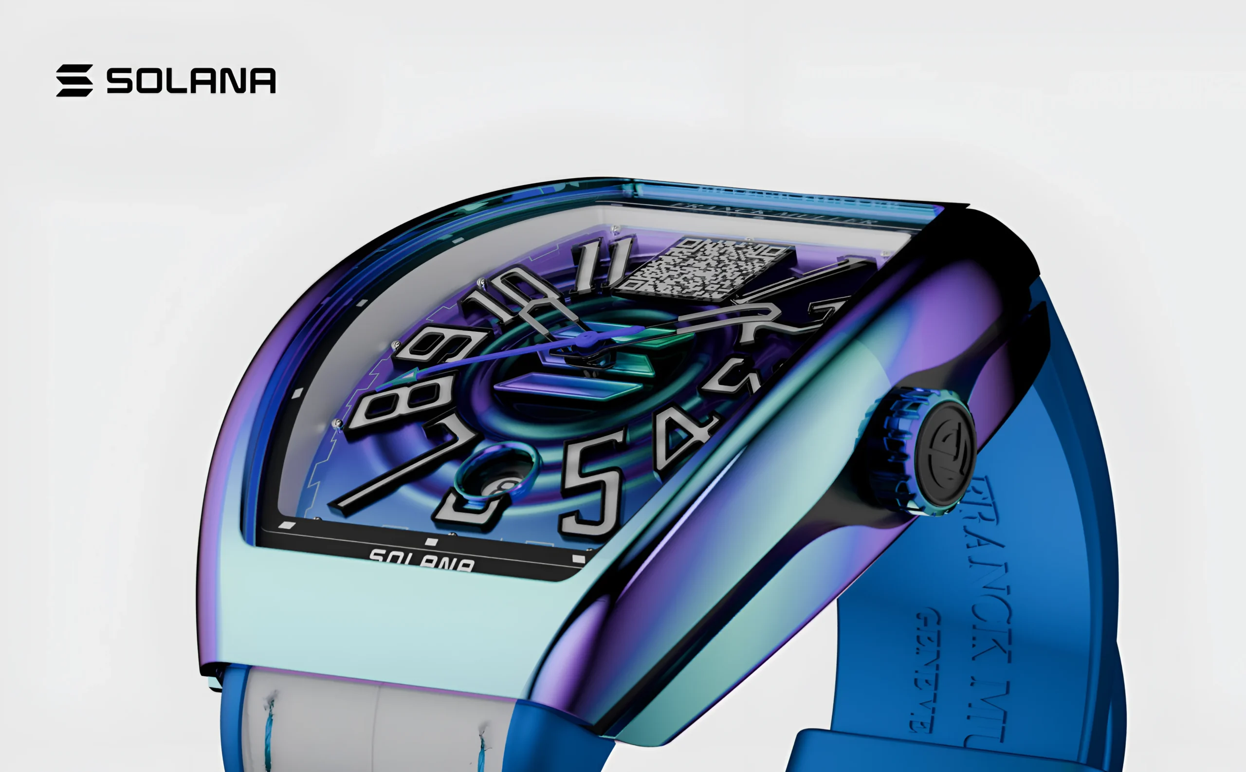
Explore the Web development process behind the franck muller.
3. High-Friction User Experiences Are Killing Your Sales Momentum
Your website might look incredible on a pristine 27-inch desktop monitor in a well-lit design studio, but how does it perform when an exhausted decision-maker is browsing it on their phone between back-to-back meetings? Friction is the silent killer of digital conversions. It manifests as slow loading speeds, unpredictable responsive layouts, counter-intuitive menus that force users to hunt for baseline information, or a convoluted multi-step lead capture process.
If your platform makes your audience work harder than necessary to find your pricing, your services, or your contact information, they simply won’t bother. Attention is the rarest commodity online. They will take the path of least resistance, which inevitably leads to your competitor’s highly optimized, frictionless user experience.
4. Your Core Value Proposition is Hidden, Vague, or Non-Existent
You and your executive team know exactly why your product or service is superior to everything else on the market, but that internal clarity rarely translates to the screen. Too many businesses bury their unique value proposition under sweeping, meaningless buzzwords like “We drive digital transformation” or “Synergizing business growth.”
If a prospect has to scroll through three pages of text, navigate through multiple dropdowns, or read an entire “About Us” essay just to figure out exactly what you sell, who you sell it to, and why it matters, you’ve already lost them. In a high-intent digital landscape, your core differentiator must be stated boldly, clearly, and concisely right above the fold on your primary landing pages.
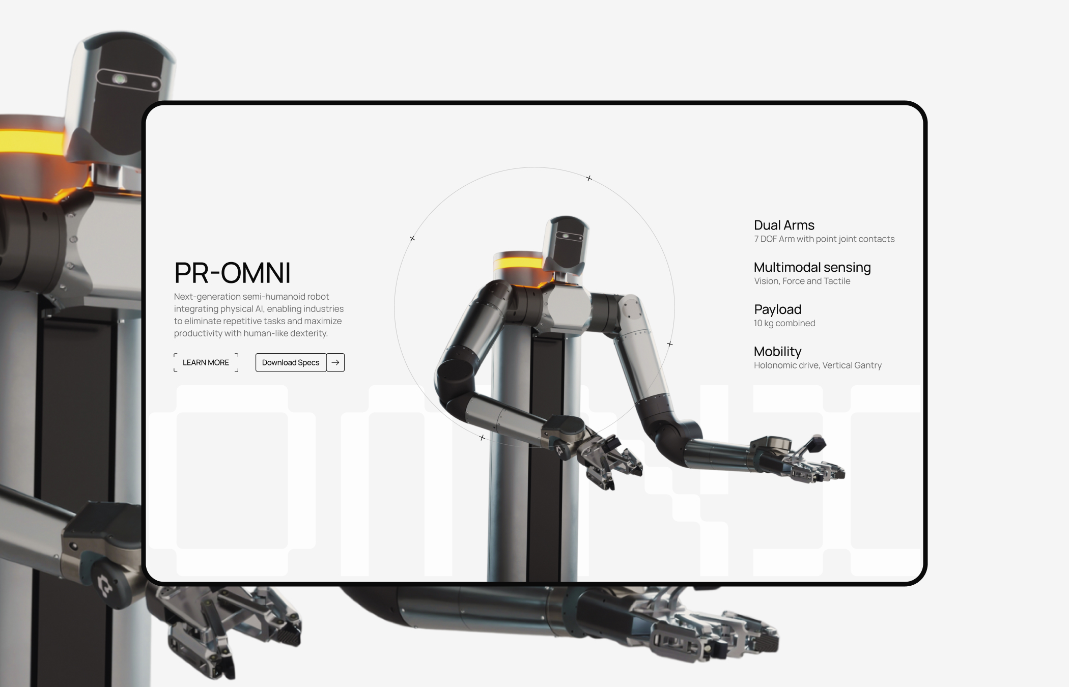
Explore the Web development process behind the perceptyne.
5. There is a Lack of Deep Credibility and Contextual Social Proof
Modern buyers are deeply cynical. They have been burned by polished marketing campaigns and empty SaaS promises before, meaning they do not take your marketing claims at face value. If your website lacks prominent, high-quality, contextual social proof, it triggers immediate red flags.
Generic quotes from anonymous users like “Great service! – John D.” no longer cut it. Skeptical buyers need to see deep-dive case studies, identifiable client logos, verifiable data points, and authentic testimonials that echo their exact business challenges. Without visible, undeniable evidence that you have successfully solved this identical problem for peers in their specific industry, prospects will take their budgets to a brand that feels like a safer, proven bet.
6. Your Calls to Action (CTAs) are Too Passive, Vague, or Distracting
An ideal client should never have to guess what their next step should be. When your Calls to Action are weak (“Learn More”), hidden in a tiny font at the bottom of a page, or worse, competing against five other conflicting buttons on the same screen, decision paralysis sets in.
If you present a user with “Schedule a Demo,” “Download our Whitepaper,” “Read our Blog,” and “Contact Sales” all within the same viewport, you dilute the user’s focus. If you don’t confidently, strategically guide the user toward the logical next step in their specific buying journey, they will simply drift off your page without taking any action at all, leaving your sales pipeline empty.
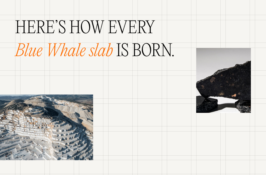
Explore the Web development process behind the Bluewhale.
7. Your Underlying Technology Platform is Underperforming and Buggy
Whether you are running a complex enterprise B2B platform or a custom Shopify ecommerce ecosystem, underlying technical flaws destroy brand trust instantly. Broken links, buggy contact forms that throw errors, disjointed checkout experiences, unoptimized images that delay page rendering, or slow server response times don’t just annoy users, they act as a direct reflection of your operational quality.
If your website feels sluggish, broken, or outdated, prospective clients will subconsciously assume that your core products, services, delivery, and customer support are equally unpolished. Your code quality is a direct extension of your brand equity.
8. You Stand for Absolutely Nothing in a Sea of Digital Sameness
In a mature and crowded market, features, specifications, and pricing eventually commoditize. What cannot be easily copied, automated, or undercut is your distinct brand perspective and point of view. If your website looks, sounds, and feels exactly like the top three competitors in your space, you force your ideal clients to make a purchasing decision based entirely on a race-to-the-bottom price comparison.
If your digital platform doesn’t display a clear, compelling corporate philosophy, a unique methodology, or a strong stance on where your industry is going, you become instantly forgettable. You give them no compelling reason to switch from the incumbent.

Explore the Web development process behind the Kind Energy
Diagnosing the Leak: Aesthetic vs. Strategic Digital Platforms
To win over skeptical customers and convert high-quality traffic into predictable pipeline revenue, you have to look at the entire picture. Use this comprehensive comparative breakdown to audit where your digital presence stands today:
| Feature/Element | The “Pretty” Brochure Website (Why They Leave) | The Strategy-Led Digital Engine (Why They Buy) |
| Design Philosophy | Designed in a vacuum purely for visual aesthetics, creative vanity, and design trend validation. | Built on a foundation of deep brand strategy to align with consumer psychology and specific sales goals. |
| Audience Messaging | Generic, safe, and heavily templated copy meant to avoid offending, excluding, or alienating anyone. | Sharp, bold, hyper-targeted positioning that speaks directly to the core pain points of a perfect-fit buyer. |
| User Experience (UX) | High friction with complex navigation, heavy animations, slow load times, and buried information. | Frictionless UX/UI design that maps seamlessly to the user’s natural decision-making and purchasing journey. |
| Conversion Pathways | Weak, passive, or hidden CTAs that leave the critical next step entirely up to the user’s imagination. | Clear, high-intent, contextually placed CTAs that actively capture qualified leads and guide the conversion. |
| Content & Narrative | Feature-focused, self-centered text that talks exclusively about who you are and what you do. | Outcome-focused narratives that offer undeniable proof of how you solve their specific, measurable pain. |
| Technical Stack | Unoptimized backend, slow page speeds, broken mobile layout scaling, and disjointed form integrations. | High-performance architecture optimized for speed, mobile-first utility, and seamless CRM synchronization. |
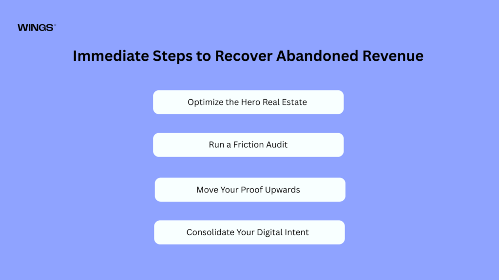
Immediate Steps to Recover Abandoned Revenue
Fixing a leaking website doesn’t require a complete six-month overhaul overnight. You can begin plugging the holes in your digital pipeline immediately by executing a few high-impact behavioral adjustments:
- Optimize the Hero Real Estate: Rewrite your main headline within the next 24 hours. Strip away the clever poetic phrasing and replace it with a blunt explanation of exactly what your business accomplishes, who it helps, and the primary benefit of your solution.
- Run a Friction Audit: Personally navigate your mobile checkout or contact flow while simulating a poor cellular connection. Eliminate every non-essential form field, optional dropdown, and unnecessary click that stands between a user and conversion.
- Move Your Proof Upwards: Don’t relegate your best client case studies or high-impact metrics to a hidden subpage. Move your most impressive industry logos and strongest data-backed testimonials to the top 30% of your homepage layout.
- Consolidate Your Digital Intent: Review your primary landing pages and strip out competing calls to action. Pick one ultimate, high-value goal per page, Whether that is booking a strategy session or purchasing a specific product tier, and let every element drive toward that single button.
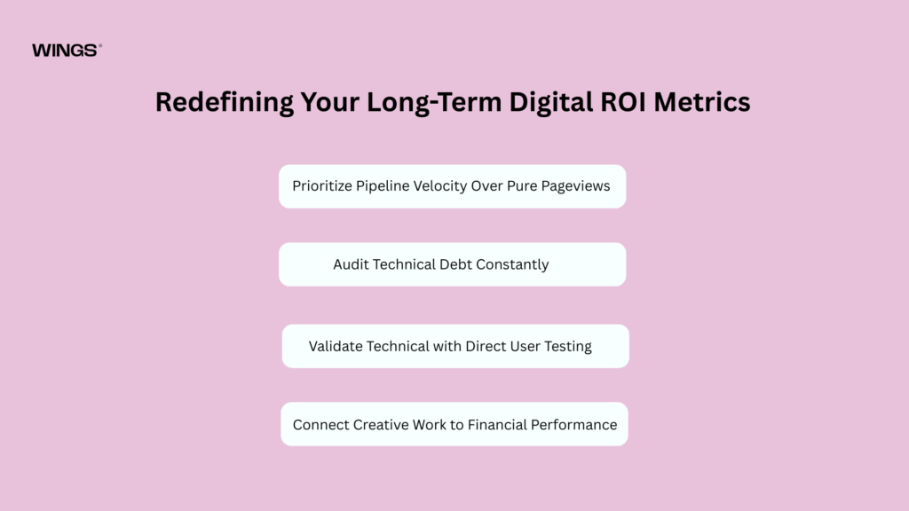
Redefining Your Long-Term Digital ROI Metrics
To ensure your web platform remains a revenue engine rather than a historical creative project, your executive team must shift how success is measured in internal reviews:
- Prioritize Pipeline Velocity Over Pure Pageviews: Stop celebrating high traffic volume if your bounce rates remain stagnant. Shift your tracking metrics to value-driven indicators like time-on-page, high-intent form completions, and sales-ready lead quality.
- Audit Technical Debt Constantly: Treat web performance metrics like page load speed and mobile UI scaling as critical operational health indicators, exactly like your company’s logistics or software stability.
- Validate Design with Direct User Testing: Never launch a significant visual layout modification based solely on an internal creative vote. Use real user behavior analytics, click heatmaps, and session recordings to let real human interactions dictate layout changes.
- Connect Creative Work to Financial Performance: Hold your engineering, copy, and design choices directly accountable to conversion targets, ensuring every digital asset works together to lower your client acquisition costs.
Stop Looking Pretty. Start Driving Revenue.
The truth is hard to swallow, but it’s also an incredible operational opportunity: the traffic is already there. You don’t necessarily need to spend thousands more dollars on top-of-funnel ads or SEO to get more eyeballs; you simply need to do right by the high-intent eyeballs that are already landing on your URL.
To win over highly skeptical modern customers, you must stop viewing your branding, your user experience, your copywriting, and your development stack as separate, disconnected departments. They are not isolated components. They are all deeply interconnected, mission-critical gears inside your digital sales engine.
When you align deep, authentic brand strategy with flawless, data-driven UX/UI design and robust engineering, your website stops being a passive line-item expense on your balance sheet. It transforms into your most powerful, relentless, 24/7 sales representative, the one that finally makes your ideal clients stop browsing, stay on the page, click the button, and choose you.

Prasanna M
WordPress Developer