Visual Hierarchy in Mobile Apps: A Tool for Strategic Decision-Making
Oct 18, 2025 ● 15 Mins Read
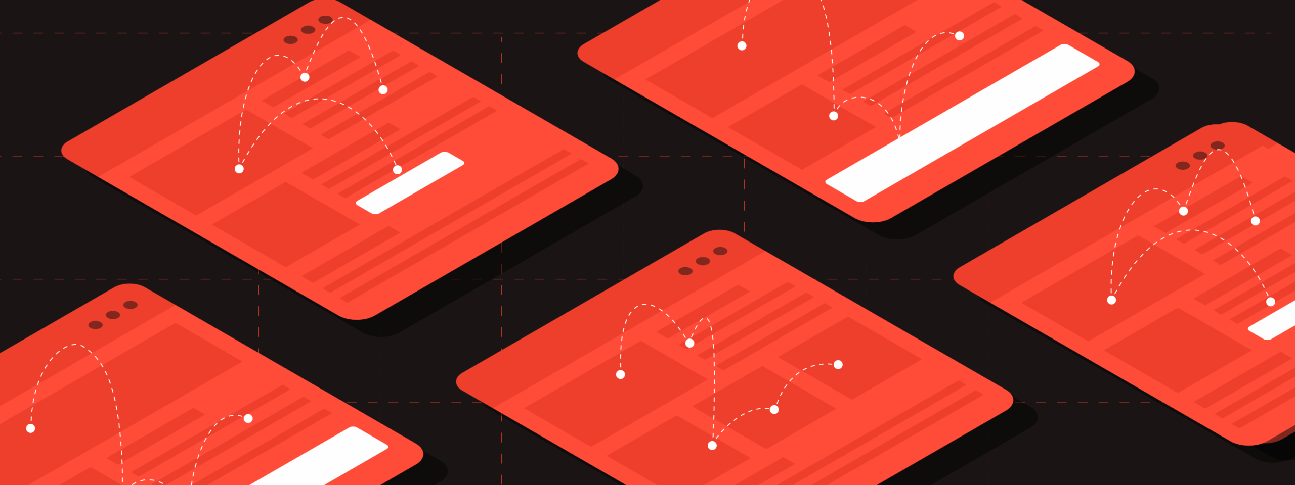
Table of Contents
Introduction
The moment a user opens a mobile app, every visual cue becomes a decision-making signal. Buttons, images, text blocks—all compete for attention, and the way they are arranged silently directs behavior. For business leaders, this isn’t just about design aesthetics; it’s a strategic tool that influences engagement, conversions, and long-term retention. Visual hierarchy transforms an app into a guided experience, aligning user actions with business objectives without overt persuasion.
In an environment where attention spans are shrinking and choices are overwhelming, understanding visual hierarchy becomes essential. It allows companies to prioritize what matters, reduce cognitive load, and subtly guide users toward desired outcomes. By treating hierarchy as a strategic lever rather than a stylistic choice, decision-makers can turn every screen into a calculated instrument for growth, insight, and competitive advantage.

Why Visual Hierarchy is More Than Design
Visual hierarchy is often misperceived as a purely creative or stylistic exercise. In reality, it functions as a strategic lever. By controlling what a user sees first, next, and last, companies can guide behavior subtly but decisively. Consider the placement of high-value features, calls-to-action, or notifications: each decision affects engagement and ultimately drives business results. For decision-makers, this translates to measurable impact, making visual hierarchy an essential component of operational strategy rather than just design finesse.
Strategically applied hierarchy reduces cognitive load, directing users toward key actions without overwhelming them. It increases efficiency, satisfaction, and the likelihood of completing desired behaviors. In essence, visual hierarchy transforms an app from a mere tool into a guided experience, aligning user intent with business goals.
Core Principles That Drive Strategic Outcomes
To leverage visual hierarchy as a decision-making tool, it’s important to understand the core principles that govern it:
- Size and Scale: Larger elements naturally draw attention, signaling priority. Placing key features or calls-to-action in a dominant visual space ensures they are noticed first.
- Color and Contrast: Strategic use of contrasting colors highlights critical actions, while muted tones allow secondary elements to recede. Decisions around branding and UI colors are therefore intertwined with behavioral guidance.
- Typography and Spacing: Fonts, weights, and line spacing communicate importance. Headings, subheadings, and body text must follow a deliberate structure to guide the eye efficiently.
- Position and Flow: Users read in patterns—top-to-bottom, left-to-right, or along curated visual pathways. Placement of elements in alignment with these patterns directs engagement naturally.
- Visual Cues and Affordances: Icons, arrows, shadows, and micro-interactions provide subtle guidance, reinforcing hierarchy without disrupting the experience.
Each of these principles is a decision-making instrument. Adjusting them is akin to fine-tuning a business process, where small changes can produce measurable outcomes.
Translating Hierarchy Into Business Insights
Decision-makers often think of visual hierarchy in terms of design teams, but the strategic implications are far-reaching. Metrics like click-through rates, time-on-task, and conversion funnels are directly influenced by how information is structured visually. A company can test multiple hierarchy strategies using A/B testing to determine which arrangement maximizes engagement or drives higher revenue.
Moreover, hierarchy informs prioritization. In feature-rich apps, not all functionality can receive equal prominence. Leaders must make deliberate choices about what deserves visual priority, balancing user needs with business imperatives. This intersection of design and strategy turns hierarchy into a governance tool, ensuring that every element on the screen serves a purpose aligned with company objectives.
Implementing Hierarchy as a Strategic Practice
Adopting visual hierarchy as a business tool requires more than a design brief—it requires a structured process:
- Audit and Map: Examine current visual structures, noting which elements attract attention and which are overlooked.
- Align with Goals: Define what actions or behaviors are most critical for business success, and ensure hierarchy supports these priorities.
- Prototype and Test: Introduce changes in a controlled environment, using analytics to track behavioral shifts.
- Iterate Continuously: Visual hierarchy is not static. As user needs and business objectives evolve, hierarchy must adapt to maintain strategic relevance.
Decision-makers who embed this approach within organizational processes gain a measurable advantage: the ability to influence behavior, optimize flows, and capture value without intrusive tactics.
Conclusion - Beyond Metrics: The Strategic Edge
Ultimately, visual hierarchy is about control and clarity. It transforms an app from a passive tool into an active driver of outcomes, shaping perception, fostering trust, and guiding decisions without overt persuasion. Leaders who appreciate its strategic potential can make informed choices about design investments, resource allocation, and growth initiatives. The most successful apps don’t just look appealing—they perform predictably and purposefully, with hierarchy as the guiding principle behind every interaction.
In a competitive mobile landscape, where user attention is finite and decisions are instantaneous, mastering visual hierarchy is no longer optional. It is a strategic asset, bridging design intuition with business impact, turning every pixel into a lever for smarter decision-making.
Passionate about creating bold, engaging visuals that tell a story. Whether designing compelling brand identities or experimenting with new artistic styles, I love exploring the power of color, composition, and creativity. When I’m not designing, you’ll often find me behind the camera, capturing moments and discovering new perspectives through photography.

Vidhya Shree
Senior Visual Designer