Neumorphism (often called “soft UI”) emerged as a visual design trend that blends skeuomorphism and flat design. It creates UI elements that appear to extrude from or be embedded into the background using subtle shadows, highlights, and low-contrast color palettes.
At its core, it attempts to recreate a tactile, almost physical interface experience in a digital environment. Instead of relying on sharp borders or high contrast separation, it uses light, shadow, and depth illusion to suggest interaction.
For designers, it is a creative experiment in visual storytelling. For decision-makers, product managers, CTOs, founders, and design leads, it is something else entirely: a trade-off between aesthetic novelty and functional performance, with real consequences for usability, accessibility, and scalability.
This article breaks down neumorphic design from a strategic product lens: when it helps, when it hurts, and how to evaluate it in real-world product decisions.
What Neumorphic Design Really Is (Beyond the Aesthetic)
At its core, neumorphism simulates physical depth using several visual techniques that work together:
- Soft, dual-tone shadows (to simulate light source direction)
- Minimal contrast between background and components
- Rounded shapes and smooth geometry
- “Embedded” or “raised” UI elements
- Subtle gradient blending rather than hard edges
Instead of clearly defined borders like in flat design, elements appear to be carved into the surface or gently floating above it. This creates a unified surface where separation is implied rather than explicitly drawn.
From a product standpoint, this is not just a visual style, it directly changes how users perceive hierarchy, interaction, and affordance. In traditional UI systems, buttons are obvious because they look like buttons. In neumorphism, they often must be “learned” through subtle visual cues, which introduces both elegance and ambiguity. This ambiguity is where both its appeal and its risk originate.

Explore the Web development process behind the Shivam.
Why Decision-Makers Care About Neumorphism
Design choices are not just aesthetic decisions; they directly influence core product metrics such as:
- Conversion rates and funnel efficiency
- User comprehension speed and onboarding success
- Accessibility compliance (WCAG and similar standards)
- Development and maintenance cost over time
- Brand perception and premium positioning
- Cross-platform consistency across devices and OS versions
Neumorphism sits at a complex intersection of all these factors. It can elevate a premium brand experience or significantly degrade usability if applied without discipline.
So the real strategic question is not “Does it look good?” but: Does neumorphism improve or hinder product performance for our users and business goals?
In many cases, teams initially adopt it for its visual novelty, only to later scale it back when usability challenges emerge.
The Pros of Neumorphic Design
Strong Visual Differentiation
In saturated markets, visual distinctiveness matters more than ever. Neumorphism can help products stand out in environments where users are constantly exposed to similar-looking interfaces.
It is especially noticeable in:
- Fintech dashboards with minimal branding
- Wellness and mindfulness applications
- Smart home control interfaces
- Creative tools and design systems
It creates a “modern premium” impression that flat UI often struggles to achieve without heavy branding elements or illustration systems.
Decision-maker takeaway:
Useful when brand differentiation is a higher priority than speed of comprehension or operational efficiency.
Emotional Appeal and Perceived Sophistication
Neumorphism creates a soft tactile illusion that users often associate with physical objects like buttons, cushions, or molded surfaces. This can produce subtle emotional effects such as:
- Increased perceived quality and polish
- Stronger emotional engagement during use
- A calming, non-intrusive visual experience
- Reduced visual “noise” compared to heavily outlined UIs
For lifestyle-oriented products, this can align well with branding strategies that emphasize calmness, simplicity, or luxury.
Example use cases:
- Meditation and breathing apps
- Luxury financial dashboards
- Personal finance apps targeting high-net-worth users
- Wellness trackers and habit-building tools
Reduced Visual Clutter (When Done Right)
Because neumorphism minimizes borders and heavy contrast, interfaces can feel:
- Less crowded and more spacious
- More fluid and continuous as a surface
- More visually cohesive across components
This is particularly effective in simple interfaces where the user is performing one primary action at a time. In such cases, reducing visual noise can actually improve perceived usability.
Examples include:
- Music players with limited controls
- Smart device control panels
- Simple status dashboards
- Focused single-task applications
However, this benefit quickly diminishes as interface complexity increases.
Strong Alignment with Modern Design Systems
Neumorphism can also be formalized into structured design systems that define:
- Depth-based hierarchy rules
- Shadow intensity tokens
- Surface elevation levels
- Consistent soft UI styling guidelines
When treated as a system rather than a visual experiment, it can support consistent branding across multiple products or modules within a product ecosystem. However, this requires strict governance and disciplined implementation.
Explore the Web development process behind the Importex.
The Cons of Neumorphic Design (Where Most Products Fail)
Despite its visual appeal, neumorphism introduces serious usability and operational challenges that often outweigh its benefits in production systems.
Accessibility Issues (The Biggest Concern)
The most critical drawback is accessibility degradation.
Because neumorphism relies on low contrast and subtle shadows:
- Text can become difficult to read
- Interactive elements may not be clearly identifiable
- Users with visual impairments face significant barriers
- Performance drops in bright sunlight or low-light conditions
This can directly conflict with accessibility standards like WCAG, making compliance difficult or impossible without significant modifications.
Decision-maker reality check:
If your product serves a broad or regulated audience (finance, healthcare, government, enterprise SaaS), neumorphism can introduce compliance risk rather than value.
Weak Visual Hierarchy
Neumorphism often struggles to clearly distinguish:
- Buttons vs static containers
- Interactive vs non-interactive elements
- Primary vs secondary actions
Because everything shares a similar “soft elevation” style, nothing naturally stands out.
This leads to:
- Slower decision-making during tasks
- Increased cognitive load
- Higher error rates in interaction
- Confusion about what is clickable
Users must “learn” the interface rather than intuitively understanding it.
Poor Scalability in Complex Interfaces
Neumorphism works best in simple UIs but breaks down quickly in complex systems such as:
- Data-heavy dashboards
- Enterprise SaaS platforms
- Multi-step workflows
- Analytics tools with dense information layouts
As complexity increases, the soft-shadow approach becomes visually overwhelming and less effective at organizing information hierarchy.
What looks elegant in a simple mockup often becomes cluttered in real-world production systems.
Performance and Development Costs
Implementing neumorphism at scale introduces technical overhead:
- Multiple layered shadows per component
- Fine-tuned color calibration systems
- Pixel-consistent rendering across devices
- Increased testing requirements across browsers and OS versions
This results in:
- Higher front-end complexity
- Increased QA workload
- Greater design system maintenance burden
- Slower iteration cycles
For large engineering teams, this translates directly into operational cost.
Inconsistent Cross-Platform Behavior
Different devices and operating systems render shadows differently. As a result:
- UI may appear inconsistent across screens
- Mobile vs desktop experiences can diverge significantly
- Dark mode becomes particularly difficult to implement consistently
This undermines reliability, especially for products that require predictable UI behavior across environments.
When Neumorphism Makes Sense (Strategic Fit)
Neumorphism should never be a default design choice. It is best used when specific product conditions are met.
Best-fit scenarios:
- Low-complexity interfaces (fewer than ~10 primary actions per screen)
- Emotion-driven applications (wellness, meditation, lifestyle products)
- Premium branding strategies where aesthetics are central
- Controlled environments (kiosks, embedded systems, smart devices)
- Small-scale internal tools with limited user variability
Poor-fit scenarios:
- Enterprise SaaS platforms
- Accessibility-first or compliance-heavy systems
- High-frequency transactional products
- Information-dense dashboards
- Government or public service applications
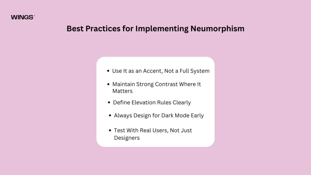
Best Practices for Implementing Neumorphism
If adopted, neumorphism must be treated as a controlled system rather than an aesthetic choice.
Use It as an Accent, Not a Full System
A hybrid approach is usually the most effective:
- Use flat or material design for structural layout
- Apply neumorphism selectively to highlight components
For example:
- Primary cards or feature widgets
- Focus panels or hero sections
- Key interaction surfaces only
Avoid applying it uniformly across every element.
Maintain Strong Contrast Where It Matters
Even within a soft UI system:
- Text must remain highly legible
- Interactive elements must be clearly distinguishable
- Error states must be visually explicit and unmissable
Aesthetic consistency should never override functional clarity.
Define Elevation Rules Clearly
Treat neumorphism like a structured design system:
- Level 0: Background surface
- Level 1: Embedded elements
- Level 2: Raised interactive components
- Level 3: Active or focused states
Without defined rules, UI quickly becomes inconsistent and confusing.
Always Design for Dark Mode Early
Neumorphism behaves unpredictably in dark mode:
- Shadows lose definition
- Depth cues become less effective
- Elements may appear flat unintentionally
Designing dark mode early prevents major redesign later.
Test With Real Users, Not Just Designers
Neumorphism often performs well in design reviews but poorly in usability testing.
You should measure:
- Task completion time
- First-click accuracy
- Error frequency
- Accessibility performance
If usability drops significantly, aesthetic preference should not override functional failure.
Pair With Strong Microinteractions
Because neumorphism reduces visual clarity, interaction feedback becomes critical:
- Button press states must be obvious
- Hover and focus states should be exaggerated slightly
- Loading, success, and error states must be explicit
Without strong feedback loops, users may feel uncertain whether actions were registered.
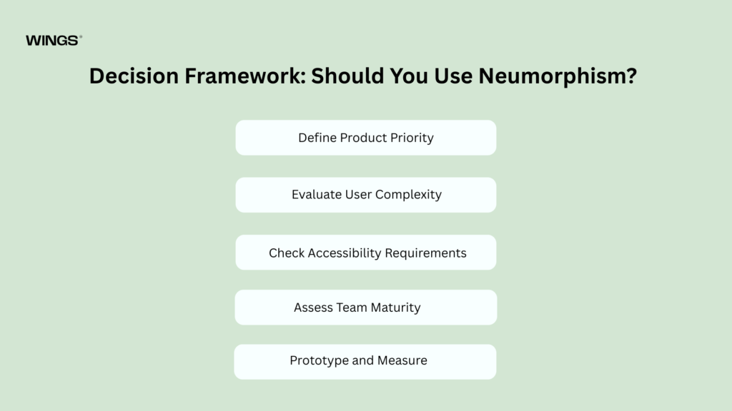
Decision Framework: Should You Use Neumorphism?
Step 1: Define Product Priority
- Is the goal emotional engagement or task efficiency?
- Is branding or usability more important?
Step 2: Evaluate User Complexity
- Simple tasks → neumorphism may work
- Complex workflows → avoid or limit usage
Step 3: Check Accessibility Requirements
- Strict compliance → avoid
- Flexible consumer product → conditional use
Step 4: Assess Team Maturity
- Strong design system → feasible
- Early-stage product → risky and unstable
Step 5: Prototype and Measure
Never rely on subjective preference. Measure:
- Conversion rates
- Task completion speed
- Drop-off points
- User error rates
Strategic Verdict: Where Neumorphism Stands Today
Neumorphism should be understood not as a design revolution, but as a stylistic tool with narrow applicability. Its core strength lies in emotional experience and visual differentiation. Its core weakness lies in operational clarity and scalability.
Most successful products today do not adopt neumorphism end-to-end. Instead, they selectively borrow its principles, soft shadows, depth cues, and tactile feel, while retaining the clarity, hierarchy, and accessibility of flat or material design systems.
Conclusion
If you are leading a product decision, neumorphism should be treated as a strategic design option, not a default direction.
Use it when:
- Emotional experience matters more than efficiency
- Interfaces are simple and controlled
- Brand perception is the primary differentiator
Avoid it when:
- Usability, accessibility, and scalability dominate requirements
- Your product is workflow-heavy or data-rich
- You cannot afford ambiguity in user interaction
In short: neumorphism is not inherently good or bad, it is conditional. And in product strategy, conditional tools must always be applied with discipline, measurement, and restraint.

Nandin
Design Lead