Table of Contents
Introduction
A crowded interface is like a noisy boardroom—everyone talks, but no one is heard. Users navigate screens with the same frustration executives feel in meetings overloaded with information: lost focus, wasted time, and overlooked priorities. White space—the space between elements—is the silent moderator, the invisible guide that allows clarity, prioritization, and purposeful action to emerge. It transforms interfaces from chaotic assemblies into experiences that feel intuitive, calm, and deliberate.
For decision-makers, understanding white space goes beyond aesthetics. It is a tool for improving operational efficiency, guiding user behavior, and enhancing brand perception—all of which influence the bottom line.

Understanding White Space in UI/UX Design
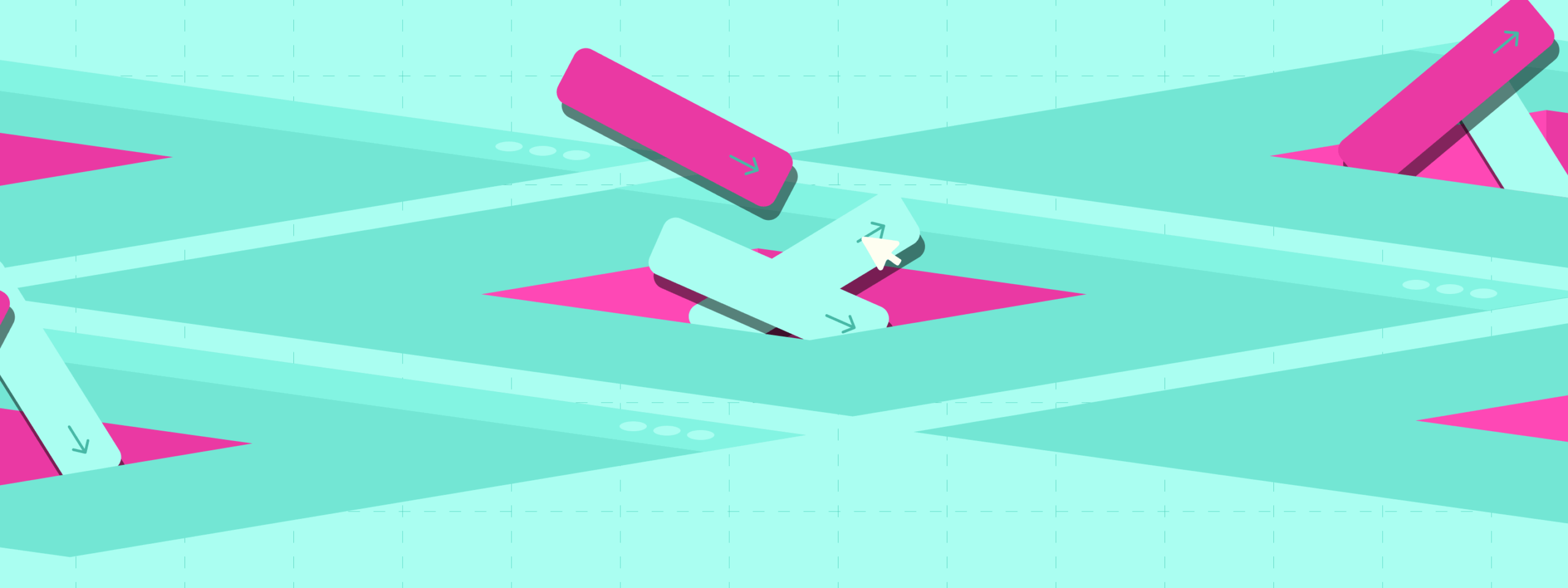
White space, often called negative space, is the intentional use of empty areas between design elements. Far from being “empty,” it is functional space that gives content room to breathe, highlights important elements, and supports visual hierarchy.
Imagine a dashboard with overlapping charts, notifications, and action buttons. Without proper spacing, users struggle to interpret data, make decisions, or identify key actions. White space introduces structure, directing focus, reducing cognitive load, and improving overall comprehension. For business leaders, this is not theoretical—it translates into faster task completion, fewer errors, and enhanced user satisfaction, metrics that directly impact product adoption and operational efficiency.
White Space and Visual Hierarchy: Guiding User Focus
Visual hierarchy is the backbone of effective UI/UX design. Users rarely consume content sequentially—they scan, interpret, and act based on cues in the interface. White space is a powerful tool for establishing these cues.
By separating headings, images, buttons, and descriptions, white space signals importance and guides attention naturally. On a product page, the strategic spacing around a call-to-action button can mean the difference between a purchase and an abandoned cart.
Benefits of leveraging white space for hierarchy include:
- Faster identification of key information
- Reduced cognitive overload, leading to better retention
- Enhanced perception of quality and trustworthiness
- Natural emphasis on conversion-driven elements
By subtly influencing where users look and how they interact, white space functions as an invisible hand guiding behavior without overt persuasion.
Enhancing Readability and Accessibility Through White Space
Dense blocks of text or tightly packed interface elements make comprehension difficult and frustrate users. White space improves readability by creating line spacing, paragraph breaks, and logical grouping of content.
Accessibility is another critical advantage. Adequate spacing helps users with visual impairments or cognitive difficulties, widening your product’s audience and ensuring compliance with accessibility standards. For decision-makers, this translates into inclusivity, brand reputation, and tangible business benefits.
Additionally, better readability reduces user errors and support costs while enabling faster decision-making in enterprise software or data-heavy applications—where efficiency is not optional but essential.
Emotional Impact: White Space as a Branding Tool
White space doesn’t just organize content—it communicates value. Minimalist, well-spaced interfaces evoke sophistication, clarity, and professionalism. Leading brands like Apple and Google use white space to reinforce a premium experience, subtly shaping perception through design.
Executives should note: cluttered interfaces can unconsciously signal disorganization, while clean, intentional layouts suggest reliability, authority, and attention to detail. Emotional response drives engagement, loyalty, and advocacy—metrics that are crucial for brand growth.
Moreover, white space reduces cognitive fatigue. In high-stakes applications, such as finance, healthcare, or enterprise dashboards, well-spaced layouts create a calm, efficient environment that increases user satisfaction and reduces errors—impacting both performance and retention.
Conclusion: Beyond Minimalism, Towards Intentional Design
White space is far more than minimalism—it is a strategic design framework that influences behavior, perception, and efficiency. When implemented thoughtfully, it transforms cluttered interfaces into intuitive, elegant experiences.
For decision-makers, the value of white space is clear: improved usability, reduced cognitive load, broader accessibility, and enhanced brand perception. In a world saturated with information, sometimes doing less—intentionally—is the most powerful way to drive impact.
Translating curiosity and creativity into experiences that feel fresh, purposeful, and memorable. Each idea is crafted with clarity and intention, blending originality with impact. Outside of work, stories, movies, and books provide inspiration, shaping new ways to see, think, and create.

Nandin
Design Lead