Swipe, Scroll, Stop: Visual Strategies That Make Social Content Pause-Worthy
Nov 09, 2025 ● 14 Mins Read

Table of Contents
Introduction
Social media moves at the speed of a thumb. Every scroll, swipe, or tap represents a decision: to stop—or keep going. In a crowded feed, content must earn the pause. It’s no longer enough for a post to exist—it must engage, communicate, and resonate in a matter of milliseconds.
Visual design is the key to earning attention. Motion, hierarchy, colour, typography, composition, and imagery don’t just make content look good—they create meaning. The posts that stop the scroll do so because every element has intention. They transform fleeting attention into a moment of connection, a brief pause where the user sees, understands, and feels your message.

Make First Glance Count: Visual Hierarchy With Purpose
Your post has roughly 300 milliseconds to make an impression. That first glance decides whether your audience stops or scrolls past. Every element on the screen—type, scale, spacing, and colour—should work together with deliberate purpose.
Visual hierarchy is your secret weapon. A bold headline paired with a muted background draws the eye immediately. Subtle calls-to-action, secondary visuals, or icons reinforce the message without competing for attention. Whitespace isn’t empty space—it’s breathing room that amplifies your focal point, giving the content room to “breathe” and the user room to focus.
Even small adjustments—like aligning the headline slightly off-center, increasing contrast on key elements, or placing your CTA where the eye naturally lands—can create tension that arrests scrolling. It’s about leading the eye strategically: first, the hook; then, the message; finally, the action.
Motion That Guides: Micro-Animations With Intent
Motion is a powerful tool in social content. A subtle pulse, a sliding element, or a hover effect can transform a static image into a living, breathing experience. But motion isn’t decoration—it’s direction.
Micro-animations help guide the viewer through content. They establish hierarchy, highlight key points, and create rhythm. A gently bouncing icon draws attention without overwhelming the overall composition. A smooth transition between carousel slides keeps the user engaged while subtly emphasizing continuity.
The most effective motion is purposeful and restrained. Over-animated content becomes noise, confusing rather than clarifying. Think of it like punctuation in writing: it highlights meaning, guides the flow, and strengthens the message. Motion should feel natural and part of the design system, reinforcing your brand personality at every interaction.
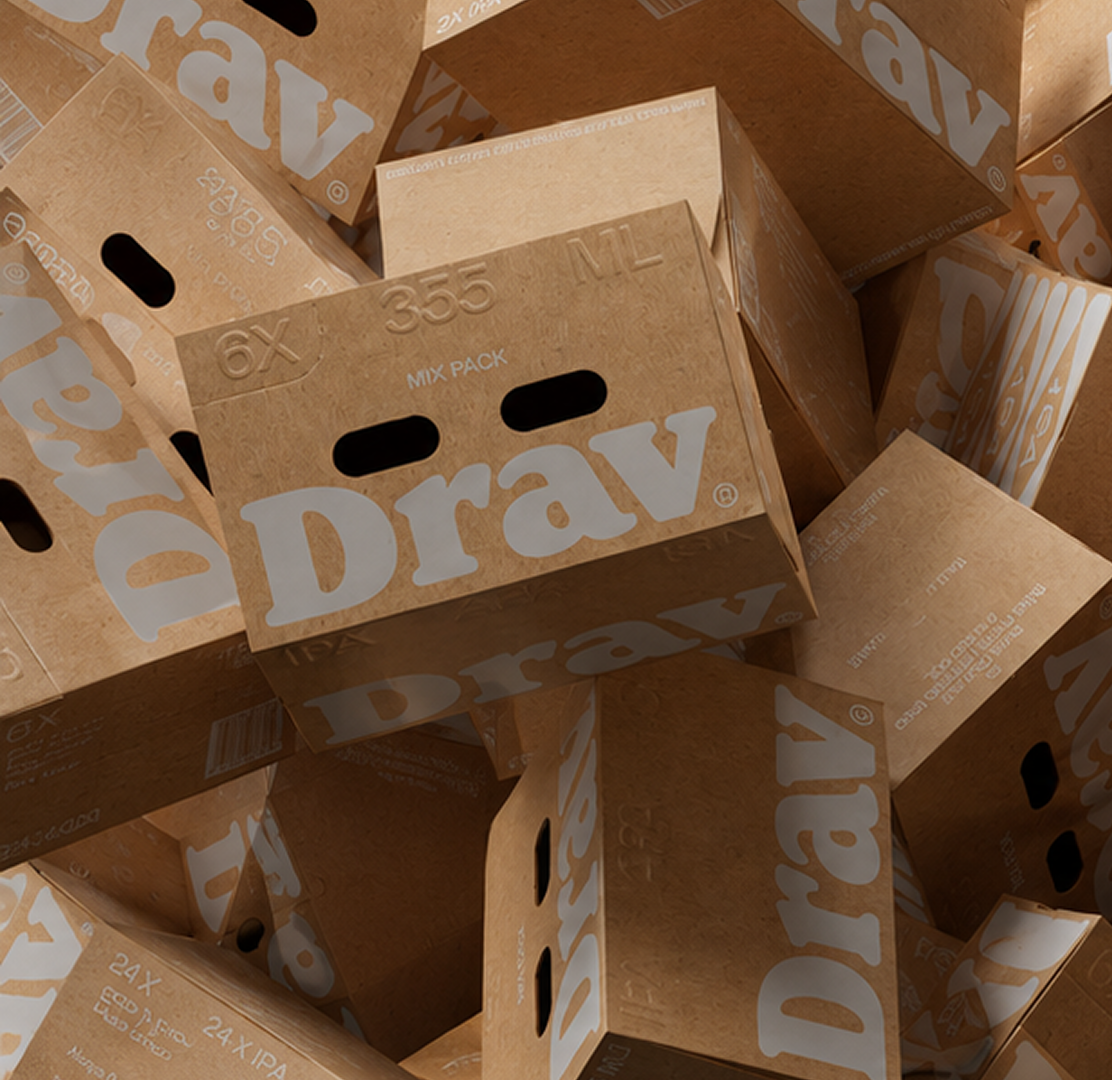
Colour and Typography: Communicate Fast, Communicate Clearly
Colour and typography speak before words do. A consistent palette—primary, secondary, accent—builds recognition, guides focus, and communicates meaning. Contrast is vital. On small screens, legibility can make or break a post. High contrast ensures important elements stand out, while subtle shades provide depth and hierarchy.
Colour also conveys emotion. Red signals urgency, green offers reassurance, and neutrals provide balance. When used intentionally, colour guides attention and reinforces brand identity.
Typography is equally important. Strong headers, clear body text, and careful hierarchy ensure your message is easy to digest. Limit yourself to two complementary fonts: one for display, one for body. Excessive typefaces dilute clarity. Proper line height, tracking, and padding around text improve readability, creating an impression of professionalism and sophistication.
Together, colour and typography allow your brand to speak without shouting, guiding the viewer naturally through your content.
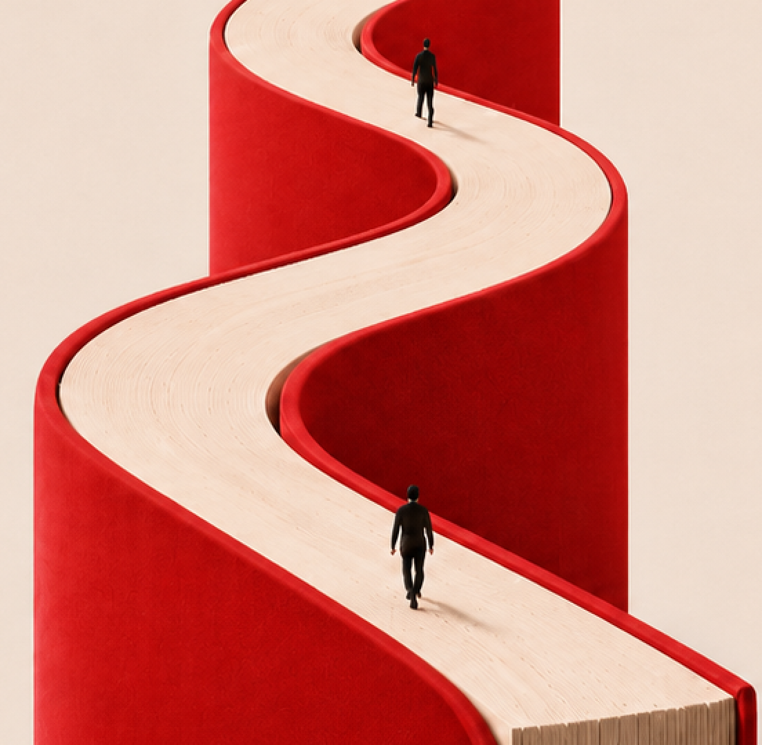
Strategic Composition: Directing the Eye, Telling a Story
Composition transforms visuals from static images into narratives. Framing, alignment, and layering tell a story without words. Your goal is to create a rhythm: lead with a focal point, then guide the eye through the rest of the content.
The rule of thirds is a helpful guideline, but intentional deviation creates tension and interest. Layering elements—overlapping shapes, semi-transparent gradients, soft shadows—adds depth, making content feel tangible on a flat screen. Even small compositional choices, like aligning a CTA near the natural endpoint of a gaze, can dramatically increase engagement.
Good composition creates a visual journey, turning quick glances into intentional pauses. Users stop because their eyes are guided naturally, and their brains understand the message effortlessly.

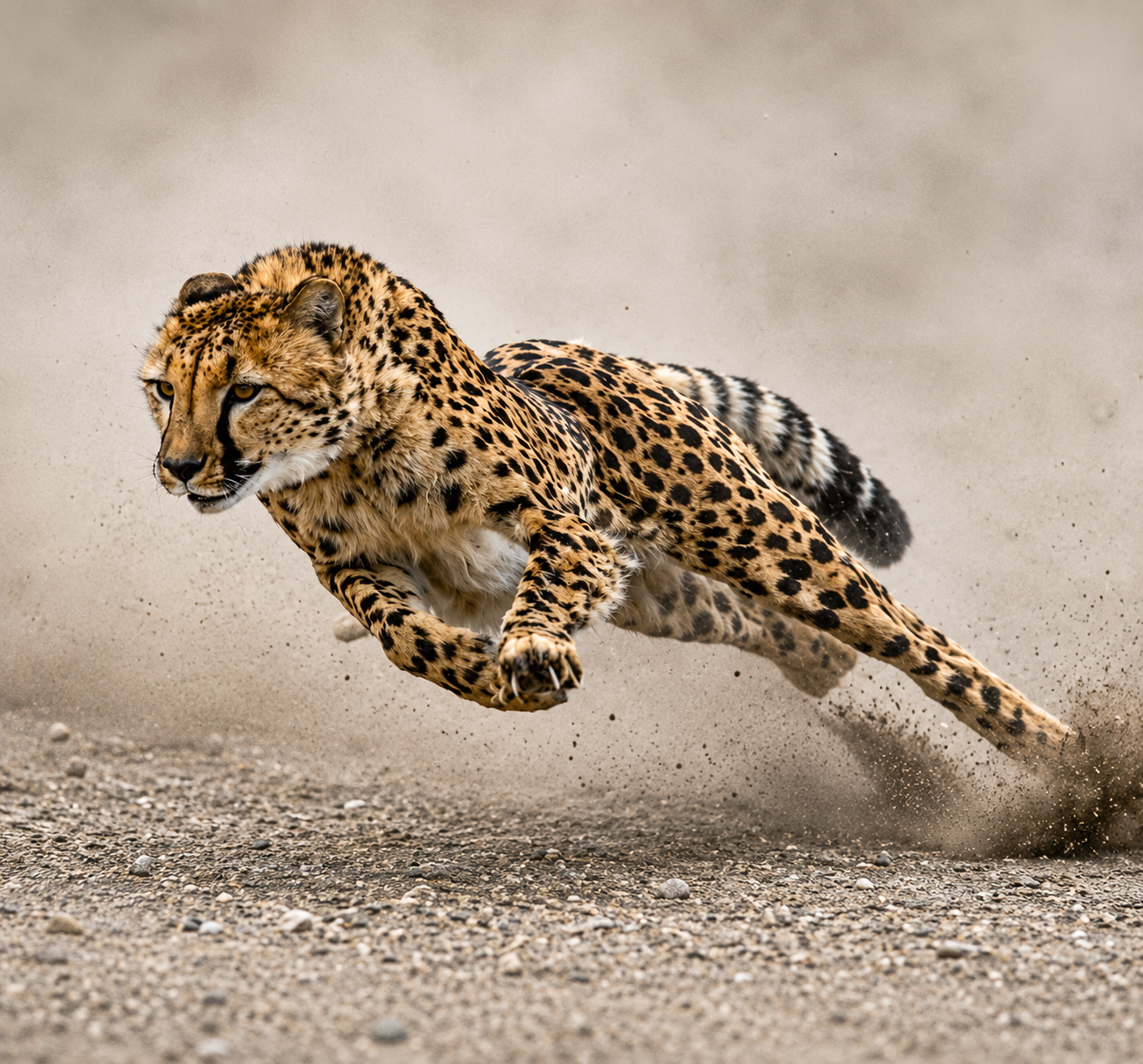
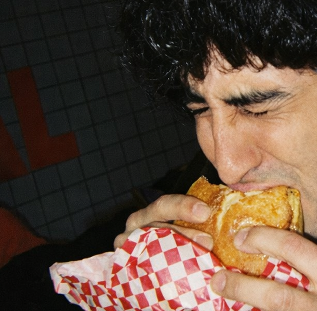
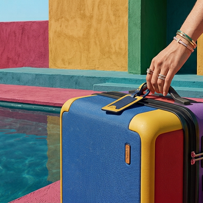
Authentic Imagery: Real, Relatable, and Mobile-Ready
Stock photos are often ignored. To truly stop the scroll, imagery must feel real, relevant, and aligned with your brand story. Authentic photos, purpose-driven illustrations, or hybrid approaches that combine styles feel intentional and modern.
Mobile-first thinking is essential. Crop for small screens, prioritize focal points, and ensure key visual information isn’t lost in the frame. Faces, gestures, and directional cues draw attention naturally. By using images that resonate, brands create a sense of relatability, trust, and emotional connection.
Blending media styles—like overlaying illustration on photography—adds visual interest and makes content feel unique without sacrificing clarity. Authentic imagery signals thoughtfulness and quality, giving viewers a reason to pause.
Consistency + Surprise: The Art of Recognition and Engagement
Consistency builds trust; surprise builds engagement. A well-defined visual system—colours, typography, motion principles, and layout patterns—anchors recognition. Users begin to recognize your brand instantly.
Yet variation keeps content fresh. Unexpected layouts, playful micro-animations, or new colour accents intrigue the eye while remaining aligned with your brand system. Iteration is key: what works today may blend into background noise tomorrow. Track engagement, test variations, and evolve your visual strategy.
This balance—between predictable recognition and delightful surprise—is what keeps users pausing, engaging, and remembering your content.
Conclusion:
A pause is earned, not assumed. When a user stops scrolling, they are granting trust and attention. Social content that commands this moment does more than exist—it communicates clearly, engages emotionally, and reinforces brand identity.
By combining hierarchy, motion, colour, typography, composition, and imagery, brands can transform fleeting attention into meaningful engagement. Every scroll is an opportunity. Every pause is a chance to be seen, understood, and remembered.
Akshita Shivani Sundar
Senior Graphic Designer

Akshita Shivani Sundar
Senior Graphic Designer