From VHS to Virtual: Using Retro Futuristic Design in Media Streaming UX
July 9, 2025 ● 13 Mins Read
Table of Contents
Introduction
Streaming platforms have evolved far beyond being mere content libraries. In today’s hyper-competitive digital ecosystem, the fight for user attention doesn’t end at acquiring premium shows or blockbuster titles—it begins at the interface level. Users no longer just watch; they enter, they browse, they feel. The user experience that envelops the content—the mood of the homepage, the transition animations, the micro-interactions—often plays a decisive role in platform preference and loyalty. This is where retrofuturistic design emerges as a surprisingly potent UX strategy. It isn’t just about throwing in some neon lights or 80s fonts for flair. It’s about creating an emotional setting around the act of media consumption, blending the tactile imperfections of analog tech with the slick, fluid expectations of modern interfaces. Retrofuturism isn’t visual fluff. It’s experiential storytelling—using visual memory as a bridge between user emotion and digital functionality.
Retrofuturism as Cultural Commentary and UX Reaction
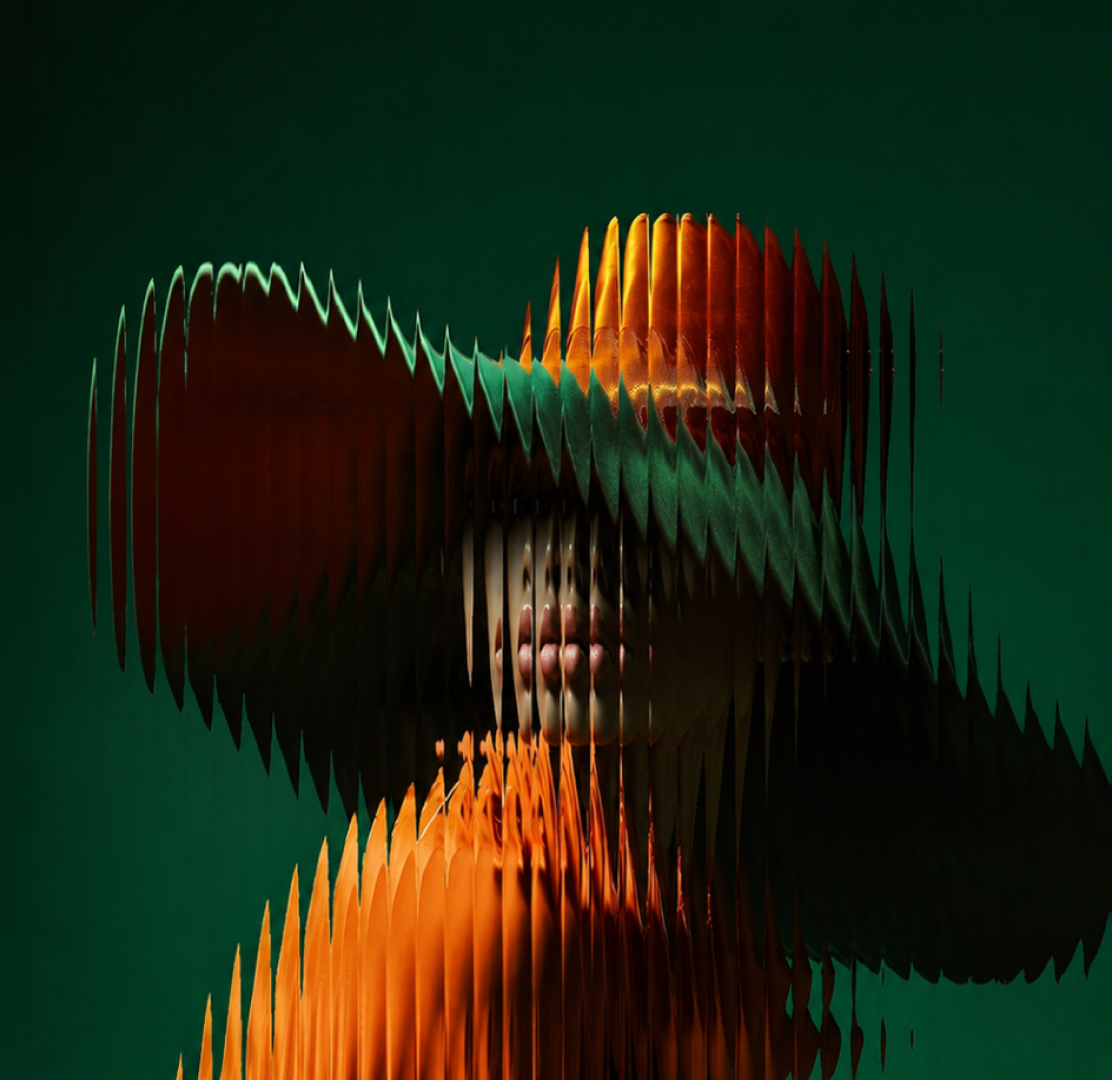
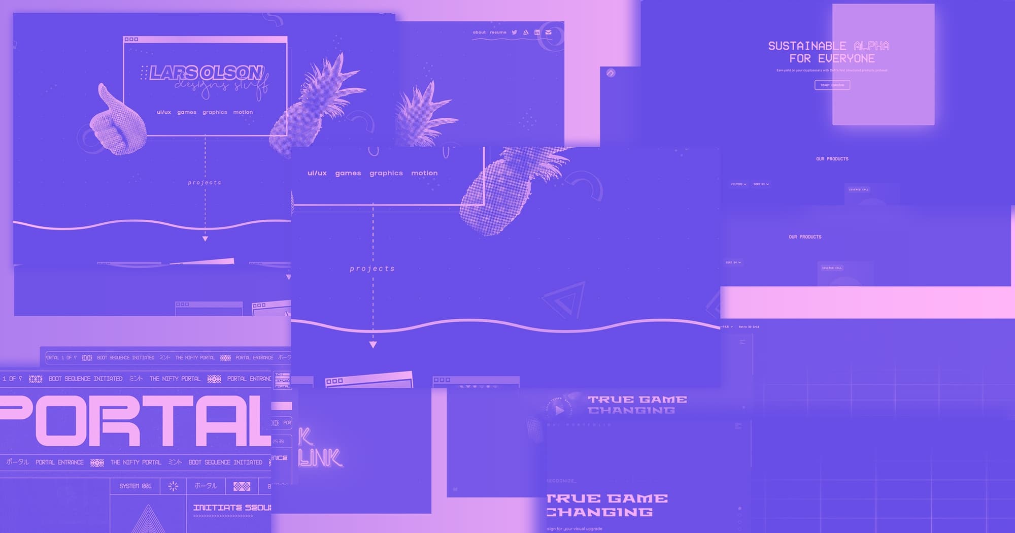
The rise of retrofuturistic UX design is not coincidental—it’s a form of cultural reaction. As technology races toward hyper-personalization, invisibility, and seamlessness, many interfaces have become so frictionless that they’re practically forgettable. Scrolling through algorithm-driven grids of content with flat UI and invisible transitions may be fast, but it leaves little emotional residue. In response, retrofuturistic design deliberately reintroduces friction—but in ways that heighten meaning rather than obstruct usability. It evokes warmth through intentional imperfections: VHS-style glitch overlays, pixelated UI fragments, color fringes, low-res scanlines. These aren’t just aesthetic tics—they are visual metaphors, cues that root the digital experience in a memory of interaction that was once physical, present, and felt. Users don’t crave the limitations of old tech, but they do crave its humanity. Retrofuturism strategically capitalizes on this tension, offering interfaces that are emotionally rich without being functionally regressive.
More Than Nostalgia: Reconstructing Ritual and Anticipation
What makes retrofuturistic UX so compelling is its ability to transform passive browsing into a kind of digital ritual. Think of the anticipation that came with renting a VHS tape, rewinding it before returning, or flipping through static-filled TV channels. These rituals embedded emotional memory into the act of media consumption. In today’s streaming world, the ritual often ends with a cold search bar or endless carousels of content. Retrofuturistic design doesn’t try to simulate outdated media mechanics—it abstracts the emotional qualities of those experiences and reimagines them as part of a new interface vocabulary. Browsing becomes less of a utility and more of an atmosphere. UI elements feel like portals into genres and moods, not just clickable buttons. When done well, opening a streaming platform can feel like stepping into a narrative prelude, not just an app. It slows the user down just enough to make discovery feel deliberate again.
Aesthetic Indulgence Meets Functional Intelligence
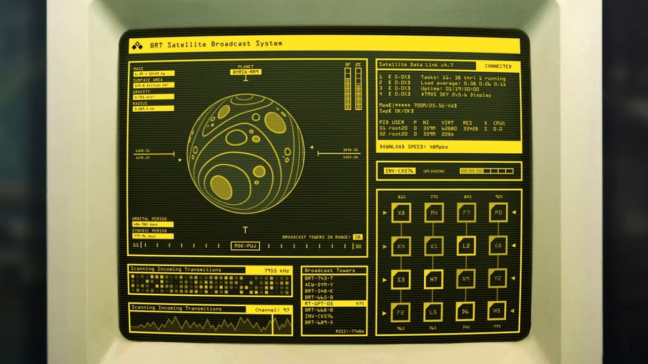
There’s a common misconception that retrofuturistic UX is just decoration—that it’s visual nostalgia slapped onto modern systems. But when thoughtfully executed, it represents a masterclass in balancing style with usability. Every neon line, VHS flicker, or LED-style indicator must serve a navigational purpose. Take skeuomorphic elements, for instance. A rotary-style dial for selecting content genres doesn’t just look cool; it mimics analog interaction that feels intuitive, even if it’s decades out of date. Similarly, progress bars styled after tape counters or CRT frames can communicate playback states in ways that are visually engaging but still functionally transparent. This interplay between form and function allows users to feel something while still doing something. Retro cues are not distractions—they’re orientation devices, mood-setting elements that guide user behavior while injecting personality into the platform.
Interfaces That Tell Stories, Not Just Host Them
One of the most exciting outcomes of retrofuturistic UX is its ability to extend storytelling beyond the content itself and into the platform interface. For a horror-focused streaming platform, this could mean gritty textures, VHS noise, and glitch transitions that feel like found footage. A sci-fi service might lean into neon wireframes, starfield animations, and vector grids pulled straight out of 80s science fiction cinema. The UX becomes an extension of the content universe—a kind of prologue to whatever the user is about to watch. This is a radical shift in how streaming services traditionally approach interface design. Instead of designing neutral containers that house varied content, retrofuturistic UX encourages platforms to embed narrative tone directly into the interface. Discovery becomes more than navigation—it becomes immersion. It’s not about what you’re going to watch. It’s about where you feel like you already are before you even press play.
Conclusion: Memory as UX Material, Emotion as Strategy
Ultimately, retrofuturistic UX in streaming platforms is not about reliving the analog age—it’s about designing interfaces that remember it. It’s about fusing visual memory with functional clarity to create spaces that feel alive. Interfaces that pulse with mood, resonate with story, and create presence beyond the algorithm. By weaving together cultural memory, emotional tactility, and future-forward usability, designers can craft experiences that don’t just serve up content—they shape the way users feel about the act of consuming it. And in a sea of platforms competing for time and attention, that emotional resonance might just be the most futuristic feature of all.

Dhamiem Ansari
Senior UI Designer