Table of Contents
Introduction
In the fierce, ever-expanding world of streaming platforms, attention isn’t just a metric—it’s the currency. As binge-watching becomes the norm and competition multiplies across borders, Over-the-Top (OTT) platforms have realized that content alone doesn’t drive revenue. It’s the experience around the content—the micro-interactions, the behavioral nudges, the carefully choreographed flows—that quietly, but decisively, dictate how long users stay, how much they consume, and ultimately, how much they’re worth.
OTT platforms have become masters of psychological design. Small UX features like “Skip Intro” or “Next Episode Autoplay” may appear user-friendly at first glance, but beneath them lies a strategic, monetization-first mindset. These design choices are not just about removing friction—they’re about maximizing watch time, engagement, and ad impressions, while subtly guiding user behavior to align with business outcomes.
The Silent Power of Seamless Flow
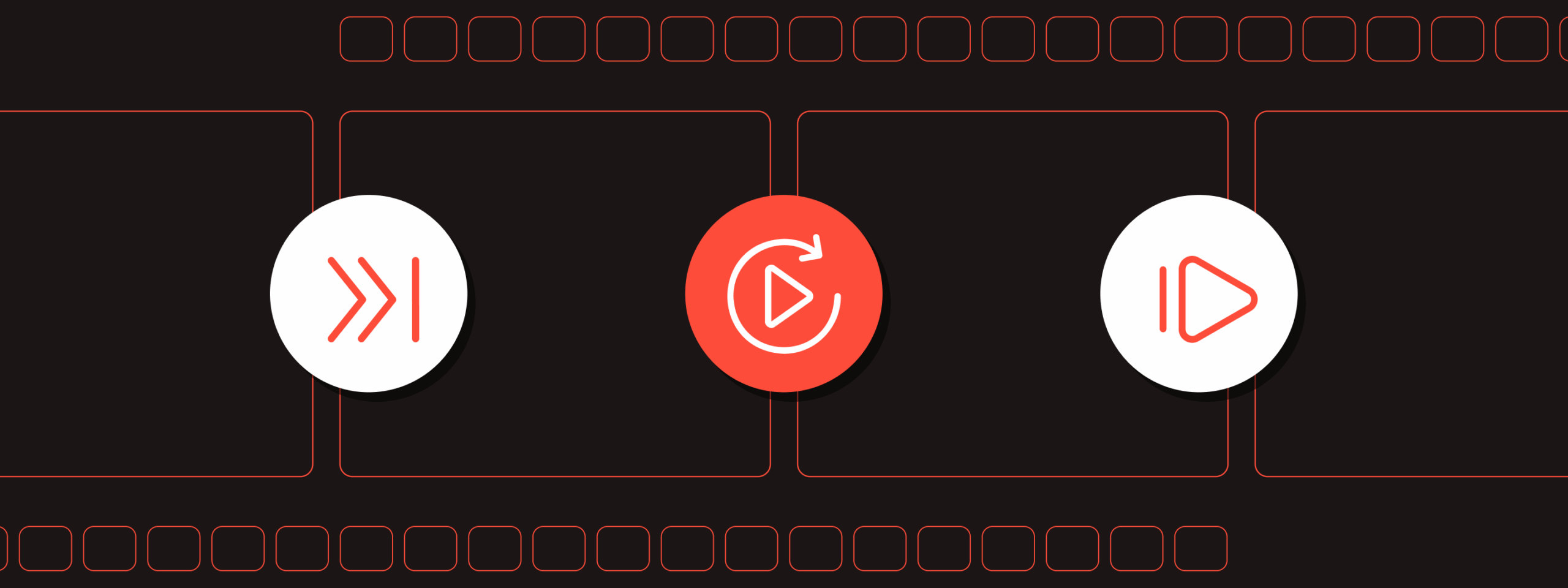
Every second a viewer spends not watching content is a second lost—potentially a skipped ad, an abandoned show, or worse, a canceled subscription. That’s why the most profitable OTT platforms obsess over reducing what UX strategists call “decision fatigue.” When a user doesn’t have to decide whether to keep watching, they usually do. Autoplay capitalizes on this psychology. It keeps viewers on a treadmill of content, removing the break where reflection—or worse, churn—might creep in.
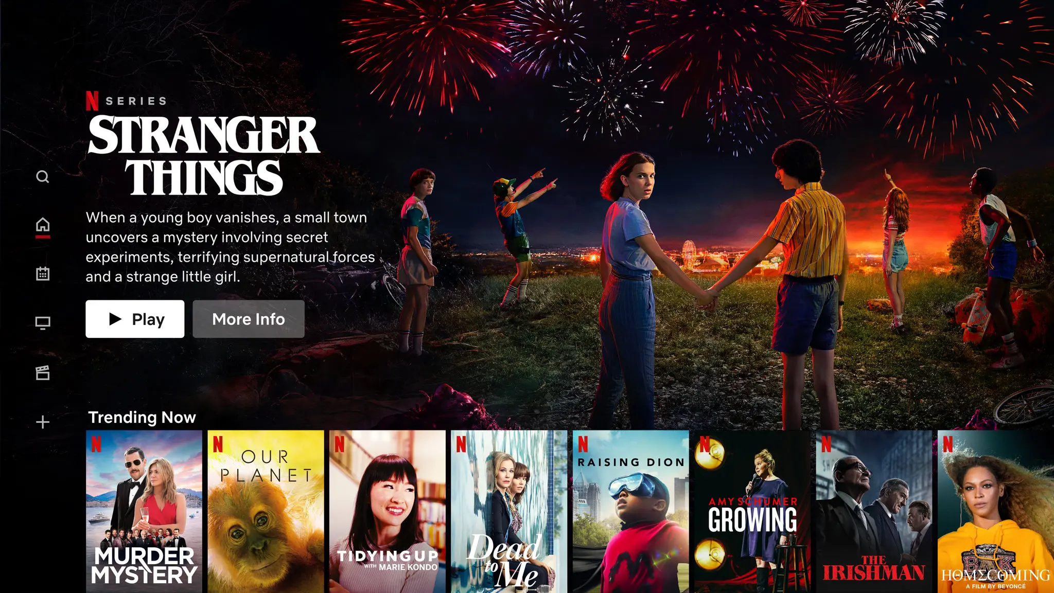
The “Up Next” carousel isn’t just a convenience feature; it’s a calculated mechanism to extend session length. By curating what shows or movies appear immediately after a viewer finishes an episode, OTT platforms reduce the chance that the user exits the app. Algorithms do the heavy lifting, but it’s the UX layer—the timing of the overlay, the countdown animation, the button placements—that ensures the transition feels effortless, even inevitable.
Skip Intro: A Shortcut to More Consumption
Ironically, allowing users to skip content increases the amount they consume. The “Skip Intro” button acknowledges that users value their time—and by removing the repetitive 90-second title sequences, platforms keep them locked into the narrative loop. The logic is simple: less friction means more episodes watched per session. This micro-UX feature alone has been shown to dramatically improve binge rates, which directly correlates with metrics like customer lifetime value and reduced churn.
The brilliance of such features lies in their simplicity. It’s not that users asked for it explicitly—platforms predicted the demand through behavioral data, then delivered it proactively. In doing so, they built trust. Users felt the platform respected their time. That emotional payoff, that feeling of being understood, is the hidden engine behind retention.
Personalization as Revenue Architecture
Beyond tactical UX, personalization plays a crucial strategic role in driving profitability. When the platform feels tailor-made for the viewer—when the thumbnails reflect their taste, when the genres shift dynamically, when recommendations feel almost too accurate—engagement skyrockets. But this isn’t just good design; it’s business strategy. More engagement means more data, and more data means better monetization, whether through ad targeting or content licensing decisions.
The UX surface of personalization—how content is grouped, what labels are used, how rows are ordered—is where data becomes design. It’s also where value is created. On ad-supported models, higher engagement means higher fill rates and better CPMs. On subscription models, it means longer retention and reduced acquisition pressure.
Micro-UX, Macro Impact
Everything from the placement of playback controls to how the app loads on different devices contributes to the financial success of a streaming platform. Even error states (“We’re having trouble playing this title…”) are now carefully scripted moments to retain goodwill. Some platforms even preload likely content based on predictive algorithms to eliminate buffering, preserving the illusion of speed and responsiveness. These are micro-UX decisions, but their compounding effect on user satisfaction, and therefore profitability, is immense.
Designing an OTT interface is no longer just a creative endeavor—it’s a financial operation. Each interaction is an opportunity to increase engagement, decrease churn, and drive up monetizable minutes. As platforms experiment with live content, commerce integration, and community-driven features, the role of UX will only grow more central to business outcomes.
Conclusion
What differentiates one OTT platform from another when most have similar content libraries or licensing strategies? Increasingly, it’s the experience. UX becomes the stickiness layer—the silent differentiator that builds brand preference and loyalty in a market where switching costs are low and choices are infinite.
The most forward-thinking OTT platforms now treat UX as a core part of their monetization stack, not just a support function. From motion design to recommendation logic, every pixel is being re-evaluated not just for beauty or usability, but for ROI.
As the attention economy accelerates, platforms that understand this will outplay those that don’t. The future of OTT is not just about the next great show. It’s about the experience that brings it to you—and the invisible UX decisions that keep you watching.

Naveen S
Senior UI/UX Designer