Table of Contents
Introduction
Crypto began in silence. A whitepaper. A pseudonym. A few lines of code that sparked a decentralized revolution. In its early days, it was defined by function: anonymity, security, and the cold precision of mathematics. But today, crypto isn’t just infrastructure, it’s culture. It has values, beliefs, aesthetics. It pulses with community, identity, and emotion. And that means it can no longer rely on logic alone to connect. It needs to be felt.
Design is how crypto speaks to the human world. It’s the translation layer between raw protocol and public perception, between SHA-256 and shared experience. As the space matures, the most impactful crypto brands won’t be the ones shouting “innovation” in glowing neon, they’ll be the ones that create emotional gravity through intentional, intelligent, and deeply human design.

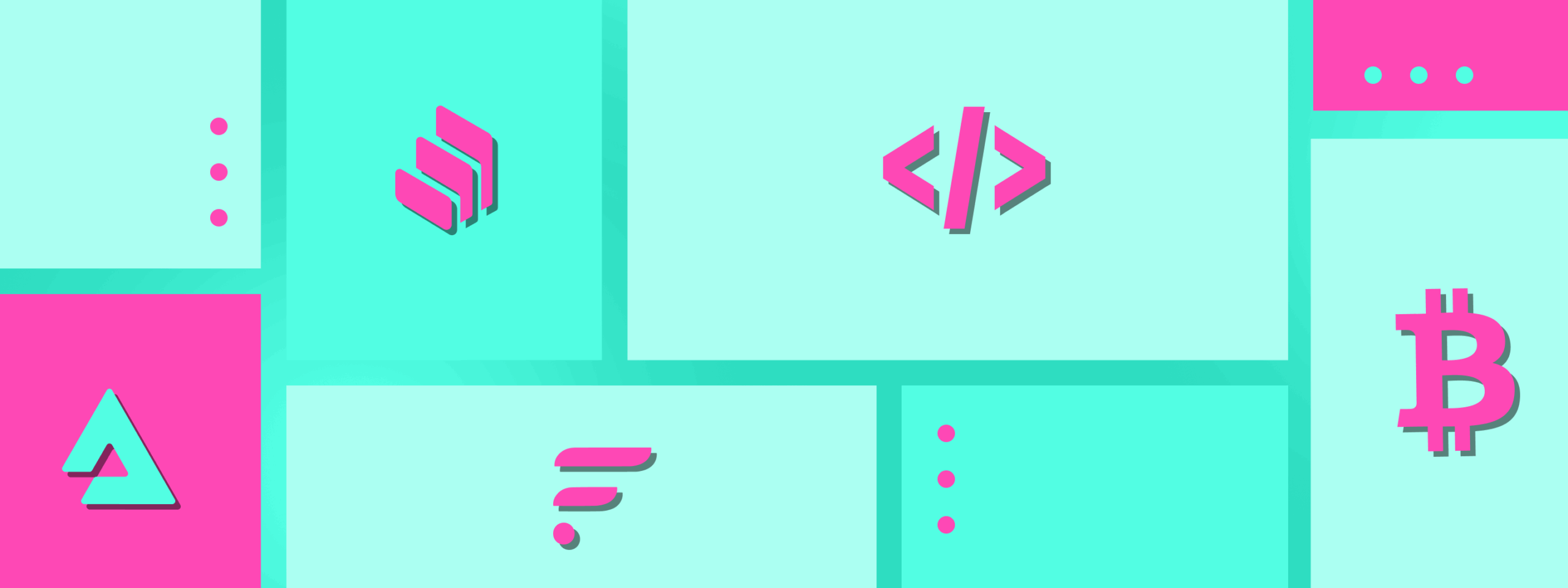
Crypto Is Culture, Not Just Code
At its core, crypto is a worldview. It’s a rejection of centralization, an embrace of autonomy, a call for transparency and inclusion. These aren’t just technical attributes, they’re emotional signals. Decentralization feels fair. Transparency feels honest. Self-custody feels empowering.
A truly resonant crypto brand must go beyond communicating these ideas, it must embody them. Design becomes the interface between ideology and emotion, allowing abstract values to manifest as something users can see, feel, and trust.
Decentralization as Visual Logic
Decentralization isn’t chaotic, it’s distributed. In design, this principle can be expressed through systems that avoid singular hierarchy. Interfaces, layouts, and even brand architecture can echo decentralized principles through modularity and symmetry.
Visual metaphors can nod to network structures, radial patterns, multi-nodal compositions, or grid systems that feel organic yet balanced. It’s not about randomness; it’s about a different kind of order. One that reflects fairness and participation, rather than top-down control.
Designing for Transparency
Transparency in blockchain is often described in technical terms, open-source code, visible transactions, auditable smart contracts. But visually, transparency means clarity. Design must remove friction, not add ornamentation. Typography should be legible across devices. Interfaces must guide, not overwhelm. Layouts need to create space for understanding, not just aesthetics.
A transparent product feels clean, deliberate, and truthful. There’s nowhere to hide, so design must speak plainly, and with confidence.
Community, Play, and Participation
What makes crypto different from traditional finance isn’t just decentralization, it’s culture. Communities form around coins, memes, causes, and shared ideals. DAOs are redefining collaboration. Memes are currency. And Discord servers often feel more alive than corporate Slack channels.
Design must honor that spirit. It can’t feel corporate or sterile. The best crypto brands know when to be irreverent, when to be playful, and when to tap into cultural language with fluency. That may mean embracing motion, remixable assets, or a visual tone that invites participation rather than dictates from above.
Typography as Tone
Typography in crypto should be more than aesthetic. It sets tone, clarity, and credibility. Sans-serif fonts bring digital clarity. Custom letterforms help projects stand apart in a sea of forks and clones. Variable fonts allow adaptive design systems that echo flexibility and forward-thinking tech.
Crypto doesn’t need to look futuristic, it needs to look believable. Typography should balance innovation with usability, confidence with warmth.
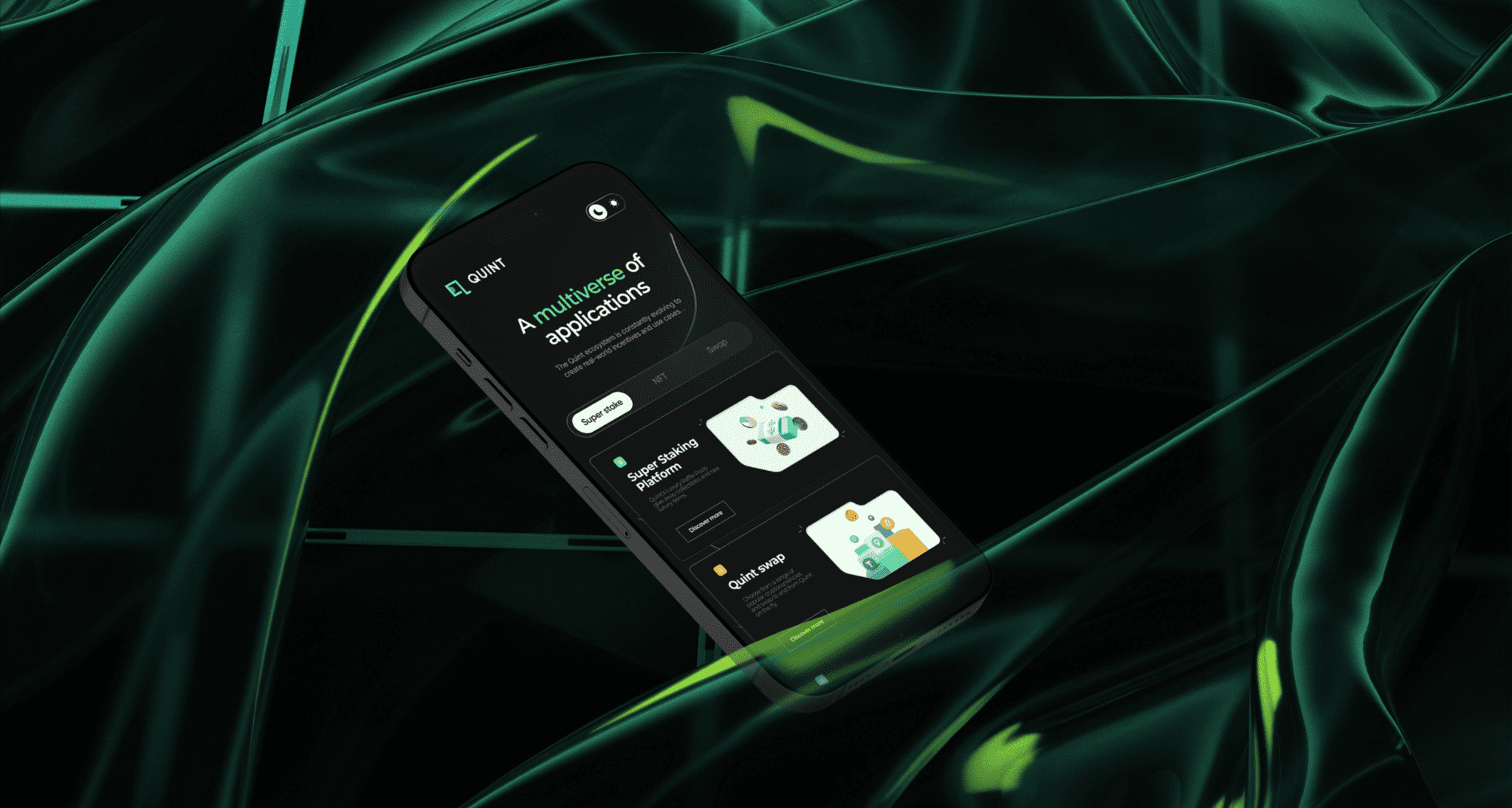
Interface Is Identity
The product is the brand. In crypto, that’s especially true. A wallet, exchange, or staking platform isn’t just a tool, it’s often the only touchpoint a user has with a protocol. That means interface design must work harder than any billboard or brand campaign.
Every microinteraction, hover state, and onboarding screen carries emotional weight. Trust is won or lost in milliseconds. When something feels visually clunky or unclear, users assume risk, even if the smart contract is perfectly secure. Design becomes the emotional safety net.
Designing for the Trustless Paradox
Here lies the ultimate irony: crypto promises trustless systems, yet it still requires emotional trust to grow. And trust isn’t a button. It’s a feeling.
Design bridges that paradox. It takes invisible systems and makes them tangible. It translates complex technology into usable, beautiful, human-centered experiences. It says: “You’re safe here. You’re in control. You belong.” This is where emotion meets engineering. Where aesthetics meet ethos.
Conclusion
We are moving into the next phase of crypto. Beyond hype cycles. Beyond speculative peaks. Into real products for real people. And real people don’t connect through whitepapers alone. They connect through feeling.
Design is how crypto makes that emotional leap. It’s not a layer on top of code, it’s the layer that lets code be seen, felt, and loved. Because while crypto may be built in silence, its future depends on being understood in color, in form, and in feeling.
From code to color, the emotional infrastructure of Web3 is already under construction. And the best-designed brands won’t just tell us what they do. They’ll show us what they believe.
Design is my daily grind and creative outlet. Whether it’s building strong visual systems or finessing the small details, I love what I do. When I’m not designing, I’m likely chasing boss levels in a video game, trying out a new recipe, or getting lost in a great anime series .

Akshita Shivani Sundar
Senior Graphic Designer