



What are UI/UX Laws?
UI/UX laws are widely accepted design principles based on human psychology and cognitive science that explain how people perceive, decide, and interact with digital interfaces. Applying these principles helps reduce cognitive load, minimize errors, improve usability, and create more intuitive experiences, leading to higher user satisfaction and better business outcomes.

Explore the design system behind the EVOS.
What is the Flow? The Invisible Architecture of UX Laws
UI/UX laws create a seamless user flow by aligning interfaces with human psychology and behavior. When applied effectively, they reduce friction, minimize cognitive effort, guide users naturally, and make the design feel invisible. This shifts the focus from designing how a product looks to designing how people naturally think and interact.
Comparative Matrix: UX Laws at a Glance
| UX Law | Primary Focus | Best Used For | Business Value |
|---|---|---|---|
| Hick’s Law | Decision Speed | Navigation menus, checkout paths, product listings | Reduces abandonment rates and minimizes analysis paralysis |
| Fitts’s Law | Physical Target Layout | Mobile buttons, interactive links, floating navigation bars | Improves interaction speed and increases conversions |
| Jakob’s Law | User Mental Models | Layout wireframes, familiar icons, e-commerce checkout flows | Reduces the learning curve and builds user trust |
| Miller’s Law | Working Memory | Multi-step forms, number inputs, phone/card layouts | Prevents cognitive overload and improves data readability |
| Aesthetic-Usability Effect | Positive Emotion | Brand identity, typography, UI animations, transitions | Enhances perceived quality and increases tolerance for minor usability issues |
The Essential List of UI/UX Laws
To build frictionless digital products, you need to know the core principles that govern user interaction. Let’s look at the foundational laws shaping the modern web.
Law-01: Hick’s Law
The time it takes to make a decision increases with the number and complexity of choices.
Detailed Breakdown
Named after psychologists William Edmund Hick and Ray Hyman, this law states that the more options you present to a user, the longer they will take to choose. Mathematically, decision time increases logarithmically as choices grow.
In digital interfaces, this leads to a phenomenon called analysis paralysis. When hit with too many options simultaneously, the human brain suffers from cognitive overload, forcing the user to mentally evaluate every path before taking action. If the effort required to make a decision feels too high, the user will often abandon the task entirely.
How to Apply It
- Progressive Disclosure: Hide advanced features, secondary settings, or complex data until the user explicitly asks for them. Use dropdowns, “Show More” toggles, or accordions.
- Onboarding Simplification: Do not show your entire feature set on day one. Walk new users through one clear setup task at a time.
- Curated Recommendations: Instead of showing 50 products at once, use filters, smart categories, or a “Top 3 Recommended” section to narrow the field.
Real-World Case Studies
- Netflix: Instead of displaying an unstructured, infinite wall of movies, Netflix categorizes content into highly specific vertical rows (e.g., “Gritty Action Thrillers”). They also feature a prominent “Top 10” list to help users choose a movie faster and reduce decision fatigue.
- Slack: During account setup, Slack doesn’t force you to customize notifications, upload avatars, or invite your entire team all on one screen. It asks one simple question per screen: “What is the name of your company?” followed by “What project are you working on right now?”
Law-02: Fitts’s Law
The time to acquire a target is a function of the distance to and size of the target.
Detailed Breakdown
Formulated by Paul Fitts in 1954, this law mathematically predicts how long it takes a human to physically move a pointer (like a mouse cursor or a human thumb) to a target area. The rule is simple: larger targets that sit closer to the user’s current pointer position are much faster and easier to hit.
Conversely, tiny targets placed far away require high physical precision, which slows down the user and spikes their physical error rate. In mobile design, this principle is highly dependent on the “Thumb Zone”, the natural range of motion for a user’s thumb when holding a phone with one hand.
How to Apply It
- Ample Touch Targets: Ensure all interactive elements (buttons, links, form inputs) have a minimum touch target size of at least 48×48 density-independent pixels (dp), as recommended by accessibility guidelines.
- Sticky Screen Corners and Edges: In desktop software, the edges and corners of the screen are infinitely large targets because the cursor automatically stops there when flung outward (e.g., the Windows “Start” button or the macOS menu bar).
- Action Placement: Place primary conversion buttons (like “Add to Cart” or “Submit”) near the bottom or center of mobile layouts where thumbs naturally rest.
Real-World Case Studies
- Mobile Banking Apps: Most banking applications place their primary “Transfer Money” or “Pay a Bill” buttons as a sticky persistent bar at the bottom of the viewport, rather than hiding them inside a hamburger menu at the top left.
- Instagram: The navigation options you use most frequently, Home, Search, Create, Reels, and Profile, are placed along the bottom bar of the screen. This layout minimizes physical strain and makes jumping between core features effortless.
Law-03: Jakob’s Law
Users spend most of their time on other sites. This means they expect your site to work the same way as all the others they already know.
Detailed Breakdown
Coined by usability pioneer Jakob Nielsen, this law reminds us that users bring pre-existing mental models to your product. Before they ever visit your platform, they have spent thousands of hours navigating giants like Google, Amazon, YouTube, and Apple.
If your design forces users to learn a completely new interaction style, such as a non-standard navigation pattern or an unfamiliar icon convention, it introduces massive friction. By leveraging familiar design systems, you allow users to focus entirely on your content, products, or services rather than wasting mental energy figuring out how the interface works.
How to Apply It
- Standardize UI Elements: Keep standard patterns right where users expect them. Place search bars at the top center or top right, profile icons in the upper right corner, and utility links in the footer.
- Familiar Iconography: Use widely recognized icons for core features. A magnifying glass means search, a house means home, a gear means settings, and a bookmark means save. Do not try to redefine these symbols.
- Consistent E-Commerce Flows: Keep the standard checkout sequence: Cart → Shipping Address → Payment Info → Review Order → Confirmation.
Real-World Case Studies
- Streaming Platforms (Disney+, HBO Max): When Disney+ and HBO Max launched, they didn’t try to reinvent how video streaming worked. They copied Netflix’s dark background interface, top hero banner slider, and horizontal scrolling categories. Because the experience felt instantly familiar, users adopted the new platforms with zero learning curve.
- Shopify Checkouts: Shopify standardizes the layout of the checkout page across thousands of independent online storefronts. Because buyers encounter the exact same form layout on almost every Shopify site, they can complete purchases securely and quickly without double-checking how the page functions.
Law-04: Miller’s Law
The average person can only keep about 7 (plus or minus 2) items in their working memory.
Detailed Breakdown
In 1956, cognitive psychologist George Miller published a foundational paper showing that human short-term memory can comfortably retain only 5 to 9 pieces of information at once. In modern digital practice, research suggests that real-world working memory limits are often even lower, closer to 4 or 5 chunks.
When an interface forces a user to remember information across different screens or lists too many unorganized items at once, it overloads their working memory. To combat this, designers use chunking, the practice of organizing separate pieces of data into distinct, meaningful groups.
How to Apply It
- Data Formatting: Always format long strings of numbers. Display phone numbers as (555) 019-2834 instead of 5550192834. Format credit cards into clear 4-digit blocks.
- Navigation Limits: Keep primary header navigation menus limited to 5-7 top-level categories. If you have more, organize them into clean, structured sub-menus.
- Step-by-Step Checkouts: Break lengthy checkout or registration flows into clear steps (e.g., Step 1 of 3) so users only need to focus on a few details at a time.
Real-World Case Studies
- Amazon Order History: When tracking a package, Amazon doesn’t show a raw wall of log data. It chunks the journey into four clear status markers: Ordered, Shipped, Out for Delivery, and Arriving. This makes the tracking status understandable at a single glance.
- Duolingo: Language learning requires taking in a lot of vocabulary and grammar rules. Duolingo structures lessons into brief exercises containing just a few concepts at a time. Users check their progress on a visual roadmap, preventing cognitive fatigue.
Law-05: Aesthetic-Usability Effect
Attractive designs are perceived as easier to use.
Detailed Breakdown
First documented in 1995 by researchers Masaaki Kurosu and Kaori Kashimura, this psychological phenomenon shows that users are incredibly forgiving of minor usability issues if an interface is visually stunning.
An attractive layout creates a positive emotional response, which makes users feel relaxed and patient. They are more likely to blame themselves for any confusion rather than blaming the system.
However, this effect is a double-edged sword: it can mask serious usability flaws during user testing. Participants might praise an app’s beautiful colors and typography while completely missing that the navigation menu is broken.
How to Apply It
- Prioritize Polish: Do not ignore visual polish. Maintain clean alignment, use consistent color palettes, choose readable typography, and use whitespace to give elements room to breathe.
- Fix Underlying Usability Issues: Never use aesthetics to cover up a broken user flow. A beautiful product might get users through the door, but if it remains genuinely hard to use, frustration will eventually override their initial positive impression.
- Delightful Micro-interactions: Use subtle animations, like a smooth button transition or a satisfying loading state, to make the experience feel high-quality and premium.
Real-World Case Studies
- Apple: Apple has built a massive global brand on the Aesthetic-Usability Effect. The minimalist design, generous whitespace, and premium materials used across both their hardware and software make users highly forgiving of platform limitations, such as restricted customization options or missing legacy ports.
- Airbnb: In its early days, Airbnb grew rapidly in part because it shifted away from messy classified-ad layouts and embraced high-resolution photography, modern typography, and clean white space. Users trusted the beautiful interface more, making them feel safer booking stays with strangers.

Explore the Design process behind the Quint.
Comparative Matrix: UX Laws at a Glance
| UX Law | Primary Focus | Best Used For | Business Value |
|---|---|---|---|
| Law of Proximity | Layout Grouping | Form design, card layouts, content feeds | Improves scanability and helps users associate related content |
| Law of Similarity | Visual Consistency | Button systems, link styles, status indicators | Creates predictable interfaces and strengthens consistency |
| Common Region Principle | Element Grouping | Complex dashboards, sidebars, nested content sections | Clearly separates related information without relying solely on whitespace |
| Law of Closure | Shape Simplification | Icon design, loading skeletons, carousel indicators | Enables clean, minimalist designs while maintaining recognition |
| Doherty Threshold | Interaction Speed | Hover effects, page loading, search suggestions | Keeps users engaged through responsive interactions |
Law-06: Law of Proximity
Objects that sit close to one another are perceived as a single group sharing similar functions.
Detailed Breakdown
Part of Gestalt psychology, this law states that the human eye naturally groups objects that are physically close together. Our brains assume these elements are related and serve a similar purpose.
If elements are scattered or spaced inconsistently, the brain struggles to build these connections, causing confusion. Proper use of proximity creates a clear visual hierarchy, allowing users to scan a page and instantly understand how different pieces of content relate to one another.
How to Apply It
- Bind Labels to Inputs: Place form input fields directly beneath their matching text labels. Make sure the space between a label and its input field is visibly smaller than the space between different form fields.
- Card Components: Group images, headlines, body text, and call-to-action buttons inside a single card layout, using distinct margins to separate that card from surrounding content.
- Paragraph Headers: Place headings slightly closer to the body text they introduce than to the preceding section.
Real-World Case Studies
- Medium: On its article index pages, Medium uses tight spacing to bind a writer’s avatar, name, publication date, article title, and reading time into one clear block. A much larger whitespace gap separates this block from the next article, making the feed incredibly easy to scan.
- Google News: Google News organizes stories by grouping the main headline, source name, publication time, and related articles inside a clear visual block. This proximity signals to the reader that all these links point to the same news event.
Law-07: Law of Similarity
Similar-looking elements are perceived as related or sharing a common function.
Detailed Breakdown
Another core Gestalt principle, the Law of Similarity states that our brains automatically group elements that share matching visual characteristics, such as color, shape, size, texture, or orientation.
If three buttons on a screen look exactly the same, a user naturally expects them to perform similar types of actions. If you introduce random changes to these visual patterns, you break the user’s expectations and force them to re-evaluate every element on the screen.
How to Apply It
- Consistent Component Styling: Style all primary buttons identically across your entire app (e.g., solid blue with rounded corners). Keep secondary buttons visually distinct but uniform (e.g., outlined buttons).
- Uniform Link Styling: Ensure all inline text links use the exact same color and styling rule (like an underline) so users can spot clickable elements instantly.
- Status Codes: Use consistent colors to convey meaning across the application: green always means success, red means an error, and yellow means a warning.
Real-World Case Studies
- Spotify: In Spotify’s interface, all playable media items (albums, playlists, podcast episodes) are styled as clean squares, while artists’ profiles are cropped into distinct circles. This simple shape difference helps users distinguish between a collection of music and an artist’s profile page instantly.
- Trello: Trello uses color-coded labels on its task cards. Even if cards are spread out across multiple columns, a user can scan the board and instantly group all cards marked with a red label, recognizing they belong to the same project phase.
Law-08: Law of Common Region
Elements appear connected if they sit inside a clearly defined boundary.
Detailed Breakdown
This Gestalt law builds upon proximity and similarity. It states that when elements are placed within a shared, enclosed boundary, the human brain views them as an isolated group with a common purpose, even if they have different shapes, colors, or sizes.
Using borders, background colors, or drop shadows to create a “common region” is an effective way to separate distinct types of content without relying purely on whitespace.
How to Apply It
- Use Containers and Cards: Wrap related interactive controls, text fields, and photos inside a distinct card container with a light background or a subtle border.
- Distinct Navigation Bars: Give header and footer menus a different background color than the main page content to separate navigation tools from article text.
- Sidebar Panels: Enclose filtering tools, widgets, or settings inside a distinct sidebar area to keep them separate from your primary data tables.
Real-World Case Studies
- Twitter / X: X places every post inside its own bordered container. The text, user avatar, image attachments, and interaction buttons (Like, Retweet, Share) are held together inside this box, ensuring readers can easily tell where one post ends and the next begins.
- Dashboard Interfaces (Salesforce, HubSpot): These analytical platforms use bordered cards to isolate distinct charts and data feeds. This common region layout keeps users from confusing the metrics of one report with another.
Law-09: Law of Closure
Humans naturally look for patterns and will mentally fill in missing information to perceive a complete shape.
Detailed Breakdown
The Law of Closure states that the human brain dislikes incomplete shapes. When confronted with an open or broken visual asset, our minds automatically fill in the gaps to create a whole, recognizable image.
In UI/UX design, this principle allows us to reduce visual clutter. We don’t need to draw every single line or border explicitly; instead, we can use minimalist icons and layouts, letting the user’s brain seamlessly complete the picture.
How to Apply It
- Minimalist Iconography: Design clean, open icons that convey meaning without full borders or complex lines (e.g., an open-ended trash can or user profile silhouette).
- Indicate Hidden Content: When building horizontal carousel sliders, deliberately cut off the edge of the next item. The user’s mind recognizes the shape is incomplete and naturally deduces that swiping will reveal the rest.
- Clean Loading Skeletons: Use simple, open outline shapes during content loading states instead of a spinning wheel. The brain fills in the shapes, anticipating the content that is about to load.
Real-World Case Studies
- Famous Brand Logos (WWF, IBM): The World Wildlife Fund (WWF) logo features a giant panda created entirely from open black shapes on a white background. There is no outline around the panda’s head or back, yet the brain connects these shapes perfectly.
- Mobile App Carousels (Netflix, App Store): When browsing categories on a mobile app store, the right-most card is clipped by the screen edge. This incomplete shape triggers the Law of Closure, prompting the user to swipe horizontally to view the hidden details.
Law-10: Doherty Threshold
System interactions should respond under 400 milliseconds to keep users engaged.
Detailed Breakdown
In 1982, IBM researcher Walter J. Doherty published a study showing that human computer interaction efficiency spikes when the system responds within 400 milliseconds of a command.
If a system takes longer than 400ms to respond, the human brain experiences a break in attention, leading to impatience and distractions. Keeping interactions below this threshold creates an addictive, fluid user experience where the tool feels like a natural extension of the user’s thoughts.
How to Apply It
- Optimistic UI Updates: Do not wait for a slow server to reply before updating the screen. When a user clicks a “Like” button, immediately change the icon to its active state. If the server request fails later, gracefully revert the change.
- Skeleton Screens: When loading rich content, show a gray, structured skeleton layout immediately. This gives the illusion of speed and keeps the user engaged while data loads in the background.
- Snappy Hover Transitions: Keep CSS button hover transitions and drop-down animations short, ideally between 150ms and 300ms.
Real-World Case Studies
- Instagram Feed Loading: When you open Instagram, the app instantly displays text placeholder skeletons and cached images while fetching new data. This immediate feedback makes the app feel incredibly fast, even on slower cellular networks.
- Google Search Auto-Complete: As you type into Google’s search bar, query suggestions update instantly with every keystroke. This real-time response keeps you locked into the search experience without a single beat of hesitation.

Explore the UX design process behind the Kind Energy.
Comparative Matrix: UX Laws at a Glance
| UX Law | Primary Focus | Best Used For | Business Value |
|---|---|---|---|
| Peak-End Rule | Memory & Experience | Success pages, error handling, payment confirmation | Leaves a memorable positive impression and encourages repeat usage |
| Serial Position Effect | Content Ordering | Navigation menus, pricing plans, feature lists | Highlights key actions and improves discoverability |
| Tesler’s Law | Managing Complexity | Address autofill, social login, sign-up processes | Shifts complexity from users to the system, reducing friction |
| Parkinson’s Law | Task Efficiency | Progress indicators, inline validation, real-time feedback | Encourages faster task completion and improves completion rates |
| Occam’s Razor | Simplicity & Minimalism | Feature prioritization, interface design, asset management | Eliminates unnecessary complexity and improves usability |
Law-11: Peak-End Rule
Users judge an experience primarily by its most intense point (the peak) and its final moment (the end), rather than the total average of the journey.
Detailed Breakdown
Discovered by Nobel Prize-winning psychologist Daniel Kahneman, this heuristic reveals that humans do not remember their experiences as a smooth, mathematical average of every second spent. Instead, our memories are anchored by the emotional peak (which can be incredibly positive or deeply frustrating) and the very end of the interaction.
A user can run into several minor bugs during a lengthy onboarding process, but if the final step is incredibly satisfying, they will walk away remembering the product as a great experience.
How to Apply It
- Elevate the High Points: Identify the core value moment in your product, the exact second the user achieves their goal and celebrate it with rich micro-animations or delightful copy.
- Finish Strong: Pay close attention to final screens: order confirmations, account creation successes, and task completions. Leave a lasting positive impression.
- Soften the Negative Peaks: When an error occurs (like a missing 404 page or a failed payment), use helpful error messages or lighthearted illustrations to reduce frustration.
Real-World Case Studies
- Mailchimp Email Delivery: Sending a massive email newsletter to thousands of subscribers can be stressful for marketers. Mailchimp creates a fun emotional peak by showing their mascot’s sweating monkey hand hovering over a big red button. Once sent, the app rewards the user with a high-five animation, ending the stressful task on a high note.
- Asana Task Completion: When you mark a major task as complete in the project management tool Asana, a colorful mythical creature (like a unicorn or phoenix) occasionally shoots across the screen. This unexpected reward turns a routine action into a delightful emotional peak.
Law-12: Serial Position Effect
Users have a strong tendency to best remember the first and last items in a series.
Detailed Breakdown
Termed by Herman Ebbinghaus, this memory law describes how the position of an item in a list affects how well we remember it. It combines two psychological biases:
- The Primacy Effect: The first items in a list are easily stored in long-term memory because our brains have more time to process them.
- The Recency Effect: The last items in a list are fresh in our working memory, making them easy to recall instantly.
Items stuck in the middle of a long list or menu tend to get blurred together and are easily forgotten.
How to Apply It
- Navigation Hierarchy: Place your most critical, high-conversion menu links (like “Home/Dashboard” and “Contact/Upgrade”) at the far left and far right of your navigation bars.
- Key Data in Content Feeds: When displaying pricing tier cards or features, position your most important options at the very beginning or the very end of the row.
- App Bar Design: In mobile applications, anchor the bottom tab bar with the two most important features at the outside positions for quick access.
Real-World Case Studies
- Apple iOS App Bottom Navigation: Look at any core Apple app. In the Phone app, Favorites sits on the far left, and Voicemail sits on the far right. The middle slots hold less critical options. This layout makes muscle-memory navigation fast and accurate.
- E-Commerce Product Landing Pages: Brands like Nike or Amazon position their primary product variations, promotional terms, or high-margin items at the very beginning of search feeds or visual carousels, knowing that’s where user attention peaks.
Law-13: Tesler’s Law (The Law of Conservation of Complexity)
Every system has an inherent amount of complexity that cannot be removed. You can only choose whether the application or the user handles it.
Detailed Breakdown
Coined by computer scientist Larry Tesler while working at Xerox PARC, this law states that all processes have a baseline of unavoidable complexity. If you want to buy car insurance online, the system fundamentally needs your name, address, car model, and driving history.
The core job of a UX designer is to pull that complexity off the user’s shoulders and build it directly into the system’s backend software infrastructure. However, designers must be careful not to over-simplify interfaces to the point of stripping away essential control or transparency.
How to Apply It
- Smart Defaults and Automation: Use browser geolocations or zip codes to auto-fill full shipping addresses, and automatically match credit card numbers to their banking providers.
- Smart Invoicing Integration: Pull data from existing user profiles so they never have to re-enter information they’ve already provided.
- Keep Essential Information Clear: Avoid hiding critical legal disclosures or pricing breakdowns in the name of an ultra-minimalist layout.
Real-World Case Studies
- Uber: The traditional taxi booking experience was filled with user-facing friction: dialing a dispatcher, explaining your location, waiting blindly, and handling cash. Uber shifted all of this complexity onto their application infrastructure. The system automatically reads your GPS location, handles the payment routing, and tracks the driver in the background, leaving the user with a simple one-click request interface.
- Apple Pay: Apple Pay reduces the complex, multi-step checkout form into a simple biometric verification scan. Instead of typing out billing addresses, card numbers, and security codes on a mobile screen, the system securely passes that stored data to the merchant in a split second.
Law-14: Parkinson’s Law
Work expands to fill the available time; simplify tasks to encourage faster completion.
Detailed Breakdown
Originally articulated by Cyril Northcote Parkinson as an observation on bureaucratic efficiency, this law states that if a person is given two hours to fill out a simple form, they will take the full two hours.
In product design, this means that if an interface feels open-ended, slow, or cluttered with non-essential steps, users will take longer to complete the process. This extended time on task increases their chances of running into a distraction and dropping off.
By adding clear visual structure, smart real-time validations, and a sense of momentum, you encourage users to finish tasks quickly and efficiently.
How to Apply It
- Inline Form Validation: Show clear success checkmarks the moment a user types a valid email address. This keeps them moving forward confidently without waiting to hit a final submit button to see errors.
- Autofill Features: Use browser autocomplete tools for address and payment fields to cut down on typing time.
- Visual Time Limit Indicators: For time-sensitive checkouts (like concert tickets), use a clear countdown timer to encourage quick decision-making.
Real-World Case Studies
- Ticketmaster: When you buy high-demand concert tickets, Ticketmaster gives you a clear 5-to-10 minute window to finish the purchase. This time constraint prevents users from overthinking the purchase or leaving the page open, ensuring transactions close fast.
- Typeform: Typeform formats surveys by showing exactly one question at a time. By hiding the rest of the form, it creates a fast, conversational rhythm that prompts users to answer quickly and increases completion rates compared to traditional, long-form pages.
Law-15: Occam’s Razor
Prefer the simplest solution that meets the user’s needs. Avoid adding unnecessary elements if they don’t solve real problems.
Detailed Breakdown
Attributed to medieval philosopher William of Ockham, this problem-solving principle states that when presented with competing hypotheses or design directions, the simplest explanation or path is usually the best.
In UI/UX design, Occam’s Razor is your defense against feature creep, the tendency for software products to become bloated with niche tools over time. Every extra button, graphic, icon, or block of text you add dilutes the primary goal of the screen. Always look for the cleanest layout that solves the user’s problem.
How to Apply It
- Relentless Content Culling: Regularly audit your interfaces and remove any secondary links or ornamental imagery that doesn’t actively help the user complete their goal.
- Consolidate User Steps: If an app requires two separate dashboard views to display similar analytics, combine them into one unified view with clean filters.
- Embrace Clean Whitespace: Do not feel the need to fill every open corner of a screen with boxes or text lines. Let whitespace frame your primary content naturally.
Real-World Case Studies
- Google Homepage vs. Yahoo (Early 2000s): Yahoo’s early portal tried to show news, sports scores, weather, directories, and search bars all on one page. Google used Occam’s Razor: it realized the user’s core problem was simply finding a website. It cut out everything else, leaving a blank page with a logo and a single input box.
- Zoom vs. Legacy Corporate Video Software: Older enterprise video tools required installing bulky plugins, setting up complex codecs, and typing in long meeting IDs. Zoom simplified the model down to a single actionable concept: click one link to join the call. This clean solution fueled their massive growth.

Explore the UX design process behind the Maverick AI.
Comparative Matrix: UX Laws at a Glance
| UX Law | Primary Focus | Best Used For | Business Value |
|---|---|---|---|
| Postel’s Law | Flexible Input Handling | Search bars, copy-paste fields, form validation | Accepts varied user input and reduces validation frustration |
| Von Restorff Effect | Visual Contrast | Primary CTA buttons, highlighted pricing plans, feature announcements | Directs attention to high-priority elements and improves conversions |
| Zeigarnik Effect | Task Completion Motivation | User onboarding, progress trackers, profile completion | Encourages users to finish incomplete tasks and increases engagement |
Law-16: Postel’s Law (The Robustness Principle)
Be strict in what you produce, and forgiving in what you accept.
Detailed Breakdown
Formulated by internet pioneer Jon Postel to govern data transfer protocols, this law translates beautifully into user experience design: your system must be incredibly resilient when accepting human input.
Humans make typos, use non-standard formatting, paste weird symbols, and misunderstand input guidelines all the time. A fragile interface throws rigid error messages, forcing the user to fix minor formatting issues manually. A robust design accepts whatever input the user provides, parses it intelligently, and formats it cleanly on the backend.
How to Apply It
- Forgiving Form Formatting: Allow users to type phone numbers using spaces, dashes, parentheses, or raw numbers (555-123-4567 or 5551234567). Let the system normalize the data format.
- Smart Search Interpretation: Program search bars to handle common spelling mistakes, typos, and missing words gracefully, showing the intended results anyway.
- Flexible Upload Formats: If a user drops a .jpeg file into a slot that asks for a .jpg or .png, convert or accept the file automatically rather than blocking the upload with an error message.
Real-World Case Studies
- Google Search Dictation: If you make a major typo on Google search (e.g., typing “nba scors”), Google doesn’t show an empty results page. It applies Postel’s Law, interprets your clear intent, and asks, “Showing results for NBA scores,” keeping you moving forward seamlessly.
- Stripe Payment Fields: Stripe’s credit card entry fields are incredibly forgiving. They automatically parse out spaces as you type, recognize the card network after the first digit, and auto-jump your cursor to the expiration date field without manual input.
Law-17: Von Restorff Effect (The Isolation Effect)
When multiple similar objects are present, the one that differs from the rest is the most likely to be remembered.
Detailed Breakdown
Discovered by psychiatrist Hedwig von Restorff in 1933, this law states that when looking at a group of similar items, our eyes are naturally drawn to the one that breaks the pattern.
The human brain is wired to spot differences, it is a survival mechanism designed to notice changes in our environment. In interface design, you can use color, size, shape, weight, or animation to intentionally guide user focus to the most critical action on the page.
How to Apply It
- High-Contrast Action Buttons: Give primary call-to-action buttons (like “Get Started Now”) a distinct color that stands out sharply from the rest of the page’s color palette.
- Feature Callouts: Use notification badges, subtle icons, or clear borders to flag new or high-value features in a long list.
- Avoid Visual Noise: If you try to make every button on a page pop, you break the pattern entirely. Limit this intense styling to one key element per screen.
Real-World Case Studies
- Saas Pricing Matrices: Look at the pricing tier pages for platforms like Notion or Zoom. The “Recommended” or “Pro” plan card is often styled with an elevated shadow, a different color border, or a bold badge across the top. This contrast immediately draws the eye and drives higher plan adoption.
- Notification Badges: App ecosystems use the Von Restorff effect by placing a bright red dot over app icons that have unread alerts. That single pop of contrast breaks your home screen’s layout and pulls your focus directly to the app.
Law-18: Zeigarnik Effect
People remember uncompleted or interrupted tasks much better than completed ones.
Detailed Breakdown
Bluma Zeigarnik, a Soviet psychologist, noticed that restaurant waiters could remember incredibly complex orders while they were still being prepared, but forgot them the second the food hit the table.
This effect shows that starting a task creates a lingering mental tension. This tension stays open in our working memory until the task is fully closed. In product design, you can leverage this to motivate users to finish onboarding steps, training exercises, or profile setups.
How to Apply It
- Visible Progress Bars: Show clear, percentage-based progress indicators during lengthy registration or onboarding flows (e.g., “Profile 65% Complete”).
- Gamified Checklists: Provide a checklist of initial setup tasks with the first few items marked complete automatically to give the user a head start.
- Save and Resume Options: When users leave a multi-step form early, show a clear visual indicator the next time they log in, inviting them to step right back in and finish what they started.
Real-World Case Studies
- LinkedIn Profile Completeness Meter: LinkedIn uses a prominent progress bar on your dashboard that fills up as you add work history, skills, and certifications. The desire to close that loop pushes millions of users to fill out their profiles completely.
- E-Commerce “Save for Later” Baskets: Brands send gentle reminder emails containing images of items left sitting in your shopping cart. Pointing out this uncompleted task taps into the Zeigarnik effect, driving users back to finish checkout.
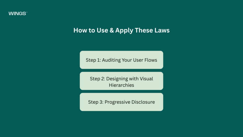
How to Use & Apply These Laws
Knowing the laws is one thing; weaving them into an active design system is another. Here is how to systematically apply these principles at every stage of product development.
Step 1: Auditing Your User Flows
Before changing a single pixel, map out your current user journeys. Track the exact paths users take to complete key goals, like signing up or purchasing an item. Look for spots where drop-offs spike, these are clear indicators of high cognitive load or an outright violation of Hick’s Law.
Step 2: Designing with Visual Hierarchies
Use the Von Restorff effect and Fitts’s Law to establish a clear visual hierarchy. Every screen should have a singular, distinct focus.
- Primary Actions: Bright, contrasting colors, large touch targets, prominent screen placement.
- Secondary Actions: Outlined buttons, muted colors, smaller text links.
Step 3: Progressive Disclosure
To prevent choice overload, use progressive disclosure. Show users only the information they need at that specific point in their journey. For example, hide advanced settings under a clear “Advanced Options” dropdown menu instead of cluttering the main dashboard for casual users.
Advantages of a Law-Driven UX Strategy
Designing with proven psychological laws provides clear, compounding benefits for both your users and your business metrics.
- Skyrocketing Conversion Rates: When you reduce choice overload (Hick’s Law) and make CTAs easy to hit (Fitts’s Law), you remove the real-world friction that causes users to abandon their shopping carts.
- Drastically Lower Support Costs: Intuitive systems mean users don’t need to ask for help. Products that respect established mental models naturally reduce customer support tickets, saving valuable team resources.
- Accelerated Development Velocity: When your product team works from a shared foundation of UX laws, you cut out endless visual debates. Design decisions are made based on objective psychological principles rather than personal opinions.
- Long-Term Brand Loyalty: Products that feel effortless to use build positive emotional associations. Users consistently return to platforms that save them time and respect their mental energy.
Explore the UX design process behind the Xenxo.
Disadvantages, Pitfalls & Dark Patterns
While UX laws are highly effective, misinterpreting or weaponizing them can lead to major usability issues and broken user trust.
The Over-Standardization Trap
Leaning too heavily on Jakob’s Law can sometimes lead to generic, uninspired designs. If every app in an industry copies the exact same layout, it becomes difficult for a brand to stand out visually. The secret lies in a careful balance: keep your core interactions familiar and intuitive, but use your brand’s unique illustrations, storytelling, and micro-interactions to build a memorable identity.
Weaponizing Psychology: Dark Patterns
Dark patterns happen when teams intentionally misuse UX laws to deceive users for short-term business gain.
| Dark Pattern Typology | Psychological Exploitation | Real-World Example |
| Misdirection | Exploits the Von Restorff effect by visually hiding choices. | Making a paid subscription button massive and bright, while hiding the free tier in tiny, low-contrast text. |
| Roach Motel | Violates Fitts’s Law and expectations of symmetry. | Making an account creation process incredibly fast, while forcing a phone call to cancel it. |
| Confirmshaming | Uses emotional manipulation alongside visual framing. | Opt-out buttons labeled with text like, “No thanks, I hate saving money.” |
While dark patterns might cause a brief spike in short-term metrics, they ultimately destroy brand reputation, alienate users, and can invite heavy legal penalties. Real growth comes from creating genuine, transparent value.
Accessibility (a11y) & Inclusivity Impacts
Applying UX laws without keeping accessibility in mind leaves out millions of users. True user experience design means ensuring your digital products work smoothly for everyone, including individuals with visual, auditory, motor, or cognitive impairments.
Fitts’s Law and Motor Disabilities
For users dealing with tremors, arthritis, or temporary motor limitations, tiny buttons are incredibly frustrating barriers. By making sure touch targets are at least 48×48 pixels (and spaced out cleanly), you ensure that your product remains easy to navigate for all users, regardless of physical dexterity.
The Von Restorff Effect and Color Blindness
Relying on color alone to make an element stand out excludes users with color vision deficiencies. If an error state is indicated only by changing a text field’s border to red, a color-blind user may miss it entirely. Always pair color contrasts with structural indicators, such as clear warning icons or bold text labels, to keep your designs inclusive.
Cognitive Accessibility and Miller’s Law
For individuals experiencing ADHD, dyslexia, or age-related cognitive decline, clear content chunking is absolutely essential. Keeping sentences short, grouping forms into simple sections, and providing clear status indicators helps users navigate complex processes with confidence.
Key Metrics: How to Measure Design Success
UX improvements shouldn’t be based on guesswork. To understand if your design changes are actually working, you need to track concrete performance data.
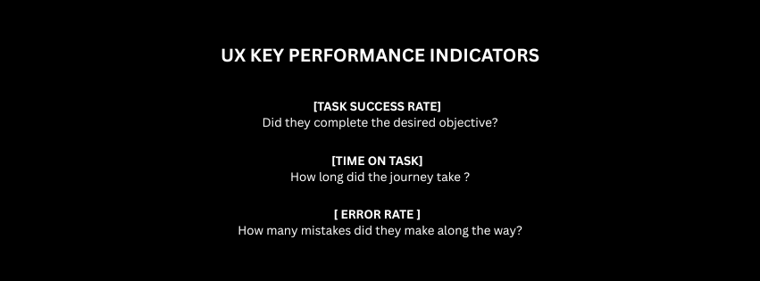
Task Success Rate (TSR)
Task Success Rate is the percentage of users who successfully complete a specific action (e.g., signing up for a newsletter or checking out). If you simplify a form using Hick’s Law and your TSR jumps from 65% to 85%, you have clear proof that reducing choice overload works.
Time on Task
This measures the exact amount of time a user spends to complete a process. For transactional tasks like paying a bill, a lower time on task means your interface is clean and efficient. However, for content platforms, higher engagement times might mean your layout is successfully keeping users hooked.
User Error Rate (UER)
Track how often users make mistakes, like filling out a form incorrectly or clicking a non-interactive element. A high UER points directly to a breakdown in visual hierarchy or an unexpected flow that violates Jakob’s Law.
System Usability Scale (SUS)
The System Usability Scale is a quick, 10-question survey given to users right after they interact with your product. It gives you a clear usability score out of 100, providing an excellent qualitative benchmark to track across product updates.
Explore the UX design process behind the GroWealth.
Key Takeaways & Design Checklist
Building a world-class user experience requires continuous refinement. Use this structured checklist during design reviews to make sure your interfaces always put the human brain first.
The UX Law Validation Checklist
▢ Mental Models (Jakob’s Law)
- Are you using standard icon conventions (e.g., a magnifying glass for search)?
- Does the navigation structure match common patterns within your industry?
▢ Interaction Efficiency (Fitts’s Law)
- Are primary actions styled as large, easy-to-tap targets?
- Is there enough breathing room between links to prevent accidental clicks?
▢ Choice Optimization (Hick’s Law)
- Have you cut out unnecessary options on your high-conversion landing pages?
- Are long processes broken up into clear, bite-sized steps?
▢ Information Architecture (Miller’s Law)
- Is your text content divided into clear sections with descriptive headers?
- Are long data points (like phone numbers or credit cards) formatted into small chunks?
▢ Visual Emphasis (Von Restorff Effect)
- Is there a clear, single focal point on every screen?
- Are primary CTAs visibly distinct from secondary buttons?
▢ Accessibility Compliance (a11y)
- Do all interactive elements meet WCAG AA contrast ratios (at least 4.5:1)?
- Can users navigate the entire application using only a keyboard or screen reader?
The Path Forward
By moving away from aesthetic guesswork and grounding your product choices in proven cognitive science, you create experiences that feel naturally intuitive. Treat these UX laws as your design foundation, measure their impact with clear data, and always build with accessibility in mind. Your users and your business metrics, will thank you.

Thanseem
Junior UI/UX Designer