



The Basics: What is the UI UX full form, and what is the actual difference between the two?
To clear up the confusion, we need to look closely at the full terms and how they operate independently yet cohesively.
What is UI? (User Interface)
The full form of UI is User Interface. The interface is the point of contact between a human and a digital machine. It includes everything you see, touch, and interact with on a screen: buttons, text typography, color schemes, images, animations, sliders, form fields, and layout spacing.
What is UX? (User Experience)
The full form of UX is User Experience. Coined by cognitive scientist Don Norman in the early 1990s while working at Apple, User Experience encompasses all aspects of the end-user’s interaction with the company, its services, and its products.

Explore the design system behind the EVOS.
The Actual Difference: Structure vs. Aesthetic
While they depend on one another to succeed, UI and UX focus on entirely different layers of the human-product relationship. A stunning user interface attached to a terrible user experience results in a beautiful product that is frustrating to use. Conversely, an flawless user experience wrapped in a terrible UI is highly functional but unappealing and hard to look at.
| Attribute | User Experience (UX) Design | User Interface (UI) Design |
| Primary Focus | Structural blueprint, functionality, logic, and emotional journey. | Visual presentation, aesthetic shell, and interactive touchpoints. |
| Core Objective | Making a product easy, useful, efficient, and satisfying to use. | Making a product visually beautiful, on-brand, and polished. |
| Key Questions | “Who is using this? What is their goal? Is this flow logical?” | “What colors should we use? Is the text readable? Are the buttons clear?” |
| Key Deliverables | User personas, journey maps, site maps, wireframes, prototypes. | Style guides, typography layouts, high-fidelity mockups, animation kits. |
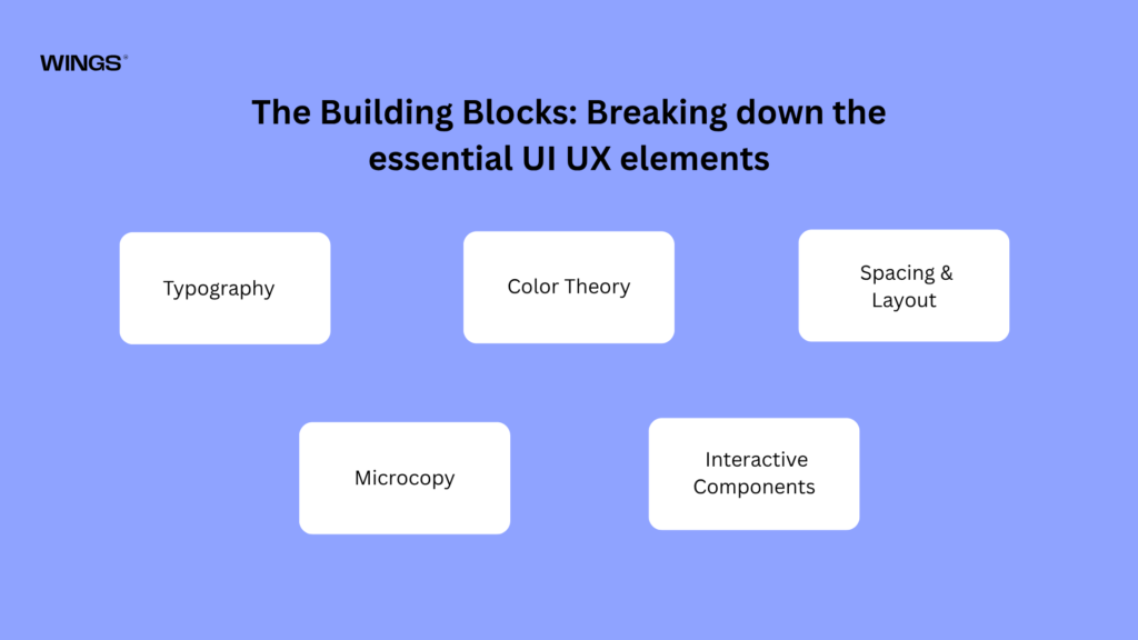
The Building Blocks: Breaking down the essential UI UX elements
To build interfaces that are intuitive, accessible, and visually appealing, designers rely on a collection of fundamental UI/UX elements. These building blocks work together to create digital products that are both functional and enjoyable to use.
01. Typography
Typography is the art and science of arranging text to make written content readable, accessible, and visually attractive. Since most digital products communicate through text, typography plays a crucial role in shaping the user experience.
UI designers carefully choose font families that match the brand’s personality while ensuring readability. For example, clean sans-serif fonts such as Inter, Roboto, or SF Pro Display are commonly used in mobile and web applications because they remain legible across different screen sizes. Designers also establish a typographic hierarchy by defining font sizes, weights, line heights, and spacing. Large, bold headings grab attention, while smaller body text provides detailed information without overwhelming users.
Good typography improves comprehension, reduces eye strain, and helps users quickly scan content, making navigation easier.
To Know More
To deepen your understanding of typography, explore online typography resources and design blogs that cover topics such as font pairing, visual hierarchy, readability, spacing, and accessibility. Studying real-world examples and practicing typography in your own designs will help you create interfaces that are both visually appealing and easy to read.
02. Color Theory
Color is one of the most powerful tools in UI/UX design because it influences emotions, guides attention, and reinforces brand identity. Color theory helps designers choose harmonious color combinations that create visually balanced interfaces.
Most interfaces use a structured color palette consisting of:
- Primary colors for branding and major actions.
- Secondary colors for supporting elements.
- Accent colors to highlight important actions such as “Sign Up” or “Buy Now.”
- Neutral colors (white, gray, black) for backgrounds and text.
Colors also communicate meaning:
- Green indicates success or completion.
- Red signals errors, warnings, or destructive actions.
- Yellow represents caution or important notifications.
- Blue often conveys trust, stability, and professionalism.
Designers must also ensure sufficient color contrast so text remains readable and interfaces remain accessible for users with visual impairments or color blindness.
03. Spacing & Layout
Spacing, also known as whitespace or negative space, refers to the empty areas between elements on a screen. Although it may seem like “unused” space, whitespace is one of the most important design tools.
Proper spacing:
- Prevents interfaces from appearing cluttered.
- Separates related and unrelated content.
- Improves readability.
- Directs users’ attention toward important information.
- Creates a clean and professional appearance.
Designers also rely on layout systems such as grids, columns, and alignment rules to organize content consistently. Consistent margins, padding, and spacing create predictable interfaces, making applications easier to navigate.
For example, increasing the space between two sections helps users understand that they contain different information without needing visual dividers.
04. Microcopy
Microcopy refers to the small pieces of text that help users interact with an interface. Although brief, these words significantly influence the overall user experience.
Examples of microcopy include:
- Button labels
- Form instructions
- Placeholder text
- Error messages
- Success confirmations
- Tooltips
- Loading messages
- Password requirements
Effective microcopy is clear, concise, and written in plain language. Rather than displaying a technical message like:
“Error 504: Gateway Timeout.”
A user-friendly interface might instead say:
“We’re having trouble connecting right now. Please try again in a few moments.”
Good microcopy reduces confusion, builds trust, and reassures users throughout their journey.
05. Interactive Components
Interactive components are the UI elements that users directly manipulate to perform tasks. They form the foundation of every digital interface and enable communication between users and the system.
Common interactive components include:
- Buttons for triggering actions.
- Text fields for entering information.
- Dropdown menus for selecting options from a list.
- Checkboxes for choosing multiple options.
- Radio buttons for selecting a single option.
- Toggle switches for turning settings on or off.
- Sliders for adjusting values within a range.
- Date pickers for selecting dates.
- Navigation menus for moving between pages.
- Search bars for finding information quickly.
Well-designed components provide immediate visual feedback when users interact with them. For example, a button may change color when hovered over, a toggle switch may animate smoothly when turned on, or an input field may display a green checkmark after valid information is entered. These responses reassure users that the system has recognized their actions.
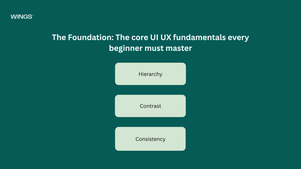
The Foundation: The core UI UX fundamentals every beginner must master
Before focusing on visual details such as icons, illustrations, animations, or advanced interactions, every UI/UX designer must first understand the fundamental principles that shape how people perceive and interact with digital products. These core concepts form the foundation of good design and help create interfaces that are intuitive, accessible, and easy to use.
01. Hierarchy
Visual hierarchy is the arrangement of interface elements according to their level of importance. It helps guide the user’s attention through a screen in a logical order, ensuring they notice the most important information first.
Designers establish hierarchy by manipulating several visual properties, including:
- Size: Larger elements naturally attract more attention than smaller ones.
- Weight: Bold or heavier fonts stand out more than regular text.
- Color: Bright or contrasting colors emphasize important actions or content.
- Position: Elements placed near the top or center of a page are often noticed first.
- Spacing: Giving an element more surrounding whitespace makes it more prominent.
For example, on an e-commerce website, the product image and product name are displayed larger than the product description. The “Add to Cart” button is highlighted with a bold color so users can quickly identify the primary action.
Without a clear hierarchy, every element competes for attention, making the interface confusing and difficult to navigate.
02. Contrast
Contrast refers to the visual difference between two or more elements. It helps distinguish important information, improves readability, and directs users toward key actions.
Designers create contrast using:
- Color
- Size
- Shape
- Font weight
- Brightness
- Spacing
A common example is placing black text on a white background, which provides excellent readability. Similarly, a brightly colored “Sign Up” button placed against a neutral background immediately catches the user’s attention.
Contrast is also essential for accessibility. Users with visual impairments or color vision deficiencies rely on sufficient contrast to read text and identify interactive elements. Low-contrast combinations, such as light gray text on a slightly lighter gray background, can make content difficult or impossible to read.
Effective contrast ensures that important information is easy to notice while creating a visually balanced interface.
03. Consistency
Consistency means maintaining the same design patterns, styles, and behaviors throughout an application. When users encounter familiar layouts and interactions, they can navigate the interface with confidence and minimal effort.
Consistency applies to many aspects of UI design, including:
- Colors
- Typography
- Buttons
- Icons
- Navigation menus
- Spacing
- Form elements
- Animations
- Interaction patterns
For example, if the primary “Submit” button is green with rounded corners on one screen, it should maintain the same appearance and behavior across every screen where that action appears. Similarly, navigation menus should remain in the same location throughout the application.
Consistent interfaces reduce the cognitive load, the mental effort required to understand and use a product. Instead of learning new patterns on every page, users can rely on familiar behaviors, allowing them to complete tasks more quickly and with fewer errors.
Many organizations maintain consistency by creating design systems or style guides that define standardized colors, typography, components, and interaction rules for the entire product.
Why These Fundamentals Matter
Hierarchy, contrast, and consistency are the building blocks of every successful user interface. Hierarchy guides users toward the most important content, contrast improves readability and accessibility, and consistency creates familiarity and trust. Together, these principles help designers create interfaces that are clear, efficient, and enjoyable to use, forming the essential foundation for more advanced UI/UX concepts such as interaction design, animations, and responsive layouts.

Explore the UX design process behind the Maverick AI.
Next Steps: How UI and UX elements work together to solve user problems
UI and UX elements do not exist in isolation. They function as a collaborative loop, working together to solve friction points for real people.
When a user encounters a problem, for example, trying to split a dinner bill with five friends on a banking app, the UX framework handles the logical flow. The UX determines how many steps it takes to select friends, input the total amount, and calculate the split. It ensures the process takes less than thirty seconds.
User-Centered Design vs. Accessibility & Inclusivity in UI/UX Design
| User-Centered Design (UCD) | Accessibility & Inclusivity |
|---|---|
| Focuses on designing around user needs, goals, and behaviors. | Focuses on ensuring everyone, including people with disabilities, can use the product. |
| Relies on user research, usability testing, and user feedback. | Relies on accessibility standards such as WCAG and inclusive design principles. |
| Aims to improve usability, efficiency, and user satisfaction. | Aims to remove barriers and provide equal access for all users. |
| Answers questions like, “Does this feature solve a user problem?” | Answers questions like, “Can every user interact with this feature regardless of ability?” |
| Prevents unnecessary features and reduces the need for costly redesigns. | Prevents exclusion and supports legal compliance and ethical design. |
| Primarily benefits the target users of the product. | Benefits the widest possible audience, including users with disabilities, older adults, and people in different contexts. |

Explore the Design process behind the Quint.
The Ultimate Collaboration: How the design handoff shapes final engineering
The absolute best UI/UX frameworks mean nothing if they cannot be accurately translated into clean code. The design-to-development handoff is the critical bridge where structural layouts, design systems, and interaction models are delivered to the engineering team.
Modern product teams rely on unified workspaces like Figma to bridge this gap. Instead of passing static image files, UI designers hand over interactive component libraries complete with exact CSS spacing tokens, hex codes, typography styles, and responsive layout rules. UX designers supply user flow diagrams and functional requirements detailing how edge cases, such as an internet disconnection or a failed password attempt, should behave. A highly integrated handoff guarantees that the final live application matches the pixel-perfect design vision.
The Standard Design Process Sequence
To see how all of these elements combine in the real world, design teams rely on a predictable sequence to take an idea from concept to launch:
Phase 1: Empathize & Research
Conduct user interviews, distribute surveys, and observe competitors to gather both qualitative and quantitative user data. This research helps the team understand users’ needs, behaviors, pain points, and expectations.
Phase 2: Define the Problem
Analyze and synthesize the research findings to identify the core problem. Create clear problem statements, user personas, and user journey maps that guide the design process.
Phase 3: Ideate & Wireframe
Brainstorm potential solutions and features. Develop low-fidelity wireframes—simple black-and-white layouts that define the structure, content placement, and user flow of the product.
Phase 4: High-Fidelity UI Design
Transform the wireframes into visually polished designs by applying branding, typography, color palettes, icons, and component libraries. Create interactive, pixel-perfect mockups that represent the final user interface.
Phase 5: Prototype & Test
Connect the high-fidelity screens into an interactive prototype. Conduct usability testing with real users, gather feedback, identify usability issues, and refine the design through multiple iterations before handing it over to developers.

Explore the UX design process behind the Kind Energy.
Conclusion: The Bottom Line on UI & UX
At the end of the day, UI and UX are not competing ideologies, isolated design phases, or interchangeable industry buzzwords. They are two halves of a single, unified mission: building software that respects human behavior, limitations, and desires.
Without solid UX, a product is a beautifully painted car with no engine, gorgeous to look at, but entirely useless when you try to drive it. Without a polished UI, that same product is a highly tuned, powerful engine sitting on a bare, rusty chassis, mechanically brilliant, but intimidating, uncomfortable, and uninviting to anyone trying to sit inside.

Nandin
Design Lead