Read summaried version with
The Emotional Palette: Using Color Psychology to Connect With Your Audience
Oct 06, 2025 ● 15 Mins Read
Table of Contents
Introduction
Colors are more than aesthetic choices—they are unspoken signals, subtle influencers, and mood architects. In the digital landscape, every hue, shade, and gradient carries an emotional weight that can guide perception, influence behavior, and subtly steer decisions. For those shaping user experiences, understanding the psychology of color isn’t an optional skill—it’s a strategic advantage.
In UI/UX design, color serves as a bridge between intention and perception. A single button’s shade can transform hesitation into engagement; a background gradient can instill calm or urgency without a word. These aren’t abstract theories—they are data-backed insights derived from human cognition and emotional response. Decision-makers must recognize that every visual choice communicates your brand’s personality and values before any content is read.

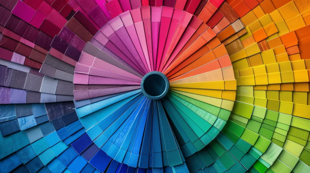
The Subtle Language of Color in Digital Interfaces
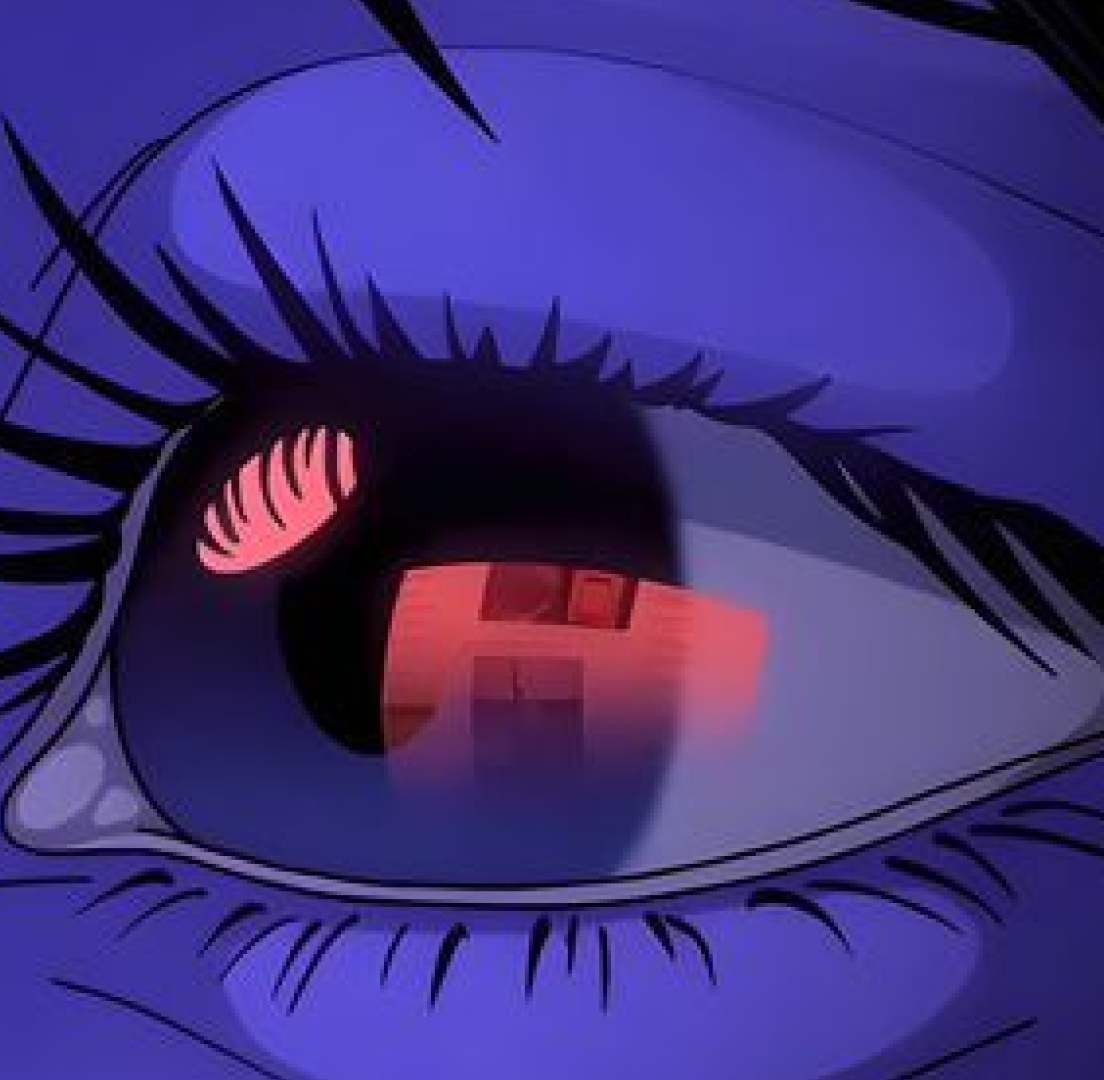
Humans perceive color almost instantaneously, and the brain associates each hue with emotions and behaviors shaped by culture, biology, and experience. For example, blue often conveys trust and stability, making it a staple in financial apps and enterprise solutions. Red signals urgency or excitement, ideal for call-to-action elements but potentially overwhelming if overused. Green communicates growth and balance, often leveraged in wellness or sustainability platforms.
Understanding these associations allows UI/UX designers to craft experiences that resonate at a subconscious level. Colors guide attention, reinforce hierarchy, and provide cues about functionality. A decision-maker reviewing a dashboard may feel confident navigating an interface that uses harmonious blues and greens, whereas clashing or random colors could erode trust and create friction.
Strategic Color Pairings: More Than Aesthetic Harmony
It’s not just about selecting colors individually but understanding how they interact. Complementary, analogous, and triadic color schemes are more than visual formulas—they shape how users perceive relationships between interface elements. For instance, a high-contrast call-to-action button isn’t just visually prominent; it signals priority and encourages immediate response. Meanwhile, subtle gradients or muted backgrounds can direct attention without overwhelming the user, fostering a sense of calm that promotes longer engagement.
Decision-makers should consider color strategy as part of the overall design framework. Colors reinforce brand identity, establish visual hierarchy, and can subtly influence the user’s journey through a product. Ignoring these nuances may lead to interfaces that feel disjointed, confusing, or emotionally disconnected from the intended audience.
The Emotional Impact of Color: User Experience Beyond Functionality
Every color choice in UI/UX design carries an emotional consequence. Warm colors such as orange or yellow can energize and draw attention, often used for notifications, promotions, or interactive elements. Cooler tones like teal or lavender evoke calmness, ideal for onboarding flows or content-heavy applications where cognitive load must be managed carefully.
Color psychology also extends to accessibility and inclusivity. Decision-makers should ensure that emotional and functional responses aren’t limited to those with standard vision. Contrast ratios, color-blind-friendly palettes, and saturation adjustments all influence how effectively your interface communicates. Emotional resonance is meaningless if it is invisible or confusing to segments of your audience.
Key Applications of Color Psychology in UI/UX Design
- Call-to-Action Elements: Strategic use of red, orange, or high-contrast colors to subtly drive engagement.
- Information Hierarchy: Color differentiation guides the eye through complex dashboards and apps.
- Mood Setting: Background gradients or tonal schemes shape emotional context for the interface.
- Trust and Credibility: Blues and neutral tones reinforce stability and reliability.
- Error Prevention and Feedback: Immediate visual cues (e.g., red for errors, green for success) reduce cognitive friction.
Integrating Color Psychology Into Strategic Design Decisions
The value of understanding color psychology lies in its ability to align human emotion with business goals. Rather than seeing color as a visual afterthought, top UI/UX teams treat it as a strategic component. From initial wireframes to final interface execution, every color choice should reinforce the intended perception, drive the desired action, and support cognitive clarity. Decision-makers benefit from frameworks that ensure color consistency, emotional resonance, and data-backed validation throughout the design lifecycle.
By integrating color psychology, companies can achieve more than visually appealing interfaces—they create environments where users feel understood, guided, and subtly influenced to take meaningful actions. Every shade, gradient, and hue becomes a silent ambassador of trust, credibility, and brand personality.
Conclusion: Curating a Strategic Emotional Palette for Maximum Impact
The value of understanding color psychology lies in its ability to align human emotion with business goals. Rather than seeing color as a visual afterthought, top UI/UX teams treat it as a strategic component. From initial wireframes to final interface execution, every color choice should reinforce the intended perception, drive the desired action, and support cognitive clarity. Decision-makers benefit from frameworks that ensure color consistency, emotional resonance, and data-backed validation throughout the design lifecycle.
By integrating color psychology, companies can achieve more than visually appealing interfaces—they create environments where users feel understood, guided, and subtly influenced to take meaningful actions. Every shade, gradient, and hue becomes a silent ambassador of trust, credibility, and brand personality.

Vidhya Shree
Senior Visual Designer