Minimalist vs. Maximalist: What Works in FMCG Packaging Design?
July 11, 2025 ● 13 Mins Read
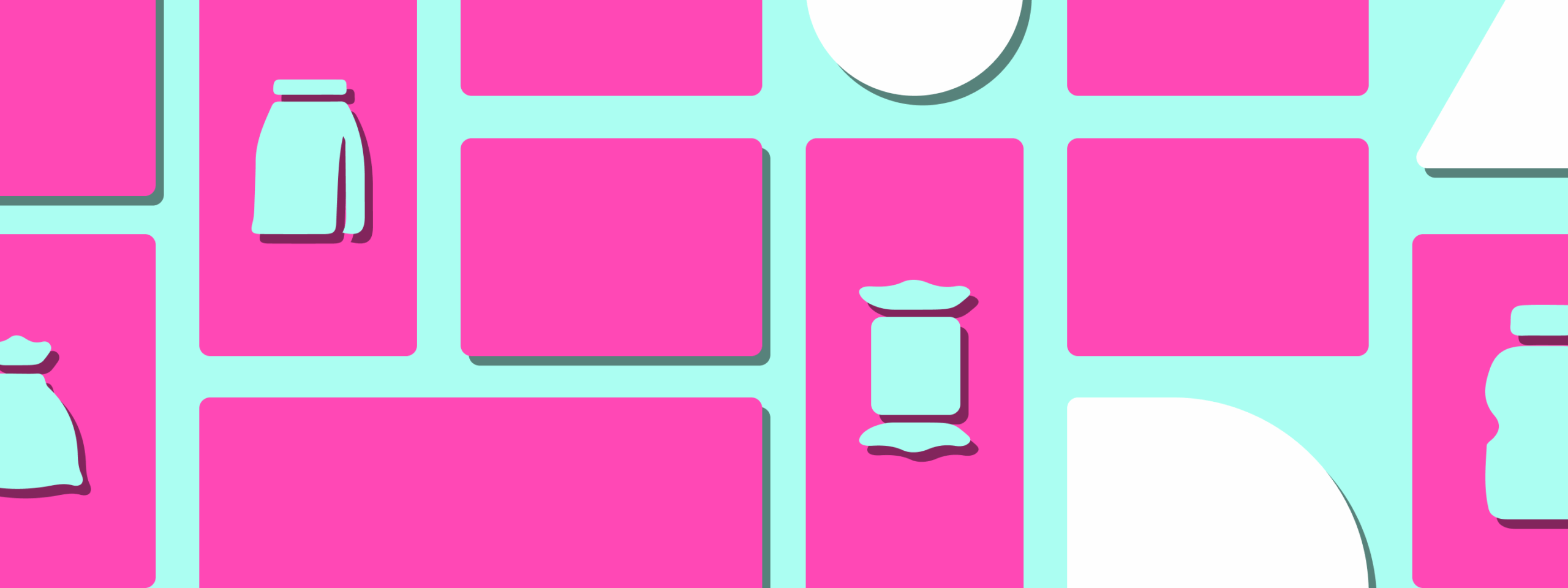
Table of Contents
Introduction
Walk down any supermarket aisle or scroll through an online grocery app, and you’re met with a blur of colors, shapes, and promises. In this visual chaos, it’s not always the best product that wins—it’s the best-looking one. Packaging is no longer just about protection or branding; it’s a split-second invitation to choose. For FMCG brands, design has become a frontline strategy—one that determines whether a product gets picked up or passed over. And in this high-stakes moment, two contrasting styles dominate the conversation: minimalist and maximalist packaging design. Each has its own logic, its own appeal, and its own risks. So which one truly works—and why?

The Case for Minimalism: Clean, Calm, and Confident
Minimalist packaging in FMCG relies on simplicity as a visual advantage. It’s clean, quiet, and deliberate. Often marked by restrained color palettes, ample whitespace, elegant typography, and minimal copy, this approach conveys a sense of control and purity. It doesn’t overwhelm the shopper—it reassures them. This sense of calm often translates into trust, especially in categories where quality and transparency matter most. Think organic foods, health and wellness, skincare, or boutique beverage brands. Here, minimalism signals premium value. It suggests the product has nothing to hide.
In crowded retail environments, minimalist packaging can stand out precisely because it resists the urge to shout. It offers a visual pause in a field of clutter. In digital settings, where thumbnail images are small and cluttered, a minimalist pack can also pop due to its clarity. But the strength of minimalism isn’t just in how it looks—it’s in how it makes consumers feel. It leans into ideas of clarity, confidence, and elevated taste. For design-aware consumers and younger demographics who favor curated aesthetics, this style often aligns with their lifestyle and values.
The Power of Maximalism: Loud, Layered, and Lively
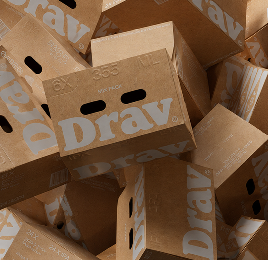
If minimalism is about restraint, maximalism is about release. Maximalist packaging embraces abundance—of color, of texture, of ideas. It thrives on visual complexity, with expressive typography, rich illustrations, bold palettes, and storytelling elements all competing for attention in the most theatrical way. This is design turned all the way up—and it’s often exactly what’s needed in categories driven by emotion, impulse, or nostalgia.
Maximalism excels in products that are meant to feel joyful, festive, indulgent, or youthful. Snacks, sweets, soft drinks, and seasonal FMCG launches often benefit from this kind of energy. A brightly colored wrapper with quirky type and dynamic graphics might be the very thing that sparks a spontaneous purchase. Maximalist design also taps into cultural codes. In regions where visual richness is celebrated—such as India, Latin America, or parts of Southeast Asia—bold, layered packaging can feel more trustworthy and familiar than minimalist alternatives. In these markets, minimalism can sometimes come across as sterile, elite, or out of place.
Maximalist packaging doesn’t whisper—it performs. It tells stories, expresses moods, and creates memorability. When done well, it doesn’t just grab attention—it holds it long enough for emotional connection to happen.
Shelf Context and Audience Behavior Matter
The debate between minimalism and maximalism cannot be separated from context. A minimalist design that feels premium in a boutique organic store may feel invisible on a crowded supermarket shelf. Conversely, a maximalist pack that explodes with personality in-store may feel overwhelming or unrefined in an e-commerce thumbnail. The environment—physical or digital—plays a massive role in determining what works.
Audience behavior adds another layer. A millennial urban professional looking for clean-label products might respond better to minimalist cues. A parent shopping for colorful breakfast cereal for their child is likely drawn to energetic, maximalist packaging. Culture, intent, and mindset all play a part in what consumers visually associate with value, fun, safety, or trust. This means that the “right” design style isn’t about design preference—it’s about business alignment. The real question isn’t which one is better—it’s which one serves your goals, your audience, and your channel best.
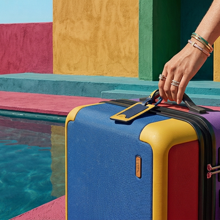
Blending the Two: A Strategic Hybrid Approach
Some of the most effective FMCG packaging today doesn’t choose a side. Instead, it blends the visual clarity of minimalism with the emotional richness of maximalism. This hybrid approach is growing in popularity because it offers the best of both worlds—clarity without coldness, character without chaos.
A skincare brand, for instance, might use a minimal white base with refined typography, but layer in tactile textures or vibrant foil stamping to introduce depth. A snack brand may keep the front-of-pack layout structured and clean, while introducing rich illustrations or playful color bursts in key visual areas. These hybrid solutions allow brands to create contrast, focus, and energy—without overwhelming the user.
This blending is especially powerful in multichannel ecosystems where packaging must perform both online and offline. In such cases, hybrid design systems create the flexibility needed to stay consistent, distinctive, and responsive across touchpoints.
Conclusion: Design to Convert, Not Just to Impress
In FMCG, the packaging is the first experience—and often the most influential one. It’s where attraction, trust, and purchase intersect in real time. And in this space, the debate between minimalist and maximalist packaging isn’t about right or wrong—it’s about what works for you. The goal isn’t to follow a style—it’s to tell the right story, to the right person, in the right way.
Great packaging doesn’t simply look good—it performs. It converts attention into action. Whether your product whispers elegance or shouts with joy, make sure it does so with intention. Because on today’s crowded shelves, attention is the most valuable currency—and design is how you earn it.

Akshita Shivani Sundar
Senior Graphic Designer