3D & Depth in UI: When It Works and When It’s Just Aesthetic
Dec 02, 2025 ● 15 Mins Read

Table of Contents
Introduction
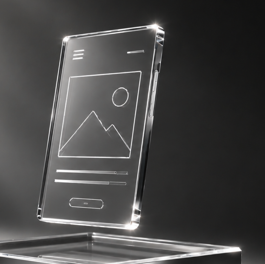
In a world where screens dominate every interaction, the days of flat, two-dimensional interfaces are slowly fading. Users no longer just want functionality—they expect experiences that feel intuitive, immersive, and sometimes even tangible. The introduction of 3D elements and depth in user interfaces is not just a visual upgrade; it’s a cognitive tool. Depth can guide attention, indicate hierarchy, and even subtly influence decision-making. But like any tool, its power lies in knowing when to use it—and when it’s merely decorative.

Depth as Cognitive Guidance
At its core, UI is communication. Every button, card, or layer is a signal to the user about priority, actionability, and flow. Depth enhances that communication by creating a visual hierarchy. Shadows, layering, and perspective cues naturally draw the eye to key elements without overwhelming the user with explicit instructions. For instance, a slightly raised call-to-action button signals interactivity, whereas a subtle drop shadow under a card distinguishes it from background content. The brain interprets these cues instantly, reducing cognitive load and increasing engagement.
Yet, not all applications of depth are equally effective. Overuse can create visual noise, while inconsistent layering can confuse the user, undermining trust in the interface. For decision-makers, this distinction is crucial: depth should never exist solely to “look modern.” Its purpose must align with usability, guiding users intuitively through an interface.
When 3D Adds Real Value
3D elements shine in scenarios where spatial relationships matter or user focus needs to be directed strategically. Consider dashboards with multiple data layers, e-commerce platforms highlighting product variations, or mobile apps emphasizing gesture-driven interactions. In these contexts, 3D can:
- Highlight hierarchy between elements
- Suggest interactivity through tactile-like cues
- Enhance spatial understanding of complex information
- Create a sense of immersion that encourages longer engagement
For executives and product leaders, the takeaway is subtle but critical: 3D is not about novelty. It’s about supporting decision pathways—both for the user and for those tracking engagement metrics behind the scenes.
When Depth Becomes a Distraction
Not every interface benefits from 3D. In content-heavy applications like news platforms, documentation tools, or banking apps, excessive layering or animation can feel intrusive. Users often come to these platforms with a goal in mind: to consume, to act, or to transact. Here, depth that doesn’t serve a functional purpose risks diluting focus and increasing cognitive friction.
Decision-makers should ask: “Does this layer, shadow, or gradient actually help the user understand something, or does it just look appealing?” If it’s the latter, it may be better to simplify. Often, subtle depth cues—like minor shadows or hover effects—can deliver functional benefits without compromising speed or clarity.
Beyond Visuals: Emotional and Brand Signals
Depth isn’t just cognitive; it can be emotional. Interfaces with well-executed 3D elements communicate quality, care, and attention to detail. Think of high-end e-commerce platforms where product renders pop off the page, or fintech apps where interactive charts provide a tactile feel. Users subconsciously associate dimensionality with sophistication, reliability, and innovation.
For leadership, this has implications beyond interface aesthetics—it touches brand perception. A UI that balances depth and clarity conveys credibility, while one that overplays 3D risks appearing gimmicky or disconnected from functional priorities. Aligning visual design with brand ethos ensures depth supports strategic objectives rather than becoming a fleeting trend.
Guidelines for Strategic Depth Implementation
To move beyond “what looks cool” and focus on what actually works, consider these principles:
- Hierarchy First: Use depth to guide attention to priority actions.
- Consistency: Ensure layering, shadows, and transitions follow a predictable pattern.
- Performance Awareness: Heavy 3D effects can slow load times, particularly on mobile.
- Contextual Relevance: Every depth element should have a purpose tied to usability or content comprehension.
- Subtlety Over Spectacle: Micro-interactions often convey more than overt 3D “pop.”
This approach helps companies avoid the common pitfall of using depth purely for visual flair, instead turning it into a strategic tool that supports both user goals and business objectives.
Conclusion: Depth as a Strategic Decision
3D and depth in UI are not just design trends—they are instruments of clarity, hierarchy, and emotional resonance. The key differentiator between effective use and mere decoration lies in intentionality. Depth should serve the interface, the user, and by extension, the organization’s goals.
For decision-makers, the lesson is clear: don’t chase visual trends for their own sake. Evaluate depth through the lens of utility, engagement, and brand alignment. When done right, it enhances comprehension, reduces friction, and communicates sophistication. When done without purpose, it risks confusing users and diluting the overall experience.
In the evolving digital landscape, understanding not just how interfaces look but how they feel and guide behavior is increasingly vital. Depth, when applied thoughtfully, is less about aesthetics and more about creating interfaces that think, act, and respond in ways that serve both users and business outcomes.

Thanseem
Junior UI/UX Designer