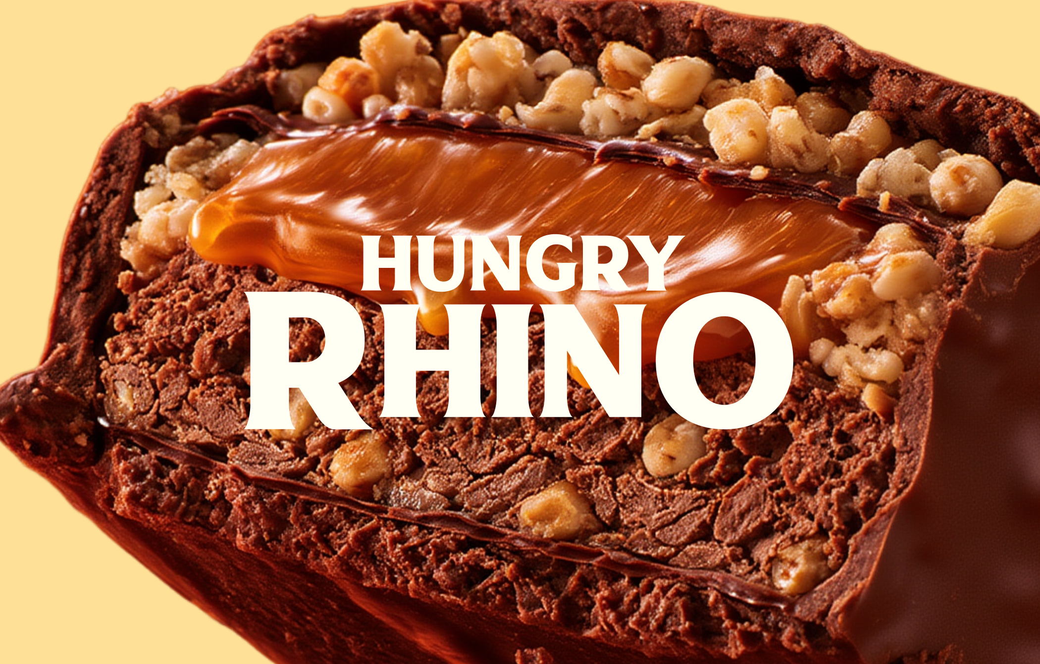
Some brands blend in. Others own their space. For Hungry Rhino, we created a bold identity built around character and visual impact.
Year
2025
Industry
Fmcg
Location
Pune, India
Services
Brand Strategy
Brand Identity System
Logo Design
Visual Design Language
Packaging Design
Project Overview
Not Built to Blend In.
In FMCG, a product is competing for attention long before a customer picks it up. The identity, colours, typography and packaging all shape how a brand is perceived, often in a matter of seconds. For Hungry Rhino, the opportunity was to build a visual identity with a clear point of view, one that could make the brand feel distinctive in a crowded consumer landscape.
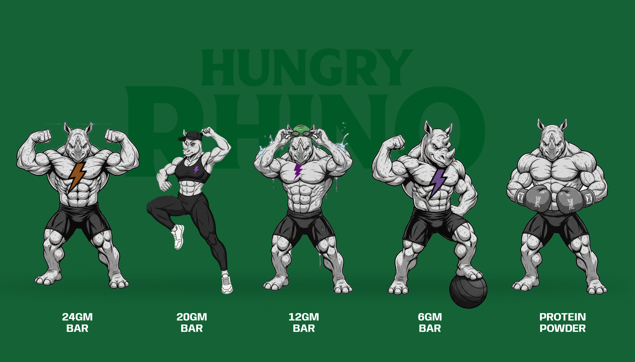
We approached the project by bringing the brand’s personality into its visual expression. Every design element needed to contribute to a cohesive identity, creating a recognisable presence across the brand’s key touchpoints. The result is a branding direction that puts character at the centre, giving Hungry Rhino a more defined visual voice.


Challenge
Crowded categories make differentiation difficult. When brands rely on familiar visual conventions, they risk becoming interchangeable, leaving customers with little reason to remember one over another. Hungry Rhino needed an identity that could establish its own character while remaining clear, cohesive and adaptable.
The challenge was to develop a recognisable visual language rather than depend on the logo alone. The identity needed to work as a complete system, with each element contributing to the brand’s overall expression. From the first impression to the smallest design detail, consistency was essential to making the brand feel considered and distinctive.

Approach
Distinctive branding begins with a clear visual direction. We focused on how the identity could express Hungry Rhino’s personality through a considered combination of logo design, typography, colour and supporting graphics. Rather than treating these elements as separate components, we approached them as parts of a unified brand language.
The intent was to create an identity that could be recognised through more than its name. A consistent relationship between the visual elements helps establish familiarity while allowing the brand to communicate across different formats. This gave Hungry Rhino a cohesive foundation for its packaging and other brand applications.

Execution
The identity takes shape through its application. Packaging brings the visual language into a tangible format, where brand recognition and information hierarchy need to work together. We considered how the core identity could translate onto product packaging while maintaining a consistent and distinctive appearance.
The broader design system brings cohesion to the brand’s visual communication. By carrying the same design principles across the applications developed for the project, the identity can feel connected wherever it appears. Each touchpoint becomes another opportunity to reinforce what makes Hungry Rhino recognisable.
shift the emotional tone away from the stress of parking and towards action, optimism, and momentum.
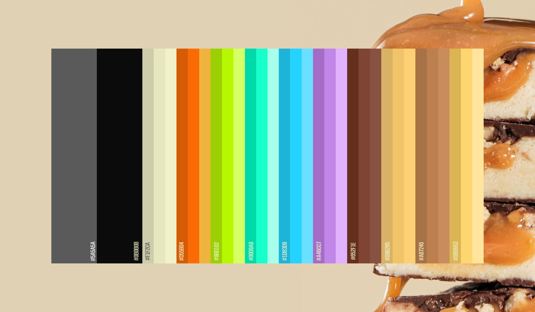
The palette went through careful experimentation to balance boldness with trust and visibility with usability.
To give the brand a distinctive motion language, we introduced a scribble line motif—a continuous line that travels across layouts, visuals, and communication. The line acts as a visual metaphor for movement and journey, reinforcing the idea of flow rather than friction. It adds a human, slightly imperfect energy to the system, and ties together everything from campaigns to digital and physical touchpoints.
Alongside this, we built the brand’s tone, narrative, and messaging system—clear, reassuring, and human-first—designed to reduce anxiety and build confidence before the service is even used.

Outcome
The identity takes shape through its application. Packaging brings the visual language into a tangible format, where brand recognition and information hierarchy need to work together. We considered how the core identity could translate onto product packaging while maintaining a consistent and distinctive appearance.
.
The broader design system brings cohesion to the brand’s visual communication. By carrying the same design principles across the applications developed for the project, the identity can feel connected wherever it appears. Each touchpoint becomes another opportunity to reinforce what makes Hungry Rhino recognisable


“Wings didn’t just redesign our website; they reshaped how global buyers perceive us. Their team deeply understood our business and delivered a platform that’s both elegant and effective. We’ve seen stronger engagement, better feedback from partners, and now have a digital presence that truly reflects who we are.”
“Working on Hungry Rhino challenged us to think beyond conventional branding. We explored how to build a visual identity with a distinct personality, bringing together creative expression and brand recognition.
The process pushed us to approach every detail with greater intent, creating a brand presence that is bold, cohesive and memorable.”


WINGS Team
//Reach us
India – Dubai – Singapore – USA – Australia


India – Dubai – Singapore – USA – Australia