Read summaried version with
The Psychology of Packaging: How Design Influences Consumer Behavior
June 21, 2025 ● 15 Mins Read
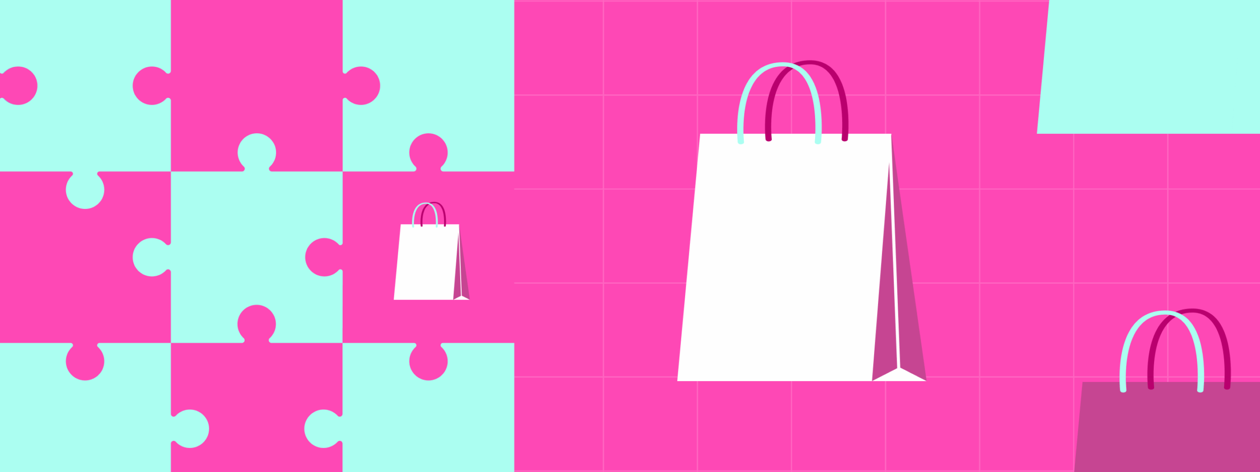
Table of Contents
Introduction
In today’s saturated marketplace, packaging is no longer just a wrapper—it is a critical form of communication. At a glance, it conveys meaning, emotion, and trust. This power comes not from its structure or material, but from its visual language: the colors, the typography, the symbols, and the composition. These elements are not decorative. They are psychological tools designed to guide perception and influence decisions. In milliseconds, before a product is ever touched, these visual cues shape how we feel about what we’re seeing.
The Instant Judgment: What We See Before We Think
Human brains are wired to make snap judgments. Research in neuroscience shows that people often make emotional decisions before logic has time to catch up. When a consumer sees a product on a shelf—or a screen—their brain is already working: scanning for familiarity, forming associations, and seeking reassurance. Packaging’s visual elements serve as triggers. The right shade of blue might instill calm and trust. A bold red might spark energy or urgency. A clean white background may suggest purity or minimalism. These are not arbitrary reactions—they are culturally informed, emotionally driven responses shaped by years of learned association.
Color as Code
Color is arguably the most immediate and powerful psychological signal in packaging. Different hues evoke different moods and expectations. A soft pink may suggest delicacy, care, or femininity. A rich black might evoke elegance, mystery, or luxury. Green is widely associated with nature, wellness, and sustainability, while yellow can suggest happiness or affordability. These reactions aren’t universal, but they are strongly guided by cultural and psychological conditioning. Brands that understand the emotional power of color can position themselves more effectively without saying a word. Color becomes a promise—a silent signal of what the product stands for.
Typography: The Voice You See
Fonts are often overlooked, but they play a vital role in how packaging speaks. Typography carries tone. A bold, uppercase sans-serif typeface can communicate strength, modernity, or efficiency. A script or handwritten font might evoke intimacy, tradition, or artisanal value. The weight, spacing, and alignment of text all influence readability and emotional tone. Serif fonts, for example, can suggest heritage or seriousness, while round, soft letters can feel more playful or accessible. Even subtle variations—like italics or kerning—can nudge a message toward elegance or urgency. In packaging, typography is not just text. It is visual voice.
Visual Hierarchy: Guiding the Eye
The layout of packaging matters not just for design appeal, but for how the brain processes information. A well-structured visual hierarchy ensures that the most important message is seen first—whether it’s the product name, a benefit claim, or a value proposition. Consumers scan, not read. A cluttered label with too many focal points can cause friction, delay decisions, or lead to abandonment. In contrast, a clear, structured design allows for quick comprehension. Strategic use of size, contrast, whitespace, and alignment all help direct attention where it’s needed most. When well-executed, visual hierarchy turns complexity into clarity.
Symbols and Icons: Fast-Tracking Understanding
In a busy shopping environment, symbols often outperform text. A simple icon—like a leaf, heart, or check mark—can convey an idea instantly. Whether it’s a badge for “organic,” “gluten-free,” or “cruelty-free,” these visual shortcuts reduce cognitive load and build credibility fast. Symbols act as quick validators. They’re also globally readable, transcending language barriers and making packaging more universally accessible. The most successful packaging integrates symbols subtly and strategically, using them to reinforce brand messages without overwhelming the design.
Style Consistency: Building Brand Recognition
Consistency across visual elements—color palette, font style, iconography, and layout—builds memory. Over time, these elements become part of the consumer’s internal brand library. When the same design language is repeated across products and platforms, it creates recognition and trust. A consumer who spots familiar packaging cues in a new context is far more likely to recall previous positive experiences. This is why sudden or drastic changes in visual design, without intentional continuity, can damage recognition and even erode loyalty. Visual consistency is not just about aesthetics—it’s about brand memory and subconscious recall.
Emotional Targeting Through Design Language
Packaging design choices aren’t just about attracting attention—they’re about appealing to a specific emotional state. A health food brand might use muted earth tones, clean fonts, and generous whitespace to convey simplicity, balance, and authenticity. A children’s product might lean into bright colors, rounded fonts, and playful illustration to feel fun and safe. A high-end tech product might employ minimalist layouts, grayscale tones, and futuristic typefaces to signal precision and innovation. These aren’t random style choices—they’re psychological strategies aimed at aligning with the consumer’s mindset and values.
Conclusion: The Visual Mind of the Consumer
In the psychology of packaging, every visual element is a signal. Color evokes mood. Fonts shape tone. Layout guides focus. Icons confirm meaning. These are not surface details—they are the building blocks of persuasion. The most effective packaging doesn’t just look good—it feels right, because it speaks the consumer’s psychological language. In a world where attention is scarce and emotion drives action, packaging is one of the most powerful, underappreciated tools of influence. It’s not just what people see—it’s what they feel when they see it that determines whether they buy.

Nancy Priscilla
UI/UX & Graphic Designer