If a corporate logo’s only job were to look premium, a machine learning algorithm could
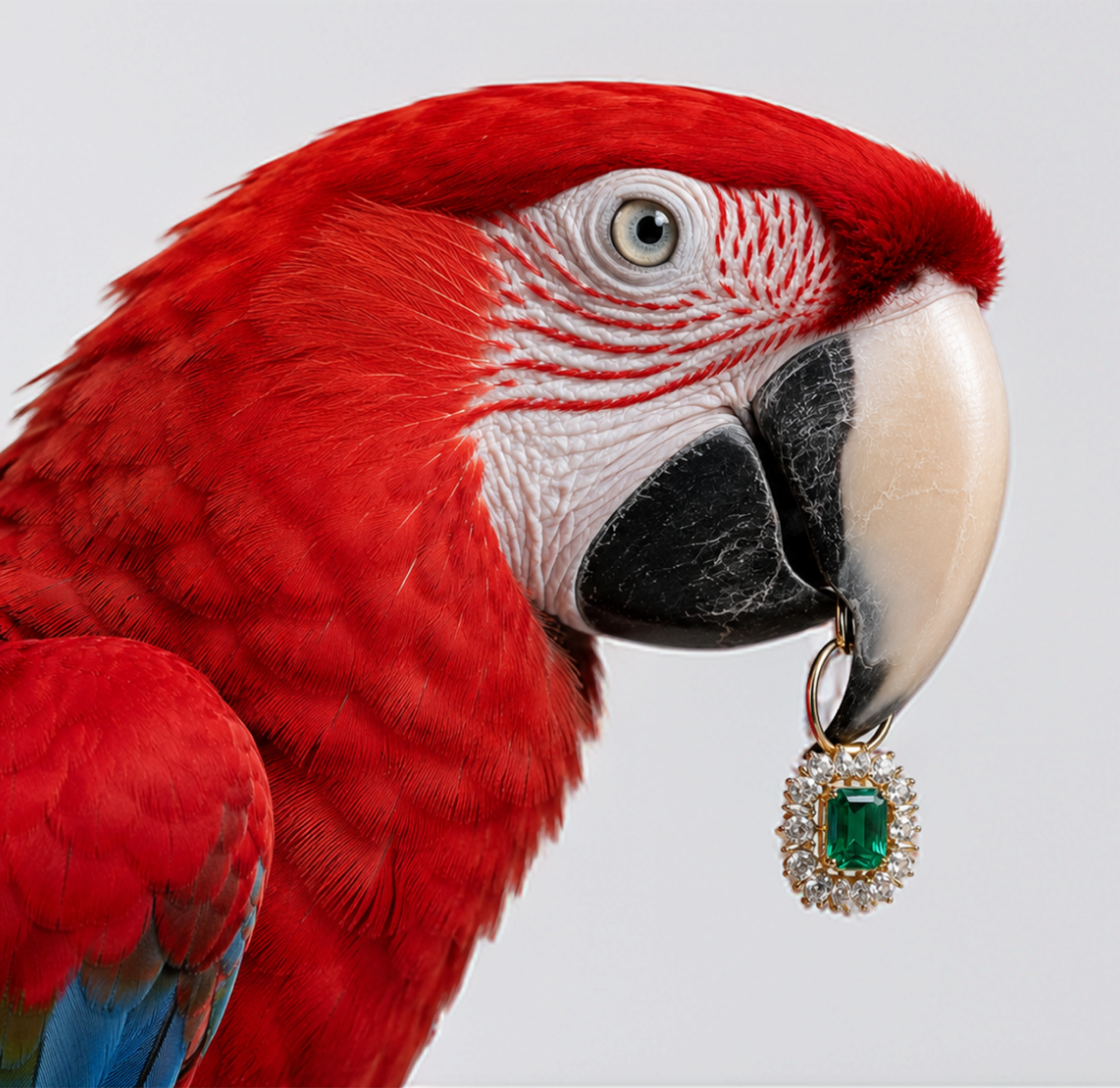
In the luxury jewelry industry, branding is far more than a logo or a beautiful
Building an enduring brand in Mumbai’s hyper-competitive commercial landscape requires far more than attractive visuals
In hyper-competitive landscape, decision-makers don’t have the luxury of time. They are constantly evaluating opportunities,
In hyper-connected world, attention is fleeting. Consumers scroll, swipe, and skim through content at an
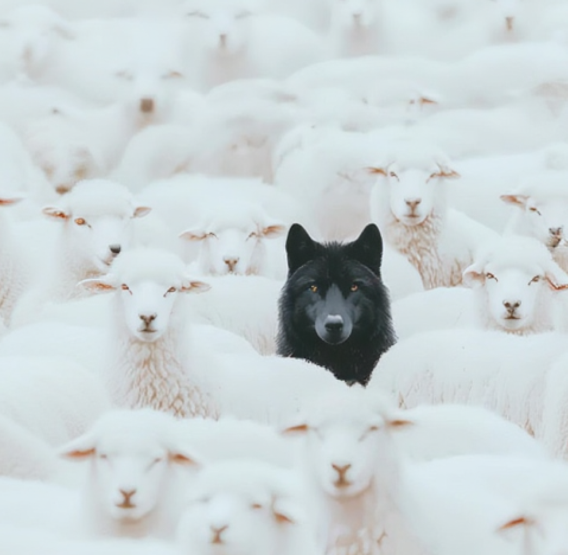
In highly competitive markets where products often look the same, brand psychology becomes the defining
Market saturation is no longer an exception; it is the default across most industries. As
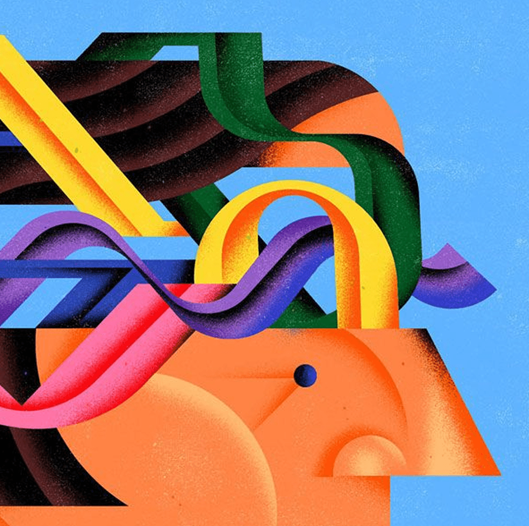
Branding Is More Than Design, It’s Experience Your brand isn’t just a logo. It’s not
When businesses compare freelancers and branding agencies, the discussion often starts with cost but ends
//Inside Wings
//Reach us
India – Dubai – Singapore – USA – Australia