From naming and positioning to story and identity, Blyp was shaped to make choosing time as ‘the smart move’.
Year
2025
Industry
Smart MobilityLocation
Delhi, India
Services
Brand Strategy
Brand Identity System
Logo Design
Visual Design Language
Brand Applications
Project Overview
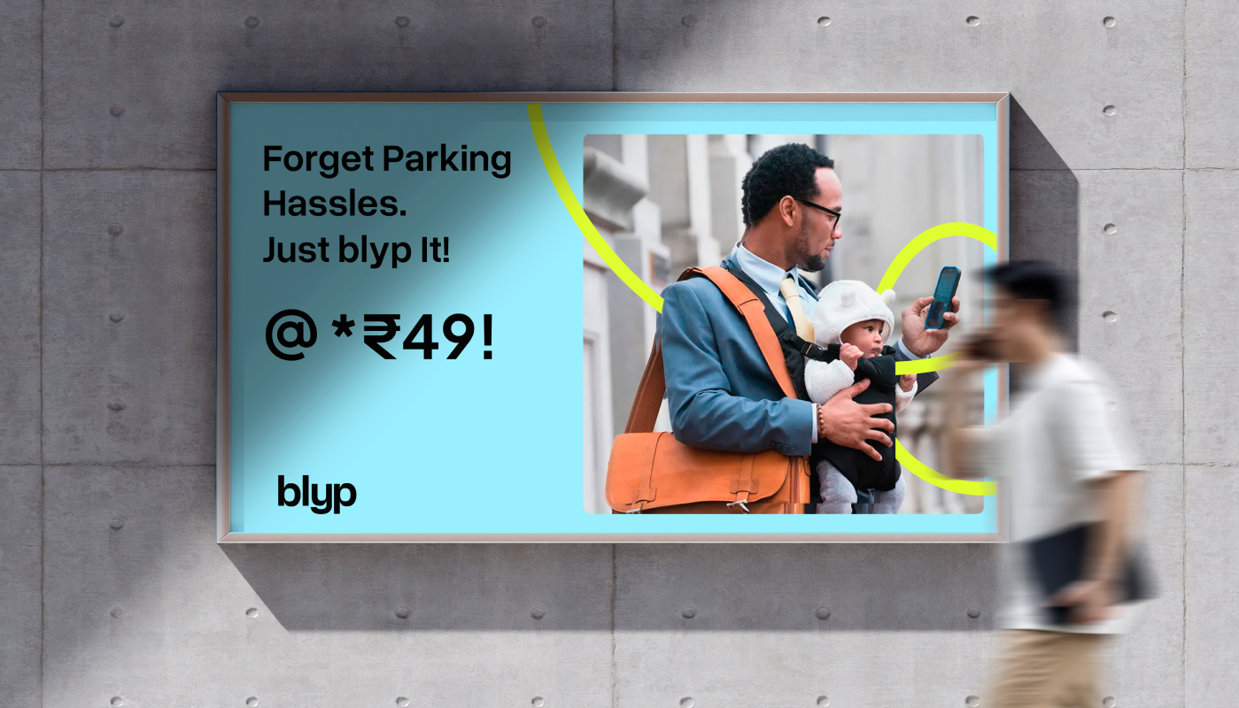
Urban mobility has a quiet, everyday problem: there are more cars than parking spaces, and more wasted minutes than anyone realises. Reaching a destination is often followed by another 20 to 30 minutes spent circling, waiting, and searching. Over the course of a year, that adds up to days lost—not in motion, but in delay. Blyp set out to change this by offering a valet-based solution that lets people skip the friction of parking altogether.
When the team came to us, however, the product was still taking shape. There was no finished platform, no defined brand, and no clear story—only a strong intent and a verbal idea of what the service could become. Our role was to build the brand from the ground up: from naming and positioning to story, tone, and identity.
Challenge
Most services looked and sounded the same, and trust was a major barrier. Handing over your car keys to someone you don’t know is a high-friction decision—especially when the car is a valuable asset.
The challenge was twofold:
First, to differentiate Blyp in a market full of functional, look-alike brands.
Second, to build trust before usage—to make the service feel credible, human, and safe even before someone tried it.
At the same time, the brand needed to move beyond talking about parking, and instead speak about what people actually care about: time, moments, and everyday life.
Approach
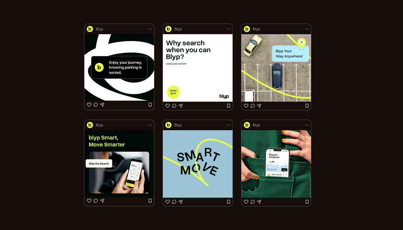
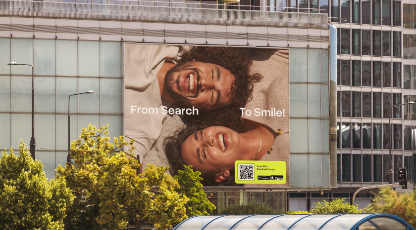
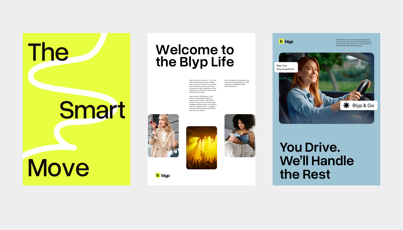
We started by reframing the problem itself. Parking wasn’t the story—time was. Time lost waiting, time missed, time that could be better spent. This became the core idea behind the brand: parking as time regained.
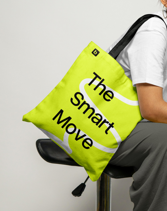
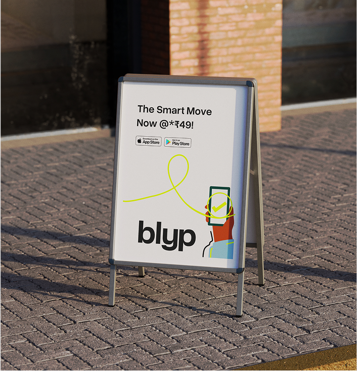
From here, everything took shape—positioning, narrative, tone of voice, and the brand’s central line: Smart Move. Not as a tech promise, but as a life choice: choosing time over waiting.
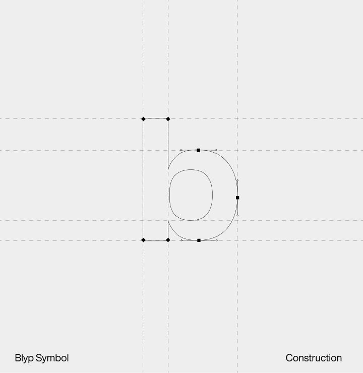
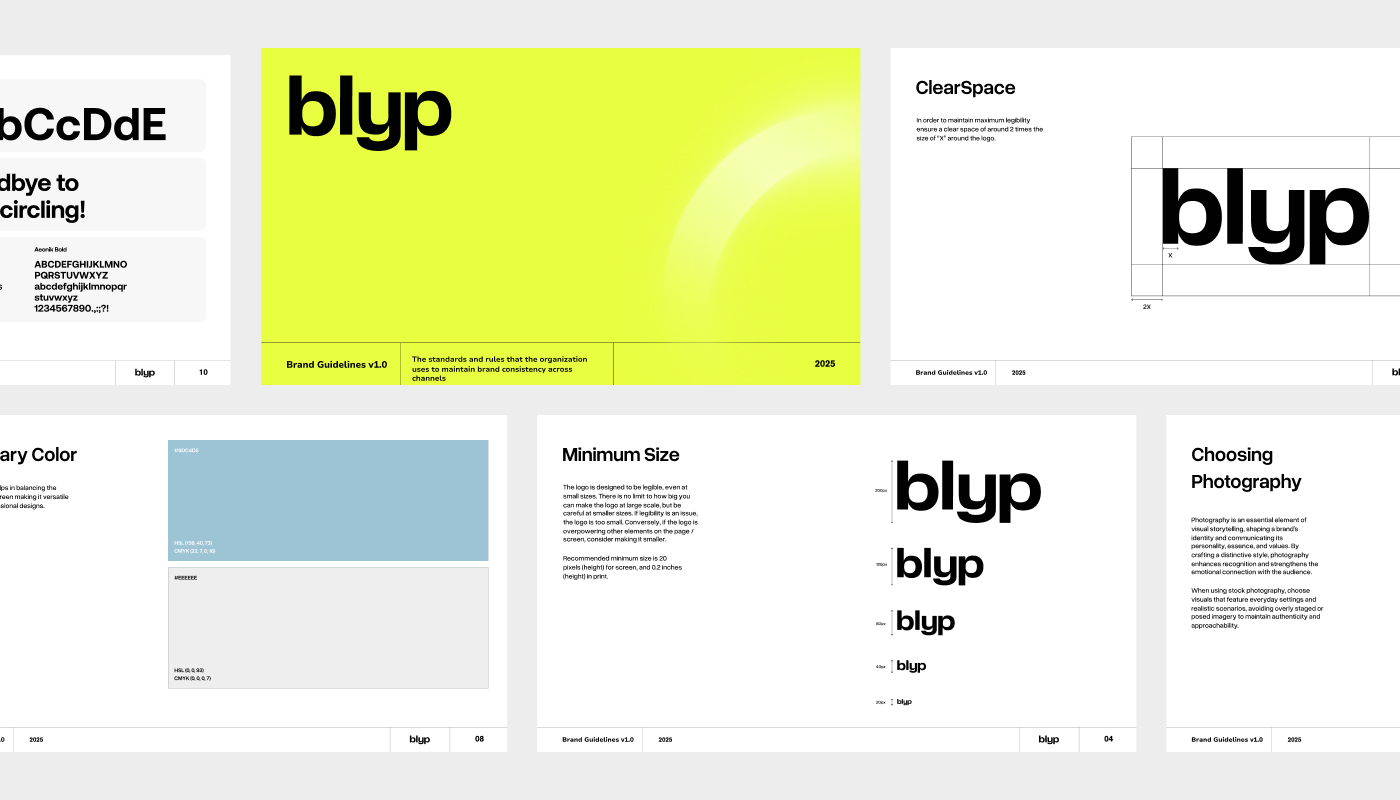
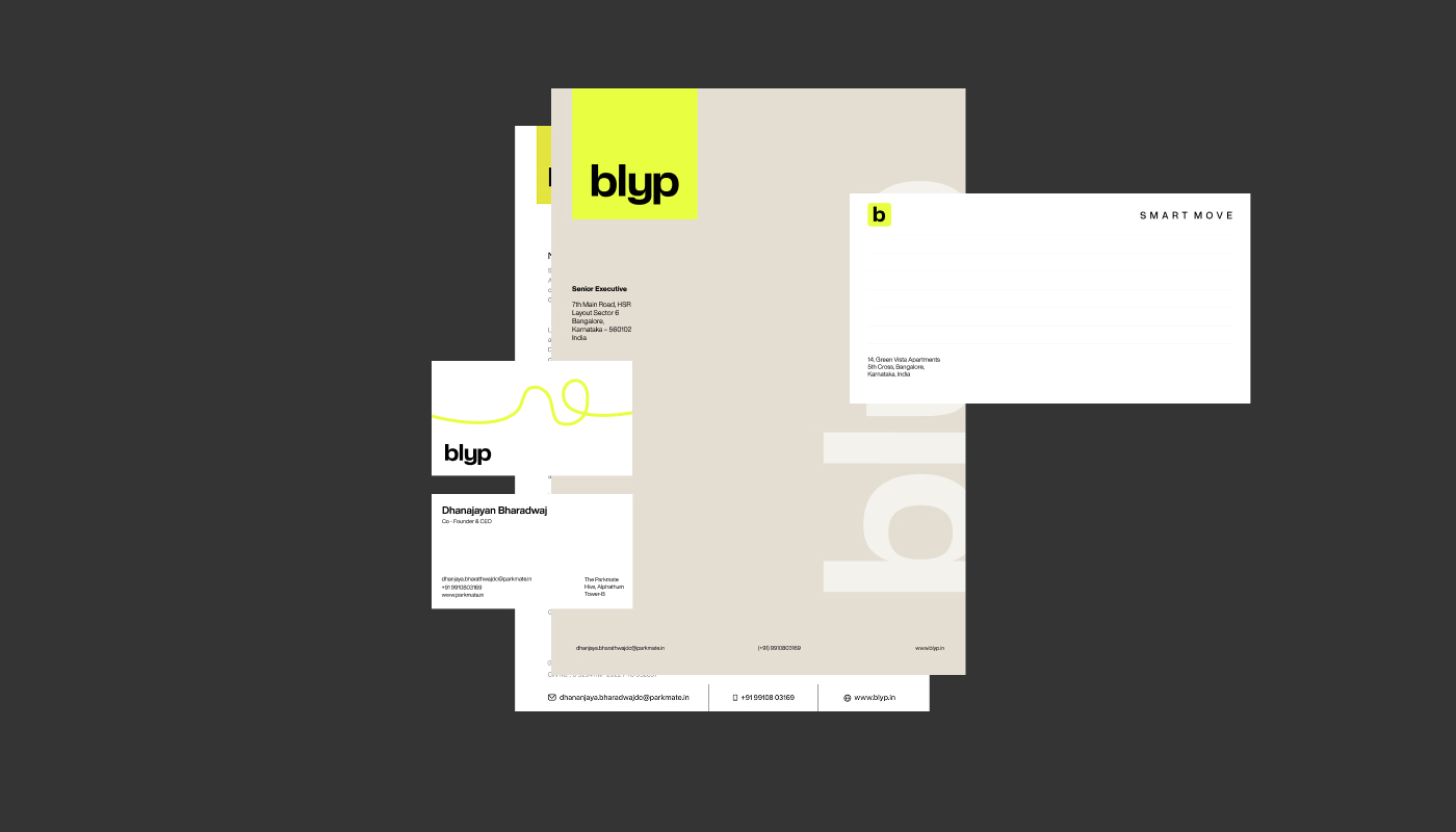
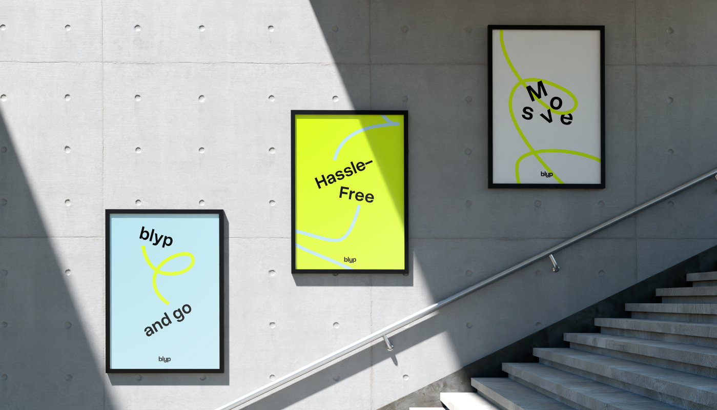
The first visible shift was in naming. The company was called Parkmate when we began—descriptive, but lost in a sea of similar names. We renamed it Blyp: short, distinctive, and experience-led. A name that feels like a moment, not a process.
The process itself was highly collaborative and exploratory. The client brought a lot of energy, openness, and ambition, and the team matched that with an equally experimental mindset. We didn’t settle quickly. Directions were tested, challenged, and refined—because the brand wasn’t just a layer to apply, it was something being discovered and built in motion. This spirit naturally extended into the wider scope, including the website and the app experience.
Execution
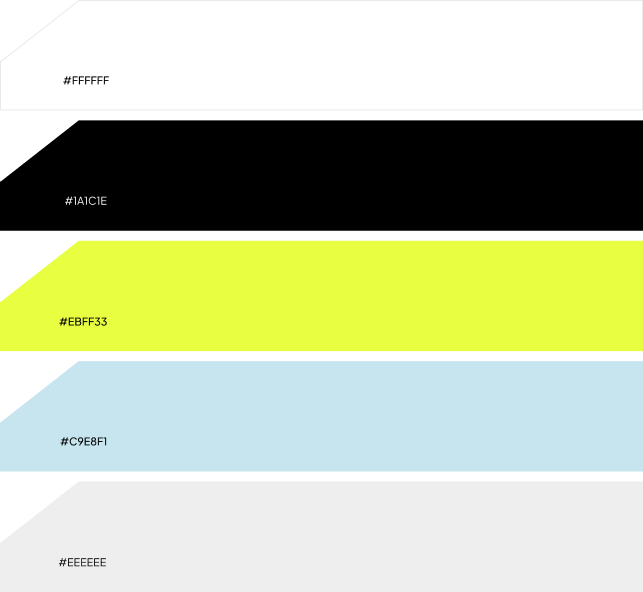
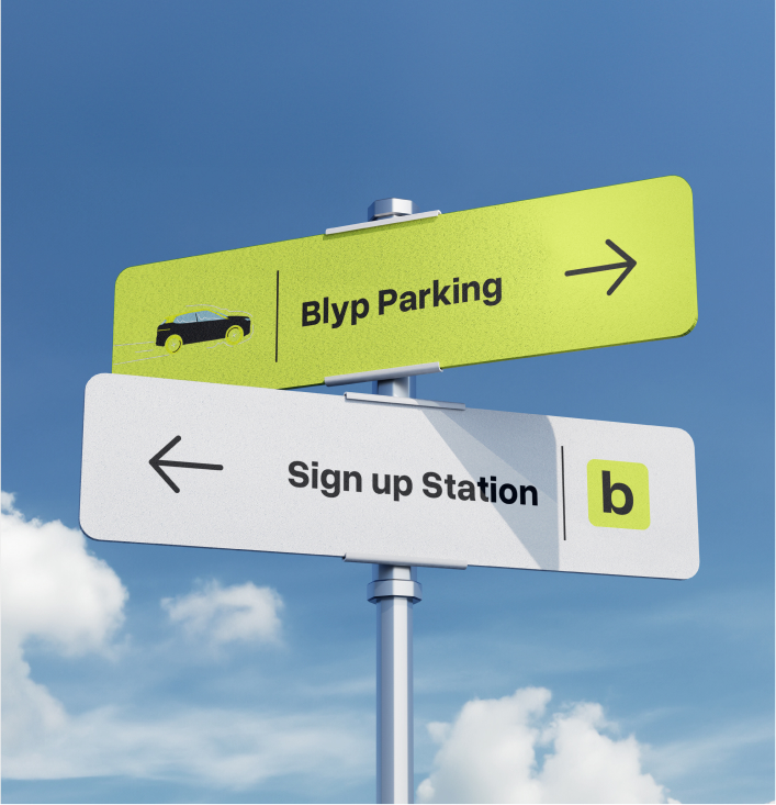
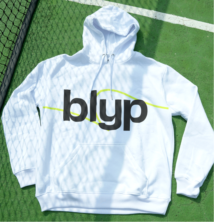
From a category dominated by muted, utilitarian palettes, we chose a vibrant neon green as the core color—highly visible, energetic, and instantly recognisable in public spaces. It was designed to stand out on valet uniforms, signage, and communication, turning the brand into a moving signal in the city. The intent was clear: shift the emotional tone away from the stress of parking and towards action, optimism, and momentum.
The palette went through careful experimentation to balance boldness with trust and visibility with usability.
To give the brand a distinctive motion language, we introduced a scribble line motif—a continuous line that travels across layouts, visuals, and communication. The line acts as a visual metaphor for movement and journey, reinforcing the idea of flow rather than friction. It adds a human, slightly imperfect energy to the system, and ties together everything from campaigns to digital and physical touchpoints.
Alongside this, we built the brand’s tone, narrative, and messaging system—clear, reassuring, and human-first—designed to reduce anxiety and build confidence before the service is even used.
Outcome
What emerged was a complete brand system—naming, positioning, story, tone, and identity—built to carry Blyp from idea to market with clarity and confidence.
More than a visual identity, the brand became a trust-building layer for a new kind of service in a sensitive, high-stakes category. It helped Blyp move away from talking about parking, and towards talking about time, choice, and better everyday moments.
Altogether, it was a deeply collaborative and energetic journey—one where both teams stayed open, experimental, and invested in getting the direction right. The result is a brand that doesn’t just introduce a service, but reframes the way people think about moving through their day: choosing time, and making the smart move.
“Wings didn’t just redesign our website; they reshaped how global buyers perceive us. Their team deeply understood our business and delivered a platform that’s both elegant and effective. We’ve seen stronger engagement, better feedback from partners, and now have a digital presence that truly reflects who we are.”
“Redesigning Shivam Jewels’ digital presence was a deep learning curve. We explored how to distill decades of trust and craftsmanship into a seamless, modern experience.
It taught us to strike the right balance between legacy and innovation; sharpening our B2B storytelling and design thinking in the process.”


WINGS Team
India – Dubai – Singapore – USA – Australia
India – Dubai – Singapore – USA – Australia