


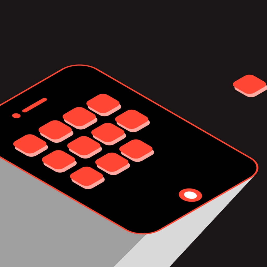
Fintech, Fear, and the Interface: Designing for the Anxious User

When people think of fintech, what often comes to mind is sleek design, frictionless transactions, and the promise of financial empowerment through digital tools. But beneath the surface lies a quieter, more complex story,one that centers not on efficiency or innovation, but on emotion. Particularly, fear.
In a world where money is increasingly invisible, interfaces have become the gatekeepers of trust. And for many users, especially those navigating economic instability, digital finance is less a playground of possibilities and more a minefield of uncertainty. This is not just a UX problem. It’s a human problem.
Multi-Sensory UX: Integrating Haptics, Sound, and Visual Cues to Enhance User Interaction

User experience (UX) has become more immersive and nuanced, aiming to engage multiple senses for richer, more intuitive interactions. Traditionally, UX design has focused heavily on visual elements, but with the rise of advanced technology, there’s a growing emphasis on integrating other sensory experiences namely, haptics (touch), sound, and visual cues to enhance user engagement and satisfaction.
UI/UX Design for E-Commerce: Streamlining the Shopping Experience

UI/UX design serves as the invisible force that dictates how users interact with an online store. For e-commerce businesses, design is no longer just an aesthetic choice, it is a critical business function that directly impacts a company’s bottom line. A poorly designed user interface or a suboptimal user experience can lead to high bounce rates, cart abandonment, and lost revenue, whereas a well-optimized design facilitates seamless navigation, accelerates purchasing decisions, and cultivates brand loyalty.
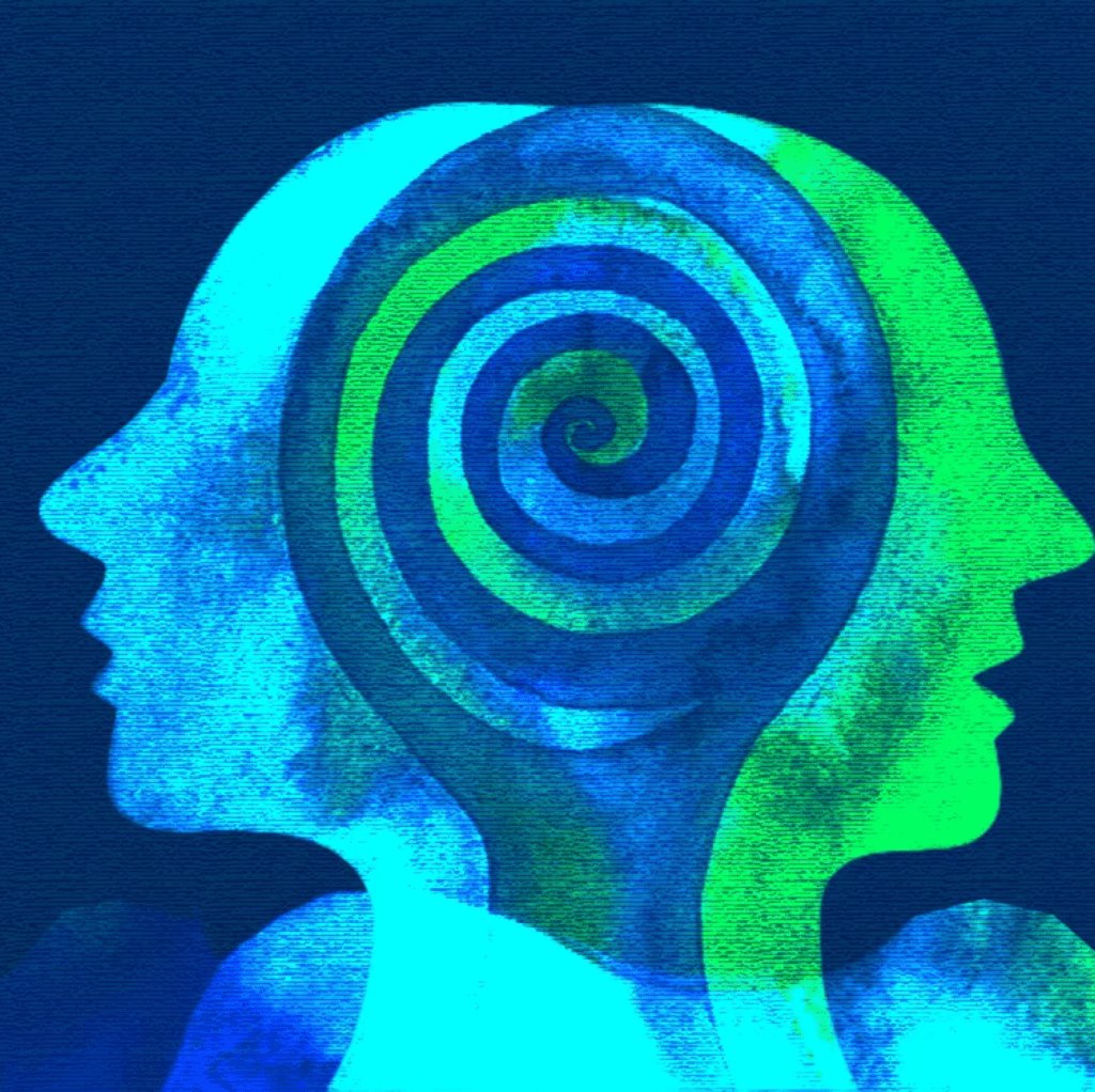
Leveraging Cognitive Science in UI/UX Design to Drive User Engagement

The study of the mind and its processes, plays a vital role in understanding how users interact with digital products. By integrating principles of cognitive science into UI/UX design, businesses can create interfaces that not only captivate users but also ensure intuitive, satisfying, and long-lasting engagement.
Gestalt Principles in UI Design: Creating Intuitive Interfaces

The Gestalt principles are psychological concepts originating from the early 20th century, focused on how people naturally perceive patterns and objects. . .
Proactive UX Audits: Preventing User Experience Failures Before They Happen
A UX audit is a systematic evaluation of a digital product’s usability and design, aimed at identifying barriers that hinder user interaction. . .
The Soul of the Digital Experience: The Importance of UI/UX Design
UI/UX design has transcended its role as a mere aesthetic consideration. It has become a cornerstone of successful product development. . .
The Rise of Voice User Interfaces: A Paradigm Shift in Human-Computer Interaction

In the ever-evolving landscape of technology, Voice User Interfaces (VUIs) stand as a vanguard of innovation. Diverging from the. . .
A Deep Dive into the Architectural Shifts in Mobile App Design
The realm of mobile app design has undergone transformative shifts since the inception of the smartphone era. As mobile devices became…
UX is not just about the IA. It is about empathizing the user’s needs.
As you can see, there is a good reason it is called User Experience. Understanding the user’s needs is the basis of creating the most effective user experience. There must be a deeper understanding of the user’s mentality, likes, dislikes, and behaviors. Doing this will also help when you design the product and hence will reap more benefits and provide a better experience to the user.
