


Gestalt Principles in UI Design: Creating Intuitive Interfaces
March 15, 2025 ● 7 Mins Read

Table of Contents
Introduction
The Gestalt principles are psychological concepts originating from the early 20th century, focused on how people naturally perceive patterns and objects in their environment. These principles are essential for UI designers, as they help create interfaces that are not only visually appealing but also intuitive and easy to navigate. By leveraging these principles, designers can organize information in ways that align with users’ cognitive abilities, enabling them to process information more efficiently.
In this blog, we’ll delve deeply into the key Gestalt principles and explore how to apply them effectively in UI design to create better user experiences.
Proximity: Grouping Related Elements Together
Proximity refers to the principle that elements placed close to each other are perceived as related, while elements spaced farther apart are seen as separate.
The proximity principle is one of the simplest yet most powerful tools in UI design. When designing forms, buttons, or menus, elements that are closely spaced are understood to be connected. This allows users to quickly understand the relationship between items without the need for additional labels or explanations.
Forms: Group related fields together, such as name, email, and phone number. Space these fields closely and separate them from unrelated fields (e.g., shipping information or payment details).
Buttons: In a navigation bar, buttons like “Home,” “About,” and “Contact” should be placed near each other to signify they belong to the same category. Secondary buttons like “Cancel” or “Delete” should be farther apart from primary actions to prevent accidental interaction.
Similarity: Creating Visual Consistency
The principle of similarity states that elements that look similar (in terms of color, shape, size, or texture) are perceived as part of the same group or function.
To maintain consistency, use uniform styles for elements that serve the same function. For instance, all buttons that trigger the same kind of action (e.g., submitting a form or starting a process) should share the same color, shape, and size to help users understand their functionality without needing to read the label.
Navigation: All navigation links in a sidebar should have the same color and typography to indicate that they share the same purpose.
Action Buttons: A “Submit” button on multiple pages should have the same design, while “Cancel” buttons should consistently use a different style (e.g., a lighter or muted color) to distinguish primary actions from secondary ones.
Similarity creates visual harmony, helping users recognize patterns. This predictability fosters trust and enhances the user’s ability to navigate interfaces without confusion.
Continuity: Creating Seamless Flow
Continuity refers to our brain’s tendency to follow lines, paths, or curves in visual elements. Objects that are aligned along a path are perceived as related or part of a sequence.
Continuity is particularly useful in navigation, progress bars, and step-by-step processes. It helps guide users through a series of actions or tasks in a smooth and intuitive manner. When elements are visually aligned, they help users naturally follow the flow of the interface, ensuring the design feels cohesive and easy to use.
Navigation Menus: Horizontal or vertical navigation menus use continuity by placing related items in a line. The use of breadcrumbs is another example where users can easily follow a sequential path from one page to another.
Onboarding: In a multi-step process, such as signing up for a service, use a progress bar or numbered steps that are visually aligned in a sequence. This gives users a clear understanding of where they are in the process and what’s coming next.
Continuity supports a smooth and predictable flow, making it easier for users to process content without disruption. It reduces mental effort and helps users stay oriented within the interface.
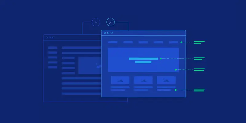
Figure/Ground: Creating Clear Visual Hierarchy
The figure/ground principle refers to the relationship between an object (the figure) and its surrounding area (the ground). Our brain naturally distinguishes the figure from the background, even in complex visuals.
Effective use of figure/ground can help users focus on the most important elements of a page. By ensuring that key content stands out from the background, designers can direct users’ attention to essential actions or information.
Buttons: Calls to action (CTAs) such as “Buy Now” or “Sign Up” should stand out against the rest of the interface, using contrasting colors or bold shapes to draw the user’s eye.
Content Overlays: A modal window that appears on top of a dimmed background is a classic example of the figure/ground principle, as it highlights the critical content while downplaying the background.
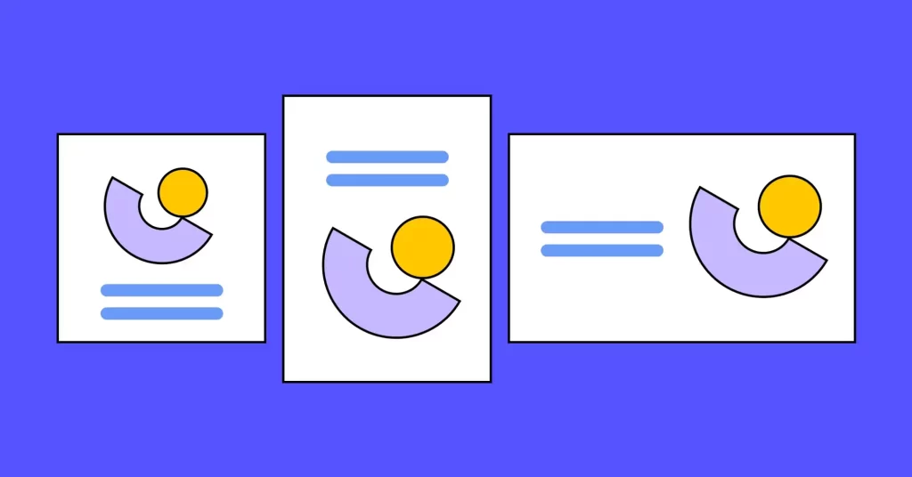
Symmetry and Order : Preferring Simplicity and Balance
This principle states that people are inclined to perceive objects in their simplest form and prefer designs that are orderly, symmetrical, and balanced.
Symmetry is crucial in creating balanced layouts that users find aesthetically pleasing and easy to navigate. A well-organized design reduces cognitive strain by presenting content in a clear, predictable manner.
Grids: Symmetrical grid layouts are a go-to for ensuring visual balance in UI design, especially in content-heavy pages like blogs, product galleries, or portfolios.
Alignment: Aligning elements symmetrically on both vertical and horizontal axes can enhance the visual appeal and make interfaces appear more professional.
Conclusion
Gestalt principles offer powerful insights into how humans perceive and interact with visual information. By applying these principles in UI design, you can create interfaces that are intuitive, well-organized, and easy to use. Understanding Proximity, Similarity, Closure, Continuity, Common Region, Figure/Ground, Symmetry and Order allows you to build designs that align with users’ natural cognitive processes, enhancing usability and engagement.
For UI/UX designers, mastering these principles is crucial to designing products that not only look good but also work effortlessly for users, helping them achieve their goals with ease and satisfaction.

Vidhya Shree
Senior Visual Designer
Passionate about creating bold, engaging visuals that tell a story. Whether designing compelling brand identities or experimenting with new artistic styles, I love exploring the power of color, composition, and creativity. When I’m not designing, you’ll often find me behind the camera, capturing moments and discovering new perspectives through photography.