


Table of Contents
Introduction
When people think of fintech, what often comes to mind is sleek design, frictionless transactions, and the promise of financial empowerment through digital tools. But beneath the surface lies a quieter, more complex story,one that centers not on efficiency or innovation, but on emotion. Particularly, fear.
In a world where money is increasingly invisible, interfaces have become the gatekeepers of trust. And for many users, especially those navigating economic instability, digital finance is less a playground of possibilities and more a minefield of uncertainty. This is not just a UX problem. It’s a human problem.
In this post, we’ll explore the emotional undercurrents that shape how users interact with fintech products, particularly those who are anxious, uncertain, or financially vulnerable. And why designing for them is not a matter of accessibility, it’s a strategic imperative.
Beyond Utility: The Emotional Architecture of Money
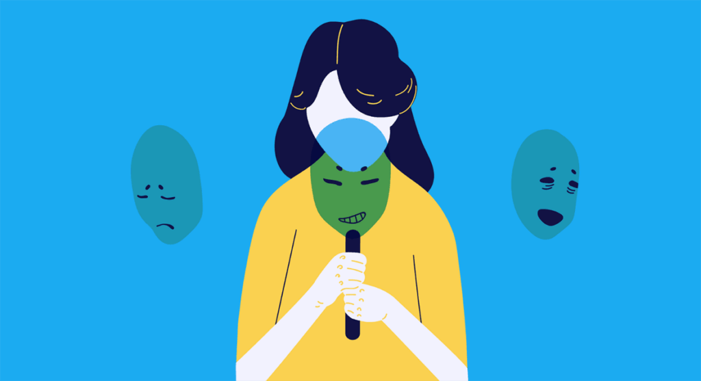
Finance is not a neutral domain. It is loaded with emotion, fear, shame, hope, pride. Every button pressed, every number seen, every transaction made has an emotional residue. This is especially true for users who have experienced financial trauma, instability, or exclusion.
Traditional financial institutions have long relied on gatekeeping language and opaque systems to assert authority. Fintech was supposed to be the antidote, a more user-centric, democratic alternative. But many fintech products have failed to recognize that financial empowerment doesn’t start with features. It starts with emotional safety.
An anxious user doesn’t need gamified savings or a colorful dashboard. They need reassurance. Clarity. Predictability. Designing for these emotions isn’t soft UX. It’s structural empathy, and it should inform everything from copywriting to error messages to onboarding flows.
Anxiety as a Design Context, Not a Persona
Much of UX design relies on personas. But anxiety is not a persona,it’s a context. It is dynamic, situational, and often invisible. A user might feel confident when checking their balance, but overwhelmed when asked to set a budget or transfer funds. The emotional terrain is fluid, and so the interface must be as well.
This calls for a shift from static personas to adaptive systems. Systems that sense emotional friction and respond accordingly. Think: reassuring microcopy, progressive disclosure of information, default protections, or nudges that respect user agency without triggering shame.
Designing for anxiety doesn’t mean designing with kid gloves. It means recognizing that fear is a rational response to financial precarity and that good design doesn’t eliminate the fear, but helps users move through it.
Interface as Trust Infrastructure
In the absence of a physical branch, the interface is the bank. It holds the burden of proving legitimacy, clarity, and care, all through pixels. And when financial anxiety is high, every friction point becomes a site of amplified emotional distress.
Consider how error states are handled. A generic “Something went wrong” isn’t just annoying, it can be terrifying when money is involved. Or take real-time updates: a pending transaction with no clear timeline can create spirals of stress for a user who’s budgeting down to the last dollar.
Trust isn’t just built through visual polish. It’s built through predictability, transparency, and emotional intelligence. The interface must become a space where users feel seen, not judged; guided, not gamed.
Micro-Moments of Reassurance: UX as Behavioral Design
The most powerful fintech interfaces don’t just display information, they anticipate feelings. They recognize the micro-moments where fear creeps in: before confirming a payment, after seeing a low balance, while waiting for a deposit. And they meet those moments with gentle reassurance.
This isn’t manipulation. It’s a behavioral design with an ethical spine.
Consider features like:
- Affirming copy: “You’re doing great” messages after small savings deposits.
- Clear next steps: After a failed payment, showing exactly what to do next.
- Soft defaults: Turning on auto-savings by default, but making opt-outs easy and judgment-free.
- Transparency indicators: Visual cues that show a transfer is processing and exactly when it will complete.
These aren’t aesthetic niceties. They are emotional UX patterns, strategic choices that guide users from fear toward confidence.
From UX to EX: Emotional Experience Design
Just as branding has moved from visual identity to emotional resonance, fintech UX must evolve from usability to emotional experience design (EX). The goal is not to make users feel nothing, it’s to help them feel in control.
This is especially critical in markets with high financial illiteracy or distrust in institutions. For users in emerging economies, migrants navigating new banking systems, or gig workers juggling irregular income, the stakes are not abstract. They are immediate and deeply personal.
Here, design becomes advocacy. The interface must educate without condescension, protect without paternalism, and empower without overwhelm. It’s a strategic repositioning: from product-as-tool to product-as-emotional-companion.
These security measures protect against potential data breaches, downtime, and other risks, ensuring that logistics operations remain uninterrupted and secure.
Designing with, Not for: The Power of Co-Creation
If fintech wants to serve the anxious user, it must stop designing in a vacuum. Co-creation with communities experiencing financial hardship or anxiety isn’t just a nice-to-have,it’s essential. These users bring lived insights that no persona can replicate.
Think of participatory testing, community-driven design sprints, or partnerships with financial counselors. These practices create a feedback loop that grounds product strategy in real emotional contexts not assumptions.
Just as open-source platforms thrive through contribution, fintech can build deeper trust by opening its design process. Not just asking what users want, but what they fear and how the interface can meet them there.
A well-executed rebrand is not just a visual shift. It’s a strategic recalibration that can define a brand’s relevance, strength, and potential in the marketplace for years to come.
Conclusion
Fintech has often positioned itself as the future of finance: fast, digital, efficient. But if it wants to be the future that works for everyone, it must reckon with fear not as a UX obstacle, but as a core design material.
Designing for the anxious user is not about simplifying for the sake of aesthetics. It’s about honoring the emotional weight of financial decisions, especially for those who carry the heaviest burdens. It’s not just a UX strategy, it’s a values strategy.
In this light, the interface is not just a medium. It’s a message. A signal to users: You are safe here. You are understood. You are not alone.
And in a world where money is increasingly digital, that kind of emotional resonance isn’t a luxury, it’s the future of trust.
Passionate about creating bold, engaging visuals that tell a story. Whether designing compelling brand identities or experimenting with new artistic styles, I love exploring the power of color, composition, and creativity. When I’m not designing, you’ll often find me behind the camera, capturing moments and discovering new perspectives through photography.

Vidhya Shree
Senior Visual Designer