Read summaried version with
Published: April 26th, 2024
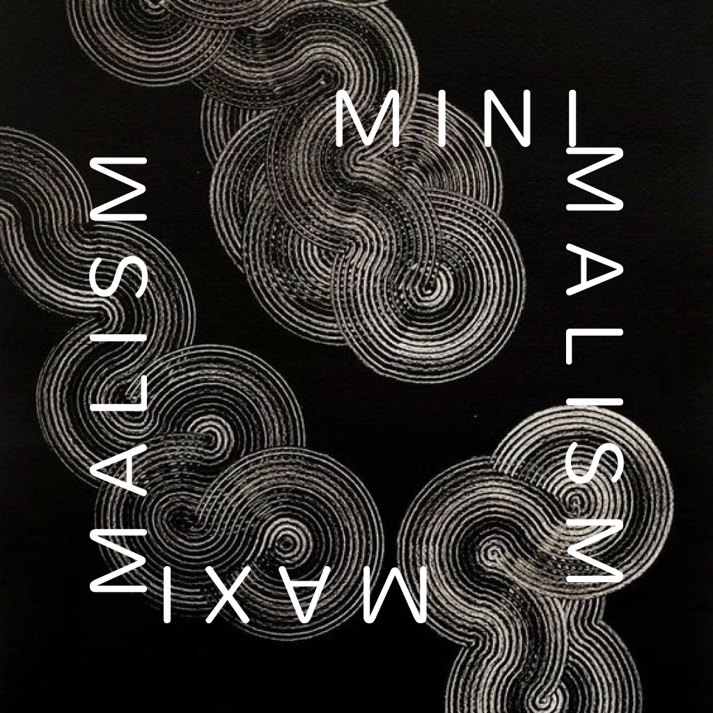
The way in which brands project themselves into the world is extremely important to their identity and goals. The process begins with the logo, typography, colors, and design of the website and other platforms. Brands’ communication with their audiences has changed drastically over the years. Brand identity has been dominated by minimalism and maximalism.
Maximalism
Maximalism is characterized by abundance and complexity, including bold colors, intricate patterns, and incongruous fonts. Maximalism is all about creating an immersive, vibrant, and luxurious experience. The main idea behind maximalism is to hold the audience through visually striking complex yet beautiful designs and layouts. Maximalism is more valued in the fashion, entertainment and art industries. Ornate typography along with multiple visuals overlapping each other to create an experience that makes the brand standout in the competitive market.
Minimalism
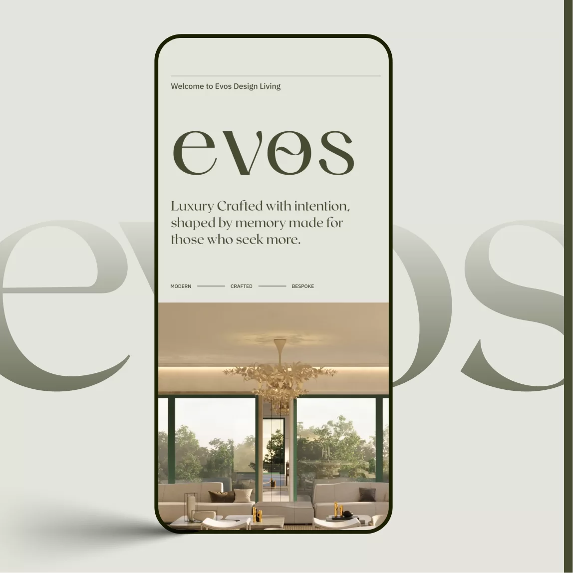
In contrast to maximalism, minimalism focuses on limited things. Flat, simple and more negative spaces are the highlights in this approach. Minimalism embraces a simple, sleek and modern look with less colors on the design. Minimalism is preferred in more professional environments because the design is less distractive. When it comes to user experience principles, its clean and simple design easily navigates the audience or visitors throughout the website.
Versatility of Minimalism and Maximalism:
Websites, mobile applications and tech gadgets depend a lot on minimalistic approach , it is easier for users to interact. Most of the film and television animations are maximalistic in nature. They aim to produce epic visuals to provide an audience with a spectacular experience. Fashion brands adapt both approaches, sometimes they go for bold choice of colors and text, sometimes be basic and clean. The usage of colors is limited in minimalism to achieve a cohesive look, in contrast maximalism uses multiple vivid colors to pop among the crowd.
Benefits of using minimalism:
1, Minimalistic designs convey clear message which makes it last for decades
2, Corporate presentations and reports are minimal in nature to reflect cohesive brand image
3, Minimalistic layouts avoid unnecessary elements that distract users.
4, Logos created with minimalistic approach are widely recognized and followed as a brand than other maximalistic logos .
5, Minimal logo ideas are considered as more modern and aesthetically pleasing than maximalistic one.
Benefits of using Maximalism:
1, Grandeur, complexity and immersive effect are the reasons why film, music and fashion industries heavily rely on maximalistic approach.
2, Events like awards shows, wedding shows and themed events use stunning big, bold, multiple layered motion graphics to keep the energy high.
3, Magazines use dashing layouts, bizarre fonts, strong colors to attract readers and make them stay longer as possible.
4, Tourism industry uses poppy graphical elements , multilayered images, vivid colors to attract targeted audiences.
5, Maximalist billboards have the power to draw attention with their striking images and detailed designs. They leave a lasting impression and stand out in crowded urban settings.
Both approaches have advantages and provide brands with a multitude of choices to enhance their brand identity. Maximalism gives brands the ability to distinguish out from the competition, while minimalism promotes a clean, contemporary brand image. Brands must utilize these ideas effectively in order to achieve their objectives and increase their reach and brand recognition. For inspiration on minimalism and maximalism check Wings Design Studio
